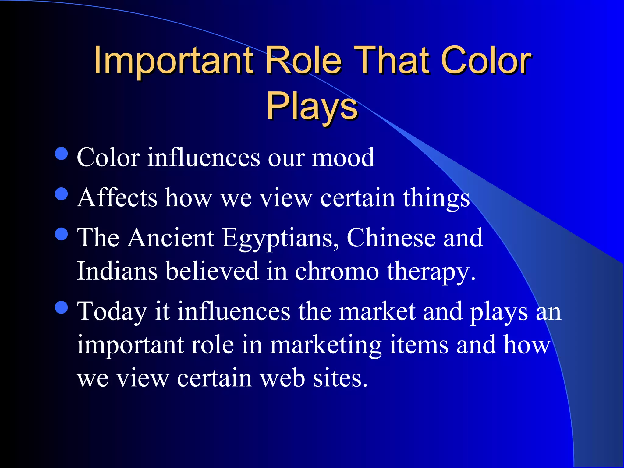
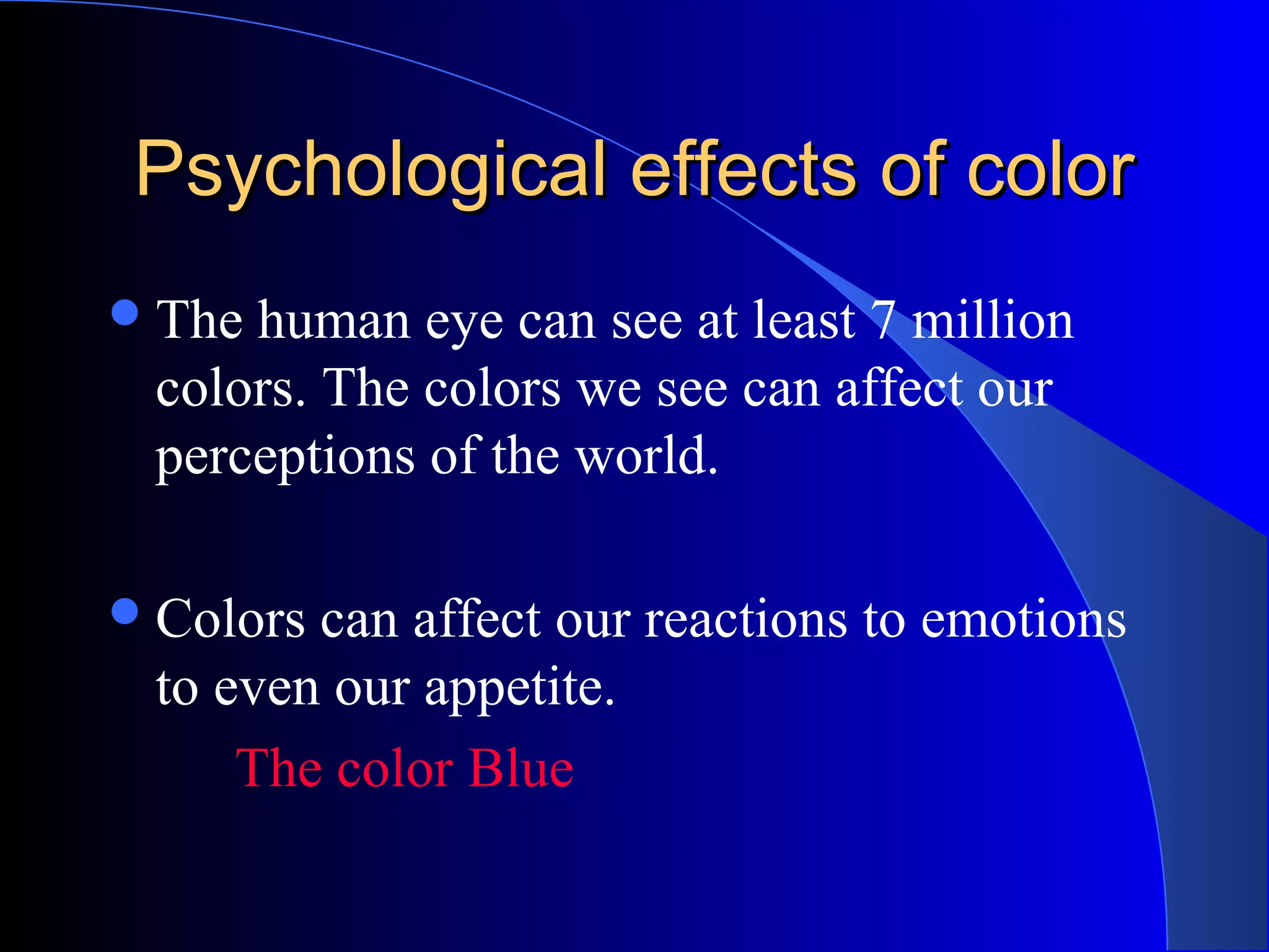
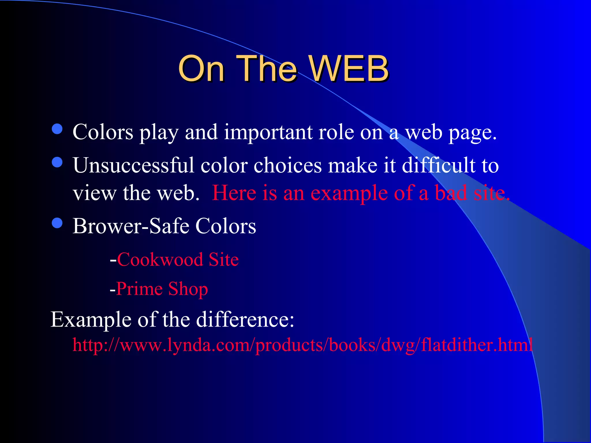
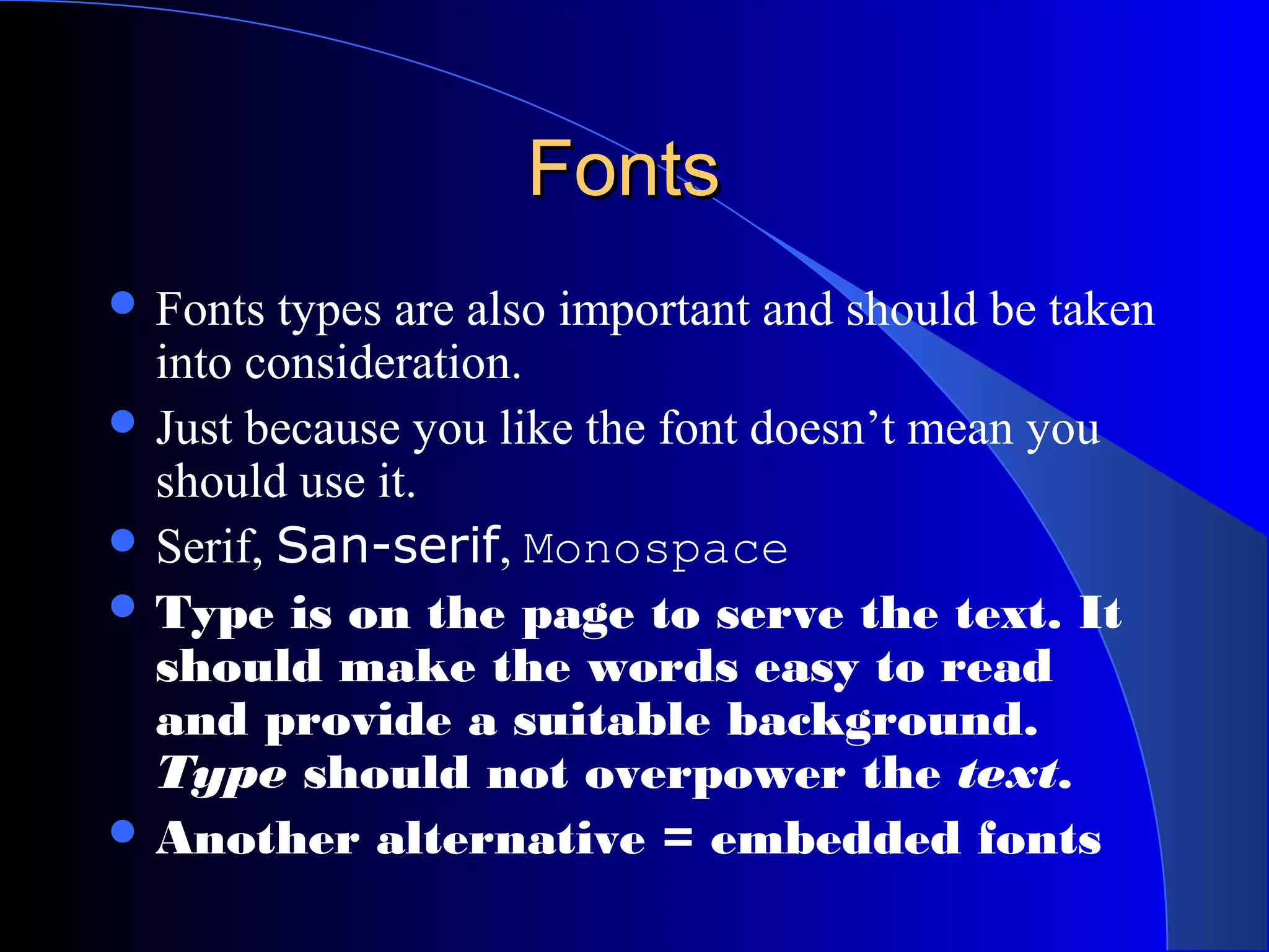
Framing an Appropriate Research Question 6b9b26d93da94caf993c038d9efcdedb.pdf
Tean color - Unitedworld School of Business
1. The Psychology of ColorThe Psychology of Color
Which Color, graphics and font for
what sites and why?
2. TopicsTopics
Why do we need to study colors?
What are some color terminology?
Psychological effects of color
What does each color represent?
Different cultural interpretations of color
How does fonts and graphics play a role?
Case studies
3. Important Role That ColorImportant Role That Color
PlaysPlays
Color influences our mood
Affects how we view certain things
The Ancient Egyptians, Chinese and
Indians believed in chromo therapy.
Today it influences the market and plays an
important role in marketing items and how
we view certain web sites.
4. Color TerminologiesColor Terminologies
Spectrum: All possible color space
Hues: Defines a specific location on
the color wheel or spectrum
Value: Describes the range from
light to dark
Muted: Colors that have very little
saturation.
Tint: The process of adding white
to a color
Tone: the process of adding black
to a color.
5. More TerminologiesMore Terminologies
Color Wheel
Primary Colors: RED,
BLUE, YELLOW
Secondary Colors:
GREEN, ORANGE AND
PURPLE
Tertiary Colors: Other
shades of color that are
produced when mixing
secondary colors
6. Color HarmonyColor Harmony
Analogous Colors are the three colors that
are side by side on a color wheel
Complimentary Colors are colors that are
opposite of each other on the color wheel.
- NY Mets uniform are complimentary
Blue and Orange
7. Psychological effects of colorPsychological effects of color
The human eye can see at least 7 million
colors. The colors we see can affect our
perceptions of the world.
Colors can affect our reactions to emotions
to even our appetite.
The color Blue
8. Our eyes can play tricks onOur eyes can play tricks on
us.us.
High contrast between
colors creates
muscular activity
which fatigues the eye.
The greater the
contrast between two
colors the more
difficult it is to look at.
9. When we reduce the ContrastWhen we reduce the Contrast
The two sets of
pictures are now easier
to see when we lower
the contrast.
10. Emotional Responses to ColorEmotional Responses to Color
Blue Tranquil, appetite suppressant
Green Soothing, being in a green room
relieves pain
Orange Improves mental clarity
Pink subdues
Red Increases bodily tension
White Cause more headaches
Bright Yellow Fatiguing; babies cry more in a
yellow room; couple fight more
Light Yellow Creates harmony
11. Some Colors Used InSome Colors Used In
MarketingMarketing
Hot Pink Vivid; shocking; high
energy; youthful; less
expensive
Glam Rock from Clair
Light Pink Romantic; feminine Victoria's Secret
Blue Dependable; reliable,
confidence
Terracotta Rustic; robust; upscale;
traditional
Cuban Cigars
12. Cultural DifferencesCultural Differences
In every culture colors
are viewed differently
In the Europe, U.S and
Japan brides
traditionally wear
white, while in China,
India and Pakistan it is
traditional to wear red.
13. Cultural DifferencesCultural Differences
Color Western
Europe &
U.S
China Japan Middle
East
Danger,
Anger, Stop
Joy, Festive
Occasions
Anger, Danger Danger, Evil
Caution,
Cowardice
Honor,
Royalty
Grace,
Nobility,
Childish,
Happiness,
Prosperity
Safe, sour, go Youth,
Growth
Future, Youth,
Energy
Fertility,
Strength
Purity, Virtue Mourning,
Humility
Death,
Mourning
Purity,
Mourning
Calm,
Authority,
Masculinity
Strength,
Power
Villainy
Death, Evil Evil Evil Mystery, Evil
14. On The WEBOn The WEB
Colors play and important role on a web page.
Unsuccessful color choices make it difficult to
view the web. Here is an example of a bad site.
Brower-Safe Colors
-Cookwood Site
-Prime Shop
Example of the difference:
http://www.lynda.com/products/books/dwg/flatdither.html
15. Four Formula For SuccessFour Formula For Success
Convert images to the correct file format
Select the most appropriate colors by analyzing
the store’s products or services and the target
market.
Use color to create a functional user-interface
Use color harmony principles
In depth coverage at this site: Color Matters
16. FontsFonts
“There are no good and bad
typefaces, there are appropriate
and inappropriate typefaces.
Think about your reader and the
feeling you want to convey, then
choose a typeface that fits.”
- Daniel Will-Harris (http://www.will-harris.com/use-type.htm)
17. FontsFonts
Fonts types are also important and should be taken
into consideration.
Just because you like the font doesn’t mean you
should use it.
Serif, San-serif, Monospace
Type is on the page to serve the text. It
should make the words easy to read
and provide a suitable background.
Type should not overpower the text.
Another alternative = embedded fonts
18. GraphicsGraphics
Graphics enhances a web site
Some different types of graph formats : jpg
and gifs
http://www.lynda.com/products/books/dwg/dither
Anti – Aliasing vs. Aliasing
21. ConclusionConclusion
Colors combinations can effect the way we
feel about things therefore it is crucial that
we learn how to use that to our benefit to
market or site or product.
Sir Isaac Newton developed the first circular diagram of colors in 1666. Since then scientists and artists have studied and designed numerous variations of this concept. Differences of opinion about the validity of one format over another continue to provoke debate. In reality, any color circle or color wheel which presents a logically arranged sequence of pure hues has merit. Secondary Colors are a result of mixing the primary colors
Chart taken from Understanding Color http://library.thinkquest.org/50065/psych/meaning.html
The Browser-Safe Palette only contains 216 colors out of a possible 256. That is because the remaining 40 colors vary on Macs and PCs. By eliminating the 40 variable colors, this palette is optimized for cross-platform use. An 8-bit video card cannot display more than 256 colors. (http://www.lynda.com/hex.html)
Here are four formulas for success: 1. Convert images to the correct file format. This not only delivers the best colors and the best images possible but it also lowers file sizes and shortens the download time. 2. Select the most appropriate colors by analyzing the store’s products or services and the target market. It is essential that colors bear some relationship — either symbolic or literal — to the product or service. Don’t try to reinvent the color wheel by using unusual colors. 3. Use color to create the most functional user-interface design. For example, use color to direct the eye to the most important areas on the page. The web designer must identify what ideal and normal sequences might entail: what the viewer should see first, where the eye should move next, and how much time the viewer's attention should be held by each area. Keep colors to minimum. "Signal detection" theory means that the brain is able to understand and organize information when a minimum of colors and shapes exists within the visual field. Too many colors and shapes make it impossible to focus and find anything. 4. Use color harmony principles to create a pleasant visual experience. In other words, all the colors of the components — the navigation system, banners, buttons, and text — as well as the images of the merchandise (if they exist), must all work well together. Some common attribute must unify them. (http://colormatters.com/des_ecom.html)
Serif typeface has strokes attached to the beginning or end of the main strokes of each letters. Common serif types are Times New Roman. San serif typeface doesn’t have the strokes Monospace uses the same amount of horizontal width for every characters. Example Courier
Jpg : Joint Photographic Experts Group used for lossy compressions. Reduces the size of a graphic file by 96% Lossy: Data compression technique in which some data is deliberately discarded in order to achieve massive reduction in the size of the compressed file. Gif: A bitmapped color graphics compressed file format. Bitmapped are pixel based as opposed to vector which is object orientated. (429 Weinman) Aliasing has the jagged edges and Anti – Aliasing creates a blended edge.
They are using the correct colors because you can almost taste how hot everything will be. Red: conveys excitement and high energy Orange is consider to be the hottest of all color, convey vitality They are also considered warm colors are aggressive and attracts the eye and excite the emotions Yellow: Warm and the hot sun The use of yellow with black color font conveys unignorable danger
Colors used are considered feminine Red: a high arousal color, high engery, passionate, Burgundy: Rich, authoritive, mature and lush Pink: Happy and sweet