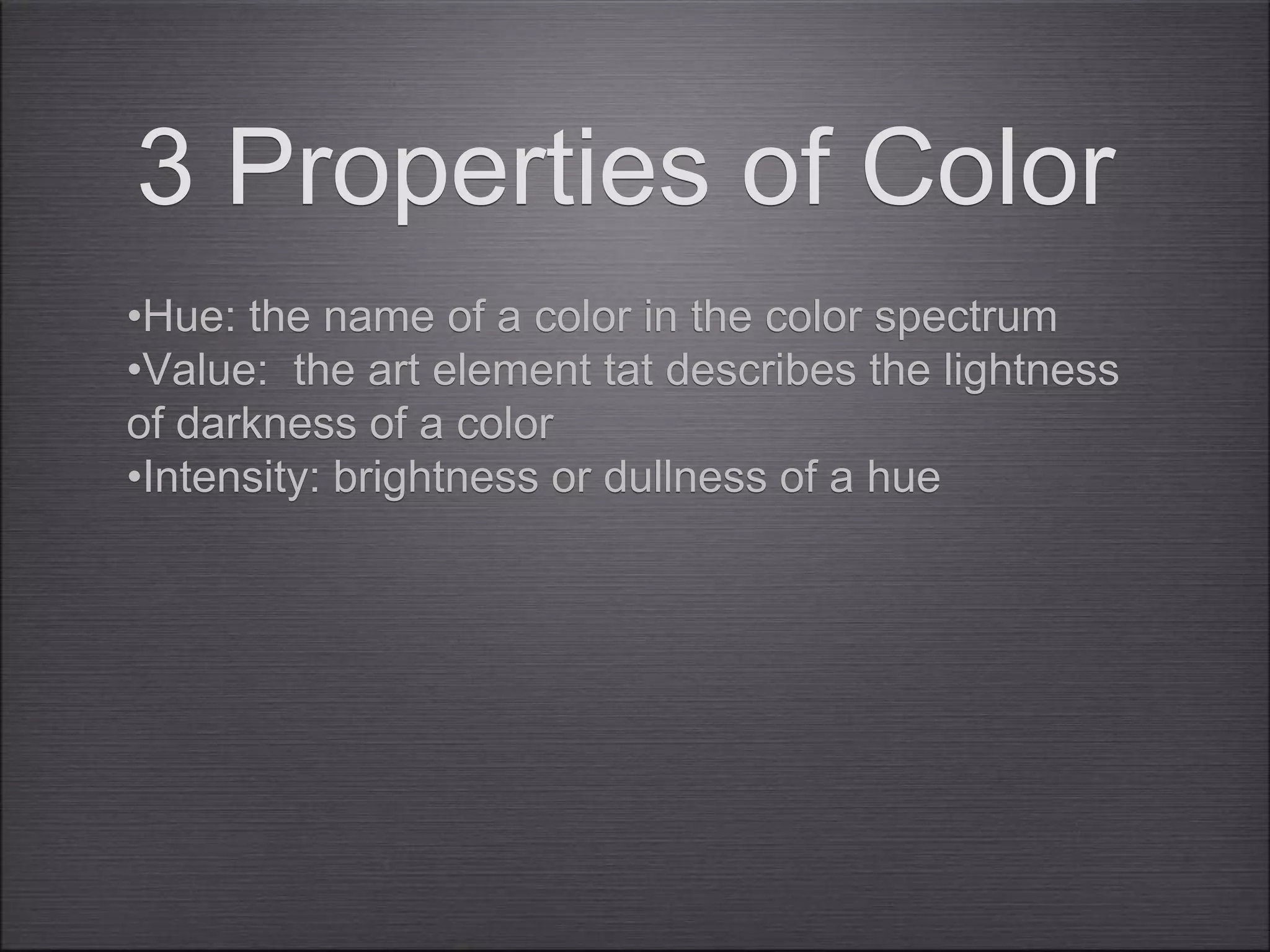
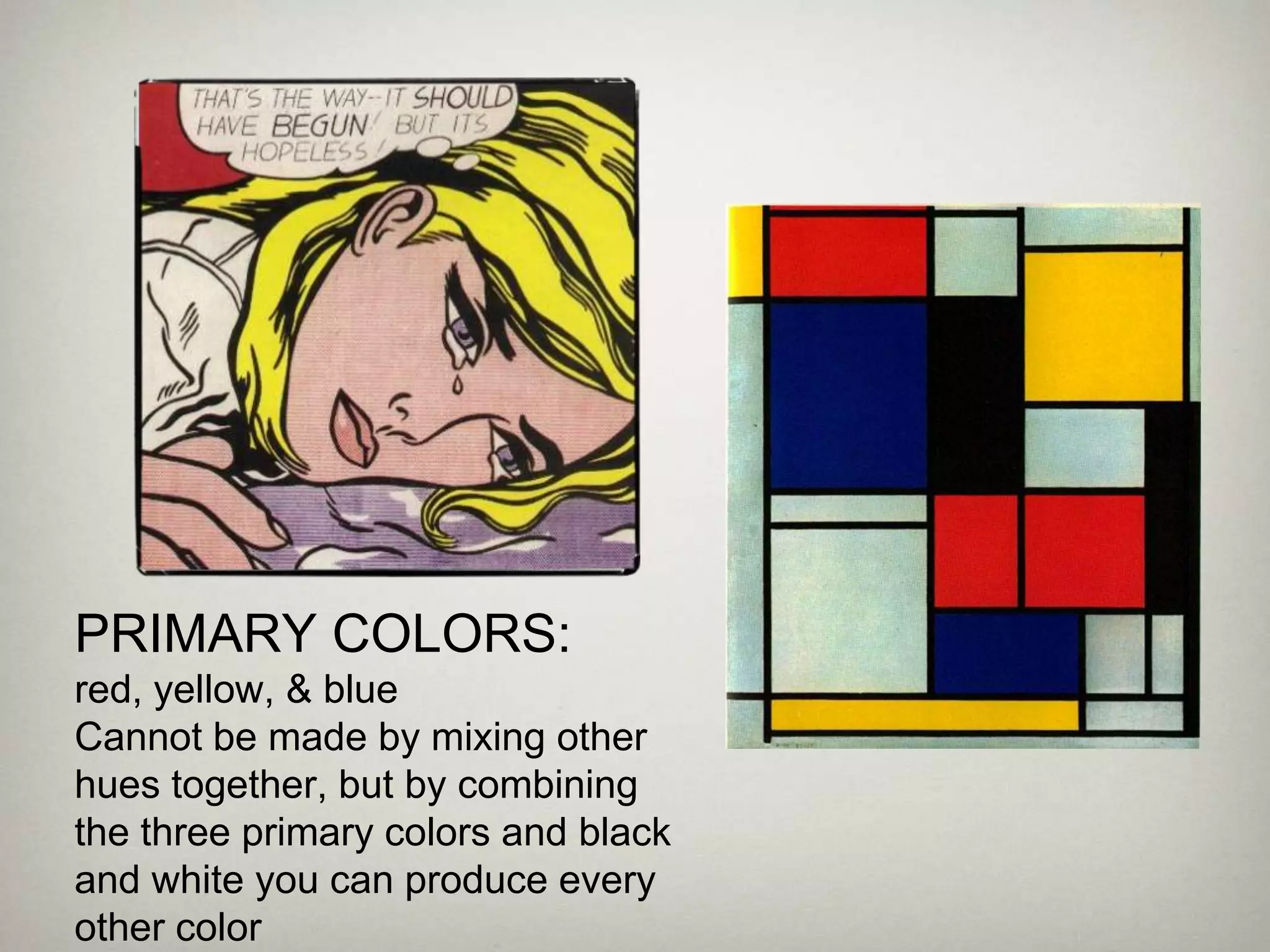
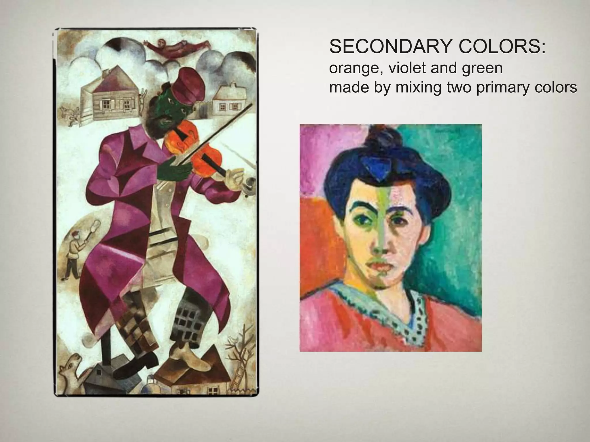
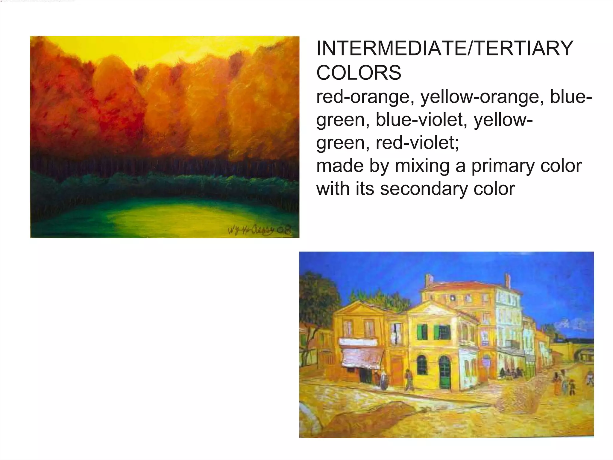
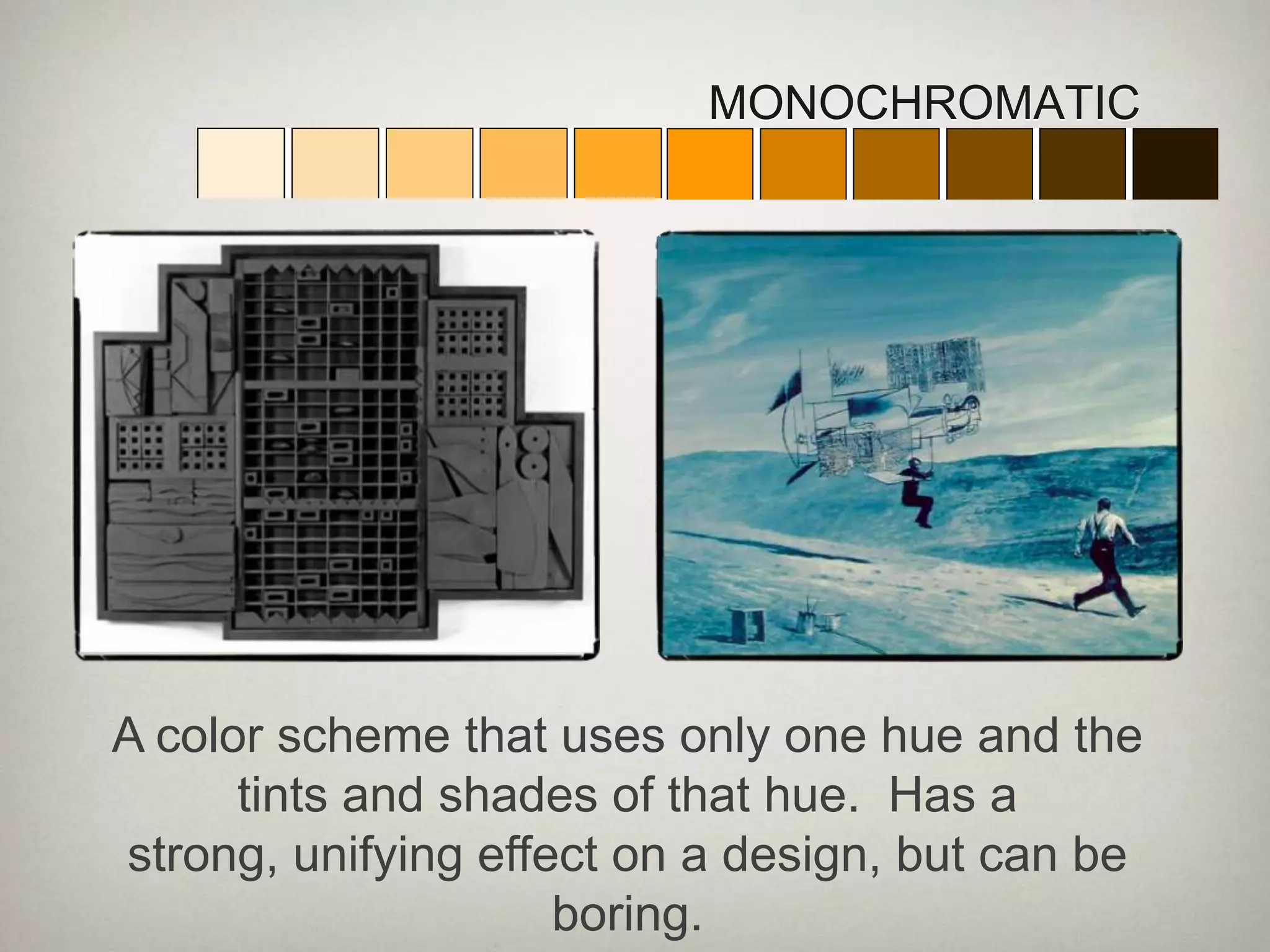
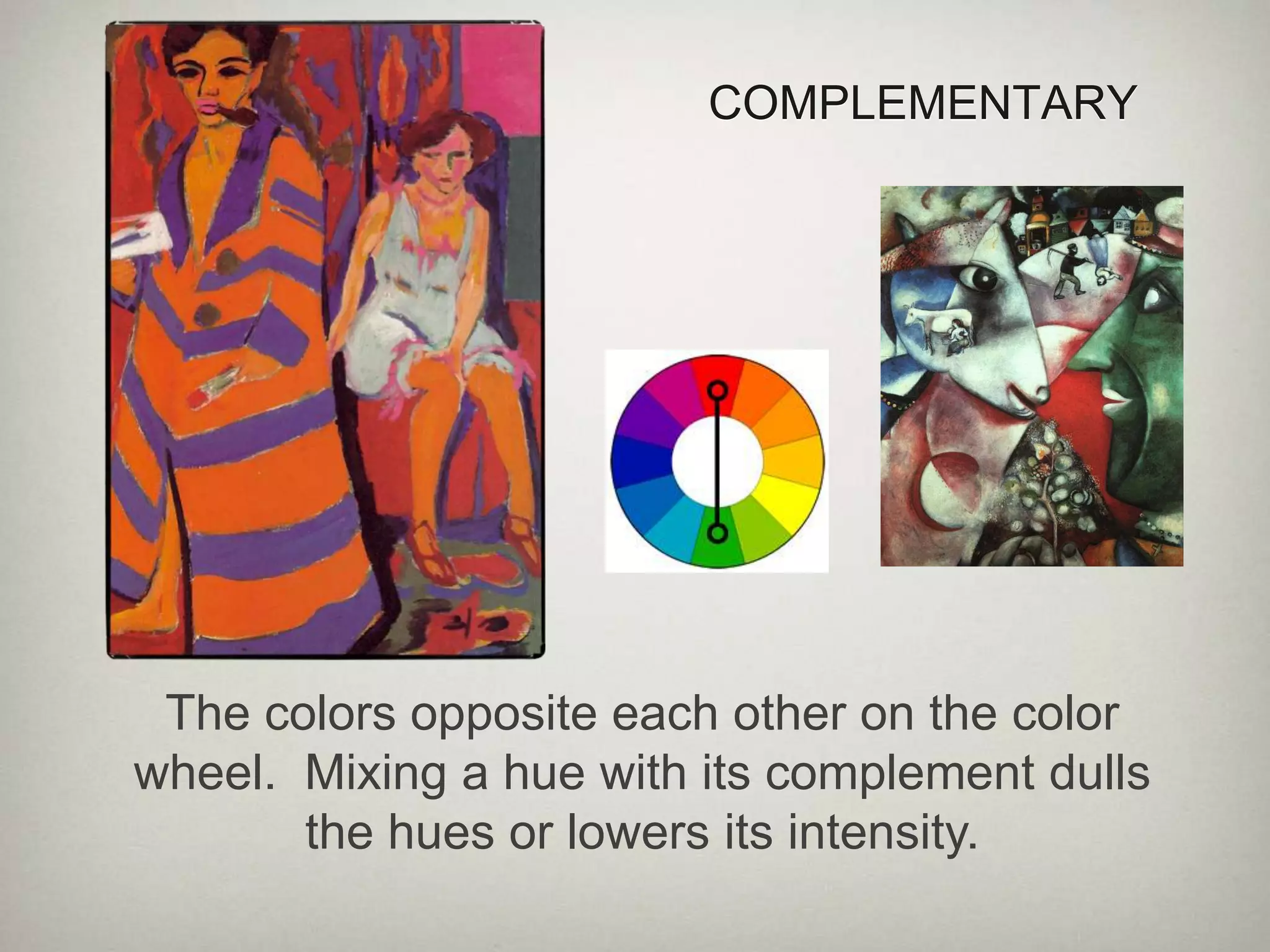
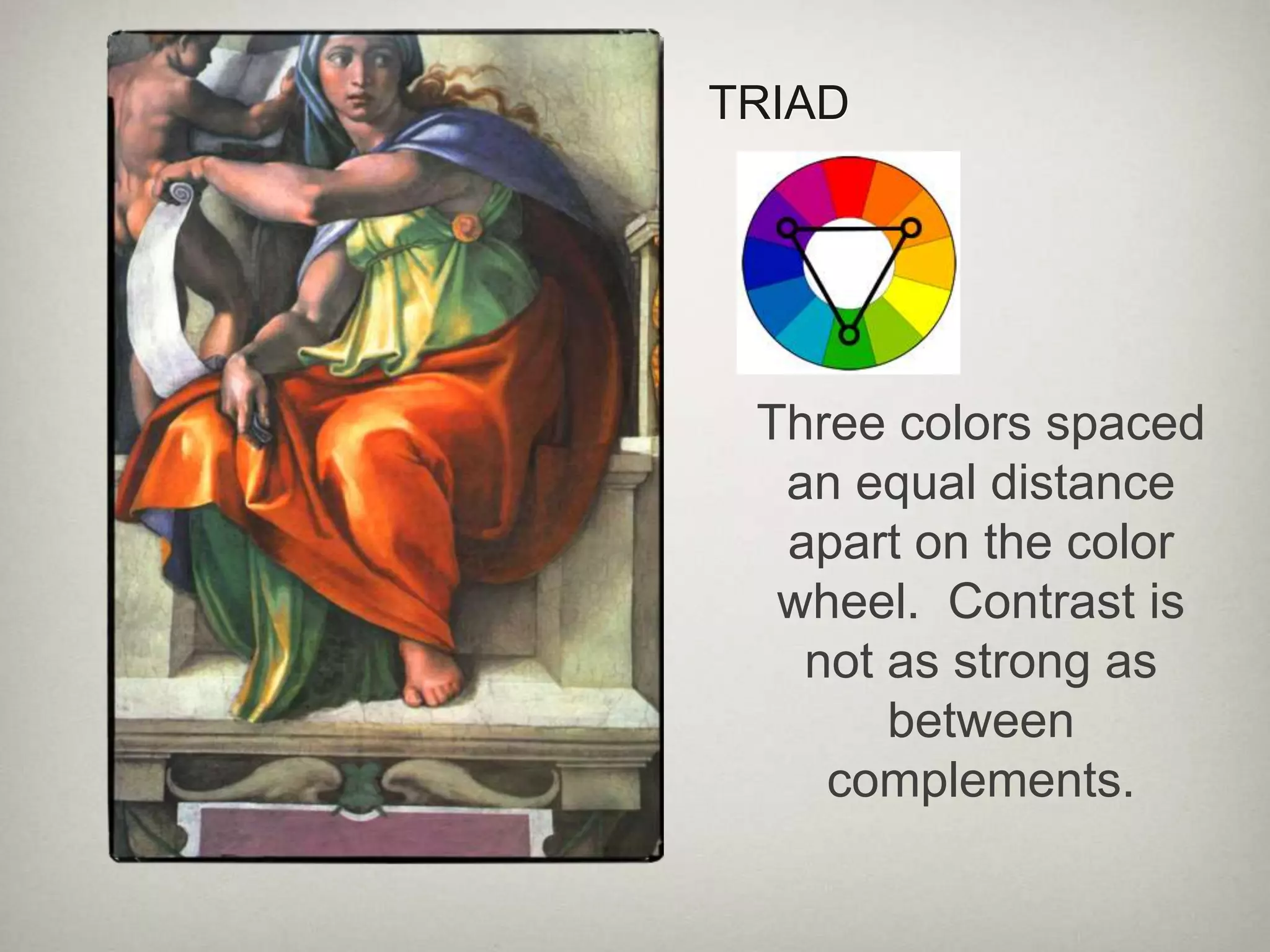
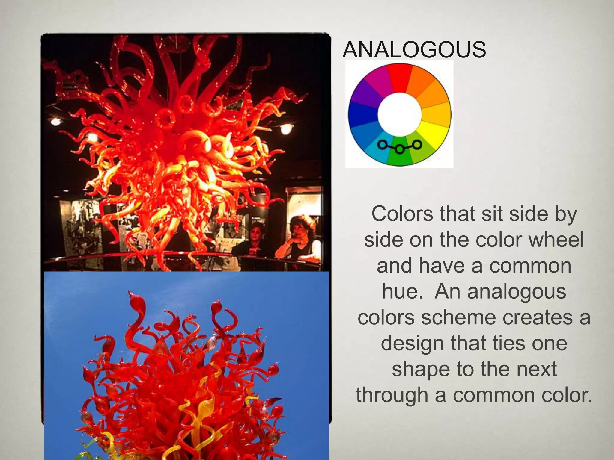
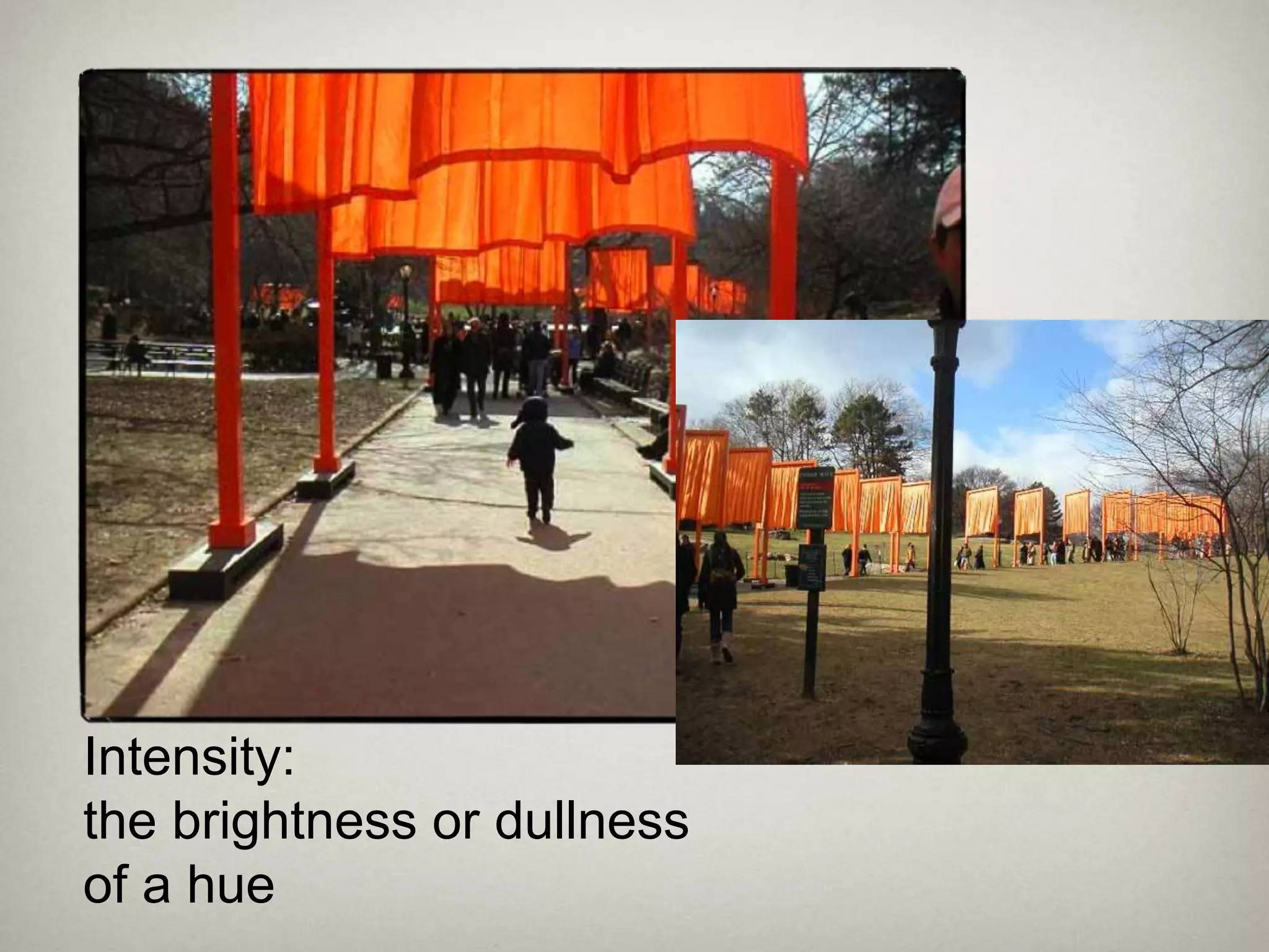
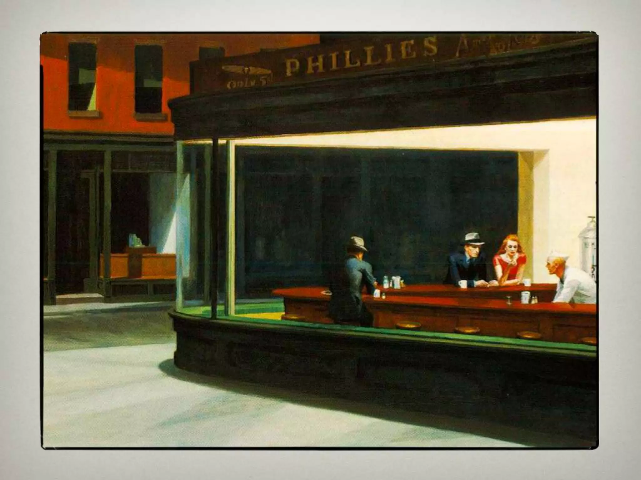
COLOR
3 Properties of ColorHue: the name of a color in the color spectrum
Value:  the art element tat describes the lightness of darkness of a color
Intensity: brightness or dullness of a huePRIMARY COLORS:red, yellow, & blueCannot be made by mixing other hues together, but by combining the three primary colors and black and white you can produce every other color
SECONDARY COLORS:orange, violet and greenmade by mixing two primary colors
INTERMEDIATE/TERTIARY COLORSred-orange, yellow-orange, blue-green, blue-violet, yellow-green, red-violet;made by mixing a primary color with its secondary color
MONOCHROMATICA color scheme that uses only one hue and the tints and shades of that hue.  Has a strong, unifying effect on a design, but can be boring.
COMPLEMENTARYThe colors opposite each other on the color wheel.  Mixing a hue with its complement dulls the hues or lowers its intensity.
Split complement:the combination of one hue plus the hues on each side of its complement.  Easier to work with than a straight complementary scheme because it offers more variety
TRIADThree colors spaced an equal distance apart on the color wheel.  Contrast is not as strong as between complements.
ANALOGOUSColors that sit side by side on the color wheel and have a common hue.  An analogous colors scheme creates a design that ties one shape to the next through a common color.
WARM & COOLWarm: red, orange, yellow – associated with warm things and seem to move toward the viewerCool: blue, green, violet – associated with cool things & seem to recede
Intensity: the brightness or dullness of a hue
Changes Perception
creating moods

Color 2010