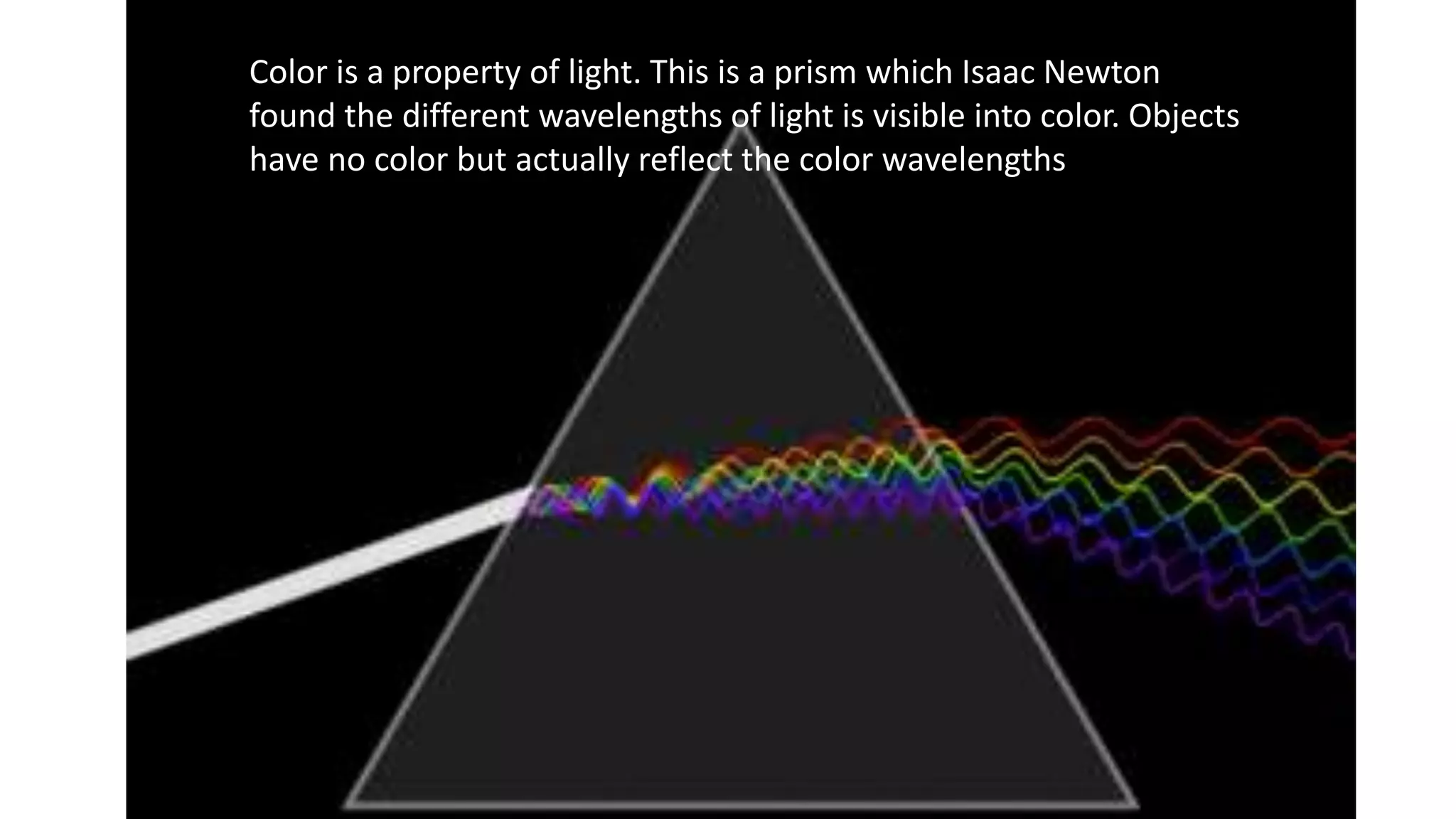
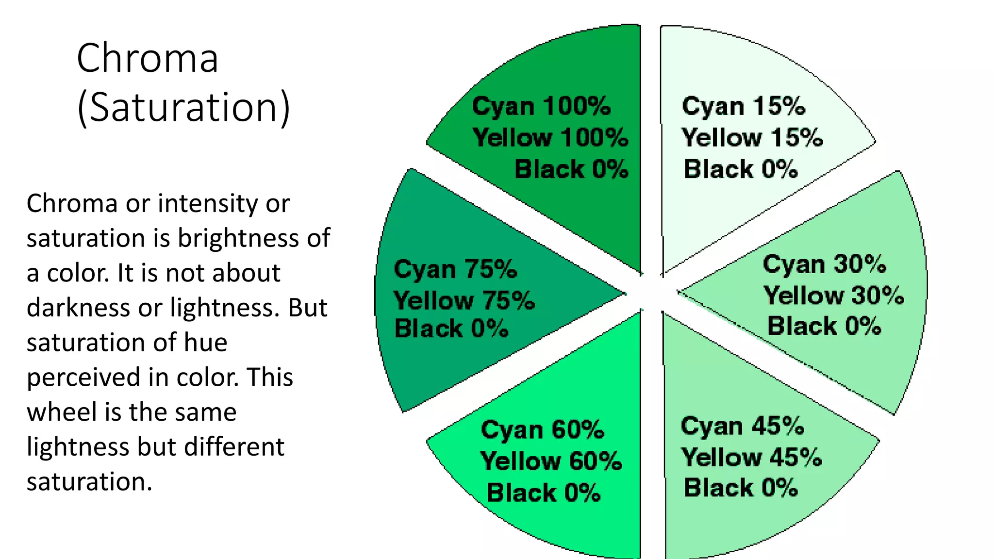
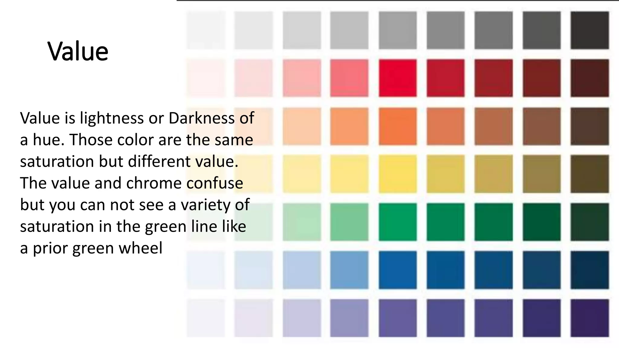
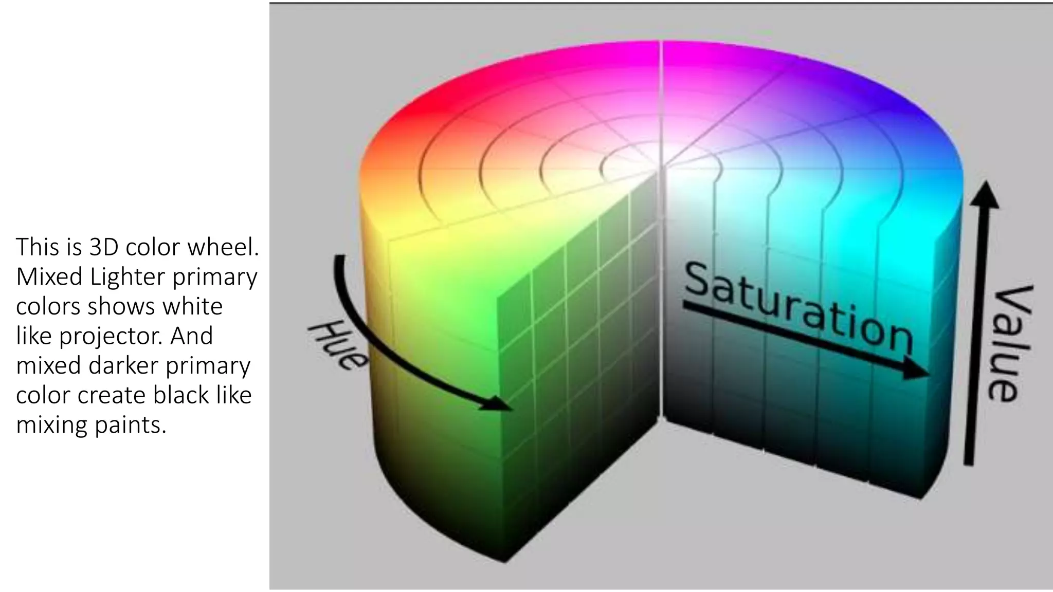
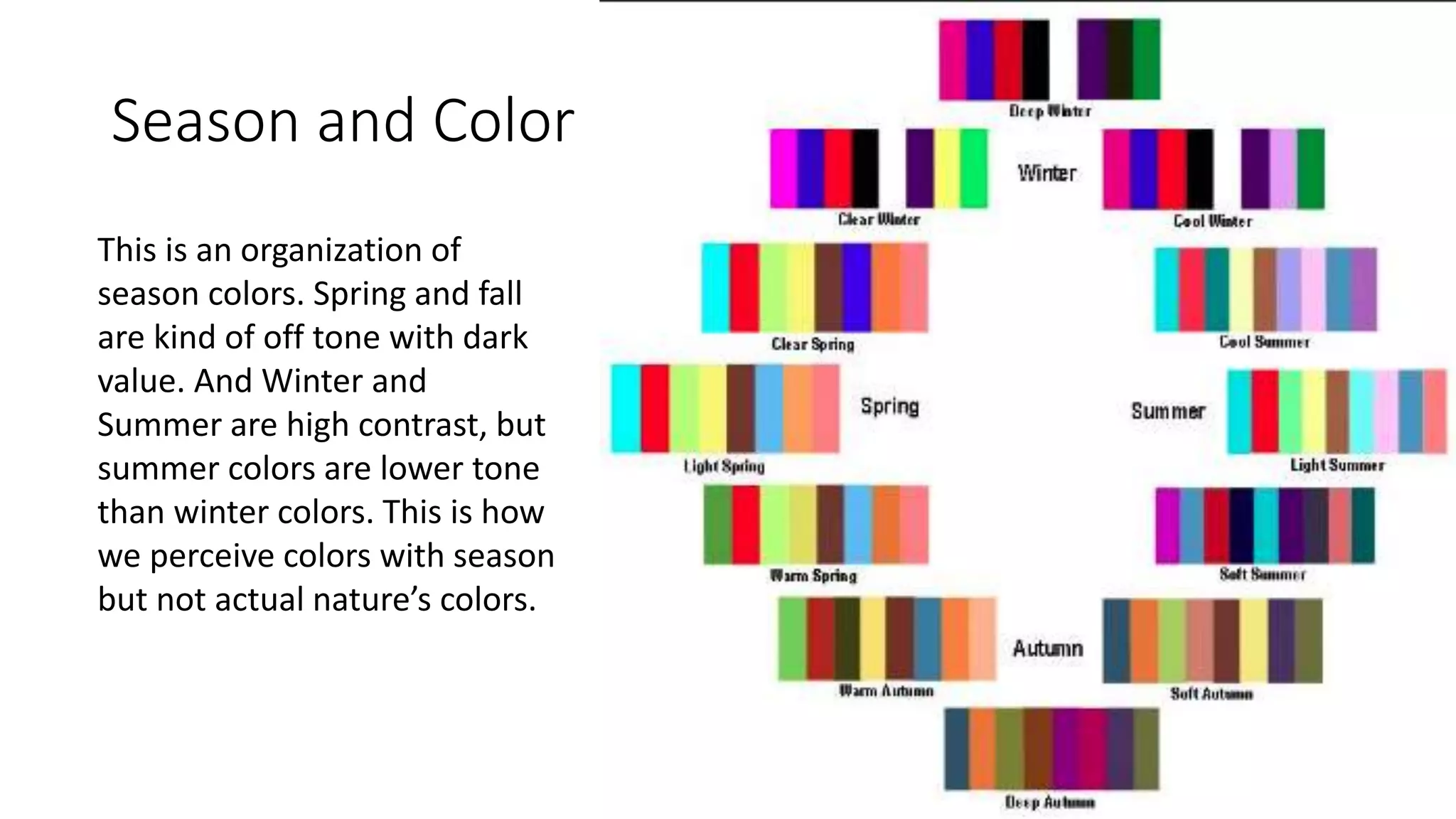
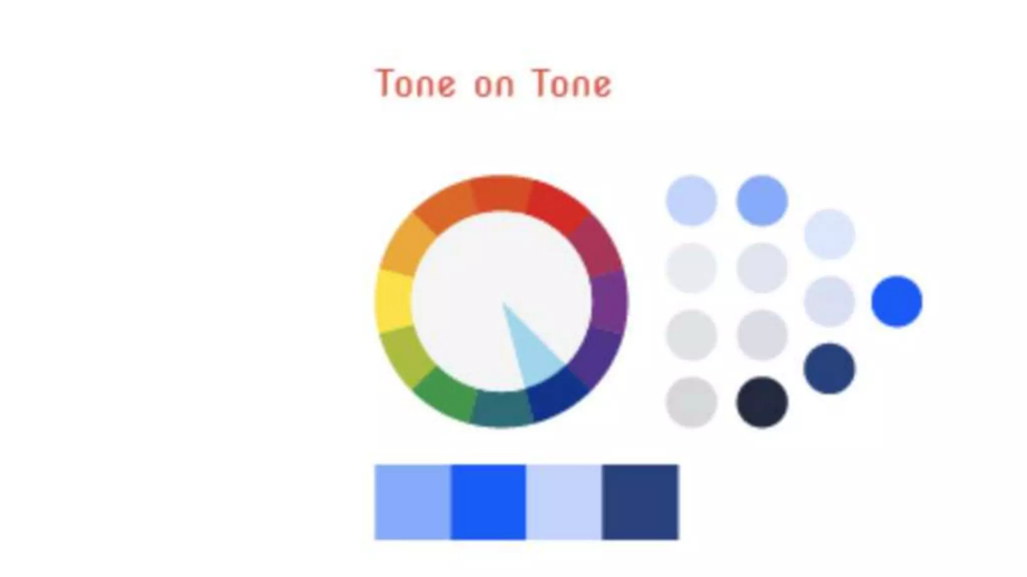
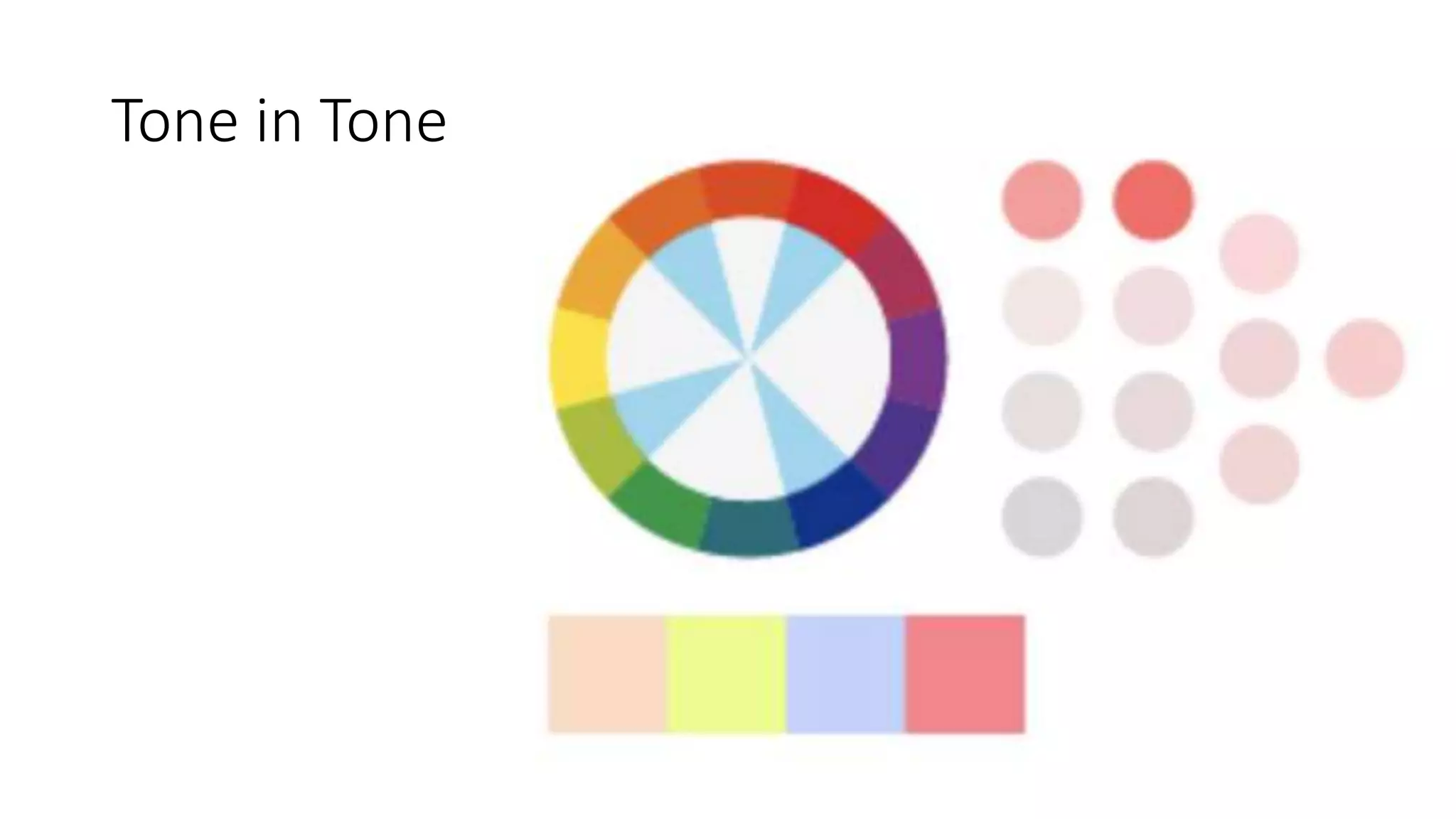
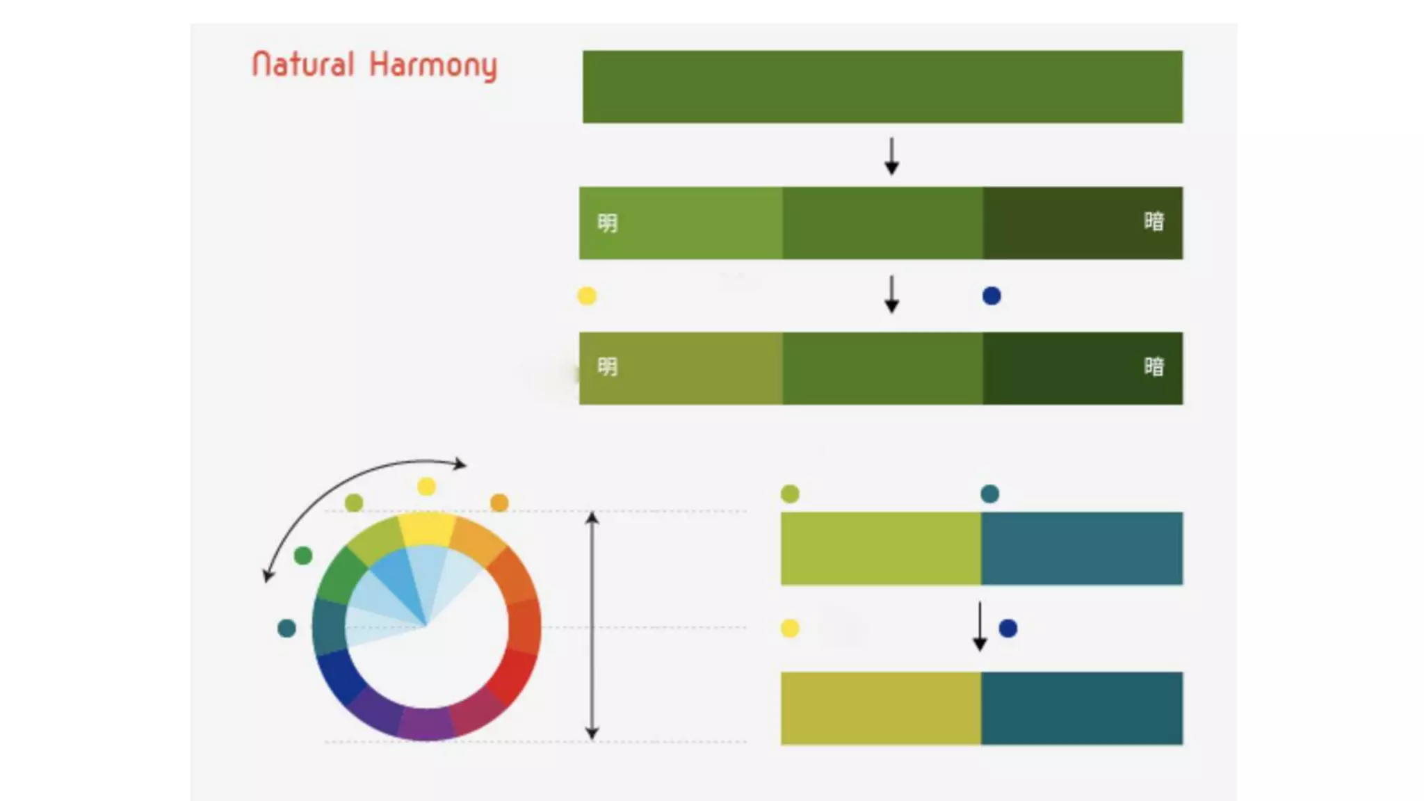
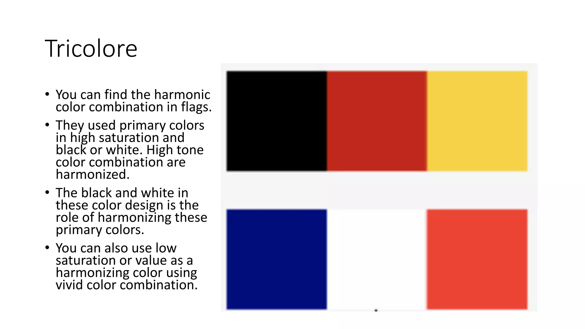
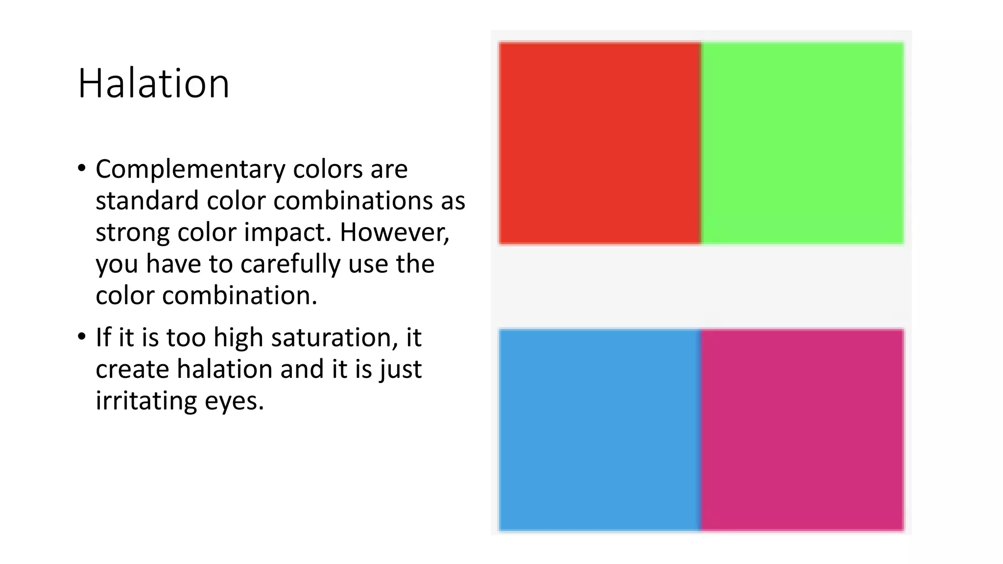
Color Theory
Design II
Manami Ishimura
Color is a property of light. This is a prism which Isaac Newton
found the different wavelengths of light is visible into color. Objects
have no color but actually reflect the color wavelengths
White reflects all of colors,
and Black absorbs all of colors
Hue
This is Color wheel that shows an
organization for the relationship of the basic
color. The three colors in the center, Red,
yellow, and blue are primary colors. Of
course this is a principle to create other
colors. And Green, purple, and Orange are
called Secondary colors because mixtures of
the primary colors.
Other colors called tertiary colors. Hue is
The name of the color. For example, Pink,
scarlet, maroon are all a hue of red. The
same hue or color can have many different
names.
Chroma
(Saturation)
Chroma or intensity or
saturation is brightness of
a color. It is not about
darkness or lightness. But
saturation of hue
perceived in color. This
wheel is the same
lightness but different
saturation.
Value
Value is lightness or Darkness of
a hue. Those color are the same
saturation but different value.
The value and chrome confuse
but you can not see a variety of
saturation in the green line like
a prior green wheel
This is 3D color wheel.
Mixed Lighter primary
colors shows white
like projector. And
mixed darker primary
color create black like
mixing paints.
Color Perception
Claude Monet, Poplars on the Epthe. 1891, oil on canvas Claude Monet, Poplars. 1891, oil on canvas
Color is a product of light, so colors are different
during different times of the day, season, and
weather. Vise versa, we associate the
combinations of colors with season, weather,
and times of the day. These are Monet’s
pictures; we can perceive the specific times and
season from the pictures.
Season and Color
This is an organization of
season colors. Spring and fall
are kind of off tone with dark
value. And Winter and
Summer are high contrast, but
summer colors are lower tone
than winter colors. This is how
we perceive colors with season
but not actual nature’s colors.
Changing Color Value/
Compression and Extension
• Black and white make different effects. Black compresses the shape of
it but white extend the shape. Naturally, the effect interact its
surrounding. Also, value depend on surrounding hues. The center
green appears much lighter on the black background than on the
white.
Weight of Color
Lighter
Heavier
Psychologically, we perceive
color along with senses like
weight and temperatures.
Temperature of Color
A Hue of blue is identified as cooler color
and of red is warmer color.
Basic Color Combinations
Tone in Tone
Picolore
Clear contrast color combinations are in harmony
Tricolore
• You can find the harmonic
color combination in flags.
• They used primary colors
in high saturation and
black or white. High tone
color combination are
harmonized.
• The black and white in
these color design is the
role of harmonizing these
primary colors.
• You can also use low
saturation or value as a
harmonizing color using
vivid color combination.
Halation
• Complementary colors are
standard color combinations as
strong color impact. However,
you have to carefully use the
color combination.
• If it is too high saturation, it
create halation and it is just
irritating eyes.
Base/ Main/ Accent
Proportion of base, main, accent color are vital
color design.
The tint yellow is the base color, green is the
accent color, brawn and orange are main color
Black/White base color
Line proportion
High saturation proportion
Accent color and main color proportion
Saturation (Chrome)

Color theory

  • 1.
  • 2.
    Color is aproperty of light. This is a prism which Isaac Newton found the different wavelengths of light is visible into color. Objects have no color but actually reflect the color wavelengths
  • 3.
    White reflects allof colors, and Black absorbs all of colors
  • 4.
    Hue This is Colorwheel that shows an organization for the relationship of the basic color. The three colors in the center, Red, yellow, and blue are primary colors. Of course this is a principle to create other colors. And Green, purple, and Orange are called Secondary colors because mixtures of the primary colors. Other colors called tertiary colors. Hue is The name of the color. For example, Pink, scarlet, maroon are all a hue of red. The same hue or color can have many different names.
  • 5.
    Chroma (Saturation) Chroma or intensityor saturation is brightness of a color. It is not about darkness or lightness. But saturation of hue perceived in color. This wheel is the same lightness but different saturation.
  • 6.
    Value Value is lightnessor Darkness of a hue. Those color are the same saturation but different value. The value and chrome confuse but you can not see a variety of saturation in the green line like a prior green wheel
  • 7.
    This is 3Dcolor wheel. Mixed Lighter primary colors shows white like projector. And mixed darker primary color create black like mixing paints.
  • 8.
    Color Perception Claude Monet,Poplars on the Epthe. 1891, oil on canvas Claude Monet, Poplars. 1891, oil on canvas Color is a product of light, so colors are different during different times of the day, season, and weather. Vise versa, we associate the combinations of colors with season, weather, and times of the day. These are Monet’s pictures; we can perceive the specific times and season from the pictures.
  • 9.
    Season and Color Thisis an organization of season colors. Spring and fall are kind of off tone with dark value. And Winter and Summer are high contrast, but summer colors are lower tone than winter colors. This is how we perceive colors with season but not actual nature’s colors.
  • 11.
    Changing Color Value/ Compressionand Extension • Black and white make different effects. Black compresses the shape of it but white extend the shape. Naturally, the effect interact its surrounding. Also, value depend on surrounding hues. The center green appears much lighter on the black background than on the white.
  • 12.
    Weight of Color Lighter Heavier Psychologically,we perceive color along with senses like weight and temperatures.
  • 13.
    Temperature of Color AHue of blue is identified as cooler color and of red is warmer color.
  • 16.
  • 22.
  • 25.
    Picolore Clear contrast colorcombinations are in harmony
  • 26.
    Tricolore • You canfind the harmonic color combination in flags. • They used primary colors in high saturation and black or white. High tone color combination are harmonized. • The black and white in these color design is the role of harmonizing these primary colors. • You can also use low saturation or value as a harmonizing color using vivid color combination.
  • 27.
    Halation • Complementary colorsare standard color combinations as strong color impact. However, you have to carefully use the color combination. • If it is too high saturation, it create halation and it is just irritating eyes.
  • 28.
    Base/ Main/ Accent Proportionof base, main, accent color are vital color design. The tint yellow is the base color, green is the accent color, brawn and orange are main color
  • 30.
  • 31.
  • 32.
  • 33.
    Accent color andmain color proportion
  • 34.

Editor's Notes

  • #3 Color is a property of light. This is a prism which Isac Newton found the different wavelengths of light is visible into color. Objects have no color but actually reflect the color wavelengths Infrared Ultra violet
  • #4 White reflects all of colors, and Black absorbs all of colors
  • #5 This is Color wheel that shows an organization for the relationship of the basic color. The three colors in the center, Red, yellow, and blue are primary colors. Of course this is a principle to create other colors. And Green, purple, and Orange are called Secondary colors because mixtures of the primary colors. Other colors called tertiary(たーしゃりー colors. Hue is The name of the color. For example, Pink, scarlet, maroon are all a hue of red. The same hue or color can have many different names. complementary colors Harmonic colors
  • #6 Chroma or intensity or saturation is brightness of a color. It is not about darkness or lightness. But saturation of hue perceived in color. This wheel is the same lightness but different saturation. Cyan (さいあん
  • #7 Value is lightness or Darkness of a hue. Those color are the same saturation but different value. The value and chrome confuse but you can not see a variety of saturation in the green line like a prior green wheel
  • #8 This is 3D color wheel. Mixed Lighter primary colors shows white like projector. And mixed darker primary color create black like mixing paints.
  • #9 Color is a product of light, so colors are different during different times of the day, season, and weather. Vise versa, we associate the combinations of colors with season, weather, and times of the day. These are Monet’s pictures; we can perceive the specific times and season from the pictures.
  • #10 This is an organization of season colors. Spring and fall are kind of off tone with dark value. And Winter and Summer are high contrast, but summer colors are lower tone than winter colors. This is how we perceive colors with season but not actual nature’s colors.
  • #11 The lines of gray are same value and intensity but looks different against the two background colors. The gray line against magenta is brightly existing. But the line against green is absorbed into the green. Our perception of colors changes its surrounding. Green and Magenta are the complementary colors which is against each other in the color wheel. When 2 compliments are next to each other they increase the visual brilliance of each other.
  • #12 Black and white make different effects. Black compresses the shape of it but white extend the shape. Naturally, the effect interact its surrounding. Also, value depend on surrounding hues. The center green appears much lighter on the black background than on the white.
  • #13 Psychologically, we perceive color along with senses like weight and temperatures. Dark value/ Light Value
  • #14 A Hue of blue is identified as cooler color and of red is warmer color.
  • #15 Also, colors imply emotion like happy and sad.
  • #16 Harmonic What consists of all same hue Focal point Dark color compress and whitening colors extends so Off tone
  • #17 Complementary colors are any two colors opposite each other on the wheel. For example, blue and orange, or red and green. These create a high contrast, so use them when you want something to stand out. Ideally, use one color as background and the other as accents. Alternately, you can use tints and shades here; a lighter tint of blue contrasted against a darker orange, for example. Split complementary colors use three colors. The scheme takes one color and matches it with the two colors adjacent to its complementary color. For example, blue, yellow-orange and red-orange. This scheme is ideal for beginners because it is difficult to mess up. That’s because you get contrasting colors, but they aren’t as diametrically opposite as complementary colors,  Analogous colors are any three colors next to each other on the wheel. For example, orange, yellow-orange, and yellow. With analogous colors, it’s best to avoid hues as they can be jarring. Instead, focus on tints of analogous colors. Triadic colors are any three colors that are equally apart on the color wheel. For example, red, yellow and blue. The Triadic scheme is also high-contrast, but more balanced than complementary colors. The trick here, one color dominate and accent with the other two. Tetradic or double complementary colors uses four colors together, in the form of two sets of complementary colors. For example, blue and orange is paired with yellow and violet.
  • #18 This color combination use only one hue, identity color Creating variety of color changing only saturation.
  • #19 This color combination using analogy color combination Changing saturation and in two hues.
  • #20 Dominant color is using identity color changing value and saturation But the narrow range of value.
  • #21 Tone on tone is the color combination using identity color changing value and saturation in wider ranges
  • #22 Dominant Tone is the color combination using random hues identifying same saturation.
  • #23 Tone in Tone is the color combination using random hues identifying same saturation and value.
  • #24 Tonal is the color combination using random hues picking only intermediate tone.
  • #25 Natural Harmony is the color combinations that you can find the nature. Any object in the nature are effected sun light.
  • #26 Clear contrast color combinations are in harmony
  • #27 You can find the harmonic color combination in flags. They used primary colors in high saturation and black or white. High tone color combination are harmonized. The black and white in these color design is the role of harmonizing these primary colors. You can also use low saturation or value as a harmonizing color using vivid color combination.
  • #28 Complementary colors are standard color combinations as strong color impact. However, you have to carefully use the color combination. If it is too high saturation, it create halation and it is just irritating eyes.
  • #29 Proportion of base, main, accent color are vital color design. The tint yellow is the base color, green is the accent color, brawn and orange are main color
  • #30 Here is other compare contrast color combinations. First, black and white (contrast): the gray color changes depending on the next color, it expends with white and compresses with black Saturation: original saturation will change depending on the color surrounding. The blue boxes the middle blues are same color but look different because of the color surrounding. Hue: the orange-ish color box on the right top, inner box orange are more yellow side in the red orange and the orange side in the yellow because your eyes try to complement color with it. Tempurture: purple is the color mixing with blue and red which is cold and hot color. The left side of purple is warmer than the right because the left is close to red range side and right is close to blue range side. Complementary color: in the center, red box surrounding the green are brighter than the red right side. Because green and red complement and generate brighter color Edge contrast: The gradation on the right in the middle, you can see the each edge of the column is darker on the side next to lighter value. Proportion contrast: even using same color change the effect by the proportion. Wide or bigger ranges are stronger effect than small or narrow range. Camouflage: using the proportion contrast, group of narrow color integrates