1. Film Poster Research
Codes and conventions used for film posters are relatively similar to the ones for
film websites, film magazines and actual films. For my specific genre of film, I
chose to look at horror and thriller film posters as I feel ‘macabre’ and
‘psychological thriller’ poster genres would be too niche to find, create or even
consider market if done on a professional level.
The codes and conventions for horror film posters are; black space to draw in
the potential viewer into the unknown, a large central image for the user to
acknowledge whom the main character or stars of the film will be. Other
conventions range from an unusual font for the title of the poster, possibly with
some added effects to make it stand out from other type on the page.
I would consider using these in my own film poster, but I feel since I do not have
any famous or well known actors staring in my media text, it would be hard for
an audience to maybe understand the intended genre of film.
Looking at previous film posters from current and historical media texts was also
an important part of my research. This primary research would not only give me
inspiration for my own film poster, but ideas about what content worked well
and what didn’t, hopefully guiding me to make better decisions for my own film
poster.
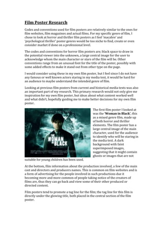
The first film poster I looked at
was the ‘Woman in Black’, this
as a mixed genre film, made up
of both horror and thriller
elements. The film poster has a
large central image of the main
character, used for the audience
to identify who will be staring in
the media text. A dark
background with faint
superimposed images,
suggesting that it might contain
ghosts or images that are not
suitable for young children has been used.
At the bottom, film information about the production involved, a few of the main
cast and directors and producers names. This is common on film websites and is
a form of advertising for the people involved in such productions due it
becoming more and more common of people taking notice of the creators of
films are, thus they can go back and view some of their other produced or
directed content.
Film posters tend to promote a tag line for the film; the tag line for this film is
directly under the glowing title, both placed in the central section of the film
poster.
2. A tagline could also be used on a film website, films poster and possibly even at
the end of a trailer, either visually seen or seen through the audio of the trailer.
The tagline is associated with the film, thus when people only see the tagline,
they associate it back to the film, recognizing what it means. This is a wonderful
marketing technique used to entice an audience to a film.
The second film poster I
analysed for research is ‘The
Girl With The Dragon
Tattoo’, this film poster is for
a psychological thriller film,
but it does have some action,
horror and crime parts to it,
thus it could be called a
hybrid genre film and hybrid
genre poster design.
The films poster has a
recognisable and custom font
for branding and
merchandising purposes, also
used on the films website,
most likely on the films DVD
front cover and on a
magazine title story. Just like
the tagline, after a while, if
used enough, the font will
become iconic. The
‘Starwars’ font is an example
of this.
The primary image is of the
leading actor framed in the
front of the subsidiary actor, placed behind and looking to the side. This could be
showing that the male has dominance and power over the female, thus more
important. The use of a monochrome (black and white) image also tells the
audience that the producers and directors do not want to give much away about
the film and not allowing colour reinforces that.
A film blurb is present at the bottom, something I myself wish to include in order
to give my cast members credit, while no specific data is given upon when the
media text will be released ‘coming soon’ is stated at the bottom of the film
poster.
3. Film Poster Restrictions
Banned in the ‘London Underground’ by ‘Transport for Britain’ the film
poster for ‘SKET’was removed due to it sending the wrong message about
Britain, thus the large image of David Cameron being stood on was unacceptable
to show to mass audiences in such areas. The banning provoked the newspapers
to create articles about the film, featured on the front page, thus seen by even
more viewers in the hope that they may choose to go and watch the film. The free
advertising caused by restrictions helped the production company, but many ask
if the banning of such a viral film poster was intentional in order to attract the
attention?
Another film poster that as been banned by
the ‘ASA’ is the ‘Final Destination 5’ film
poster. This poster was banned due to it
making young children cry when they had
past it in the street. The image is actually
surreal, animated graphics with no relation
to real life, but the idea behind it is what
forced the banning to continue. Film posters
should be planned with greater care to
ensure they do not have to be redesigned,
thus re-printed causing high costs for film
production companies. The film poster
doesn’t in fact contain much information
about the film, just a large title placed at the
bottom and a slightly smaller tagline
positioned at the top of the portrait style
film poster.
I have established that any use of violence, weapons, and pornographic or
distasteful content will result in banning of a film poster, thus I should try and
stay away from this for my own production task.