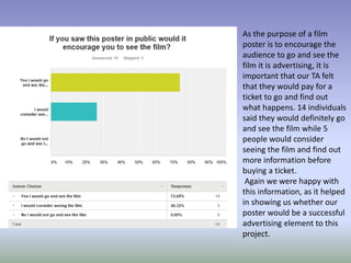
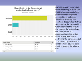
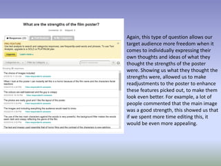
AUDIENCE FEEDBACK ON
FILM POSTER
Like the magazine front
cover, the main image on
a film poster is one of the
very first things an
audience sees. Therefore,
we felt like it should also
be the first question. We
asked this, as we wanted
to ensure that the image
we used was most
effective, as otherwise it
would ruin the overall
effect of our poster. The
results show that 17
respondents agreed that
the image was extremely
effective while only three
people thought that it
was only slightly
effective.
There are conventionally
limited features on a film
poster, as the main area of
concern should be the image
and the text. The text is
significantly important, as it
gives the audience all of the
information that they need
to know for the film, such as
what it is called and when it
is released. This is crucial to
the advertising point of view,
as without this information,
the poster has no purpose.
We wanted to ensure that
we had done this correctly
and, 16 people thought that
the choice of text was very
effective while only 4
respondents thought that it
was only slightly effective.
This question allowed us
to see what our TA
thought of the colour
scheme of our poster.
This is similar to the
question asked for the
magazine feedback, as it
is an element which
needs to be of the best
standard. With these
results, it showed us that
there were a few
adjustments that could
be made. 17 people
agreed that the choice of
colours was very effective
and only 3 individuals
thought that it could be
improved on in some
way.
The results of this question
allowed us to see if the
audience felt that the poster
stood out to them and was
unique enough. 17
respondents thought that the
poster was very eye catching
and only three thought that it
was only slightly eye catching.
We were mostly happy with
this result as the majority of
people agreed that it was
very eye catching.
Furthermore, we also
understand that when
creating a product as such as
this, you cannot pleas
everybody.
As the purpose of a film
poster is to encourage the
audience to go and see the
film it is advertising, it is
important that our TA felt
that they would pay for a
ticket to go and find out
what happens. 14 individuals
said they would definitely go
and see the film while 5
people would consider
seeing the film and find out
more information before
buying a ticket.
Again we were happy with
this information, as it helped
in showing us whether our
poster would be a successful
advertising element to this
project.
My partner and I put a lot of
effort into trying to make sure
that the horror aspect of our
poster came through well
enough to our audience.
Therefore, by asking this
question, it assured us that we
were making the right decision
when it came to the colours,
the images, the text and even
the catch phrase. 17
respondents replied saying
that it is very effective at
portraying the horror gene but
3 people thought that there
could be more obvious clues
that it is a poster for a horror
film.
This question was asked, as
we wanted to make sure
that the product we were
creating, looked professional
and realistic enough to be
advertising a real life film. 17
said that it looked very
professional and realistic but
3 people said that it looks
slightly professional/ realistic
but some improvements
could be made to make it
seem more professional. The
results we got back, were
mostly positive, which
assured us that we were
following the right track.
Again, this type of question allows our
target audience more freedom when it
comes to individually expressing their
own thoughts and ideas of what they
thought the strengths of the poster
were. Showing us what they thought the
strengths were, allowed us to make
readjustments to the poster to enhance
these features picked out, to make them
look even better. For example, a lot of
people commented that the main image
was a good strength, this showed us that
if we spent more time editing this, it
would be even more appealing.
On the other hand, responses to
this question showed us what
we needed to spend more time
on, enhancing wise. This was an
important question to add, as it
gave us helps and pointers to
what the audience felt needed
to be improved the most. This
meant that we could tailor the
adjustments to their opinions so
it would be the best possible
version and attractive to the
audience. For example, the very
first comment mentions the
colouring. We then went back
into the editing process of the
poster to make these
readjustments.

Poster questionnaire feedback

  • 1.
  • 2.
    Like the magazinefront cover, the main image on a film poster is one of the very first things an audience sees. Therefore, we felt like it should also be the first question. We asked this, as we wanted to ensure that the image we used was most effective, as otherwise it would ruin the overall effect of our poster. The results show that 17 respondents agreed that the image was extremely effective while only three people thought that it was only slightly effective.
  • 3.
    There are conventionally limitedfeatures on a film poster, as the main area of concern should be the image and the text. The text is significantly important, as it gives the audience all of the information that they need to know for the film, such as what it is called and when it is released. This is crucial to the advertising point of view, as without this information, the poster has no purpose. We wanted to ensure that we had done this correctly and, 16 people thought that the choice of text was very effective while only 4 respondents thought that it was only slightly effective.
  • 4.
    This question allowedus to see what our TA thought of the colour scheme of our poster. This is similar to the question asked for the magazine feedback, as it is an element which needs to be of the best standard. With these results, it showed us that there were a few adjustments that could be made. 17 people agreed that the choice of colours was very effective and only 3 individuals thought that it could be improved on in some way.
  • 5.
    The results ofthis question allowed us to see if the audience felt that the poster stood out to them and was unique enough. 17 respondents thought that the poster was very eye catching and only three thought that it was only slightly eye catching. We were mostly happy with this result as the majority of people agreed that it was very eye catching. Furthermore, we also understand that when creating a product as such as this, you cannot pleas everybody.
  • 6.
    As the purposeof a film poster is to encourage the audience to go and see the film it is advertising, it is important that our TA felt that they would pay for a ticket to go and find out what happens. 14 individuals said they would definitely go and see the film while 5 people would consider seeing the film and find out more information before buying a ticket. Again we were happy with this information, as it helped in showing us whether our poster would be a successful advertising element to this project.
  • 7.
    My partner andI put a lot of effort into trying to make sure that the horror aspect of our poster came through well enough to our audience. Therefore, by asking this question, it assured us that we were making the right decision when it came to the colours, the images, the text and even the catch phrase. 17 respondents replied saying that it is very effective at portraying the horror gene but 3 people thought that there could be more obvious clues that it is a poster for a horror film.
  • 8.
    This question wasasked, as we wanted to make sure that the product we were creating, looked professional and realistic enough to be advertising a real life film. 17 said that it looked very professional and realistic but 3 people said that it looks slightly professional/ realistic but some improvements could be made to make it seem more professional. The results we got back, were mostly positive, which assured us that we were following the right track.
  • 9.
    Again, this typeof question allows our target audience more freedom when it comes to individually expressing their own thoughts and ideas of what they thought the strengths of the poster were. Showing us what they thought the strengths were, allowed us to make readjustments to the poster to enhance these features picked out, to make them look even better. For example, a lot of people commented that the main image was a good strength, this showed us that if we spent more time editing this, it would be even more appealing.
  • 10.
    On the otherhand, responses to this question showed us what we needed to spend more time on, enhancing wise. This was an important question to add, as it gave us helps and pointers to what the audience felt needed to be improved the most. This meant that we could tailor the adjustments to their opinions so it would be the best possible version and attractive to the audience. For example, the very first comment mentions the colouring. We then went back into the editing process of the poster to make these readjustments.