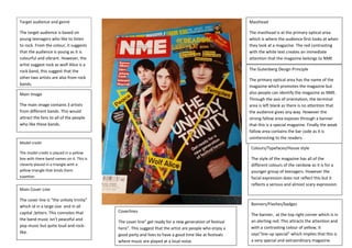
1. Target audience and genre
The target audience is based on
young teenagers who like to listen
to rock. From the colour, it suggests
that the audience is young as it is
colourful and vibrant. However, the
artist suggest rock as wolf Alice is a
rock band, this suggest that the
other two artists are also from rock
bands.
Main Image
The main image contains 3 artists
from different bands. This would
attract the fans to all of the people
who like these bands.
Model credit
The model credit is placed in a yellow
box with there band names on it. This is
cleverly placed in a triangle with a
yellow triangle that binds them
together.
Main Cover Line
The cover line is “the unholy trinity”
which id in a large size and in all
capital ;letters. This connotes that
the band music isn’t peaceful and
pop music but quite loud and rock-like.
Masthead
The masthead is at the primary optical area
which is where the audience first looks at when
they look at a magazine. The red contrasting
with the white text creates an immediate
attention that the magazine belongs to NME
The Gutenberg Design Principle
The primary optical area has the name of the
magazine which promotes the magazine but
also people can identify the magazine as NME.
Through the axis of orientation, the terminal
area is left blank as there is no attention that
the audience gives any way. However the
strong fallow area exposes through a banner
that this is a special magazine. Finally the weak
fallow area contains the bar code as it is
uninteresting to the readers.
Colours/Typefaces/House style
The style of the magazine has all of the
different colours of the rainbow as it is for a
younger group of teenagers. However the
facial expression does not reflect this but it
reflects a serious and almost scary expression.
Coverlines
The cover line” get ready for a new generation of festival
hero”. This suggest that the artist are people who enjoy a
good party and lives to have a good time like at festivals
where music are played at a loud noise.
Banners/Flashes/badges
The banner, at the top right corner which is in
an alerting red. This attracts the attention and
with a contrasting colour of yellow, it
says”line-up special” which implies that this is
a very special and extraordinary magazine.