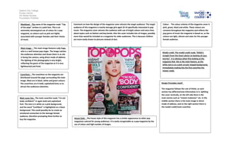
1. Salford City College
Eccles Centre
AS Media Studies
Foundation Portfolio
Masthead - The name of the magazine reads "Top
of the pops" written in a pink font. This is an
extremely stereotypical use of colour for a pop
magazine, as colours such as pink are highly
associated with younger females and their choice
of music.
Main image – The main image features Lady Gaga,
who is a well known pop singer. The image catches
the audiences attention and draws them in as she
is facing the camera, using direct mode of address.
The lighting of the photography is very bright,
reflecting the genre of the magazine as it is very
lighthearted and fresh.
Model credit: The model credit reads "GAGA's
straight-from-the-heart advice on beating all your
worries" It is obvious when first looking at the
magazine that this is the main feature, as the
white text is on a pink circular shaped background,
immediately making this the first coverline the
viewer reads.
Coverlines - The coverlines on the magazine are
distributed around the page surrounding the main
image. Most are in black, white and green colours.
The coverlines are in bold, capitalized fonts so to
attract the audiences attention.
Main cover line - The main coverline reads "I'm not
body confident!" in again bold and capitalised
font. The text is in white on a pink background,
and the word "Confident" is highlighted on a black
background. This could possibly be to create an
emotional connection to the teenage female
audience, therefore prompting them further to
buy the magazine.
Colour - The colour scheme of the magazine cover is
pink, green, black and white. These colours are
constant throughout the magazine and reflects the
pop genre of music the magazine is based on, as the
colours are light, vibrant and cater for the younger
female audience.
Design Principles Used?
The magazine follows the rule of thirds, as each
section has different/new information in it. Splitting
the cover vertically, on the left side there is the
main stories such as "Instant makeover" etc. In the
middle section there is the main image in direct
mode of address, and on the right section there is
the model credit/main coverline.
House Style - The house style of this magazine has a similar appearance to other pop
magazines catered for young audiences. It is easily recognizable as a pop magazine by the
use of colour and high number of images.
Comment on how the design of the magazine cover attracts the target audience: The target
audience of this magazine is mainly teenage girls aged 10-14 specifically interested in pop
music. The magazine cover attracts this audience with use of bright colours and story lines
about topics such as fashion and boy bands. Also the cover includes lots of images, possibly
more than would be included on a magazine for older audiences. This is because children
are more easily drawn to pictures instead of text.