The document discusses strategies for magazine cover design. It explains that magazine covers aim to entice readers to buy the issue with bold but brief information. Covers stand out visually and highlight enticing elements like free gifts or discounts to draw in target audiences. Placement of elements like price and barcodes are designed so readers do not notice them in order to increase likelihood of purchase. Color schemes, images, and wording are tailored to appeal to intended gender demographics. Maintaining consistent branding through the masthead helps expand sales over time.
Palestine last event orientationfvgnh .pptxRaedMohamed3
An EFL lesson about the current events in Palestine. It is intended to be for intermediate students who wish to increase their listening skills through a short lesson in power point.
Read| The latest issue of The Challenger is here! We are thrilled to announce that our school paper has qualified for the NATIONAL SCHOOLS PRESS CONFERENCE (NSPC) 2024. Thank you for your unwavering support and trust. Dive into the stories that made us stand out!
The French Revolution, which began in 1789, was a period of radical social and political upheaval in France. It marked the decline of absolute monarchies, the rise of secular and democratic republics, and the eventual rise of Napoleon Bonaparte. This revolutionary period is crucial in understanding the transition from feudalism to modernity in Europe.
For more information, visit-www.vavaclasses.com
Operation “Blue Star” is the only event in the history of Independent India where the state went into war with its own people. Even after about 40 years it is not clear if it was culmination of states anger over people of the region, a political game of power or start of dictatorial chapter in the democratic setup.
The people of Punjab felt alienated from main stream due to denial of their just demands during a long democratic struggle since independence. As it happen all over the word, it led to militant struggle with great loss of lives of military, police and civilian personnel. Killing of Indira Gandhi and massacre of innocent Sikhs in Delhi and other India cities was also associated with this movement.
How to Make a Field invisible in Odoo 17Celine George
It is possible to hide or invisible some fields in odoo. Commonly using “invisible” attribute in the field definition to invisible the fields. This slide will show how to make a field invisible in odoo 17.
Embracing GenAI - A Strategic ImperativePeter Windle
Artificial Intelligence (AI) technologies such as Generative AI, Image Generators and Large Language Models have had a dramatic impact on teaching, learning and assessment over the past 18 months. The most immediate threat AI posed was to Academic Integrity with Higher Education Institutes (HEIs) focusing their efforts on combating the use of GenAI in assessment. Guidelines were developed for staff and students, policies put in place too. Innovative educators have forged paths in the use of Generative AI for teaching, learning and assessments leading to pockets of transformation springing up across HEIs, often with little or no top-down guidance, support or direction.
This Gasta posits a strategic approach to integrating AI into HEIs to prepare staff, students and the curriculum for an evolving world and workplace. We will highlight the advantages of working with these technologies beyond the realm of teaching, learning and assessment by considering prompt engineering skills, industry impact, curriculum changes, and the need for staff upskilling. In contrast, not engaging strategically with Generative AI poses risks, including falling behind peers, missed opportunities and failing to ensure our graduates remain employable. The rapid evolution of AI technologies necessitates a proactive and strategic approach if we are to remain relevant.
A Strategic Approach: GenAI in EducationPeter Windle
Artificial Intelligence (AI) technologies such as Generative AI, Image Generators and Large Language Models have had a dramatic impact on teaching, learning and assessment over the past 18 months. The most immediate threat AI posed was to Academic Integrity with Higher Education Institutes (HEIs) focusing their efforts on combating the use of GenAI in assessment. Guidelines were developed for staff and students, policies put in place too. Innovative educators have forged paths in the use of Generative AI for teaching, learning and assessments leading to pockets of transformation springing up across HEIs, often with little or no top-down guidance, support or direction.
This Gasta posits a strategic approach to integrating AI into HEIs to prepare staff, students and the curriculum for an evolving world and workplace. We will highlight the advantages of working with these technologies beyond the realm of teaching, learning and assessment by considering prompt engineering skills, industry impact, curriculum changes, and the need for staff upskilling. In contrast, not engaging strategically with Generative AI poses risks, including falling behind peers, missed opportunities and failing to ensure our graduates remain employable. The rapid evolution of AI technologies necessitates a proactive and strategic approach if we are to remain relevant.
2024.06.01 Introducing a competency framework for languag learning materials ...Sandy Millin
http://sandymillin.wordpress.com/iateflwebinar2024
Published classroom materials form the basis of syllabuses, drive teacher professional development, and have a potentially huge influence on learners, teachers and education systems. All teachers also create their own materials, whether a few sentences on a blackboard, a highly-structured fully-realised online course, or anything in between. Despite this, the knowledge and skills needed to create effective language learning materials are rarely part of teacher training, and are mostly learnt by trial and error.
Knowledge and skills frameworks, generally called competency frameworks, for ELT teachers, trainers and managers have existed for a few years now. However, until I created one for my MA dissertation, there wasn’t one drawing together what we need to know and do to be able to effectively produce language learning materials.
This webinar will introduce you to my framework, highlighting the key competencies I identified from my research. It will also show how anybody involved in language teaching (any language, not just English!), teacher training, managing schools or developing language learning materials can benefit from using the framework.
1.4 modern child centered education - mahatma gandhi-2.pptx
Front cover analysis
1. The puff provides information which aims to
entice the reader to buy and look inside the
magazine. The information is bold and enticing
but brief enough for them to have to look inside
the magazine for more information. The puff
here says “new look” so this is targeted more for
the female side of the TA, this will entice more
women to buy this magazine rather than a
typical women’s magazine; e.g. OK.
The puff is a bright coral colour which
stands out from the deep purple
background. It is important that the puff
stands out from the background because
this is another key piece of information
we want the TA to be appealed to.
The barcode and price are small and in the bottom corner so
the TA has to look for it; hopefully doesn’t notice the price
and buys the magazine regardless. This should be the last
piece of information the reader looks at before they buy the
magazine, especially if the magazine is expensive we don’t
want anyone to be attracted to this part of the cover.
The main sell-line is placed on the
left, where the eye will go first. The
main sell-line is the largest piece on
text on the cover (other than the
masthead), it’s the reason why most
of the TA will buy the magazine so it
has to stand out, and it is also
featured in a different colour
compared to the rest of the articles
featured.
The masthead is found in the
same place each week, looking
the same in order to maintain
brand identity. Whenever the
audience see this masthead they
will instantly know which
magazine it belongs to,
maintaining brand identity helps
to expand sales.
Including a free gift will lure in the TA and make
them buy the magazine; some people may buy
the magazine solely for the free gift. This is an
easy way of making more sales and extending
your audience. Especially if the free gift inside is
relevant to the magazine and genre it is a
successful method in becoming a more
popular/well known magazine.
Using an attractive/glamourous model for
the main image lures in both males and
females. Females will feel more relatable
to the magazine if the main mage is of a
female and therefore are more likely to
buy it.
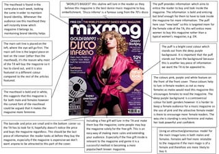
‘WORLD’S BIGGEST’ this skyline will lure in the reader as they
believe this magazine is the best dance music magazine to buy,
embellishment. ‘Disco inferno’ is a famous song from the 70’s disco
era.
era – this is a play on words and true dance fans will recognise this.
The colours pink, purple and white feature on
the front of the front cover. These colours help
to lure in female readers as not as many
females as males would read this magazine this
encourages females to read the magazine. The
deep purple background is a controversial
colour for both genders however it is harder to
keep a female audience for a music magazine so
the use of pink and the attractive female model
is there to encourage more female readers. The
way she is standing is very feminine and makes
her look powerful and confident.
The masthead is bold and in white,
this suggests that this magazine is
for both male and females however
the curved font of the masthead
could be argued that it makes the
magazine more feminine.
2. The main sell-line “CUT PRICE IBZIA!” will
lure in the target audience because they
want to get the cheapest and best deal to
go to Ibiza, they would want to save as
much money as they can. “Drink cheap! …
Eat only when essential” this will attract
young adults/students as they want to be
able to go on holidays for at least money
as possible , as long as they have fun and
it is cheap they’re happy!
Free gift of a CD will lure in the target
audience because most of the time the gift
will be worth more than the magazine so
they instantly buy it. Some people will buy
the magazine solely for the gift that comes
with it so if the gift is related to the
magazine’s genre and it is of some quality
you are guarantee to make a lot more sales.
The barcode and price are small and in the
bottom corner so the TA has to look for it;
hopefully doesn’t notice the price and buys
the magazine regardless. We want to hide
the barcode and price as much as possible
and keeps the readers eye away from it as;
depending on the price, this could affect
whether people buy the magazine or look
for a cheaper one.
The masthead is bold and in white,
this suggests that this magazine is
for both male and females however
the curved font of the masthead
could be argued that it makes the
magazine more feminine. However,
young males would also be very
interested in a dance music
magazine, especially men who are
into clubbing and Dj’ing.
The masthead is found in the same
place each week, looking the same
in order to maintain brand
identity. Whenever people see this
masthead they will instantly know
which magazine it belongs to,
maintaining brand identity helps
to expand sales.
It is clearthat this magazine is based on
house/dance music because of the
obvious advertisement of Ibiza (one of the
top party holiday destinations), the model
in the main image is also dressed and
posed like she is having a great time on
holiday in Ibiza so this will entice the
reader to buy the magazine and want to
read about the holiday destination that is
Ibiza. The model on the main image is also
very fit and have a nice figure so women
may want a ‘summer body’ like her and
therefore buy this magazine.
Small imagesrelatedtoarticlesinside makesthe articleseemmore real and
relatable tothe targetaudience.Theyalsoreceiveavisual representationof
whatis goingto be inside the magazine aswell asinformation.
The coloursusedon thismagazine coverare verybrightand attractive;pink,blue,
yellow.Usingbrightcoloursisone of the mostimportantaspects fora musicmagazine,
whenmagazinesare onthe shelf youare instantlyattractedtothe brightest,most
colourful coversothiswill increase salesandprofits.Evenpeople whoaren’tasinterest
indance musicwouldbuythismagazine because of itsobviousadvertisementof a
holidayinIbiza,anyyoungadultswouldbe attractedtowardsthismagazine.
3. The masthead is found in the same
place each week, looking the same
in order to maintain brand
identity. Whenever people see this
masthead they will instantly know
which magazine it belongs to,
maintaining brand identity helps
to expand sales.
The masthead is bold and in white,
this suggests that this magazine is
for both male and females however
the curved font of the masthead
could be argued that it makes the
magazine more feminine. But on
this specific magazine cover the
main image and colour scheme
contradicts this.
A 20% off music download voucher will lure
in the target audience they are not just
getting the magazine but they are also
getting something extra out of it. Including a
free gift or an offer with a magazine will
increase the magazines popularity; especially
if you are consistent in doing this, and will
therefore increase profits.
The coloursusedon thismagazine coverare completelydifferenttothe colourscheme
inthe previousmagazine.Here we have amore masculine magazine usingdeeppurples
and blackas our maincolourscheme.Usingdarkercoloursrather thanbrightyellows
and pinks,givesthe magazine amore mature,professionalandthereforemayattract
more malesintheirlate 20’s rather thanjust youngadults.
The main sell-line “CARL CRAIG” this will
lure in the target audience because he is
obviously a well-known popular artist/DJ
in the techno/dance music world.
It is clearthat this magazine is based on
house/techno music because of the main
image. The main image features a popular
techno DJ, he is dressed very smart in a
suit and is looking down at the camera
(direct address), and this makes the
reader feel more involved with ‘Carl Craig’
and the magazine. The fact that he is
holding a dog and the sell line is “Techno’s
top dog” is a play on words and makes
Carl Craig look very prestige and
important.
The barcode and price are small and in the
bottom corner so the TA has to look for it;
hopefully doesn’t notice the price and buys
the magazine regardless. We want to hide
the barcode and price as much as possible
and keeps the readers eye away from it as;
depending on the price, this could affect
whether people buy the magazine or look
for a cheaper one.
Including brief descriptions of what is to come further on in the magazine
increasessalesbecause people knowwhattheyare gettingoutof it.People like
to know what they are getting and the quality of it before they invest into it.
The artist isholdingadog and
he has beenreferredtoasa ‘top
dog’ – but thisisalmostmade
humorousas the dogin the
image isa Chihuahua– whichis
a small,non-threateningdog.