class presentation
•Download as PPT, PDF•
0 likes•146 views
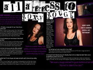
The document discusses the design choices made for the features page of a magazine. Fonts were selected to distinguish the questions from the artist's answers and keep the page from looking too busy. Pictures of the artist were taken against various backgrounds to seem edgy and posed in a non-typical way. Colors like black, white and dark purple were used throughout for contrast, to represent the rock image, and create a brand identity since purple is not a common magazine color.
Report
Share
Report
Share
![The text I used ,[object Object],[object Object],[object Object],[object Object]](data:image/gif;base64,R0lGODlhAQABAIAAAAAAAP///yH5BAEAAAAALAAAAAABAAEAAAIBRAA7)
Recommended
Feature page presentation
The document discusses the design choices made for a music magazine feature page profile. Fonts, colors, photos, and layout were selected to create an edgy feel representing rock music. Black, white and dark purple were used as the main colors. Photos of an established rock artist named "Roxy Rouge" were taken against different backgrounds and edited for contrast to make them striking.
Feature pages
The document discusses the design choices made for a music magazine feature page profile. Fonts, colors, photographs, and the featured artist were selected to create an edgy style representing rock music. Black, white and dark purple were used as the main colors. Pictures of the established artist "Roxy Rouge" were taken against different backgrounds including red to relate to her name.
Summary of research
The document summarizes the author's research into the conventions of music magazine layouts, genres, modes of address, and technical elements. Some key conventions identified include mastheads appearing at the top in large font, cover stories and images centered below, and barcodes in bottom corners. Colors like red and black and fonts like sans serif are commonly used for rock magazines. Layouts aim to guide the reader's eye along typical routes. Images and styles suit genres and aim to address audiences informally with edgy, passionate, or aggressive tones.
Montage
Abbie Roberts chose various magazine design elements that stood out, including front covers with bold main images and multiple colors, contents pages with pictures in different areas and layouts, and double page spreads with different layouts. Roberts also selected fonts that stood out, including a graffiti-style font that fits the hip hop genre, a bold font for a masthead, another graffiti-style and large font, and a sophisticated font to make the magazine seem worth reading.
Luke qu1
The document summarizes the design conventions used in the student's rap magazine project. For the masthead, conventions from another rap magazine were used, including a bold black masthead to portray the strong and violent nature of the rap genre. Names on the contents page are written in bold, colorful fonts for noticeability and importance. The double page spread layout layers a picture on one page and writing on the other, similarly to conventions in another rap magazine, with a pull quote the student created themselves about Eminem.
Question 1
The document summarizes the design conventions used in the student's rap magazine project. For the masthead, conventions from another rap magazine were used, including a bold black masthead to portray the strong and violent nature of the rap genre. Names on the contents page are written in bold, colorful fonts for noticeability and importance. The double page spread layout layers a picture on one page and writing on the other, similarly to conventions in another rap magazine, with a pull quote the student created themselves about Eminem.
Luke evaluation 1
The document summarizes the design conventions used in the student's rap magazine project. For the masthead, contents page, and double page spread, conventions from existing rap magazines such as bold colors and fonts were utilized to portray the aggressive nature of the rap genre. Names and topics were highlighted in red and decorative fonts to catch the reader's eye. Pictures and text were balanced across pages for the double spread feature on Eminem.
Kerrang and Vamp Conventions
The document discusses how the media product, a magazine called "Vamp", uses, develops, and challenges conventions of real magazines like "Kerrang!".
The magazine uses conventions like a black, white, and red color scheme. Fonts are chosen to fit the rock genre. Photos are placed on the left side with artists looking at the camera. Issue contents list band names in titles. However, some conventions are challenged, like using subtle front cover photos instead of high contrast images. Fonts and colors are also experimented with in non-traditional ways. Overall, the magazine borrows from real magazines but also puts its own spin on conventions of the genre.
Conventions and analysing
This document discusses conventions for magazine front covers, contents pages, and double page spreads. It analyzes examples from Vibe, Blender, Q, and Top of the Pops magazines. Key points made include liking the simplicity and color choices of Vibe and Blender covers, as well as Q's elegant contents page with few pictures. Examples of double page spreads show interviews and photos following conventions like credits, columns, and quotes. Overall the document examines magazine design elements to help create a professional student magazine.
Diary of make
The document discusses designing a logo for a magazine. The author experiments with graffiti fonts but finds the first one too animated and the second too urban and confusing. The third font is selected as it suits the magazine's ethos. The logo is done in capital black letters on the magazine cover to look urban and emphasize the title. A promotion sentence is added below along with a black, yellow and white color scheme to look smart and represent road colors.
Doublepage Spread Analysis
The document summarizes and analyzes the layout, design elements, and images used across multiple pages of a music magazine. Various techniques are used to maintain the publication's house style and branding, engage the target audience, and represent the subjects of articles. Pull quotes, different fonts, column structure, drop caps, and consistent color schemes help guide the reader through the content in a neat and readable way. Photographs relate visually to the articles and profiles of musicians, depicting their style and public persona.
Magazine billboard
The document provides guidance for a student project to design the front cover, contents page, and a double-page article spread for a new music magazine. Students will use Photoshop and InDesign and must include a minimum of four original images. Possible cover ideas featured bright colors and a main appealing image. Example contents pages were sophisticated with stylish writing and canted angled photos. The double-page spread examples featured a large artist image on one page paired with an interview on the other, using elegant fonts to title the pages.
Contents research
The document summarizes an image on the cover of a rap music magazine. The image features the rap artist Ice Cube in close-up with an aggressive expression, reflecting the serious and angry nature of his music. His face is faded into the dark background to portray the dark side of hip hop. Text and other design elements are used strategically throughout the image to highlight Ice Cube as the focus, match the dark tone of hip hop, and align with song and album titles from Ice Cube's discography. The magazine's logo, colors, and layout are also designed to look dark and unique in capturing the essence of hip hop culture.
How my rock music magazines represent people
The fonts, colors, and images used in the magazine are meant to represent the artists featured. A bold masthead and blood-stained text represent the cover artist as loud, bold, and violent. Dark colors like black convey power and mystery, while white makes parts stand out. Images using instruments like drums and guitars portray the artists as loud and energetic. Camera angles and costumes are also used representationally, with a low angle making one artist look dominant and black clothes portraying another as more casual and laid back. Overall, the design elements are intended to symbolize the artists and appeal to the target audience for a rock music magazine.
Task 23
This document discusses the process of creating a logo and selecting a font for an indie pop artist's branding. The author researched logos from similar artists, noting themes of minimalism. They explored fonts on dafont.com, analyzing 6 options for suitability. Font 4 was chosen as it was bold, recognizable as indie pop style but distinctive from others. For the logo, the author drew a hand outline within a circle in Photoshop layers, adding a white background and black border. The finished logo incorporated graphic art as seen on other indie artists' brands.
How my rock music magazine represent people
The document discusses how fonts, colors, and photography are used in a rock music magazine to represent the artists featured. Bold, sans-serif fonts on the cover are used to represent artists as loud, bold, and masculine. A blood-stained effect on the masthead represents artists as violent or aggressive. Dark colors like black create an atmosphere that represents artists as powerful and mysterious, while white fonts make parts stand out and represent artists as fashionable trendsetters. Photographs use props like guitars and drums or expressive poses to represent artists as loud, energetic, and aggressive. Camera angles and clothing also represent dominance, social class, and casualness.
Construction
The document discusses mood boards and pre-production materials for a magazine. It includes inspiration photos, artist references, font options, early name ideas, and cover sketches. The key points are:
1) Mood boards include nature and indie/rock style photos to inspire the magazine's visual style.
2) Artists like Florence and the Machine are referenced for their fashion and photography styles.
3) Font and masthead concepts aim to attract readers with bold, rebellious designs.
4) Cover sketches explore layouts featuring band photos, pull quotes, and mastheads against woodland backgrounds.
Dps amended
The document provides details for a photoshoot plan and layout for a digital photoshoot spread (DPS) for a magazine. It includes details on the model, lighting, editing, and photo selection. Feedback was provided on font and color scheme choices. The creator then made changes based on the feedback, selecting new fonts, changing the color scheme to blue and pink, and altering the model's lip and guitar strap colors in photos. Further revisions were made based on teacher feedback, including repositioning elements like the masthead, photo credit, and page numbers to make the layout less distracting.
Dps new
Photos are selected and edited for a magazine feature on singer-songwriter Poppy Casson. Shots include medium close-ups of Casson playing guitar on a bed. Various photos are considered but some are discarded due to cropping issues, lack of space
Media evaluation question 1
The document describes how the creator of a magazine front cover was inspired by and copied conventions from two existing music magazines, NME and Kerrang, to design their own magazine intended for a female audience. Key elements copied included layouts, fonts, colors, photo styles, and sections like contents pages. The goal was to take the indie theme but make it more appealing to women, incorporating conventions from the example magazines into the creator's own style and design.
Masthead and Font Decisions
The document discusses font choices for a magazine masthead and artist's name. For the masthead, simpler, classic sans-serif fonts were chosen over more flashy options to balance the colorful cover design. A font with curved styles and a slightly youthful feel was selected. For the artist's name, girly or childish fonts were rejected in favor of a taller, slimmer sans-serif font that represents the artist in a classic way.
durgadurg
The document summarizes the process of creating a magazine cover and article based on research of existing magazines in the grime/hip-hop genre. Key points:
- The author analyzed magazines to understand conventions around layout, design elements, word choice and trends.
- Research informed choices like using dull colors with bright accents to make parts stand out, and a basic cover design to clearly signal the genre.
- Grime/hip-hop magazines tend toward minimalism with limited pictures and colors, unlike more visually busy rock magazines.
- Titles for articles relate visually to the artist being featured through fonts or styles associated with that artist.
Describe the design of the title.docx
The document describes the design choices for a music magazine called "The Rhythm". It will focus on R&B music. The designer chose bold red or black fonts to match conventions of Vibe magazine. An image of artist Ebonie will be on the cover to represent the main article. Articles will include how to create your own R&B look and top upcoming artists. Multiple fonts in red, black, and navy blue were selected to match the genre while providing visual interest.
6. the production process of the band’s logo
The document discusses the creation of a logo for a band called Invoke. Various fonts were tried before settling on the Riven font. The band's name Invoke is used as the logo, written in the Riven font, without additional design elements. Riven is described as an old-style serif font that is commonly used for rock band logos and is well-suited for the simple and attractive logo design. Different color combinations and backgrounds were tested before finalizing the logo design.
Representations in my magazine
The document discusses typography, images, and language used in a heavy metal magazine. For typography, sans-serif fonts in red, black, and yellow are used to attract a younger audience and make the text more creative. Images include low shots to show depression, mid shots of faces and bodies, and props like electric guitars and masks to portray emotions like anger and depictions conventional to heavy metal. Language is informal with terms like "hell will be raised" and punctuation like exclamation points to exaggerate words to readers, while using formal questions and informal replies to appeal to younger audiences.
FONT RESEARCH AND DESIGN
The document discusses selecting a font for an artist's album cover and advertisement. The author tries different fonts from the website DaFont to find one that represents the artist and genre of acoustic/folk music. Ultimately, the author selects the font "Queen of Clubs" because it is bold, readable and similar to fonts used by other acoustic/folk artists. The author believes this font best represents their artist and the genre of music.
Media key conventions
This document discusses key conventions used in magazine design. It notes that magazine titles are always big and bold to identify the publication. The title on the example magazine is half hidden behind the artist's face, but is still recognizable due to its consistent style. The document also discusses other conventions like artists always looking at the camera to seem more professional, and the "U-shape" layout with the artist in the middle and text wrapped around. Fonts, colors and designs are chosen to match the artist's genre and image.
Final evaluation presentation
- The document evaluates the author's music magazine project, discussing how it uses conventions of real music magazines.
- Key aspects discussed include the use of eye-catching design elements like colors, fonts, and images on the cover and throughout the magazine. Pull quotes, interviews, and reviews of music are also included.
- Representation of the hip hop genre and culture is emphasized through aspects like clothing, hairstyles, and jewelry in photos as well as graffiti-style text and topics covered.
Creating a clear brand identity on my contents page and the flat plan on cont...
The document discusses creating a clear brand identity for a hip-hop magazine. Key elements include focusing all content on hip-hop to consistently remind readers of the magazine's focus. The layout organizes important new articles prominently to engage readers. Visual elements like a distinctive color scheme and logo help readers instantly recognize the magazine.
5th a grade and mandy carving pumpkins14 15
The document describes the process of carving faces into 3 pumpkins. It outlines the materials used which include the pumpkins, knives, candles, cleaning supplies and drawing tools. It then provides a play-by-play of the activities, with different students taking turns drawing and carving various features onto the pumpkins such as eyes, noses, mouths, and removing seeds. By the end, with the help of Mandy and their classmates, the 5th grade class has carved 3 pumpkins and created "scary faces" to display as jack-o-lanterns.
More Related Content
What's hot
Conventions and analysing
This document discusses conventions for magazine front covers, contents pages, and double page spreads. It analyzes examples from Vibe, Blender, Q, and Top of the Pops magazines. Key points made include liking the simplicity and color choices of Vibe and Blender covers, as well as Q's elegant contents page with few pictures. Examples of double page spreads show interviews and photos following conventions like credits, columns, and quotes. Overall the document examines magazine design elements to help create a professional student magazine.
Diary of make
The document discusses designing a logo for a magazine. The author experiments with graffiti fonts but finds the first one too animated and the second too urban and confusing. The third font is selected as it suits the magazine's ethos. The logo is done in capital black letters on the magazine cover to look urban and emphasize the title. A promotion sentence is added below along with a black, yellow and white color scheme to look smart and represent road colors.
Doublepage Spread Analysis
The document summarizes and analyzes the layout, design elements, and images used across multiple pages of a music magazine. Various techniques are used to maintain the publication's house style and branding, engage the target audience, and represent the subjects of articles. Pull quotes, different fonts, column structure, drop caps, and consistent color schemes help guide the reader through the content in a neat and readable way. Photographs relate visually to the articles and profiles of musicians, depicting their style and public persona.
Magazine billboard
The document provides guidance for a student project to design the front cover, contents page, and a double-page article spread for a new music magazine. Students will use Photoshop and InDesign and must include a minimum of four original images. Possible cover ideas featured bright colors and a main appealing image. Example contents pages were sophisticated with stylish writing and canted angled photos. The double-page spread examples featured a large artist image on one page paired with an interview on the other, using elegant fonts to title the pages.
Contents research
The document summarizes an image on the cover of a rap music magazine. The image features the rap artist Ice Cube in close-up with an aggressive expression, reflecting the serious and angry nature of his music. His face is faded into the dark background to portray the dark side of hip hop. Text and other design elements are used strategically throughout the image to highlight Ice Cube as the focus, match the dark tone of hip hop, and align with song and album titles from Ice Cube's discography. The magazine's logo, colors, and layout are also designed to look dark and unique in capturing the essence of hip hop culture.
How my rock music magazines represent people
The fonts, colors, and images used in the magazine are meant to represent the artists featured. A bold masthead and blood-stained text represent the cover artist as loud, bold, and violent. Dark colors like black convey power and mystery, while white makes parts stand out. Images using instruments like drums and guitars portray the artists as loud and energetic. Camera angles and costumes are also used representationally, with a low angle making one artist look dominant and black clothes portraying another as more casual and laid back. Overall, the design elements are intended to symbolize the artists and appeal to the target audience for a rock music magazine.
Task 23
This document discusses the process of creating a logo and selecting a font for an indie pop artist's branding. The author researched logos from similar artists, noting themes of minimalism. They explored fonts on dafont.com, analyzing 6 options for suitability. Font 4 was chosen as it was bold, recognizable as indie pop style but distinctive from others. For the logo, the author drew a hand outline within a circle in Photoshop layers, adding a white background and black border. The finished logo incorporated graphic art as seen on other indie artists' brands.
How my rock music magazine represent people
The document discusses how fonts, colors, and photography are used in a rock music magazine to represent the artists featured. Bold, sans-serif fonts on the cover are used to represent artists as loud, bold, and masculine. A blood-stained effect on the masthead represents artists as violent or aggressive. Dark colors like black create an atmosphere that represents artists as powerful and mysterious, while white fonts make parts stand out and represent artists as fashionable trendsetters. Photographs use props like guitars and drums or expressive poses to represent artists as loud, energetic, and aggressive. Camera angles and clothing also represent dominance, social class, and casualness.
Construction
The document discusses mood boards and pre-production materials for a magazine. It includes inspiration photos, artist references, font options, early name ideas, and cover sketches. The key points are:
1) Mood boards include nature and indie/rock style photos to inspire the magazine's visual style.
2) Artists like Florence and the Machine are referenced for their fashion and photography styles.
3) Font and masthead concepts aim to attract readers with bold, rebellious designs.
4) Cover sketches explore layouts featuring band photos, pull quotes, and mastheads against woodland backgrounds.
Dps amended
The document provides details for a photoshoot plan and layout for a digital photoshoot spread (DPS) for a magazine. It includes details on the model, lighting, editing, and photo selection. Feedback was provided on font and color scheme choices. The creator then made changes based on the feedback, selecting new fonts, changing the color scheme to blue and pink, and altering the model's lip and guitar strap colors in photos. Further revisions were made based on teacher feedback, including repositioning elements like the masthead, photo credit, and page numbers to make the layout less distracting.
Dps new
Photos are selected and edited for a magazine feature on singer-songwriter Poppy Casson. Shots include medium close-ups of Casson playing guitar on a bed. Various photos are considered but some are discarded due to cropping issues, lack of space
Media evaluation question 1
The document describes how the creator of a magazine front cover was inspired by and copied conventions from two existing music magazines, NME and Kerrang, to design their own magazine intended for a female audience. Key elements copied included layouts, fonts, colors, photo styles, and sections like contents pages. The goal was to take the indie theme but make it more appealing to women, incorporating conventions from the example magazines into the creator's own style and design.
Masthead and Font Decisions
The document discusses font choices for a magazine masthead and artist's name. For the masthead, simpler, classic sans-serif fonts were chosen over more flashy options to balance the colorful cover design. A font with curved styles and a slightly youthful feel was selected. For the artist's name, girly or childish fonts were rejected in favor of a taller, slimmer sans-serif font that represents the artist in a classic way.
durgadurg
The document summarizes the process of creating a magazine cover and article based on research of existing magazines in the grime/hip-hop genre. Key points:
- The author analyzed magazines to understand conventions around layout, design elements, word choice and trends.
- Research informed choices like using dull colors with bright accents to make parts stand out, and a basic cover design to clearly signal the genre.
- Grime/hip-hop magazines tend toward minimalism with limited pictures and colors, unlike more visually busy rock magazines.
- Titles for articles relate visually to the artist being featured through fonts or styles associated with that artist.
Describe the design of the title.docx
The document describes the design choices for a music magazine called "The Rhythm". It will focus on R&B music. The designer chose bold red or black fonts to match conventions of Vibe magazine. An image of artist Ebonie will be on the cover to represent the main article. Articles will include how to create your own R&B look and top upcoming artists. Multiple fonts in red, black, and navy blue were selected to match the genre while providing visual interest.
6. the production process of the band’s logo
The document discusses the creation of a logo for a band called Invoke. Various fonts were tried before settling on the Riven font. The band's name Invoke is used as the logo, written in the Riven font, without additional design elements. Riven is described as an old-style serif font that is commonly used for rock band logos and is well-suited for the simple and attractive logo design. Different color combinations and backgrounds were tested before finalizing the logo design.
Representations in my magazine
The document discusses typography, images, and language used in a heavy metal magazine. For typography, sans-serif fonts in red, black, and yellow are used to attract a younger audience and make the text more creative. Images include low shots to show depression, mid shots of faces and bodies, and props like electric guitars and masks to portray emotions like anger and depictions conventional to heavy metal. Language is informal with terms like "hell will be raised" and punctuation like exclamation points to exaggerate words to readers, while using formal questions and informal replies to appeal to younger audiences.
FONT RESEARCH AND DESIGN
The document discusses selecting a font for an artist's album cover and advertisement. The author tries different fonts from the website DaFont to find one that represents the artist and genre of acoustic/folk music. Ultimately, the author selects the font "Queen of Clubs" because it is bold, readable and similar to fonts used by other acoustic/folk artists. The author believes this font best represents their artist and the genre of music.
Media key conventions
This document discusses key conventions used in magazine design. It notes that magazine titles are always big and bold to identify the publication. The title on the example magazine is half hidden behind the artist's face, but is still recognizable due to its consistent style. The document also discusses other conventions like artists always looking at the camera to seem more professional, and the "U-shape" layout with the artist in the middle and text wrapped around. Fonts, colors and designs are chosen to match the artist's genre and image.
What's hot (19)
Viewers also liked
Final evaluation presentation
- The document evaluates the author's music magazine project, discussing how it uses conventions of real music magazines.
- Key aspects discussed include the use of eye-catching design elements like colors, fonts, and images on the cover and throughout the magazine. Pull quotes, interviews, and reviews of music are also included.
- Representation of the hip hop genre and culture is emphasized through aspects like clothing, hairstyles, and jewelry in photos as well as graffiti-style text and topics covered.
Creating a clear brand identity on my contents page and the flat plan on cont...
The document discusses creating a clear brand identity for a hip-hop magazine. Key elements include focusing all content on hip-hop to consistently remind readers of the magazine's focus. The layout organizes important new articles prominently to engage readers. Visual elements like a distinctive color scheme and logo help readers instantly recognize the magazine.
5th a grade and mandy carving pumpkins14 15
The document describes the process of carving faces into 3 pumpkins. It outlines the materials used which include the pumpkins, knives, candles, cleaning supplies and drawing tools. It then provides a play-by-play of the activities, with different students taking turns drawing and carving various features onto the pumpkins such as eyes, noses, mouths, and removing seeds. By the end, with the help of Mandy and their classmates, the 5th grade class has carved 3 pumpkins and created "scary faces" to display as jack-o-lanterns.
Features page presentation
Shown here is a presentation shown to my class, explaining how i created my features page and alo why i made my decisions
To be
The document discusses the use of contractions in the English language when asking questions using the verbs "to be". It provides examples of questions using the full verb forms "am, are, is" and the contracted forms "I'm, you're, he's, she's, it's, we're, you're, they're". The document serves as a guide for properly forming questions using contractions of the verb "to be".
Creating a clear brand identity on my contents page and the flat plan of my c...
The document discusses creating a clear brand identity for a hip-hop magazine. Key elements include focusing all content on hip-hop to consistently remind readers of the magazine's focus. The layout organizes important new articles prominently to engage readers. Visual elements like a consistent color scheme and logo help readers instantly recognize the magazine.
039 kewirausahaan
Dokumen tersebut membahas tentang kewirausahaan, termasuk definisi wirausaha, imbalan dalam kewirausahaan seperti laba, kebebasan, dan kepuasan, serta tantangan dan karakteristik yang dibutuhkan untuk menjadi wirausaha."
All my photos taken
This document contains annotations for various photos taken for a magazine feature page. Many of the photos are commented on for having issues like poor lighting, focus, or composition that make them unsuitable despite other desirable qualities. A few photos are highlighted as very good examples that effectively capture emotion, use flattering angles, and have well-lit quality, but are still not used due to not fully representing the magazine's style or message. The main photo chosen for the feature page is praised for being edited to match the magazine's colors and stylistic vision.
Management Derailers Presentation Revised
Employee surveys are becoming a popular management tool. They not only help management investigate whether employees align with corporate values, but they identify problem areas and elicit information to increase engagement.
Adjectives1
This document contrasts a series of opposite adjectives in two columns, with antonyms such as strong/weak, short/tall, slow/fast, heavy/light, ugly/beautiful, boring/funny, and big/small placed opposite one another.
Evangilizing Social Learning
The document summarizes an agenda for an ASTD-RTA eLearning SIG meeting. The agenda includes:
- Welcoming attendees and introducing members
- Upcoming events being held by the SIG
- Discussion forums for eLearning topics
- The focus topic of "How to Evangelize Social Learning" and breaking it down using the ADDIE model
- Selecting the topic for the next meeting
Penetapan KKM Kur KTSP
Dokumen ini membahas tentang penetapan Kriteria Ketuntasan Minimal (KKM) di satuan pendidikan. KKM ditetapkan berdasarkan hasil musyawarah guru mata pelajaran untuk menilai pencapaian kompetensi peserta didik. KKM berfungsi sebagai acuan penilaian, persiapan peserta didik, evaluasi program pembelajaran, dan kontrak pedagogik. Penetapan KKM mempertimbangkan kompleksitas materi pelajaran, kemampuan peserta didik, dan
Media pictures
The document discusses the benefits of exercise for mental health. Regular physical activity can help reduce anxiety and depression and improve mood and cognitive functioning. Exercise causes chemical changes in the brain that may help protect against mental illness and improve symptoms.
Viewers also liked (15)
Creating a clear brand identity on my contents page and the flat plan on cont...
Creating a clear brand identity on my contents page and the flat plan on cont...
Creating a clear brand identity on my contents page and the flat plan of my c...
Creating a clear brand identity on my contents page and the flat plan of my c...
Similar to class presentation
Holly Corden's Evaluation
Holly Corden created a magazine cover and contents page to represent the alternative rock genre. She used dark colors like black, red, and white throughout. Fonts and images were chosen to look unusual or "destroyed" in keeping with alternative aesthetics. For the cover, she included an alternative-styled photo of a model, distinctive masthead font, and cover lines featuring famous alternative artists. The contents page also featured band photos and a scribbled-looking font for section headings. Holly believes her magazine appeals to a wide alternative rock audience through its variety of featured artists.
As media evaluation
The document summarizes Mariatou Hydara's process for designing a music magazine cover and layout using Photoshop. She was inspired by magazines like NME and Q and researched their styles. For her cover, she chose a close-up image and used contrast tools to change it to black and white. She cropped images to fit the layout and used different fonts to represent artists. Her double-page spread featured edited black and white photos with a bold quote in multiple fonts. Photoshop tools like cropping, contrast, and text formatting helped bring her designs together inspired by indie magazine styles.
Creation of my Double Page Spread
The document describes the process of creating a double page spread for a magazine. First, the author created a double-width document with rulers to mark the page boundaries. Then, three potential images were edited and placed on the pages to choose the best one. The first image was selected because it epitomized the magazine's unconventional style. Next, a disjointed font was used for the headline to convey change. The left page includes an introduction for the featured article, and the right page contains the main interview content in a question and answer format. Colors and fonts are used consistently to reinforce the magazine's brand identity.
Evaluation part one
- The document discusses the student's media product, a music magazine, and how it uses and develops conventions of real music magazines.
- The magazine follows conventions through its genre (hip hop/R&B), layout, use of fonts, colors, and natural posing of the cover model.
- The contents page also mirrors real magazines through its use of headings, fonts, and single cover image while keeping a clean design.
- The double page spread interviews an artist through photos and quotes, representing the target audience in a conventional style.
Features page pitch to an audience
The document describes the layout and design choices for a features page in a music magazine. It focuses on featuring a new acoustic artist through a Q&A interview style piece. Key design elements include using the magazine's house colors of red and blue, with more blue to match the male artist. Text is laid out in two columns and short paragraphs to encourage reading. A mixture of serif and sans serif fonts add visual interest while appealing to both male and female readers. Photos include casual, posed shots to give a behind-the-scenes feel alongside more polished images.
As media evaluation 2
The document describes a student's magazine project covering R&B music. It includes details on the design elements used like the red and black color scheme, large images and fonts to draw attention. Feedback was collected through a questionnaire that showed most respondents would buy the magazine if it cost £2-3 and focused on R&B music. The student aimed to make the magazine appealing to their target audience through familiar music content and conventions similar to popular music magazines.
Evaluation
- The document discusses the student's music magazine project and how it uses and develops conventions of real music magazines.
- The magazine follows conventions of magazines like Vibe and Blender in its bold masthead font, white background, and placement of the artist in front of the masthead on the cover.
- The contents page also follows conventions through its use of headings, website listing, and fonts/colors that match the cover.
- The double page spread layout similarly places the main image and follows conventions used in magazines like Top of the Pops.
- The student feels they have progressed from their preliminary school magazine task by using more effects, fitting content to their genre/audience, and making the music magazine
Re-Construction of my Magazine
The document summarizes changes made to improve the design of a new R&B music magazine. The cover was changed from too colorful to primarily red to reflect the genre. The magazine name was changed from "Lemz" to "Flame" to better capture the R&B vibe. Fonts and layouts were standardized across pages for consistency. Photographs were adjusted for quality and to better represent the targeted audience and R&B style. Colors, fonts, and elements were limited for cleaner designs that remain appealing yet consistent throughout the magazine.
As media evaluation 2
The document describes the design choices made for a magazine cover and contents page. Red and black were used as the main colors to make the magazine stand out. Larger text was used for the artist's name and a quote was included to encourage readers. Images were featured prominently including a large one on the contents page about the main story. The double page spread used two columns and photos to feature an interview. Photography and editing skills were applied such as using a white background and medium shots.
Music Magazine Audience Feedback And Evaluation
This document summarizes and evaluates a music magazine created by the author. The magazine targets 16-30 year olds, mostly male, and focuses on the dance music genre. Key design elements include a black and white color scheme with bright accents to draw the eye. Photographs feature musicians within the target demographic. Layout and design conventions are followed to aid navigation and make content easily visible on shelves.
Q1
The document discusses the forms and conventions used in creating a music magazine cover and contents page.
The magazine cover follows conventions of Rolling Stone magazine, including the masthead, cover line, main image, selling line, headline, price and barcode. Eye contact and modern clothing were used to represent the R&B genre. Consistent colors of red, black and white were used throughout.
The contents page uses two columns, house style fonts and colors, images, and lists articles with page numbers to follow typical magazine conventions. Article pages also use consistent colors and positioning of a single image to the right of text.
Evaluation text
The document summarizes the key design elements and choices made in creating a magazine focused on R&B music. These include using the rule of thirds and balanced photographs. Choosing bold yet simple colors of yellow, grey, and black to create a consistent house style. Selecting fonts that fit the genre and are eye-catching. Including images where the subjects make direct eye contact to engage the audience. The target audience is ages 11-25 who are interested in R&B artists and in learning about celebrities. Direct address, relevant artists, and bright colors are used to attract this audience. The document reflects on improvements from the preliminary task, such as a bolder masthead and higher quality images.
Question 1 Evaluation
The document discusses how the media product uses and develops conventions of real music magazines. It summarizes the choices made in designing elements like the masthead, photography, costumes, fonts, layouts, and written content. Overall, the document aims to follow conventions to look like a real magazine but also make it original to suit the indie/soul genre targeted audience. The designer strived to balance following conventions with adding uniqueness.
Music magazine progress
The document describes the process of designing the front cover, contents page, and a double page spread for a magazine. Key steps included blowing up an image on the cover to hide the background, adding a red outline and barcode to the masthead, and manipulating images to look more "vampire-like" or give a professional look. The final cover included additional information like "Win something" to entice readers. The contents page listed artists and included photos. The double page spread positioned interview text on one page with a related manipulated image on the other.
How did i attract my audience
The document provides details on how the author appealed to their target audience through the design elements used in a magazine for a mainly male readership interested in rock music. The author used conventional colors like red, black, and white that signify aggression and masculinity. Bold, sans-serif fonts were used to appear masculine and easy to read. Images featured conventional costumes like black outfits and accessories to relate to the audience. Settings and poses also aimed to appeal to the psychographic of the target demographic. Consistency across elements like color and fonts helped maintain the magazine's style and brand identity.
Media powerpoint
This document outlines the planning and design process for a magazine called "Sound" aimed at young adults aged 16-25. Key details include choosing a name that relates to music, selecting fonts and colors inspired by other magazines, taking original photos to feature, and designing the cover with an eye-catching image and text. Distribution is planned through Bauer Publishing and the intended audience is described as interested in alternative music across both genders. Learning experiences included using software like Photoshop and InDesign, as well as showcasing work through a blog and Flickr.
Katie Small
The document discusses techniques used to attract and address the intended audience of a rock music magazine, including:
1) The mode of address uses personal pronouns like "your" to create rapport and exclamatives like "FREE INSIDE!" to convey excitement and fun.
2) Images on the cover and contents page feature people with the stereotypical look of rock artists to attract readers interested in that genre.
3) The color scheme of red, black, and white with splashes of blue is used to look fun and inviting while indicating a conventional rock audience. The same font style provides consistency across pages.
Construction & development double page spread.
The document discusses the layout and design choices for a double page magazine spread. It was inspired by conventions from other magazines, including using a large central image, divider lines, and faded letters. Feedback confirmed the spread fit the target audience of teenagers and had a pop theme. The same fonts were used for consistency, and colors were chosen to reflect the artist's favorite purple. Text was proofread to avoid errors. The illustration and quote were carefully selected to relate to each other through mise-en-scene.
Photoshop process
The document provides step-by-step instructions for creating the front cover, contents page, and a double page spread in Photoshop for a music magazine. For the front cover, the creator edited an image, added a masthead, cover lines, and slogan. The contents page includes the masthead, features list, and artist images. For the double page spread, the creator used flipped images as a background, centered the main image, and pasted and formatted the interview text.
Question 1
The document describes the design elements used in a student-created music magazine, including the front cover, contents page, article page, and double-page spread. Key elements discussed are the masthead, headlines, cover lines, pulled quotes, fonts, barcodes, sections, columns, photos, and use of color. The student found challenges with layout and readability but overcame them by experimenting with color schemes and formatting to create a cohesive magazine that represents the target audience.
Similar to class presentation (20)
More from Alfieweston
Final contents page
This document appears to contain a 10-digit number. The number 19050457200 may be an identification code, reference number, account number, or some other type of numeric identifier. Without more context it is difficult to determine what specifically this number represents or pertains to.
Front cover flat plan
This document contains a single number - 268605000. It is a numeric value with no additional context provided.
Features page mind map
The document provides details on the layout and design elements of a magazine page, including prominent images and graphics to catch readers' attention, use of different fonts and text treatments to structure information and guide the eye, and inclusion of additional details to promote related articles and advertising.
School magazine ideology
The document describes several aspects of two different school magazines. It notes that one school has a traditional emblem logo and uses serif fonts, suggesting more traditional standards, while the other has a modern logo in bright colors and sans serif fonts, indicating less traditional approaches. Both magazines prominently feature their house colors and include smiling images of students, implying an emphasis on a positive learning environment.
Media pictures
The document discusses the benefits of exercise for mental health. Regular physical activity can help reduce anxiety and depression and improve mood and cognitive function. Exercise causes chemical changes in the brain that may help protect against developing mental illness and improve symptoms for those who already suffer from conditions like anxiety and depression.
Features page analysis and mode of address
Kerrang magazine featured the band Limp Bizkit in their latest issue, known for many iconic songs. The article portrays the band members as everyday people who want to maintain a normal lifestyle. It includes fan questions and comments in paragraph form. The headline uses a large bold font in the magazine's signature red and black colors to match their brand identity. A photo shows the band in casual clothes and an aged effect, though the posed shot lacks emotion and is not very eye-catching.
Features page analysis and mode of address
Kerrang magazine featured the band Limp Bizkit in their latest issue, known for many iconic songs. The article portrays the band members as everyday people who want to maintain a normal lifestyle. It includes fan questions and comments in paragraph form. The headline uses a large bold font in the magazine's signature red and black colors to match their brand identity. A photo shows the band in casual clothes and an aged effect, though the posed shot lacks emotion or eye-catching visuals.
Analysis of my preliminary task
The document analyzes the author's preliminary task of creating a school magazine. For each element - language, images, software use, content, mise-en-scene, and finish - the author reflects on what they did and how they could improve. The author used a variety of text styles and angles in photos but could have added more text or elaborated more. Editing software was used to manipulate photos and create the logo, but more care and time could have been spent on photo editing. Overall, the magazine had an unfinished look and the author wishes for more time and resources to refine and polish the final product.
Features page for my music magazine
This is the flat plan i am going to use for the features page in my music magazine
Reader profile
Shown here is my reader profile i have created using serif photo editing and page editing software. I have shown that i can use an array of techniques and also how to manipulate photos to fit in well with a theme.
Reader profile doc
Shown here is my Reader profile. I have used multiple features on serif page editing software. I have added in quotes and used an array of photos to distinguish my skills in media.
Reader profile doc
Shown here is my Reader profile. I have used multiple features on serif page editing software. I have added in quotes and used an array of photos to distinguish my skills in media.
Reader Profile
Shown here is my Reader profile. I have used multiple features on serif page editing software. I have added in quotes and used an array of photos to distinguish my skills in media.
Reader Profile
Shown here is my Reader profile. I have used multiple features on serif page editing software. I have added in quotes and used an array of photos to distinguish my skills in media.
Features page analysis and mode of address
All of the images on the page are combined to create a collage that brings life to the page and stands out against the bright background. All other features are well organized, including the columns of writing in a sensible font and the "revolving revolutions" section with a well-organized layout. The background uses lively bright colors to catch the reader's eye and give an atmosphere of a festival or large party. A drop cap is used to introduce the lengthy columns of writing to attract the reader's eye. The page includes a quote from a fan, a picture of an album cover, and a long list of artists mentioned in the caption.
Alfie weston yr 12 media
Alfie Weston created a preliminary contents page and front cover for a school magazine. He chose the house color of red to match the theme of Grace Dieu Manor School. For the front cover, he used his own photos and kept the fonts consistent. He created a school logo using photo editing software. The contents page features a traditional red border and formal font. It includes two photos showing different camera angles and techniques. While he had some issues arranging the font on the front cover, he gained experience that will help for his actual music magazine assignment.
More from Alfieweston (20)
Recently uploaded
Elevate Your Nonprofit's Online Presence_ A Guide to Effective SEO Strategies...
Whether you're new to SEO or looking to refine your existing strategies, this webinar will provide you with actionable insights and practical tips to elevate your nonprofit's online presence.
Contiguity Of Various Message Forms - Rupam Chandra.pptx
Contiguity Of Various Message Forms - Rupam Chandra.pptx
A Visual Guide to 1 Samuel | A Tale of Two Hearts
These slides walk through the story of 1 Samuel. Samuel is the last judge of Israel. The people reject God and want a king. Saul is anointed as the first king, but he is not a good king. David, the shepherd boy is anointed and Saul is envious of him. David shows honor while Saul continues to self destruct.
Philippine Edukasyong Pantahanan at Pangkabuhayan (EPP) Curriculum
(𝐓𝐋𝐄 𝟏𝟎𝟎) (𝐋𝐞𝐬𝐬𝐨𝐧 𝟏)-𝐏𝐫𝐞𝐥𝐢𝐦𝐬
𝐃𝐢𝐬𝐜𝐮𝐬𝐬 𝐭𝐡𝐞 𝐄𝐏𝐏 𝐂𝐮𝐫𝐫𝐢𝐜𝐮𝐥𝐮𝐦 𝐢𝐧 𝐭𝐡𝐞 𝐏𝐡𝐢𝐥𝐢𝐩𝐩𝐢𝐧𝐞𝐬:
- Understand the goals and objectives of the Edukasyong Pantahanan at Pangkabuhayan (EPP) curriculum, recognizing its importance in fostering practical life skills and values among students. Students will also be able to identify the key components and subjects covered, such as agriculture, home economics, industrial arts, and information and communication technology.
𝐄𝐱𝐩𝐥𝐚𝐢𝐧 𝐭𝐡𝐞 𝐍𝐚𝐭𝐮𝐫𝐞 𝐚𝐧𝐝 𝐒𝐜𝐨𝐩𝐞 𝐨𝐟 𝐚𝐧 𝐄𝐧𝐭𝐫𝐞𝐩𝐫𝐞𝐧𝐞𝐮𝐫:
-Define entrepreneurship, distinguishing it from general business activities by emphasizing its focus on innovation, risk-taking, and value creation. Students will describe the characteristics and traits of successful entrepreneurs, including their roles and responsibilities, and discuss the broader economic and social impacts of entrepreneurial activities on both local and global scales.
A Free 200-Page eBook ~ Brain and Mind Exercise.pptx
(A Free eBook comprising 3 Sets of Presentation of a selection of Puzzles, Brain Teasers and Thinking Problems to exercise both the mind and the Right and Left Brain. To help keep the mind and brain fit and healthy. Good for both the young and old alike.
Answers are given for all the puzzles and problems.)
With Metta,
Bro. Oh Teik Bin 🙏🤓🤔🥰
BÀI TẬP BỔ TRỢ TIẾNG ANH LỚP 8 - CẢ NĂM - FRIENDS PLUS - NĂM HỌC 2023-2024 (B...
BÀI TẬP BỔ TRỢ TIẾNG ANH LỚP 8 - CẢ NĂM - FRIENDS PLUS - NĂM HỌC 2023-2024 (B...Nguyen Thanh Tu Collection
https://app.box.com/s/nrwz52lilmrw6m5kqeqn83q6vbdp8yzpGeography as a Discipline Chapter 1 __ Class 11 Geography NCERT _ Class Notes...
Geography as discipline
How to Fix [Errno 98] address already in use
This slide will represent the cause of the error “[Errno 98] address already in use” and the troubleshooting steps to resolve this error in Odoo.
KHUSWANT SINGH.pptx ALL YOU NEED TO KNOW ABOUT KHUSHWANT SINGH
INDIA`S OWN LITERARY GENIUS MR.KHUSHWANT SINGH WAS TRULY A VERY BRAVE SOUL AND WAS AWARDED WITH THE MAGIC OF WORDS BY GOD.
مصحف القراءات العشر أعد أحرف الخلاف سمير بسيوني.pdf
مصحف أحرف الخلاف للقراء العشرةأعد أحرف الخلاف بالتلوين وصلا سمير بسيوني غفر الله له
220711130083 SUBHASHREE RAKSHIT Internet resources for social science
Internet resources for social science
Recently uploaded (20)
Elevate Your Nonprofit's Online Presence_ A Guide to Effective SEO Strategies...
Elevate Your Nonprofit's Online Presence_ A Guide to Effective SEO Strategies...
Contiguity Of Various Message Forms - Rupam Chandra.pptx
Contiguity Of Various Message Forms - Rupam Chandra.pptx
Philippine Edukasyong Pantahanan at Pangkabuhayan (EPP) Curriculum
Philippine Edukasyong Pantahanan at Pangkabuhayan (EPP) Curriculum
A Free 200-Page eBook ~ Brain and Mind Exercise.pptx
A Free 200-Page eBook ~ Brain and Mind Exercise.pptx
BÀI TẬP BỔ TRỢ TIẾNG ANH LỚP 8 - CẢ NĂM - FRIENDS PLUS - NĂM HỌC 2023-2024 (B...
BÀI TẬP BỔ TRỢ TIẾNG ANH LỚP 8 - CẢ NĂM - FRIENDS PLUS - NĂM HỌC 2023-2024 (B...
220711130097 Tulip Samanta Concept of Information and Communication Technology
220711130097 Tulip Samanta Concept of Information and Communication Technology
Geography as a Discipline Chapter 1 __ Class 11 Geography NCERT _ Class Notes...
Geography as a Discipline Chapter 1 __ Class 11 Geography NCERT _ Class Notes...
KHUSWANT SINGH.pptx ALL YOU NEED TO KNOW ABOUT KHUSHWANT SINGH
KHUSWANT SINGH.pptx ALL YOU NEED TO KNOW ABOUT KHUSHWANT SINGH
مصحف القراءات العشر أعد أحرف الخلاف سمير بسيوني.pdf
مصحف القراءات العشر أعد أحرف الخلاف سمير بسيوني.pdf
220711130083 SUBHASHREE RAKSHIT Internet resources for social science
220711130083 SUBHASHREE RAKSHIT Internet resources for social science
class presentation
- 3. Pictures For my artist I took pictures of my friend and placed her against several backgrounds, including a red background, which relates to her name ‘Roxy Rouge’. I wanted my artist to be a bit edgy and weird so we tried to create a posed shot that wasn’t your typical photo shoot. I used direct address to make the readers feel like they are connected personally to the artist. I edited the pictures slightly and gave it a higher contrast in order to make the picture more striking. I used a purple border around the pictures to emphasise them against the black background and purple is one of my house colours.