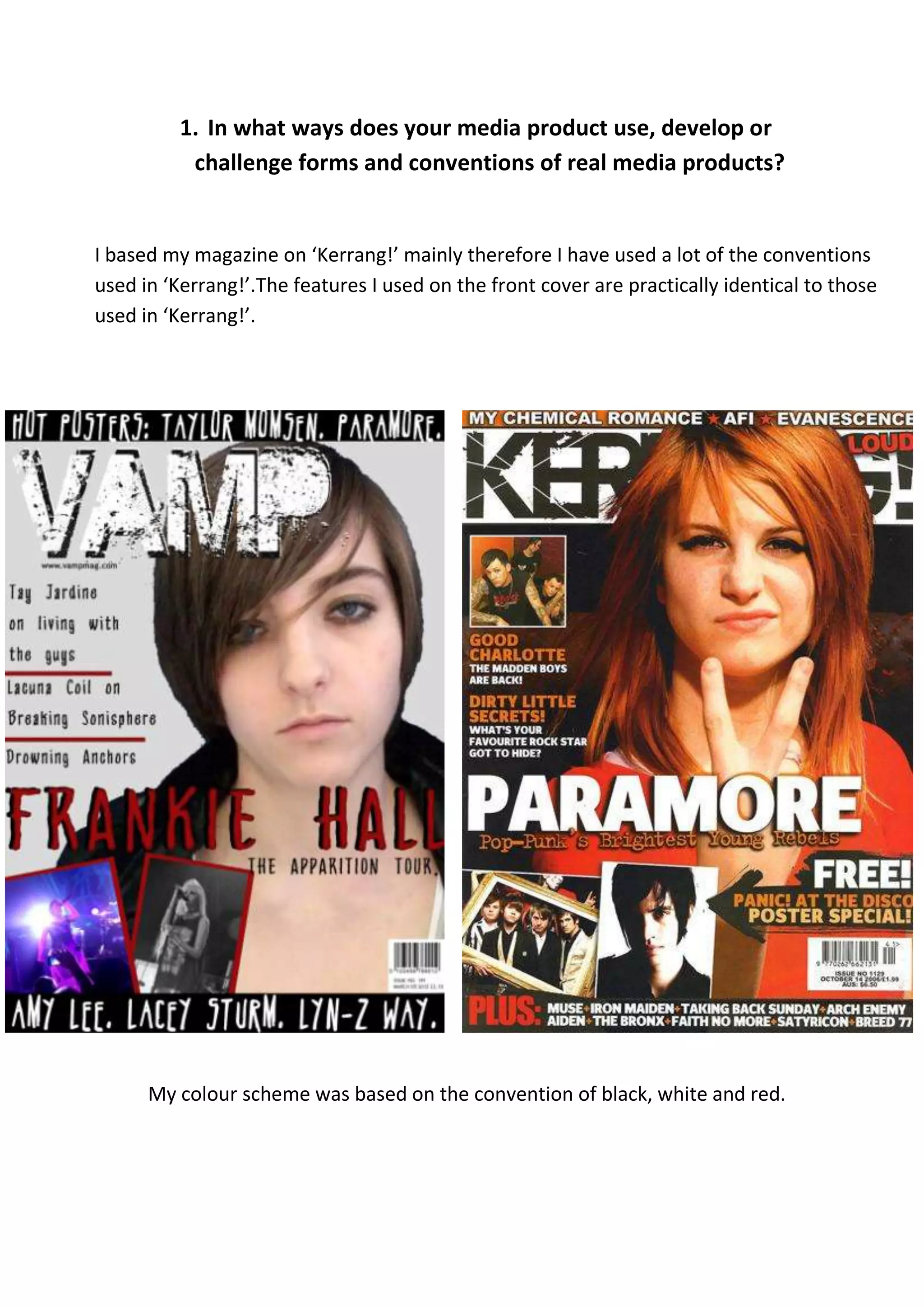
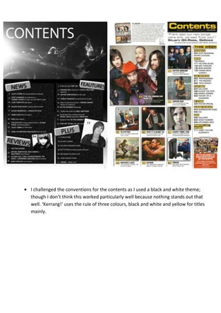
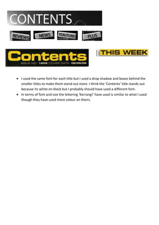
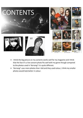
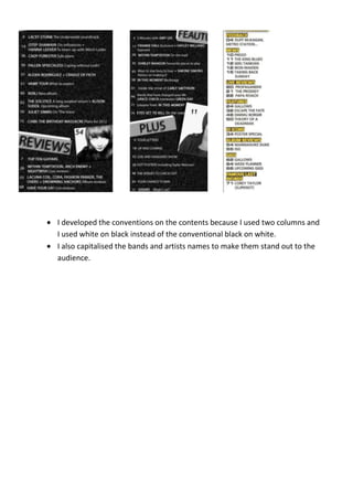
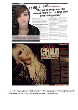
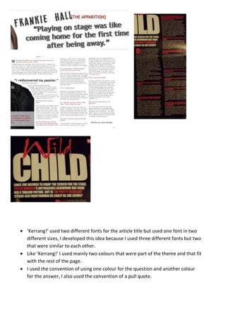
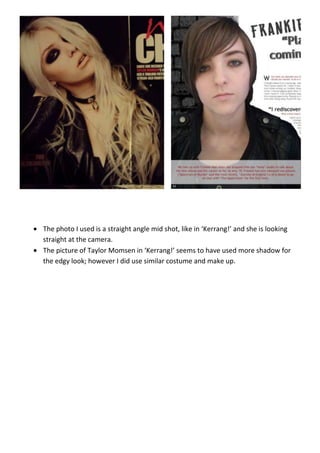
The document discusses how the media product, a magazine called "Vamp", uses, develops, and challenges conventions of real magazines like "Kerrang!".
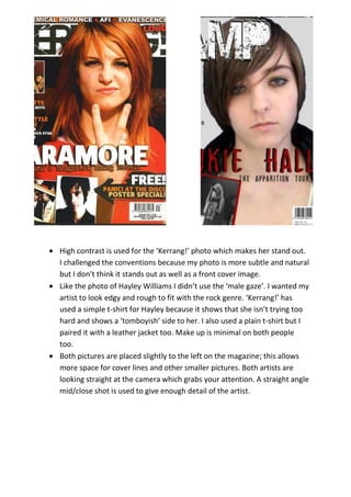
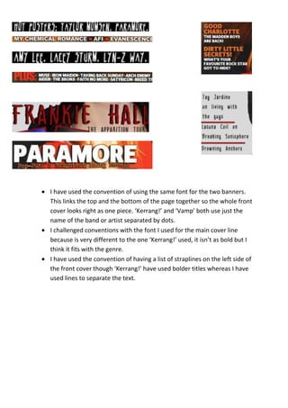
The magazine uses conventions like a black, white, and red color scheme. Fonts are chosen to fit the rock genre. Photos are placed on the left side with artists looking at the camera. Issue contents list band names in titles. However, some conventions are challenged, like using subtle front cover photos instead of high contrast images. Fonts and colors are also experimented with in non-traditional ways. Overall, the magazine borrows from real magazines but also puts its own spin on conventions of the genre.