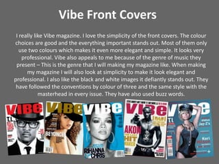
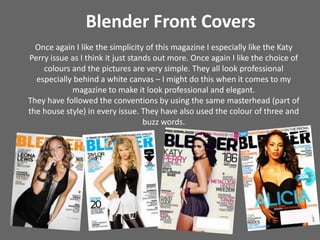
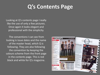
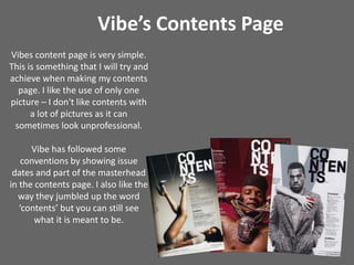
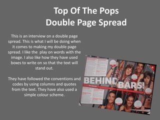
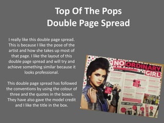
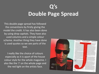
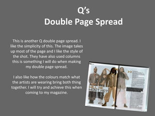
This document discusses conventions for magazine front covers, contents pages, and double page spreads. It analyzes examples from Vibe, Blender, Q, and Top of the Pops magazines. Key points made include liking the simplicity and color choices of Vibe and Blender covers, as well as Q's elegant contents page with few pictures. Examples of double page spreads show interviews and photos following conventions like credits, columns, and quotes. Overall the document examines magazine design elements to help create a professional student magazine.


![Music magazine[1]](https://cdn.slidesharecdn.com/ss_thumbnails/musicmagazine1-120224055441-phpapp02-thumbnail.jpg?width=640&height=640&fit=bounds)