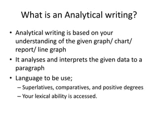
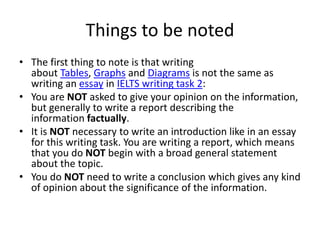
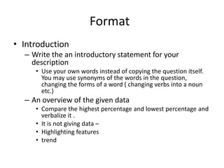
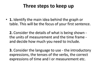
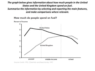
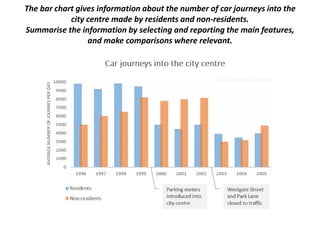
Analytical Writing
-Explain the analytical Writing
-Familiarize with graph interpretation
-Write an analytical paragraph
What is an Analytical writing?
• Analytical writing is based on your
understanding of the given graph/ chart/
report/ line graph
• It analyses and interprets the given data to a
paragraph
• Language to be use;
– Superlatives, comparatives, and positive degrees
– Your lexical ability is accessed.
Things to be noted
• The first thing to note is that writing
about Tables, Graphs and Diagrams is not the same as
writing an essay in IELTS writing task 2:
• You are NOT asked to give your opinion on the information,
but generally to write a report describing the
information factually.
• It is NOT necessary to write an introduction like in an essay
for this writing task. You are writing a report, which means
that you do NOT begin with a broad general statement
about the topic.
• You do NOT need to write a conclusion which gives any kind
of opinion about the significance of the information.
Format
• Introduction
– Write the an introductory statement for your
description
• Use your own words instead of copying the question itself.
You may use synonyms of the words in the question,
changing the forms of a word ( changing verbs into a noun
etc.)
– An overview of the given data
• Compare the highest percentage and lowest percentage and
verbalize it .
• It is not giving data –
• Highlighting features
• trend
Three steps to keep up
• 1. Identify the main idea behind the graph or
table. This will be the focus of your first sentence.
2. Consider the details of what is being shown -
the units of measurement and the time frame -
and decide how much you need to include.
3. Consider the language to use - the introductory
expressions, the tenses of the verbs, the correct
expressions of time and I or measurement etc.
Three possible ways to start
• 1. Refer to the visual directly (e.g. This graph shows the population of
Canada in from 1867 up to 2007.) However, this method is not advisable,
since the instructions in the test will normally give you just this
information. If you copy directly from the paper you are wasting time,
since the examiner cannot assess your English from a copied sentence.
2. Refer directly to the main message conveyed by the visual (e.g. There
was a sharp increase in the population of Canada from 1867 up to 2007.)
This way is perfectly acceptable, and shows that you are able to recognise
the main concept or message that the graph or table shows.
3. Combine the two (e.g. The graph shows that there was a sharp increase
in the population of Canada from 1867 up to 2007.) This is also
acceptable, and is often used as a convenient way to start. In order to use
this method, it is necessary to use a few fixed expressions, which refer to
the text itself, like those below.
Eg:
• The graph shows traffic growth in -----------
between 1990 and 2015
• The graph indicates the change in the traffic in
the ------ from 1990 to 2015
• This bar/line/ pie chart tells us the sporting
preferences among young student samples
• The pie chart reveals the average household
expenditure etc......
• The graph shows the percentage of children using
supplements in a place over a year.
Useful introductory expressions:
The graph shows / indicates / depicts /illustrates
From the graph it is clear
It can be seen from the graph
As can be seen from the graph,
As is shown / illustrated by the graph,
Sample
The chart examines the level of donations among people of
different ages in Britain.
Overall, a great percentage of British people gave money to
charity in 1990 than in 2010. However, across the two years,
the Pattern differs before and after the age of 50.
An overview- useful phrases
- Remarkable feature of the graph is that..
- It is interesting to note that.....
- The striking feature of the graph is that....
- The gist of the graph is that ....
- The pivot point of the graph is that...
The bar chart below gives information about the percentage of the
population living in urban areas in different parts of the world.
Summarise the information by selecting and reporting the main features,
and make comparisons where relevant.
The graph below gives information about how much people in the United
States and the United Kingdom spend on fuel.
Summarise the information by selecting and reporting the main features,
and make comparisons where relevant.
The bar chart gives information about the number of car journeys into the
city centre made by residents and non-residents.
Summarise the information by selecting and reporting the main features,
and make comparisons where relevant.
Main paragraph
• Organise the salient features of the given
information into a consolidated report with
relevant comparison and contrasts.
• Normally – start with striking a contrast you
find the data eg: highest and the lowest.
• Use
• Useful time expressions:
over the next... / for the following... (for the following two months... over
the next six months...)
from ... to / between ... and (from June to August... between June and
August...)
during (during the first three months...)
Warning!
Per cent is the word form of the symbol %. We can write 10% or 10 per
cent. Percentage is the noun form: The percentage of children using
supplements. NOT The percent of children...
Note!
You can use a combination of adjective + noun, or verb + adverb, to avoid
repeating the same phrase.
Example: There was a sharp decrease in the numbers. The numbers
decreased sharply.
Example: main paragraphs
In 1990,42% of the 36-50 age group made charitable
donations, and this figure is the highest on the chart.
The 18-20 category contributed the least at only 17%.
By 2010, these had fallen significantly to 35% and 7%
respectively. The level of donations from the 26-35
age-group also experienced a decreased in 2010 from
31% to 24%.
While donations up to the age of 50 declined across
the two years, they rose among the 51-65 age group
from 35% to nearly 40%, which was the highest
percentage for 2010. The figure for the over 65 was
lower than this, at 35%, but it was still a little higher
than the 1990 figure of 32%.

Analytical Writing - Bar graph

  • 1.
    Analytical Writing -Explain theanalytical Writing -Familiarize with graph interpretation -Write an analytical paragraph
  • 2.
    What is anAnalytical writing? • Analytical writing is based on your understanding of the given graph/ chart/ report/ line graph • It analyses and interprets the given data to a paragraph • Language to be use; – Superlatives, comparatives, and positive degrees – Your lexical ability is accessed.
  • 3.
    Things to benoted • The first thing to note is that writing about Tables, Graphs and Diagrams is not the same as writing an essay in IELTS writing task 2: • You are NOT asked to give your opinion on the information, but generally to write a report describing the information factually. • It is NOT necessary to write an introduction like in an essay for this writing task. You are writing a report, which means that you do NOT begin with a broad general statement about the topic. • You do NOT need to write a conclusion which gives any kind of opinion about the significance of the information.
  • 4.
    Format • Introduction – Writethe an introductory statement for your description • Use your own words instead of copying the question itself. You may use synonyms of the words in the question, changing the forms of a word ( changing verbs into a noun etc.) – An overview of the given data • Compare the highest percentage and lowest percentage and verbalize it . • It is not giving data – • Highlighting features • trend
  • 5.
    Three steps tokeep up • 1. Identify the main idea behind the graph or table. This will be the focus of your first sentence. 2. Consider the details of what is being shown - the units of measurement and the time frame - and decide how much you need to include. 3. Consider the language to use - the introductory expressions, the tenses of the verbs, the correct expressions of time and I or measurement etc.
  • 6.
    Three possible waysto start • 1. Refer to the visual directly (e.g. This graph shows the population of Canada in from 1867 up to 2007.) However, this method is not advisable, since the instructions in the test will normally give you just this information. If you copy directly from the paper you are wasting time, since the examiner cannot assess your English from a copied sentence. 2. Refer directly to the main message conveyed by the visual (e.g. There was a sharp increase in the population of Canada from 1867 up to 2007.) This way is perfectly acceptable, and shows that you are able to recognise the main concept or message that the graph or table shows. 3. Combine the two (e.g. The graph shows that there was a sharp increase in the population of Canada from 1867 up to 2007.) This is also acceptable, and is often used as a convenient way to start. In order to use this method, it is necessary to use a few fixed expressions, which refer to the text itself, like those below.
  • 7.
    Eg: • The graphshows traffic growth in ----------- between 1990 and 2015 • The graph indicates the change in the traffic in the ------ from 1990 to 2015 • This bar/line/ pie chart tells us the sporting preferences among young student samples • The pie chart reveals the average household expenditure etc...... • The graph shows the percentage of children using supplements in a place over a year.
  • 8.
    Useful introductory expressions: Thegraph shows / indicates / depicts /illustrates From the graph it is clear It can be seen from the graph As can be seen from the graph, As is shown / illustrated by the graph,
  • 9.
    Sample The chart examinesthe level of donations among people of different ages in Britain. Overall, a great percentage of British people gave money to charity in 1990 than in 2010. However, across the two years, the Pattern differs before and after the age of 50.
  • 10.
    An overview- usefulphrases - Remarkable feature of the graph is that.. - It is interesting to note that..... - The striking feature of the graph is that.... - The gist of the graph is that .... - The pivot point of the graph is that...
  • 11.
    The bar chartbelow gives information about the percentage of the population living in urban areas in different parts of the world. Summarise the information by selecting and reporting the main features, and make comparisons where relevant.
  • 12.
    The graph belowgives information about how much people in the United States and the United Kingdom spend on fuel. Summarise the information by selecting and reporting the main features, and make comparisons where relevant.
  • 13.
    The bar chartgives information about the number of car journeys into the city centre made by residents and non-residents. Summarise the information by selecting and reporting the main features, and make comparisons where relevant.
  • 14.
    Main paragraph • Organisethe salient features of the given information into a consolidated report with relevant comparison and contrasts. • Normally – start with striking a contrast you find the data eg: highest and the lowest. • Use
  • 15.
    • Useful timeexpressions: over the next... / for the following... (for the following two months... over the next six months...) from ... to / between ... and (from June to August... between June and August...) during (during the first three months...) Warning! Per cent is the word form of the symbol %. We can write 10% or 10 per cent. Percentage is the noun form: The percentage of children using supplements. NOT The percent of children... Note! You can use a combination of adjective + noun, or verb + adverb, to avoid repeating the same phrase. Example: There was a sharp decrease in the numbers. The numbers decreased sharply.
  • 16.
    Example: main paragraphs In1990,42% of the 36-50 age group made charitable donations, and this figure is the highest on the chart. The 18-20 category contributed the least at only 17%. By 2010, these had fallen significantly to 35% and 7% respectively. The level of donations from the 26-35 age-group also experienced a decreased in 2010 from 31% to 24%. While donations up to the age of 50 declined across the two years, they rose among the 51-65 age group from 35% to nearly 40%, which was the highest percentage for 2010. The figure for the over 65 was lower than this, at 35%, but it was still a little higher than the 1990 figure of 32%.