This document provides information about presenting an advertising campaign, including logos, advertisements, and storyboards. It discusses:
- Understanding the logo manual, advertisements, and storyboard thoroughly before pitching the campaign.
- Details about an example logo for Idea Cellular, including the shape inspired by SIM cards, colors symbolizing innovation, and typography choices.
- Recommendations for differentiating advertisements by color or layout and providing examples of press, print, and outdoor ads.
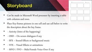
- Instructions for creating a storyboard in a table with key frames, descriptions, dialogues, sounds, visual effects, and voiceovers.
- An overview of various agency departments involved in the campaign including creative, production