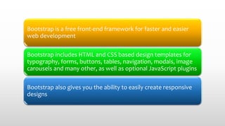
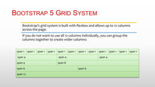
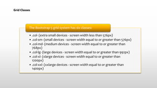
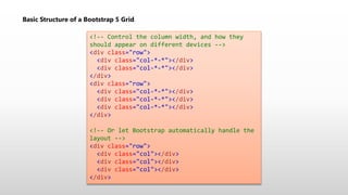
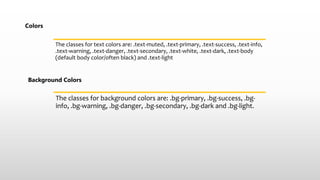
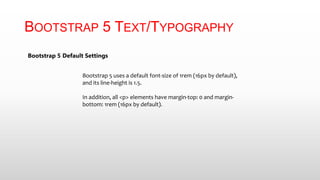
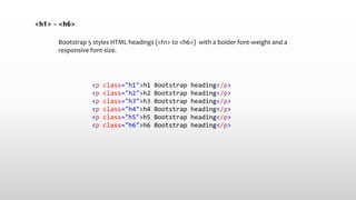
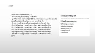
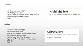
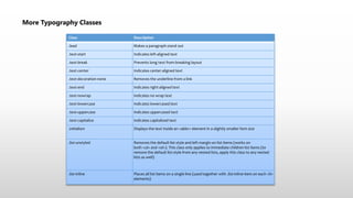
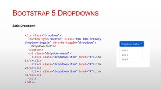
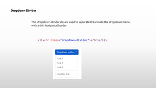
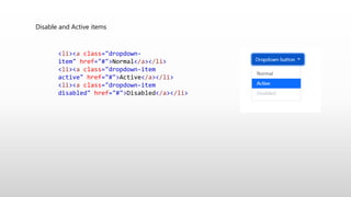
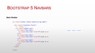
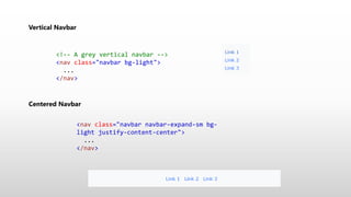
2. Bootstrap is a free front-end framework for faster and easier
web development
Bootstrap includes HTML and CSS based design templates for
typography, forms, buttons, tables, navigation, modals, image
carousels and many other, as well as optional JavaScript plugins
Bootstrap also gives you the ability to easily create responsive
designs
4. BOOTSTRAP 5 CONTAINERS
The .container class provides a responsive fixed
width container
The .container-fluid class provides a full width
container, spanning the entire width of the
viewport
5. Use the .container class to create a responsive, fixed-width
container.
Fixed Container
<!DOCTYPE html>
<html lang="en">
<head>
<title>Bootstrap Example</title>
<meta charset="utf-8">
<meta name="viewport" content="width=device-width,
initial-scale=1">
<link
href="https://cdn.jsdelivr.net/npm/bootstrap@5.2.3/dist/cs
s/bootstrap.min.css" rel="stylesheet">
<script
src="https://cdn.jsdelivr.net/npm/bootstrap@5.2.3/dist/js/b
ootstrap.bundle.min.js"></script>
</head>
<body>
<div class="container">
<h1>My First Bootstrap Page</h1>
<p>This part is inside a .container class.</p>
<p>The .container class provides a responsive fixed
width container.</p>
<p>Resize the browser window to see that the
container width will change at different breakpoints.</p>
</div>
</body>
</html>
6. Fluid Container
<!DOCTYPE html>
<html lang="en">
<head>
<title>Bootstrap Example</title>
<meta charset="utf-8">
<meta name="viewport" content="width=device-width, initial-scale=1">
<link href="https://cdn.jsdelivr.net/npm/bootstrap@5.2.3/dist/css/bootstrap.min.css" rel="stylesheet">
<script src="https://cdn.jsdelivr.net/npm/bootstrap@5.2.3/dist/js/bootstrap.bundle.min.js"></script>
</head>
<body>
<div class="container-fluid">
<h1>My First Bootstrap Page</h1>
<p>This part is inside a .container-fluid class.</p>
<p>The .container-fluid class provides a full width container, spanning the entire width of the
viewport.</p>
</div>
</body>
</html>
9. BOOTSTRAP 5 GRID SYSTEM
Bootstrap's grid system is built with flexbox and allows up to 12 columns
across the page.
If you do not want to use all 12 columns individually, you can group the
columns together to create wider columns:
span 1 span 1 span 1 span 1 span 1 span 1 span 1 span 1 span 1 span 1 span 1 span 1
span 4 span 4 span 4
span 4 span 8
span 6 span 6
span 12
10. Grid Classes
• .col- (extra small devices - screen width less than 576px)
• .col-sm- (small devices - screen width equal to or greater than 576px)
• .col-md- (medium devices - screen width equal to or greater than
768px)
• .col-lg- (large devices - screen width equal to or greater than 992px)
• .col-xl- (xlarge devices - screen width equal to or greater than
1200px)
• .col-xxl- (xxlarge devices - screen width equal to or greater than
1400px)
The Bootstrap 5 grid system has six classes:
11. Basic Structure of a Bootstrap 5 Grid
<!-- Control the column width, and how they
should appear on different devices -->
<div class="row">
<div class="col-*-*"></div>
</div>
<div class="row">
<div class="col-*-*"></div>
</div>
<!-- Or let Bootstrap automatically handle the
layout -->
<div class="row">
<div class="col"></div>
</div>
12. Row Cols
<div class="row row-cols-1">
<div class="col bg-success">1 of 2</div>
<div class="col bg-warning">2 of 2</div>
</div>
<br>
<div class="row row-cols-2">
<div class="col bg-success">1 of 4</div>
<div class="col bg-warning">2 of 4</div>
<div class="col bg-success">3 of 4</div>
<div class="col bg-warning">4 of 4</div>
</div>
<br>
<div class="row row-cols-3">
<div class="col bg-success">1 of 6</div>
<div class="col bg-warning">2 of 6</div>
<div class="col bg-success">3 of 6</div>
<div class="col bg-warning">4 of 6</div>
<div class="col bg-success">5 of 6</div>
<div class="col bg-warning">6 of 6</div>
</div>
</div>
23. Spacing
.m-# / m-*-# margin on all sides
.mt-# / mt-*-# margin top
.mb-# / mb-*-# margin bottom
.ms-# / ms-*-# margin left
.me-# / me-*-# margin right
.mx-# / mx-*-# margin left and right
.my-# / my-*-# margin top and bottom
.p-# / p-*-# padding on all sides
.pt-# / pt-*-# padding top
.pb-# / pb-*-# padding bottom
.ps-# / ps-*-# padding left
.pe-# / pe-*-# padding right
.py-# / py-*-# padding top and bottom
.px-# / px-*-# padding left and right
25. Colors
The classes for text colors are: .text-muted, .text-primary, .text-success, .text-info,
.text-warning, .text-danger, .text-secondary, .text-white, .text-dark, .text-body
(default body color/often black) and .text-light
Background Colors
The classes for background colors are: .bg-primary, .bg-success, .bg-
info, .bg-warning, .bg-danger, .bg-secondary, .bg-dark and .bg-light.
26. BOOTSTRAP 5 TEXT/TYPOGRAPHY
Bootstrap 5 Default Settings
Bootstrap 5 uses a default font-size of 1rem (16px by default),
and its line-height is 1.5.
In addition, all <p> elements have margin-top: 0 and margin-
bottom: 1rem (16px by default).
27. <h1> - <h6>
Bootstrap 5 styles HTML headings (<h1> to <h6>) with a bolder font-weight and a
responsive font-size.
<p class="h1">h1 Bootstrap heading</p>
<p class="h2">h2 Bootstrap heading</p>
<p class="h3">h3 Bootstrap heading</p>
<p class="h4">h4 Bootstrap heading</p>
<p class="h5">h5 Bootstrap heading</p>
<p class="h6">h6 Bootstrap heading</p>
28. Display Headings
<div class="container mt-3">
<h1>Display Headings</h1>
<p>Display headings are used to stand out more than
normal headings (larger font-size and lighter font-
weight):</p>
<h1 class="display-1">Display 1</h1>
<h1 class="display-2">Display 2</h1>
<h1 class="display-3">Display 3</h1>
<h1 class="display-4">Display 4</h1>
<h1 class="display-5">Display 5</h1>
<h1 class="display-6">Display 6</h1>
</div>
29. <small>
<div class="container mt-3">
<h1>Smaller, Secondary Text</h1>
<p>The small element (and the .small class) is used to create
a smaller, secondary text in any heading:</p>
<h1>h1 heading <small>secondary text</small></h1>
<h2>h2 heading <small>secondary text</small></h2>
<h3>h3 heading <small>secondary text</small></h3>
<h4>h4 heading <small>secondary text</small></h4>
<h5>h5 heading <small>secondary text</small></h5>
<h6>h6 heading <small>secondary text</small></h6>
</div>
30. <mark>
<div class="container mt-3">
<h1>Highlight Text</h1>
<p>Use the mark element (or the .mark class) to
<mark>highlight</mark> text.</p>
</div>
<abbr>
<div class="container mt-3">
<h1>Abbreviations</h1>
<p>The abbr element is used to mark up an
abbreviation or acronym:</p>
<p>The <abbr title="World Health
Organization">WHO</abbr> was founded in
1948.</p>
</div>
31. More Typography Classes
Class Description
.lead Makes a paragraph stand out
.text-start Indicates left-aligned text
.text-break Prevents long text from breaking layout
.text-center Indicates center-aligned text
.text-decoration-none Removes the underline from a link
.text-end Indicates right-aligned text
.text-nowrap Indicates no wrap text
.text-lowercase Indicates lowercased text
.text-uppercase Indicates uppercased text
.text-capitalize Indicates capitalized text
.initialism Displays the text inside an <abbr> element in a slightly smaller font size
.list-unstyled Removes the default list-style and left margin on list items (works on
both <ul> and <ol>). This class only applies to immediate children list items (to
remove the default list-style from any nested lists, apply this class to any nested
lists as well)
.list-inline Places all list items on a single line (used together with .list-inline-item on each <li>
elements)
33. Dropdown Divider
The .dropdown-divider class is used to separate links inside the dropdown menu
with a thin horizontal border:
<li><hr class="dropdown-divider"></hr></li>
34. Disable and Active items
<li><a class="dropdown-
item" href="#">Normal</a></li>
<li><a class="dropdown-item
active" href="#">Active</a></li>
<li><a class="dropdown-item
disabled" href="#">Disabled</a></li>