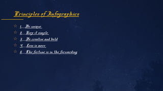
1. The document discusses 10 basic principles of graphics and layout: balance, proximity, alignment, repetition, contrast, hierarchy and emphasis, movement, rhythm, proportion, and variety.
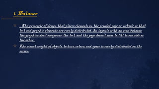
2. Balance refers to evenly distributing text and graphic elements on a page or website. Proximity involves positioning related items closer together.
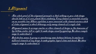
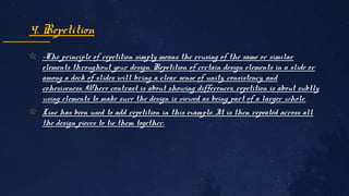
3. Alignment, repetition, contrast, hierarchy and emphasis, movement, rhythm, proportion, and variety are principles for organizing visual elements in a design.