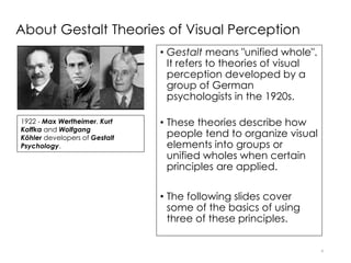
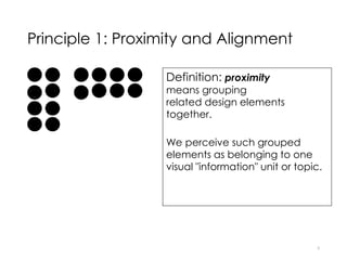
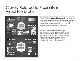
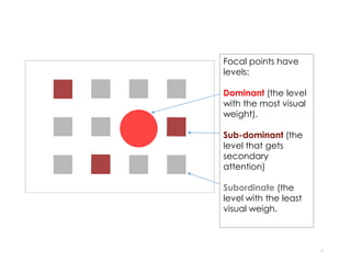
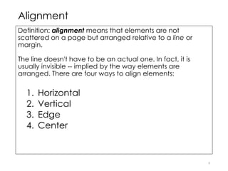
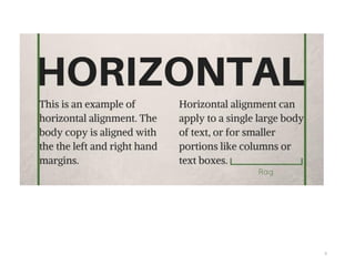
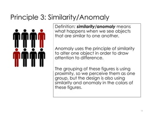
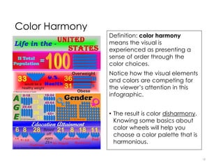
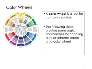
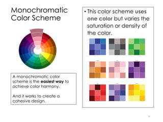
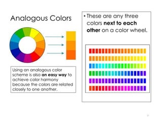
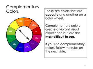
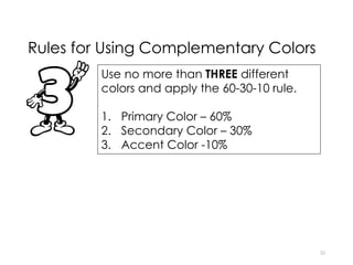
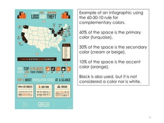
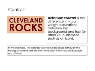
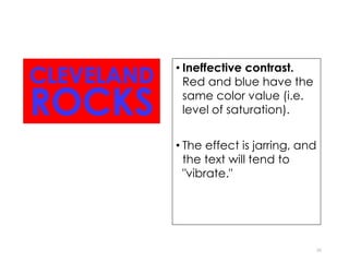
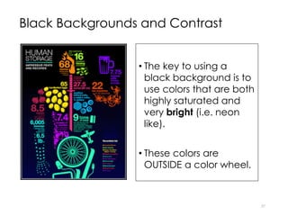
Gestalt Theory and Color Harmony:
Design for Non-Designers
1
Acknowledgement
These slides were designed by
Professor Karen Thompson, Director
of Professional Writing at the
University of Idaho. She has kindly
given me permission to share them
with you. Thank you, Professor
Thompson.
How to apply basic principles of
Gestalt Design
3
About Gestalt Theories of Visual Perception
• Gestalt means "unified whole".
It refers to theories of visual
perception developed by a
group of German
psychologists in the 1920s.
• These theories describe how
people tend to organize visual
elements into groups or
unified wholes when certain
principles are applied.
• The following slides cover
some of the basics of using
three of these principles.
4
1922 - Max Wertheimer, Kurt
Koffka and Wolfgang
Köhler developers of Gestalt
Psychology.
Principle 1: Proximity and Alignment
Definition: proximity
means grouping
related design elements
together.
We perceive such grouped
elements as belonging to one
visual "information" unit or topic.
5
Closely Related to Proximity is
Visual Hierarchy
6
Definition: visual hierarchy means
the arrangement of elements in a
way that implies a hierarchy of
importance within a section.
It is achieved by creating
dominant, sub-dominant, and
subordinate focal points using
varying visual weight (size,
contrast) and alignment.
7
Focal points have
levels:
Dominant (the level
with the most visual
weight).
Sub-dominant (the
level that gets
secondary
attention)
Subordinate (the
level with the least
visual weigh.
Alignment
Definition: alignment means that elements are not
scattered on a page but arranged relative to a line or
margin.
The line doesn't have to be an actual one. In fact, it is
usually invisible -- implied by the way elements are
arranged. There are four ways to align elements:
1. Horizontal
2. Vertical
3. Edge
4. Center
8
9
10
This type of alignment is sometimes hard to understand.
Notice how the text is contained (aligned) between the
two green lines and how the text below the word vertical is
fully justified (aligned left and no ragged right edge).
11
12
Many templates in free infographic tools use too much center aligned
text. To improve readability, try to avoid center aligned text except in
titles.
13
Example of an infographic
using principle of proximity
and alignment.
Principle 2: Closure
Definition: closure means what happens when
we look at a shape that is incomplete.
When a shape is incomplete, we perceive it as
a whole by filling in the negative space to
complete it.
Using closure reduces the complexity needed
to convey visual information while also actively
engaging the viewer who has to stay with the
shape long enough to make sense of it.
14
Icons
• Many icons use the principle of closure
effectively.
• Icons, whether they use closure or not, are
effective to use when creating the
isotype (pictograph or pictogram) section
or to add visual interest to other sections
of your infographic.
• You will find links to free icons under Tools
and Resources.
• Flaticon.com will allow you to easily
change the icon color if you sign up for a
free account.
15
Principle 3: Similarity/Anomaly
Definition: similarity/anomaly means
what happens when we see objects
that are similar to one another.
Anomaly uses the principle of similarity
to alter one object in order to draw
attention to difference.
The grouping of these figures is using
proximity, so we perceive them as one
group, but the design is also using
similarity and anomaly in the colors of
these figures.
16
How to apply basic principles of
Color Theory
17
Color Harmony
18
Definition: color harmony
means the visual is
experienced as presenting a
sense of order through the
color choices.
Notice how the visual elements
and colors are competing for
the viewer’s attention in this
infographic.
• The result is color disharmony.
Knowing some basics about
color wheels will help you
choose a color palette that is
harmonious.
Color Wheels
• A color wheel is a tool for
combining colors.
• The following slides
provide some basic
approaches for choosing
a color scheme based
on a color wheel.
19
Monochromatic
Color Scheme
• This color scheme uses
one color but varies the
saturation or density of
the color.
20
A monochromatic color
scheme is the easiest way to
achieve color harmony.
And it works to create a
cohesive design.
Analogous Colors • These are any three
colors next to each
other on a color wheel.
21
Using an analogous color
scheme is also an easy way to
achieve color harmony
because the colors are related
closely to one another.
Complementary
Colors
22
These are colors that are
opposite one another on a
color wheel.
Complementary colors
create a vibrant visual
experience but are the
most difficult to use.
If you use complementary
colors, follow the rules on
the next slide.
Rules for Using Complementary Colors
23
Use no more than THREE different
colors and apply the 60-30-10 rule.
1. Primary Color – 60%
2. Secondary Color – 30%
3. Accent Color -10%
24
Example of an infographic using
the 60-30-10 rule for
complementary colors.
60% of the space is the primary
color (turquoise).
30% of the space is the secondary
color (cream or beige).
10% of the space is the accent
color (orange).
Black is also used, but it is not
considered a color nor is white.
Contrast
Definition: contrast is the
difference in visual
weight (saturation)
between the
background and text (or
other visual element
such as an icon).
25
In this example, the contrast is effective because although the
background and text are the same color the levels of saturation
are different.
• Ineffective contrast.
Red and blue have the
same color value (i.e.
level of saturation).
• The effect is jarring, and
the text will tend to
"vibrate."
26
Black Backgrounds and Contrast
• The key to using a
black background is to
use colors that are both
highly saturated and
very bright (i.e. neon
like).
• These colors are
OUTSIDE a color wheel.
27

Graphic design principles for non designers

  • 1.
    Gestalt Theory andColor Harmony: Design for Non-Designers 1
  • 2.
    Acknowledgement These slides weredesigned by Professor Karen Thompson, Director of Professional Writing at the University of Idaho. She has kindly given me permission to share them with you. Thank you, Professor Thompson.
  • 3.
    How to applybasic principles of Gestalt Design 3
  • 4.
    About Gestalt Theoriesof Visual Perception • Gestalt means "unified whole". It refers to theories of visual perception developed by a group of German psychologists in the 1920s. • These theories describe how people tend to organize visual elements into groups or unified wholes when certain principles are applied. • The following slides cover some of the basics of using three of these principles. 4 1922 - Max Wertheimer, Kurt Koffka and Wolfgang Köhler developers of Gestalt Psychology.
  • 5.
    Principle 1: Proximityand Alignment Definition: proximity means grouping related design elements together. We perceive such grouped elements as belonging to one visual "information" unit or topic. 5
  • 6.
    Closely Related toProximity is Visual Hierarchy 6 Definition: visual hierarchy means the arrangement of elements in a way that implies a hierarchy of importance within a section. It is achieved by creating dominant, sub-dominant, and subordinate focal points using varying visual weight (size, contrast) and alignment.
  • 7.
    7 Focal points have levels: Dominant(the level with the most visual weight). Sub-dominant (the level that gets secondary attention) Subordinate (the level with the least visual weigh.
  • 8.
    Alignment Definition: alignment meansthat elements are not scattered on a page but arranged relative to a line or margin. The line doesn't have to be an actual one. In fact, it is usually invisible -- implied by the way elements are arranged. There are four ways to align elements: 1. Horizontal 2. Vertical 3. Edge 4. Center 8
  • 9.
  • 10.
    10 This type ofalignment is sometimes hard to understand. Notice how the text is contained (aligned) between the two green lines and how the text below the word vertical is fully justified (aligned left and no ragged right edge).
  • 11.
  • 12.
    12 Many templates infree infographic tools use too much center aligned text. To improve readability, try to avoid center aligned text except in titles.
  • 13.
    13 Example of aninfographic using principle of proximity and alignment.
  • 14.
    Principle 2: Closure Definition:closure means what happens when we look at a shape that is incomplete. When a shape is incomplete, we perceive it as a whole by filling in the negative space to complete it. Using closure reduces the complexity needed to convey visual information while also actively engaging the viewer who has to stay with the shape long enough to make sense of it. 14
  • 15.
    Icons • Many iconsuse the principle of closure effectively. • Icons, whether they use closure or not, are effective to use when creating the isotype (pictograph or pictogram) section or to add visual interest to other sections of your infographic. • You will find links to free icons under Tools and Resources. • Flaticon.com will allow you to easily change the icon color if you sign up for a free account. 15
  • 16.
    Principle 3: Similarity/Anomaly Definition:similarity/anomaly means what happens when we see objects that are similar to one another. Anomaly uses the principle of similarity to alter one object in order to draw attention to difference. The grouping of these figures is using proximity, so we perceive them as one group, but the design is also using similarity and anomaly in the colors of these figures. 16
  • 17.
    How to applybasic principles of Color Theory 17
  • 18.
    Color Harmony 18 Definition: colorharmony means the visual is experienced as presenting a sense of order through the color choices. Notice how the visual elements and colors are competing for the viewer’s attention in this infographic. • The result is color disharmony. Knowing some basics about color wheels will help you choose a color palette that is harmonious.
  • 19.
    Color Wheels • Acolor wheel is a tool for combining colors. • The following slides provide some basic approaches for choosing a color scheme based on a color wheel. 19
  • 20.
    Monochromatic Color Scheme • Thiscolor scheme uses one color but varies the saturation or density of the color. 20 A monochromatic color scheme is the easiest way to achieve color harmony. And it works to create a cohesive design.
  • 21.
    Analogous Colors •These are any three colors next to each other on a color wheel. 21 Using an analogous color scheme is also an easy way to achieve color harmony because the colors are related closely to one another.
  • 22.
    Complementary Colors 22 These are colorsthat are opposite one another on a color wheel. Complementary colors create a vibrant visual experience but are the most difficult to use. If you use complementary colors, follow the rules on the next slide.
  • 23.
    Rules for UsingComplementary Colors 23 Use no more than THREE different colors and apply the 60-30-10 rule. 1. Primary Color – 60% 2. Secondary Color – 30% 3. Accent Color -10%
  • 24.
    24 Example of aninfographic using the 60-30-10 rule for complementary colors. 60% of the space is the primary color (turquoise). 30% of the space is the secondary color (cream or beige). 10% of the space is the accent color (orange). Black is also used, but it is not considered a color nor is white.
  • 25.
    Contrast Definition: contrast isthe difference in visual weight (saturation) between the background and text (or other visual element such as an icon). 25 In this example, the contrast is effective because although the background and text are the same color the levels of saturation are different.
  • 26.
    • Ineffective contrast. Redand blue have the same color value (i.e. level of saturation). • The effect is jarring, and the text will tend to "vibrate." 26
  • 27.
    Black Backgrounds andContrast • The key to using a black background is to use colors that are both highly saturated and very bright (i.e. neon like). • These colors are OUTSIDE a color wheel. 27