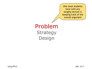
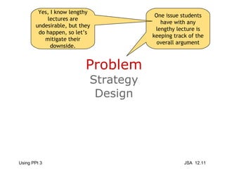
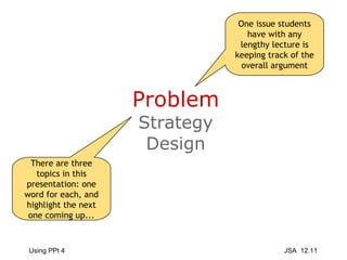
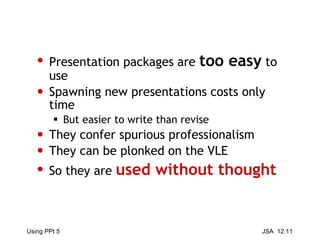
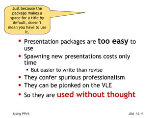
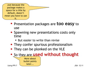
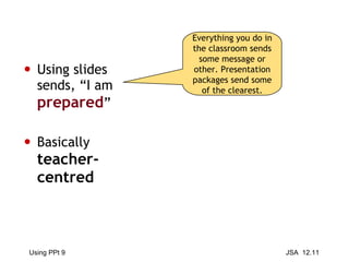
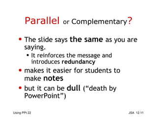
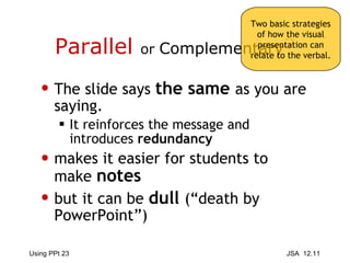
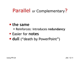
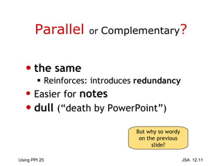
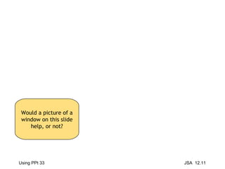
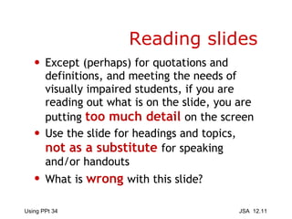
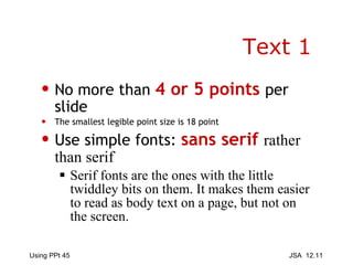
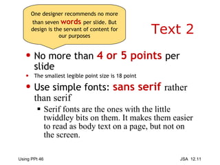
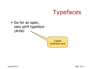
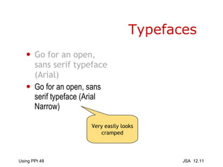
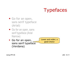
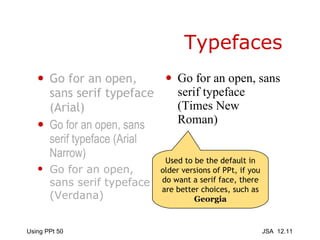
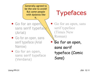
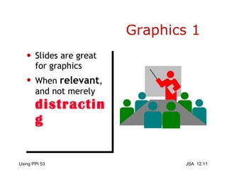
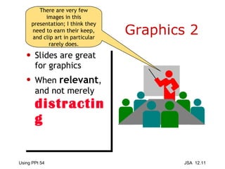
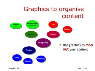
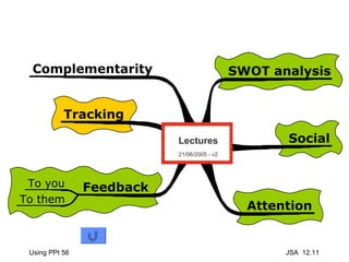
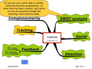
Basic Introduction to the use of Presentation Packages to support teaching James Atherton December 2011
Problem Strategy Design One issue students have with any lengthy lecture is keeping track of the overall argument
Problem Strategy Design One issue students have with any lengthy lecture is keeping track of the overall argument Yes, I know lengthy lectures are undesirable, but they do happen, so let’s mitigate their downside.
Problem Strategy Design One issue students have with any lengthy lecture is keeping track of the overall argument There are three topics in this presentation: one word for each, and highlight the next one coming up...
Presentation packages are  too easy  to use Spawning new presentations costs only time But easier to write than revise They confer spurious professionalism They can be plonked on the VLE So they are  used without thought
Presentation packages are  too easy  to use Spawning new presentations costs only time But easier to write than revise They confer spurious professionalism They can be plonked on the VLE So they are  used without thought Just because the package makes a space for a title by default, doesn’t mean you have to use it.
Presentation packages are  too easy  to use Spawning new presentations costs only time But easier to write than revise They confer spurious professionalism They can be plonked on the VLE So they are  used without thought Just because the package makes a space for a title by default, doesn’t mean you have to use it. More about bullet points later...
Problem Strategy Design
Using slides sends, “I am  prepared ” Basically  teacher-centred Everything you do in the classroom sends some message or other. Presentation packages send some of the clearest.
Using slides sends, “I am  prepared ” Basically  teacher-centred Everything you do in the classroom sends some message or other. Presentation packages send some of the clearest. Not necessarily a bad thing!
Using slides sends, “I am  prepared ” Basically  teacher-centred Whiteboard/flipchart/ smart board sends, “This is  spontaneous ” Potentially more  accessible   to class Flip-chart sheets can be kept and hung around room
Using slides sends, “I am  prepared ” Basically  teacher-centred Whiteboard/flipchart/ smart board sends, “This is  spontaneous ” Potentially more  accessible   to class Flip-chart sheets can be kept and hung around room So probably more suited to promoting/supporting discussion
On or Off the Rails? Encourages you to cram in  too much sheer information How often have you had too many slides and gabbled through them to finish? And taking stuff out of (your) order is clunky So can you be  responsive to student interest ?
On or Off the Rails? Encourages you to cram in  too much sheer information How often have you had too many slides and gabbled through them to finish? And taking stuff out of (your) order is clunky So can you be  responsive to student interest ? One of the big issues with presentation packages: great for a single sequential thread...
On or Off the Rails? Encourages you to cram in  too much sheer information How often have you had too many slides and gabbled through them to finish? And taking stuff out of (your) order is clunky So can you be  responsive to student interest ? One of the big issues with presentation packages: great for a single sequential thread... ...but not well-suited to a branching topic or one which can be approached from several angles
On the other hand, who said you can only have one presentation available at a time? Prepare different versions to support different directions, and switch between them if necessary by using Alt+tab to cycle through all open applications on the machine
Epistemology The default setting is the bullet point With limited scope for change  Everything is reduced to a succession of such points Isolated gobbets of knowledge, which reinforce surface learning And the lower reaches of the SOLO taxonomy  (Biggs and Collis, 1982)
Epistemology The default setting is the bullet point With limited scope for change  Everything is reduced to a succession of such points Isolated gobbets of knowledge, which reinforce surface learning And the lower reaches of the SOLO taxonomy  (Biggs and Collis, 1982) Philosophical label for the theory of knowledge.
Epistemology The default setting is the bullet point With limited scope for change  Everything is reduced to a succession of such points Isolated gobbets of knowledge, which reinforce surface learning And the lower reaches of the SOLO taxonomy  (Biggs and Collis, 1982) The basic question is, “What kind of knowledge transmission does a presentation package promote?” when...
 
Edward Tufte sees PowerPoint as tyrannical, imposing its own repressive order on everything it touches http://www.edwardtufte.com/tufte/powerpoint
Parallel  or  Complementary ? The slide says  the same  as you are saying. It reinforces the message and introduces  redundancy makes it easier for students to make  notes but it can be  dull   (“death by PowerPoint”)
Parallel  or  Complementary ? The slide says  the same  as you are saying. It reinforces the message and introduces  redundancy makes it easier for students to make  notes but it can be  dull   (“death by PowerPoint”) Two basic strategies of how the visual presentation can relate to the verbal.
Parallel  or  Complementary ? the same Reinforces: introduces  redundancy Easier for  notes dull   (“death by PowerPoint”)
Parallel  or  Complementary ? the same Reinforces: introduces  redundancy Easier for  notes dull   (“death by PowerPoint”) But why so wordy on the previous slide?
Parallel  or  Complementary ? the same Reinforces: introduces  redundancy Easier for  notes dull   (“death by PowerPoint”) But why so wordy on the previous slide? 16 words instead of 36; punchier, quicker to read, less distraction, but same content
Redundancy 1 Like a rope twists together many strands to gain strength redundant communication reinforces the message with back-ups and patterning
Redundancy 2 Like a rope twists together many strands to gain strength redundant communication reinforces the message with back-ups and patterning But this bit is redundant (in the other sense), when you are explaining it verbally, too...
Redundancy 1 redundant communication reinforces  message with back-ups and patterning So cut it out!
Counterpoint: diagrams, quotes, references,  illustrations Distracting? if you leave it on if graphics attract attention to themselves  Parallel   or  Complementary?
Counterpoint: diagrams, quotes, references,  illustrations Distracting? if you leave it on if graphics too obtrusive Parallel   or  Complementary? Despite what some business-oriented design gurus say, you do not want a presentation to attract attention in itself.
Counterpoint: diagrams, quotes, references,  illustrations Distracting? if you leave it on if graphics too obtrusive Parallel   or  Complementary? It’s a means of getting at the content; it’s a window you look through, not a picture you look at. Despite what some business-oriented design gurus say, you do not want a presentation to attract attention in itself.
Would a picture of a window on this slide help, or not?
Reading slides Except (perhaps) for quotations and definitions, and meeting the needs of visually impaired students, if you are reading out what is on the slide, you are putting  too much detail   on the screen Use the slide for headings and topics,  not as a substitute  for speaking and/or handouts What is  wrong   with this slide?
Problem Strategy Design
Using master layouts Click with Shift
Using master layouts Click with Shift Edit the master layout to apply a consistent style to all your slides at once.
Click with Shift
Using master layouts This (top) slide is the master of the masters; modify that to alter all subordinate layouts
What does this add? For teaching purposes and clarity?
What does this add? For teaching purposes and clarity? The built in themes are obtrusive and distracting for teaching purposes.
Or this one? How would you respond to an hour of this? The animation will not show on SlideShare so you are spared that. Inexorable animation is exhausting!
Or this one? How would you respond to an hour of this? K.I.S.S.
Or this one? How would you respond to an hour of this? Keep It Simple, Stupid!
Text 1 No more than  4 or 5 points  per slide The smallest legible point size is 18 point Use simple fonts:  sans serif  rather than serif   Serif fonts are the ones with the little twiddley bits on them. It makes them easier to read as body text on a page, but not on the screen.
Text 2 No more than  4 or 5 points  per slide The smallest legible point size is 18 point Use simple fonts:  sans serif  rather than serif   Serif fonts are the ones with the little twiddley bits on them. It makes them easier to read as body text on a page, but not on the screen. One designer recommends no more than seven  words   per slide. But design is the servant of content for our purposes
Typefaces Go for an open, sans serif typeface (Arial) A good workhorse face
Typefaces Go for an open, sans serif typeface (Arial) Go for an open, sans serif typeface (Arial Narrow) Very easily looks cramped
Typefaces Go for an open, sans serif typeface (Arial) Go for an open, sans serif typeface (Arial Narrow) Go for an open, sans serif typeface (Verdana) Lower and wider; a good choice
Typefaces Go for an open, sans serif typeface (Arial) Go for an open, sans serif typeface (Arial Narrow) Go for an open, sans serif typeface (Verdana) Go for an open, sans serif typeface (Times New Roman) Used to be the default in older versions of PPt, if you do want a serif face, there are better choices, such as  Georgia
Typefaces Go for an open, sans serif typeface (Arial) Go for an open, sans serif typeface (Arial Narrow) Go for an open, sans serif typeface (Verdana) Go for an open, sans serif typeface (Times New Roman) Go for an open, sans serif typeface (Comic Sans) Generally agreed to be the one to avoid! But  some  people with dyslexia like it.
Text 2 No more than 5 or 6 points per slide The smallest legible point size is 18 points Use simple fonts: sans serif rather than serif USE UPPER AND LOWER CASE, NOT CAPITALS THROUGHOUT it preserves the shape of the words If you are building up an argument over several slides, you can keep previous points in mind with small recaps.
Graphics 1 Slides are great for graphics When  relevant , and not merely  distracting
Graphics 2 Slides are great for graphics When  relevant , and not merely  distracting There are very few images in this presentation; I think they need to earn their keep, and clip art in particular rarely does.
Graphics to organise content Use graphics to  map out  your content
 
Or you can use a mind-map or similar, colouring branches progressively  to show what has been covered, and return to it as you proceed through the teaching—even week by week.

Basic introduction to using presentations to support teaching

  • 1.
    Basic Introduction tothe use of Presentation Packages to support teaching James Atherton December 2011
  • 2.
    Problem Strategy DesignOne issue students have with any lengthy lecture is keeping track of the overall argument
  • 3.
    Problem Strategy DesignOne issue students have with any lengthy lecture is keeping track of the overall argument Yes, I know lengthy lectures are undesirable, but they do happen, so let’s mitigate their downside.
  • 4.
    Problem Strategy DesignOne issue students have with any lengthy lecture is keeping track of the overall argument There are three topics in this presentation: one word for each, and highlight the next one coming up...
  • 5.
    Presentation packages are too easy to use Spawning new presentations costs only time But easier to write than revise They confer spurious professionalism They can be plonked on the VLE So they are used without thought
  • 6.
    Presentation packages are too easy to use Spawning new presentations costs only time But easier to write than revise They confer spurious professionalism They can be plonked on the VLE So they are used without thought Just because the package makes a space for a title by default, doesn’t mean you have to use it.
  • 7.
    Presentation packages are too easy to use Spawning new presentations costs only time But easier to write than revise They confer spurious professionalism They can be plonked on the VLE So they are used without thought Just because the package makes a space for a title by default, doesn’t mean you have to use it. More about bullet points later...
  • 8.
  • 9.
    Using slides sends,“I am prepared ” Basically teacher-centred Everything you do in the classroom sends some message or other. Presentation packages send some of the clearest.
  • 10.
    Using slides sends,“I am prepared ” Basically teacher-centred Everything you do in the classroom sends some message or other. Presentation packages send some of the clearest. Not necessarily a bad thing!
  • 11.
    Using slides sends,“I am prepared ” Basically teacher-centred Whiteboard/flipchart/ smart board sends, “This is spontaneous ” Potentially more accessible to class Flip-chart sheets can be kept and hung around room
  • 12.
    Using slides sends,“I am prepared ” Basically teacher-centred Whiteboard/flipchart/ smart board sends, “This is spontaneous ” Potentially more accessible to class Flip-chart sheets can be kept and hung around room So probably more suited to promoting/supporting discussion
  • 13.
    On or Offthe Rails? Encourages you to cram in too much sheer information How often have you had too many slides and gabbled through them to finish? And taking stuff out of (your) order is clunky So can you be responsive to student interest ?
  • 14.
    On or Offthe Rails? Encourages you to cram in too much sheer information How often have you had too many slides and gabbled through them to finish? And taking stuff out of (your) order is clunky So can you be responsive to student interest ? One of the big issues with presentation packages: great for a single sequential thread...
  • 15.
    On or Offthe Rails? Encourages you to cram in too much sheer information How often have you had too many slides and gabbled through them to finish? And taking stuff out of (your) order is clunky So can you be responsive to student interest ? One of the big issues with presentation packages: great for a single sequential thread... ...but not well-suited to a branching topic or one which can be approached from several angles
  • 16.
    On the otherhand, who said you can only have one presentation available at a time? Prepare different versions to support different directions, and switch between them if necessary by using Alt+tab to cycle through all open applications on the machine
  • 17.
    Epistemology The defaultsetting is the bullet point With limited scope for change Everything is reduced to a succession of such points Isolated gobbets of knowledge, which reinforce surface learning And the lower reaches of the SOLO taxonomy (Biggs and Collis, 1982)
  • 18.
    Epistemology The defaultsetting is the bullet point With limited scope for change Everything is reduced to a succession of such points Isolated gobbets of knowledge, which reinforce surface learning And the lower reaches of the SOLO taxonomy (Biggs and Collis, 1982) Philosophical label for the theory of knowledge.
  • 19.
    Epistemology The defaultsetting is the bullet point With limited scope for change Everything is reduced to a succession of such points Isolated gobbets of knowledge, which reinforce surface learning And the lower reaches of the SOLO taxonomy (Biggs and Collis, 1982) The basic question is, “What kind of knowledge transmission does a presentation package promote?” when...
  • 20.
  • 21.
    Edward Tufte seesPowerPoint as tyrannical, imposing its own repressive order on everything it touches http://www.edwardtufte.com/tufte/powerpoint
  • 22.
    Parallel or Complementary ? The slide says the same as you are saying. It reinforces the message and introduces redundancy makes it easier for students to make notes but it can be dull (“death by PowerPoint”)
  • 23.
    Parallel or Complementary ? The slide says the same as you are saying. It reinforces the message and introduces redundancy makes it easier for students to make notes but it can be dull (“death by PowerPoint”) Two basic strategies of how the visual presentation can relate to the verbal.
  • 24.
    Parallel or Complementary ? the same Reinforces: introduces redundancy Easier for notes dull (“death by PowerPoint”)
  • 25.
    Parallel or Complementary ? the same Reinforces: introduces redundancy Easier for notes dull (“death by PowerPoint”) But why so wordy on the previous slide?
  • 26.
    Parallel or Complementary ? the same Reinforces: introduces redundancy Easier for notes dull (“death by PowerPoint”) But why so wordy on the previous slide? 16 words instead of 36; punchier, quicker to read, less distraction, but same content
  • 27.
    Redundancy 1 Likea rope twists together many strands to gain strength redundant communication reinforces the message with back-ups and patterning
  • 28.
    Redundancy 2 Likea rope twists together many strands to gain strength redundant communication reinforces the message with back-ups and patterning But this bit is redundant (in the other sense), when you are explaining it verbally, too...
  • 29.
    Redundancy 1 redundantcommunication reinforces message with back-ups and patterning So cut it out!
  • 30.
    Counterpoint: diagrams, quotes,references, illustrations Distracting? if you leave it on if graphics attract attention to themselves Parallel or Complementary?
  • 31.
    Counterpoint: diagrams, quotes,references, illustrations Distracting? if you leave it on if graphics too obtrusive Parallel or Complementary? Despite what some business-oriented design gurus say, you do not want a presentation to attract attention in itself.
  • 32.
    Counterpoint: diagrams, quotes,references, illustrations Distracting? if you leave it on if graphics too obtrusive Parallel or Complementary? It’s a means of getting at the content; it’s a window you look through, not a picture you look at. Despite what some business-oriented design gurus say, you do not want a presentation to attract attention in itself.
  • 33.
    Would a pictureof a window on this slide help, or not?
  • 34.
    Reading slides Except(perhaps) for quotations and definitions, and meeting the needs of visually impaired students, if you are reading out what is on the slide, you are putting too much detail on the screen Use the slide for headings and topics, not as a substitute for speaking and/or handouts What is wrong with this slide?
  • 35.
  • 36.
    Using master layoutsClick with Shift
  • 37.
    Using master layoutsClick with Shift Edit the master layout to apply a consistent style to all your slides at once.
  • 38.
  • 39.
    Using master layoutsThis (top) slide is the master of the masters; modify that to alter all subordinate layouts
  • 40.
    What does thisadd? For teaching purposes and clarity?
  • 41.
    What does thisadd? For teaching purposes and clarity? The built in themes are obtrusive and distracting for teaching purposes.
  • 42.
    Or this one?How would you respond to an hour of this? The animation will not show on SlideShare so you are spared that. Inexorable animation is exhausting!
  • 43.
    Or this one?How would you respond to an hour of this? K.I.S.S.
  • 44.
    Or this one?How would you respond to an hour of this? Keep It Simple, Stupid!
  • 45.
    Text 1 Nomore than 4 or 5 points per slide The smallest legible point size is 18 point Use simple fonts: sans serif rather than serif Serif fonts are the ones with the little twiddley bits on them. It makes them easier to read as body text on a page, but not on the screen.
  • 46.
    Text 2 Nomore than 4 or 5 points per slide The smallest legible point size is 18 point Use simple fonts: sans serif rather than serif Serif fonts are the ones with the little twiddley bits on them. It makes them easier to read as body text on a page, but not on the screen. One designer recommends no more than seven words per slide. But design is the servant of content for our purposes
  • 47.
    Typefaces Go foran open, sans serif typeface (Arial) A good workhorse face
  • 48.
    Typefaces Go foran open, sans serif typeface (Arial) Go for an open, sans serif typeface (Arial Narrow) Very easily looks cramped
  • 49.
    Typefaces Go foran open, sans serif typeface (Arial) Go for an open, sans serif typeface (Arial Narrow) Go for an open, sans serif typeface (Verdana) Lower and wider; a good choice
  • 50.
    Typefaces Go foran open, sans serif typeface (Arial) Go for an open, sans serif typeface (Arial Narrow) Go for an open, sans serif typeface (Verdana) Go for an open, sans serif typeface (Times New Roman) Used to be the default in older versions of PPt, if you do want a serif face, there are better choices, such as Georgia
  • 51.
    Typefaces Go foran open, sans serif typeface (Arial) Go for an open, sans serif typeface (Arial Narrow) Go for an open, sans serif typeface (Verdana) Go for an open, sans serif typeface (Times New Roman) Go for an open, sans serif typeface (Comic Sans) Generally agreed to be the one to avoid! But some people with dyslexia like it.
  • 52.
    Text 2 Nomore than 5 or 6 points per slide The smallest legible point size is 18 points Use simple fonts: sans serif rather than serif USE UPPER AND LOWER CASE, NOT CAPITALS THROUGHOUT it preserves the shape of the words If you are building up an argument over several slides, you can keep previous points in mind with small recaps.
  • 53.
    Graphics 1 Slidesare great for graphics When relevant , and not merely distracting
  • 54.
    Graphics 2 Slidesare great for graphics When relevant , and not merely distracting There are very few images in this presentation; I think they need to earn their keep, and clip art in particular rarely does.
  • 55.
    Graphics to organisecontent Use graphics to map out your content
  • 56.
  • 57.
    Or you canuse a mind-map or similar, colouring branches progressively to show what has been covered, and return to it as you proceed through the teaching—even week by week.

Editor's Notes

  • #31 Demonstrate blanking the slide
  • #32 Demonstrate blanking the slide
  • #33 Demonstrate blanking the slide