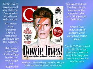
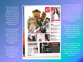
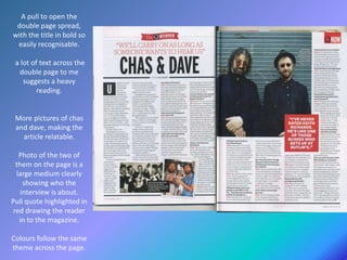
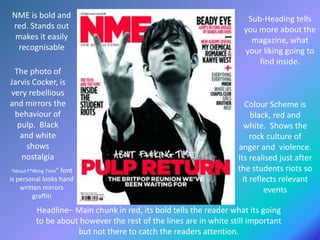
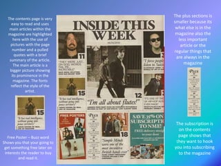
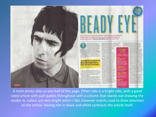
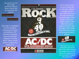
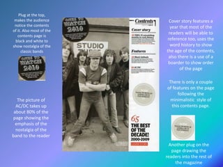
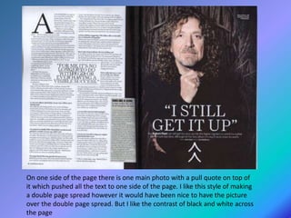
Price is £3.99 Very small
to hide t from the
consumers, make the
rest of the mag draw
them in and then find
out the price
Sub-Image and sub-
Heading tells you
more about the
magazine, what
your liking going to
find inside.
Headline is bold and very powerful, tells you
about the main article of the magazine
Buzz words:
Rare!
Exclusive!
Shows a
reason why
you should buy
this magazine.
Layout is very
organised, not
very cluttered.
Seems to be
aimed to an
older market.
Graphic Plug,
showing added
contents which
may attract certain
people
Main Image,
shows David
Bowie as Ziggy
Stardust, an
iconic image
very
recognisable
The featured articles
are shown with
pictures then the
page number in a red
box so its easily
recognisable and
easy to find in the
magazine.
The main article is
just a photo of the
Muppets which is
different to the way
the other articles are
laid out this is much
easier to read this
way also it’s the
biggest picture so it
draws you in.
The subscription is on
the contents page
shows that they want
to hook you into
subscribing to the
magazine
The review done by Q its
self is on the bottom right
this time the article
picture has some text next
to it to show you a little
nugget of the article to
draw you in
The front page is shown at
the top of the page on to link
the contents page to its front
cover and also it’s a common
Q convention so it reminds
the audience on why they
open the magazine and also
how much other stuff is in
the magazine
The regular section of it is
a common convention,
showing you what the
magazine offers most
issues also gives the page
numbers and a brief
description
A pull to open the
double page spread,
with the title in bold so
easily recognisable.
a lot of text across the
double page to me
suggests a heavy
reading.
More pictures of chas
and dave, making the
article relatable.
Photo of the two of
them on the page is a
large medium clearly
showing who the
interview is about.
Pull quote highlighted in
red drawing the reader
in to the magazine.
Colours follow the same
theme across the page.
Headline– Main chunk in red, its bold tells the reader what its going
to be about however the rest of the lines are in white still important
but not there to catch the readers attention.
NME is bold and
red. Stands out
makes it easily
recognisable
Sub-Heading tells
you more about the
magazine, what
your liking going to
find inside.
The photo of
Jarvis Cocker, is
very rebellious
and mirrors the
behaviour of
pulp. Black
and white
shows
nostalgia
Colour Scheme is
black, red and
white. Shows the
rock culture of
anger and violence.
Its realised just after
the students riots so
it reflects relevant
events
“About F*#king Time” font
is personal looks hand
written mirrors
graffiti
The contents page is very
easy to read and uses
main articles within the
magazine are highlighted
here with the use of
pictures with the page
number and a pulled
quotes with a brief
summary of the article.
The main article is a
bigger picture showing
its prominence in the
magazine. The fonts
reflect the style of the
artist.
The subscription is
on the contents
page shows that
they want to hook
you into subscribing
to the magazine
Free Poster – Buzz word
Shows you that your going to
get something free later on
interests the reader to buy
and read it.
The plus sections is
smaller because its
what else is in the
magazine also the
less important
article or the
regular things that
are always in the
magazine
A main photo take us one half of the page. Other side is a bright side, with a good
sized article with pull quotes throughout with a column that stands out drawing the
reader in. colour are very bright which I like, however mainly used to draw attention
to the article. Having him in black and white contracts the article itself.
Buzz words: Free CD!
Bonus Mag!
Anniversary Special!
Shows a reason why
you should buy this
magazine.
Band logo is embedded
into the Headline,
showing prominence
and boldness. 40th
Anniversary Special,
tells you what the
magazine is mainly
about. Shows secret
history intrigues the
audience in.
The art work is very
unusual it looks like
an old book, reflects
nostalgia, the art
work draws you in to
the main picture of
the lead singer of the
band, in his iconic
school uniform. This
reflects the iconic
nature of AC/DC. Also
the text in the middle
has a flow and a wave
to the way the text is
laid out
The front cover is very
centralised, with all the
text in the middle drawing
the readers eyes into the
centre of the page also its
very minimalistic intrigues
the audience in
Plug at the top,
makes the audience
notice the contents
of it. Also most of the
contents page is
black and white to
show nostalgia of the
classic bands
The picture of
AC/DC takes up
about 80% of the
page showing the
emphasis of the
nostalgia of the
band to the reader
Cover story features a
year that most of the
readers will be able to
reference too, uses the
word history to show
the age of the contents,
also there is a use of a
boarder to show order
of the page
There is only a couple
of features on the page
following the
minimalistic style of
this contents page.
Another plug on the
page drawing the
readers into the rest of
the magazine
On one side of the page there is one main photo with a pull quote on top of
it which pushed all the text to one side of the page. I like this style of making
a double page spread however it would have been nice to have the picture
over the double page spread. But I like the contrast of black and white across
the page

Texual research.

  • 1.
    Price is £3.99Very small to hide t from the consumers, make the rest of the mag draw them in and then find out the price Sub-Image and sub- Heading tells you more about the magazine, what your liking going to find inside. Headline is bold and very powerful, tells you about the main article of the magazine Buzz words: Rare! Exclusive! Shows a reason why you should buy this magazine. Layout is very organised, not very cluttered. Seems to be aimed to an older market. Graphic Plug, showing added contents which may attract certain people Main Image, shows David Bowie as Ziggy Stardust, an iconic image very recognisable
  • 2.
    The featured articles areshown with pictures then the page number in a red box so its easily recognisable and easy to find in the magazine. The main article is just a photo of the Muppets which is different to the way the other articles are laid out this is much easier to read this way also it’s the biggest picture so it draws you in. The subscription is on the contents page shows that they want to hook you into subscribing to the magazine The review done by Q its self is on the bottom right this time the article picture has some text next to it to show you a little nugget of the article to draw you in The front page is shown at the top of the page on to link the contents page to its front cover and also it’s a common Q convention so it reminds the audience on why they open the magazine and also how much other stuff is in the magazine The regular section of it is a common convention, showing you what the magazine offers most issues also gives the page numbers and a brief description
  • 3.
    A pull toopen the double page spread, with the title in bold so easily recognisable. a lot of text across the double page to me suggests a heavy reading. More pictures of chas and dave, making the article relatable. Photo of the two of them on the page is a large medium clearly showing who the interview is about. Pull quote highlighted in red drawing the reader in to the magazine. Colours follow the same theme across the page.
  • 4.
    Headline– Main chunkin red, its bold tells the reader what its going to be about however the rest of the lines are in white still important but not there to catch the readers attention. NME is bold and red. Stands out makes it easily recognisable Sub-Heading tells you more about the magazine, what your liking going to find inside. The photo of Jarvis Cocker, is very rebellious and mirrors the behaviour of pulp. Black and white shows nostalgia Colour Scheme is black, red and white. Shows the rock culture of anger and violence. Its realised just after the students riots so it reflects relevant events “About F*#king Time” font is personal looks hand written mirrors graffiti
  • 5.
    The contents pageis very easy to read and uses main articles within the magazine are highlighted here with the use of pictures with the page number and a pulled quotes with a brief summary of the article. The main article is a bigger picture showing its prominence in the magazine. The fonts reflect the style of the artist. The subscription is on the contents page shows that they want to hook you into subscribing to the magazine Free Poster – Buzz word Shows you that your going to get something free later on interests the reader to buy and read it. The plus sections is smaller because its what else is in the magazine also the less important article or the regular things that are always in the magazine
  • 6.
    A main phototake us one half of the page. Other side is a bright side, with a good sized article with pull quotes throughout with a column that stands out drawing the reader in. colour are very bright which I like, however mainly used to draw attention to the article. Having him in black and white contracts the article itself.
  • 7.
    Buzz words: FreeCD! Bonus Mag! Anniversary Special! Shows a reason why you should buy this magazine. Band logo is embedded into the Headline, showing prominence and boldness. 40th Anniversary Special, tells you what the magazine is mainly about. Shows secret history intrigues the audience in. The art work is very unusual it looks like an old book, reflects nostalgia, the art work draws you in to the main picture of the lead singer of the band, in his iconic school uniform. This reflects the iconic nature of AC/DC. Also the text in the middle has a flow and a wave to the way the text is laid out The front cover is very centralised, with all the text in the middle drawing the readers eyes into the centre of the page also its very minimalistic intrigues the audience in
  • 8.
    Plug at thetop, makes the audience notice the contents of it. Also most of the contents page is black and white to show nostalgia of the classic bands The picture of AC/DC takes up about 80% of the page showing the emphasis of the nostalgia of the band to the reader Cover story features a year that most of the readers will be able to reference too, uses the word history to show the age of the contents, also there is a use of a boarder to show order of the page There is only a couple of features on the page following the minimalistic style of this contents page. Another plug on the page drawing the readers into the rest of the magazine
  • 9.
    On one sideof the page there is one main photo with a pull quote on top of it which pushed all the text to one side of the page. I like this style of making a double page spread however it would have been nice to have the picture over the double page spread. But I like the contrast of black and white across the page