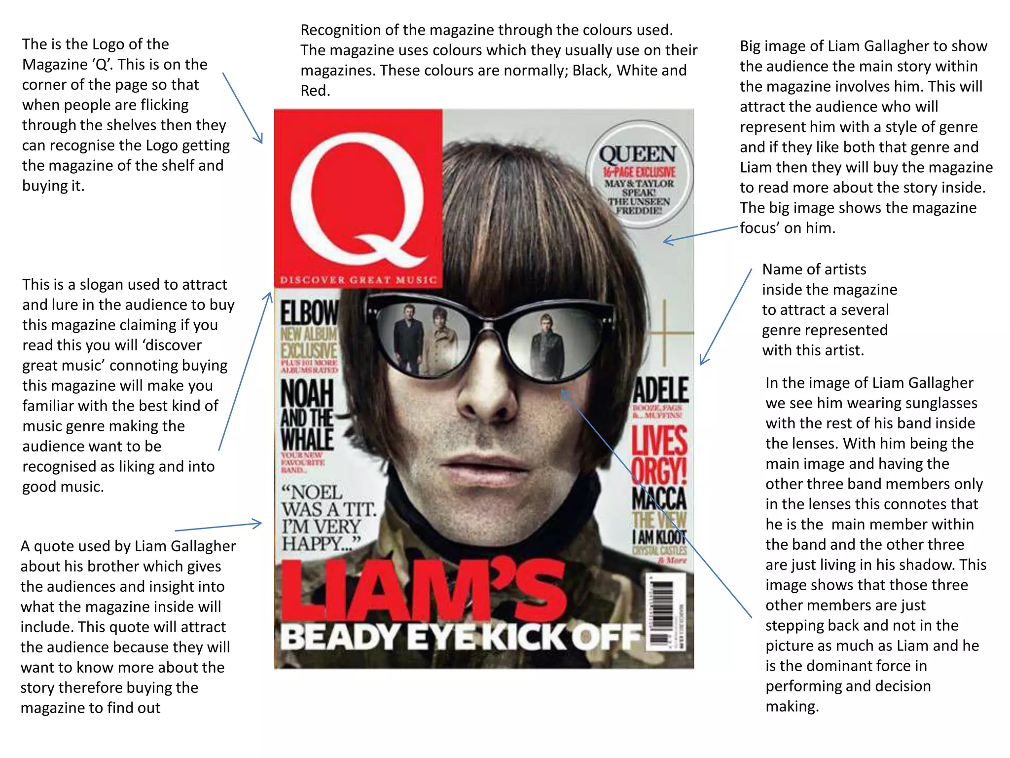
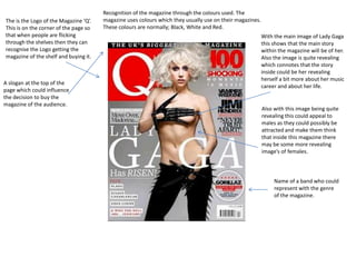
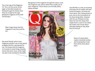
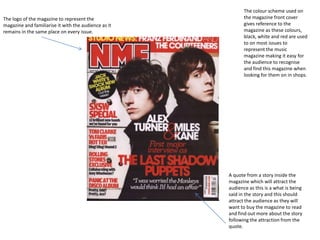
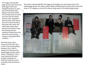
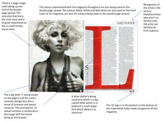
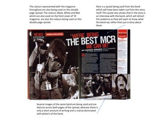
The document discusses how magazines use design elements like logos, colors and images to attract readers and signal what stories and artists will be featured. The magazine analyzed uses red, black and white consistently to help readers recognize issues on shelves. Photos of prominent artists take up large spaces to indicate they are the primary focus of stories. Quotes and names of bands are also used to preview content and pique readers' interest in learning more by buying the magazine.
Call Girls Pune Just Call 9907093804 Top Class Call Girl Service Available
Magazine analysis
1. Recognition of the magazine through the colours used.
The is the Logo of the The magazine uses colours which they usually use on their Big image of Liam Gallagher to show
Magazine ‘Q’. This is on the magazines. These colours are normally; Black, White and the audience the main story within
corner of the page so that Red. the magazine involves him. This will
when people are flicking attract the audience who will
through the shelves then they represent him with a style of genre
can recognise the Logo getting and if they like both that genre and
the magazine of the shelf and Liam then they will buy the magazine
buying it. to read more about the story inside.
The big image shows the magazine
focus’ on him.
Name of artists
This is a slogan used to attract inside the magazine
and lure in the audience to buy to attract a several
this magazine claiming if you genre represented
read this you will ‘discover with this artist.
great music’ connoting buying
this magazine will make you In the image of Liam Gallagher
familiar with the best kind of we see him wearing sunglasses
music genre making the with the rest of his band inside
audience want to be the lenses. With him being the
recognised as liking and into main image and having the
good music. other three band members only
in the lenses this connotes that
he is the main member within
A quote used by Liam Gallagher the band and the other three
about his brother which gives are just living in his shadow. This
the audiences and insight into image shows that those three
what the magazine inside will other members are just
include. This quote will attract stepping back and not in the
the audience because they will picture as much as Liam and he
want to know more about the is the dominant force in
story therefore buying the performing and decision
magazine to find out making.
2. Recognition of the magazine through the colours used. The
The is the Logo of the Magazine ‘Q’. magazine uses colours which they usually use on their magazines.
This is on the corner of the page so These colours are normally; Black, White and Red.
that when people are flicking With the main image of Lady Gaga
through the shelves then they can this shows that the main story
recognise the Logo getting the within the magazine will be of her.
magazine of the shelf and buying it. Also the image is quite revealing
which connotes that the story
inside could be her revealing
herself a bit more about her music
A slogan at the top of the
career and about her life.
page which could influence
the decision to buy the
magazine of the audience.
Also with this image being quite
revealing this could appeal to
males as they could possibly be
attracted and make them think
that inside this magazine there
may be some more revealing
image’s of females.
Name of a band who could
represent with the genre
of the magazine.
3. Recognition of the magazine through the colours used.
The is the Logo of the Magazine The magazine uses colours which they usually use on
‘Q’. This is on the corner of the their magazines. These colours are normally; Black,
Lana Del Rey is a new, up incoming
page so that when people are White and Red.
artist who lost of readers will have
flicking through the shelves then heard of however, not know too
they can recognise the Logo much about. She is being shown as
getting the magazine of the shelf pure, due to the connotations of
and buying it. her dress being white. However,
with the use of blood running
down her face this shows that
maybe there is more to her which
the readers don’t know about
Main image shows that this although reading on may allow
magazine’s main focus will be them to find out.
her.
Name of a band which
readers should be familiar
Key word ‘bloody’ which some with knowing that inside
magazines wouldn’t use as they would their will be story about
probably find this a daring word to them.
use. This shows that this magazine
isn't scared to reveal things, possibly
stories that some music artists might
not want to be revealed to the public.
4. The colour scheme used on
The logo of the magazine to represent the the magazine front cover
magazine and familiarise it with the audience as it gives reference to the
remains in the same place on every issue. magazine as these colours,
black, white and red are used
to on most issues to
represent the music
magazine making it easy for
the audience to recognise
and find this magazine when
looking for them on in shops.
A quote from a story inside the
magazine which will attract the
audience as this is a what is being
said in the story and this should
attract the audience as they will
want to buy the magazine to read
and find out more about the story
following the attraction from the
quote.
5. The image in this double
page spread is laid out across The colours represented with the magazine throughout are also being used on this
both pages. With Liam double page spread. The colours; Black, White and Red which are also used on the front
Gallagher being on his own cover of ‘Q’ magazine, are also the colours being used on this double page spread.
seat and his band mates
being on the same settee,
this connotes that he stands
out more than the others
and has more recognition
than the other. Also next to
each of his band members,
they have their name and
information about them
whereas Liam doesn’t have
this showing that the
audience should know more
about him and are quite
unaware of the other band
members.
Here they have used a
synonym of the word ‘Eye’
as this is the wrong spelling
however, this is used in
reference to the band, the
double page spread is about
which is ‘Beady Eye’. This is
used represent the band
and give recognition to
them for those who aren’t
as familiar with the band as
others.
6. There is a large image
Recognition of
used taking up one The colours represented with the magazine throughout are also being used on this the artist in the
half of the double double page spread. The colours; Black, White and Red which are also used on the front picture
page spread. This cover of ‘Q’ magazine, are also the colours being used on this double page spread. therefore those
connotes that she is
who aren’t as
the main issue and is
familiar with
of great importance as
the artist can
she is a well known
identify her
music artist.
from a glance.
The a big letter ‘L’ being shown
A drop capital is being
on the page in red this colour
used here which is a big
connotes danger but also a
capital letter which is in
sense of romance and sexual The ‘Q’ logo is in the bottom on the bottom of
bold and a much larger
romance. The connotation of the make which helps make recognition of this
font which allows it to
sexual romance is reinforced in magazine.
stand out.
the image with her hands
being on her breasts.
7. The colours represented with the magazine Here is a quote being used from the band
throughout are also being used on this double which will have been taken out from the story
page spread. The colours; Black, White and Red itself. This quote also shows that in the story is
which are also used on the front cover of ‘Q’ an interview with the band, which will attract
magazine, are also the colours being used on this the audience as they will want to know what
double page spread. the band say rather than just a story about
them.
Several images of the same band are being used and are
laid out across both pages of the spread, whereas there is
only a short amount of writing and is mainly dominated
with photo’s of the band.