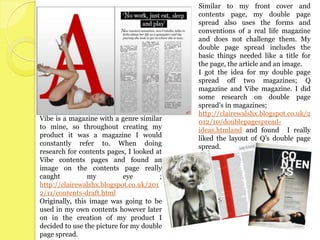
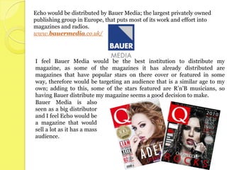
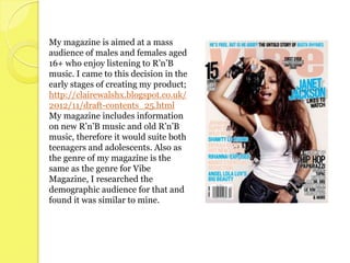
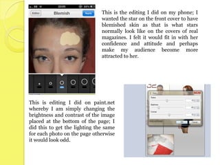
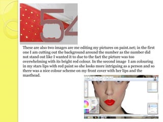
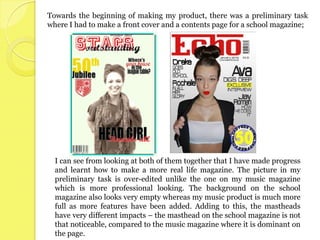
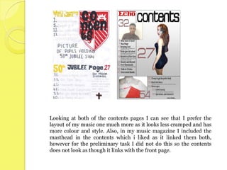
The document discusses the ways in which the author's media product uses real magazine forms and conventions without challenging them. The front cover, contents page, and double page spread all incorporate typical magazine layouts, with influences taken from magazines like Blender, Sugar, Q, and Vibe. Images are used to represent the target R&B audience. Bauer Media would be a suitable distributor given their experience with similar magazines. The intended audience is described as males and females aged 16+ interested in R&B music. Features like images and puffs are used to attract this audience.
2. In what ways does
your media product
use, develop or
challenge the forms
and conventions of
real media products?
3. Towards the start of creating my product, I analysed a magazine in order to
ascertain the basic codes and conventions I needed to involve in my own
work.
http://clairewalshx.blogspot.co.uk/2012/09/magazine-analysis.html
The front cover of my magazine uses
the forms and conventions of a real
product rather than challenge them;
this is shown through the use of direct
mode of address, the masthead and the
features etc. I chose not to challenge
them as I thought it may look less
realistic and also having analysed
magazines with a genre similar to
mine, I found that very few challenged
the conventions.
I got the idea for my front cover off
‘Blender’ magazine;
I liked the way the star was in the middle of the page and
the way she was blocking out part of the masthead. I felt
this made the star look more dominant and made the
magazine seem as though it was popular because not all of
the masthead had to be shown. Most of the features on the
front cover of the ‘Blender’ magazine were around the star;
this is another thing I involved in my own piece.
4. My contents uses the conventions involved in a
magazines contents page; it includes the
magazines masthead to link the front page and
contents together, pictures and features are
included also.
I got the idea for the layout of my magazine off sugar magazine, where there is a main
picture in the right hand corner of the page and features around it; this is also shown in
another contents page I looked at http://clairewalshx.blogspot.co.uk/2012/11/front-
page-contents-and-dps-link-q.html . I liked this layout as I feel it made the contents
look full and exciting, which is what would make my target audience want to read it.
However, as my magazine is an R’n’B magazine I wanted to include something that
made it look like an R’n’B contents page, so I decided to include a picture that had
‘attitude’ in it to keep in line with my genre.
5. Similar to my front cover and
contents page, my double page
spread also uses the forms and
conventions of a real life magazine
and does not challenge them. My
double page spread includes the
basic things needed like a title for
the page, the article and an image.
I got the idea for my double page
spread off two magazines; Q
magazine and Vibe magazine. I did
some research on double page
spread’s in magazines;
http://clairewalshx.blogspot.co.uk/2
Vibe is a magazine with a genre similar 012/10/doublepagespread-
to mine, so throughout creating my ideas.htmland and found I really
product it was a magazine I would liked the layout of Q’s double page
constantly refer to. When doing spread.
research for contents pages, I looked at
Vibe contents pages and found an
image on the contents page really
caught my eye ;
http://clairewalshx.blogspot.co.uk/201
2/11/contents-draft.html
Originally, this image was going to be
used in my own contents however later
on in the creation of my product I
decided to use the picture for my double
page spread.
7. The social group my magazine is aimed at is teenagers to
adolescents of both male and female who enjoy listening to R’n’B
music and perhaps a bit of rap.
This type of social group is represented in my magazine through my
images used. The images I have included of the star ‘Ava Costella’
portray her to be an attractive, confident woman with slight attitude;
representing a stereotypical R’n’B/Rap social group. This could also
be said for my image of the star ‘Jay Roman’; adding to this, the star
is a black afro-caribbean man therefore would represent a
stereotypical ‘Rap’ musician.
The colours used in my magazine may also represent the social group
I am portraying in my product; in the early stages of creating my
product I created a questionnaire and one of my questions was ‘What
colours would you associate with R’n’B’, this is the answer I got -
http://clairewalshx.blogspot.co.uk/2012/11/draft-contents.html
By using the colours I was
told in the answer to my
question shows I am giving
my demographic audience
what they want and it helps
me to make sure the
colours used in my product
are colours that would
relate to R’n’B.
9. Echo would be distributed by Bauer Media; the largest privately owned
publishing group in Europe, that puts most of its work and effort into
magazines and radios.
www.bauermedia.co.uk/
I feel Bauer Media would be the best institution to distribute my
magazine, as some of the magazines it has already distributed are
magazines that have popular stars on there cover or featured in some
way, therefore would be targeting an audience that is a similar age to my
own; adding to this, some of the stars featured are R’n’B musicians, so
having Bauer distribute my magazine seems a good decision to make.
Bauer Media is also
seen as a big distributor
and I feel Echo would be
a magazine that would
sell a lot as it has a mass
audience.
11. My magazine is aimed at a mass
audience of males and females aged
16+ who enjoy listening to R’n’B
music. I came to this decision in the
early stages of creating my product;
http://clairewalshx.blogspot.co.uk/
2012/11/draft-contents_25.html
My magazine includes information
on new R’n’B music and old R’n’B
music, therefore it would suite both
teenagers and adolescents. Also as
the genre of my magazine is the
same as the genre for Vibe
Magazine, I researched the
demographic audience for that and
found it was similar to mine.
13. Images;
The images included in my magazine would have a major influence on how easily my
audience are attracted to my product. On the front page I made sure I had an image that
stood out; I did this by editing things on my picture like my stars lips and her
blemishes; http://clairewalshx.blogspot.co.uk/2012/12/front-cover.html
The pictures included in my contents would not only attract my audience due to
the fact they look nice, but they may also make my
audience feel as though they are being addressed
directly; the main image in my contents is of the
star ‘Ava’ who is slightly turned yet still has direct
mode of address which could perhaps make my
audience feel they are being looked at and almost
grasped in.
PUGS&PUFFS;
I have both a pug and a puff on the front page of
my magazine; my puff being the ‘exclusive
interview’ and my pug being the ‘free downloads’.
Both of these items would make my readers feel as
though they are getting information and stuff for
free, therefore attracting them to the magazine and
perhaps making them want to carry on buying it.
Here is a link showing how I made my pug;
http://clairewalshx.blogspot.co.uk/2013/02/dp
s.html
14. Language;
My magazine entails both formal and informal language. I came to this decision
due to the 6th question on my questionnaire;
http://clairewalshx.blogspot.co.uk/2012/11/draft-contents.html
On my front cover I have alliteration ‘Digs Deep’; although many people would not
notice the alliteration, it still automatically brings my audience in more than it
would if alliteration was not there, due to the fact it helps the sentence to flow more
therefore the language would seem easier for my audience and they may be
attracted to my product further.
Colour Scheme;
I looked at a lot of different colours before
choosing the colours I wanted to use for
my product.
My background colour for my magazine is
a grey colour going from light to dark; this
colour may not attract my audience as it is This is also the same for my double
not very noticeable. However, as my page spread as the big letter and my
background colour is quite subtle, it allows stars lips are both red – drawing my
the other colours I include in my magazine readers in. The yellow used behind the
to stand out; e.g. The red used in the word ‘Exclusive’ on my front cover may
masthead and my stars lips. The colour be seen as a way of addressing my
red connoted to danger which would audience; putting yellow behind it
automatically grab attention, then as you makes it more bold therefore conveying
actually look at the magazine you may be to the audience that I want them to
attracted to the bright red lips of the star. read it
15. What have you
learnt about
technologies
from the process
of constructing
the product?
16. I used Paint.Net for any editing and for the actual construction of my
product.
I found that Paint.Net was great when editing pictures as there was a
variety of editing techniques; adding to that I liked how layers could
be removed from the page for a while whilst you wanted to edit
something by itself.
However there were some difficulties when using paint.net; I felt
that trying to cut around a picture without it having jagged edges was
quite hard even when using effects to alter it. Also the pace of the
program was not the quickest which could sometimes take up time
needed to do something else.
My phone was another technology I used to edit photos; I liked working
with photos on my phone as I was more comfortable with how to use it
exactly and what editing techniques are good etc. However a downfall of
this was the size of the screen and the fact I then had to email myself the
images to then get them on the computer – similar to paint.net it was
rather time consuming. This is the app I used on my phone to edit
photos; https://itunes.apple.com/gb/app/instaeditor-instant-
photo/id528529413?mt=8
17. This is the editing I did on my phone; I
wanted the star on the front cover to have
blemished skin as that is what stars
normally look like on the covers of real
magazines. I felt it would fit in with her
confidence and attitude and perhaps
make my audience become more
attracted to her.
This is editing I did on paint.net
whereby I am simply changing the
brightness and contrast of the image
placed at the bottom of the page; I
did this to get the lighting the same
for each photo on the page otherwise
it would look odd.
18. These are also two images are me editing my pictures on paint.net; in the first
one I am cutting out the background around the number as the number did
not stand out like I wanted it to due to the fact the picture was too
overwhelming with its bright red colour. In the second image I am colouring
in my stars lips with red paint so she looks more intriguing as a person and so
there was a nice colour scheme on my front cover with her lips and the
masthead.
19. Looking back to
your preliminary
task, what do you
feel that you have
learnt in the
progression from
it to the full
product?
20. Towards the beginning of making my product, there was a preliminary task
where I had to make a front cover and a contents page for a school magazine;
I can see from looking at both of them together that I have made progress
and learnt how to make a more real life magazine. The picture in my
preliminary task is over-edited unlike the one on my music magazine
which is more professional looking. The background on the school
magazine also looks very empty whereas my music product is much more
full as more features have been added. Adding to this, the mastheads
have very different impacts – the masthead on the school magazine is not
that noticeable, compared to the music magazine where it is dominant on
the page.
21. Looking at both of the contents pages I can see that I prefer the
layout of my music one much more as it looks less cramped and has
more colour and style. Also, in my music magazine I included the
masthead in the contents which i liked as it linked them both,
however for the preliminary task I did not do this so the contents
does not look as though it links with the front page.
22. Overall, I am happy with my final piece. I feel the research and the time
spent on this product has developed my skills when it comes to producing
magazines. I would say my strongest aspect is my front cover, and my
weakest aspect is my contents page. However, I am pleased with how I
have shown my genre through my work.