
Download to read offline

![Crash
Course:
R
and
BioConductor
2
Appendix
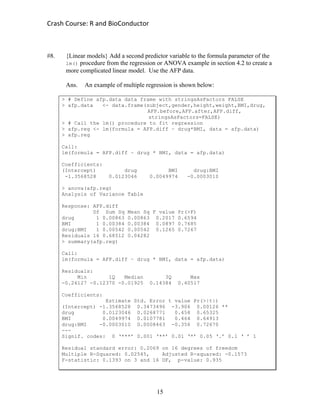
Solutions to Sample Problems for Students
#1. {Fisher’s iris data} Sir Ronald A. Fisher famously used this set of iris flower data
as an example to test his new linear discriminant statistical model. Now, the iris
data set is used as a historical example for new statistical classification models.
A) Search the help menu for the keyword “linear discriminant”, then report
the names of the functions and packages you find.
Ans. > help.search(“linear discriminant”) returns results for the
functions lda() and predict.lda() from the MASS package library.
B) Search the help menus or a search engine for additional classification
models that could be tested with the iris data.
Ans. Any results are OK, but two examples are the knn() function from the
class package library and the randomForest() function from the
randomForest package library.
C) The measurements from the iris data set were made in centimeters, but
suppose a researcher wanted to compare the performance of their classifier
for measurements in both cm and inches. Remember 1 cm = 0.3937 inch
and create a new iris data set with measurements in inches.
Ans. One possible answer is shown below:
> irisINCHES <- data.frame(0.3937*iris[,1:4],iris[,5])
> iris[1:4,]
Sepal.Length Sepal.Width Petal.Length Petal.Width Species
1 5.1 3.5 1.4 0.2 setosa
2 4.9 3.0 1.4 0.2 setosa
3 4.7 3.2 1.3 0.2 setosa
4 4.6 3.1 1.5 0.2 setosa
> irisINCHES[1:4,]
Sepal.Length Sepal.Width Petal.Length Petal.Width iris...5.
1 2.00787 1.37795 0.55118 0.07874 setosa
2 1.92913 1.18110 0.55118 0.07874 setosa
3 1.85039 1.25984 0.51181 0.07874 setosa
4 1.81102 1.22047 0.59055 0.07874 setosa](https://image.slidesharecdn.com/crashcourseinrandbioconductor-appendix-170503181500/85/Appendix-Crash-course-in-R-and-BioConductor-2-320.jpg)
![Crash
Course:
R
and
BioConductor
3
D) Use indexing to verify that the 77th
plant (i.e. row 77) has petal length of
approximately 1.89 inches.
Ans. Two possible answers are shown below:
> iris[77,"Petal.Length"]*0.3937
[1] 1.88976
> irisINCHES[77,3]
[1] 1.88976
#2. {AFP data} Suppose alpha-fetoprotein (AFP) is a potential biomarker for liver
cancer and other cancer types. A researcher might be interested in AFP levels
before and after taking a new drug in one of four concentrations.
A) The example in section 2.7.2 of the manual provided a list of 20 AFP
levels before drug treatment. Use your own methods to enter a new
column of 20 AFP levels after drug treatment, then enter another column
with the difference between the pre- and post-treatment AFP levels
Ans. One possible answer is shown below:
# manually enter Alpha-fetoprotein (AFP) levels for 20 patients
> AFP.after <- AFP.before - 1.2 + 0.2*rnorm(20)
> AFP.diff <- AFP.after - AFP.before
> afp.data <- data.frame(subject,gender,height,weight,BMI,
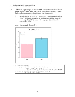
drug,AFP.before,AFP.after,AFP.diff)
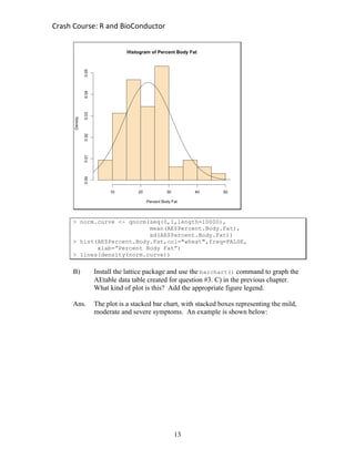
> afp.data
B) Verify the storage mode of the data set afp.data. Verify the storage
mode of the variable drug. Verify the storage mode of the variable
gender. Convert the storage mode of drug to factor.
Ans. One possible answer shown below
> class(afp.data)
[1] "data.frame"
> class(afp.data$drug)
[1] "numeric"
> class(afp.data$gender)
[1] “factor”
> afp.data$drug <- as.factor(afp.data$drug)](https://image.slidesharecdn.com/crashcourseinrandbioconductor-appendix-170503181500/85/Appendix-Crash-course-in-R-and-BioConductor-3-320.jpg)
![Crash
Course:
R
and
BioConductor
4
C) Create a subset of the AFP data that only includes male patients with
BMI > 25.5 or weight > 180 lbs. How many men are included in the
data subset?
Ans. Six male patients are included in the subset. One example is shown:
> afp.subset <- afp.data[afp.data$gender=="male",]
> indx <- afp.subset$BMI > 25.5 | afp.subset$weight > 180
> afp.subset <- afp.subset[indx,]
> afp.subset
subject gender height weight BMI drug ...
2 2 male 69.15696 202.9318 29.82865 5 ...
3 3 male 69.35599 211.0632 30.84607 10 ...
5 5 male 71.44586 241.4526 33.25317 20 ...
7 7 male 68.21618 297.4155 44.93081 5 ...
8 8 male 69.77130 289.2935 41.77731 10 ...
10 10 male 66.95951 178.6660 28.01385 20 ...
D) Sort the entire data subset created in part C) by the BMI variable in an
descending order. What is the row ordering of the sorted data subset?
Save the data subset as a comma separated value (.csv) text file.
Ans. The row order is: 7, 8, 5, 3, 2, 10. A possible solution is below:
> afp.subset <- afp.subset[order(afp.subset$BMI,
decreasing=TRUE),]
> afp.subset
subject gender height weight BMI drug ...
7 7 male 68.21618 297.4155 44.93081 5 ...
8 8 male 69.77130 289.2935 41.77731 10 ...
5 5 male 71.44586 241.4526 33.25317 20 ...
3 3 male 69.35599 211.0632 30.84607 10 ...
2 2 male 69.15696 202.9318 29.82865 5 ...
10 10 male 66.95951 178.6660 28.01385 20 ...
> write.csv(afp.subset,file="~/subset.csv")
#3. {AE data} Doctors, epidemiologists and other researchers look at adverse events
to explore the symptoms and medical conditions affecting patients. A researcher
might choose to look for associations between adverse events and diet.
A) One of the adverse events in the data table is “Malaise”. Recode the AE
data table, such that all entries for “Malaise” read “Discomfort” instead.
Ans. Hint: you need to convert the adverse event variable to a character variable
> AE$Adverse.Event <- as.character(AE$Adverse.Event)
> indx <- AE$Adverse.Event == "Malaise"
> AE$Adverse.Event <- replace(AE$Adverse.Event,indx,"Discomfort")
> AE$Adverse.Event <- as.factor(AE$Adverse.Event)](https://image.slidesharecdn.com/crashcourseinrandbioconductor-appendix-170503181500/85/Appendix-Crash-course-in-R-and-BioConductor-4-320.jpg)
![Crash
Course:
R
and
BioConductor
5
B) Look at the results of your recoded adverse events. How many different
types of adverse events are there? Look through their names. Do you see
any potential problems? Fix any problems that you might find.
Ans. Initially, there are 18 different types of adverse events. There appears to
be a typo; “Mylagia” should be “Myalgia”. After correction, there are 17
different types of adverse events.
> length(levels(AE$Adverse.Event))
[1] 18
> AE$Adverse.Event <- as.character(AE$Adverse.Event)
> indx <- AE$Adverse.Event == "Mylagia"
> AE$Adverse.Event <- replace(AE$Adverse.Event,indx,"Myalgia")
> AE$Adverse.Event <- as.factor(AE$Adverse.Event)
> length(levels(AE$Adverse.Event))
[1] 17
C) Create an adverse event table to examine relationship between different
adverse event symptoms and their severities. Make sure the “Discomfort”
AE shows up in the table, instead of “Malaise”.
Ans. One possible solution is shown:
> attach(AE)
> AEtable <- table(Adverse.Event,Severity)
> AEtable
Severity
Adverse.Event Mild Moderate Severe
Anemia 2 3 1
Arthralgia 2 0 0
Dimpling 1 0 0
Discomfort 1 1 3
Ecchymosis 0 2 1
Elavated CH50 0 0 1
Erythema 0 3 1
Headache 1 5 0
Induration 1 3 0
Leukopenia 1 1 2
Myalgia 2 0 1
Nausea 4 0 1
Nodule 0 1 0
Pain 2 5 0
Papule 0 3 0
Swelling 1 2 1
Tenderness 2 2 1](https://image.slidesharecdn.com/crashcourseinrandbioconductor-appendix-170503181500/85/Appendix-Crash-course-in-R-and-BioConductor-5-320.jpg)
![Crash
Course:
R
and
BioConductor
6
D) Search the help menus for the functions rowSums and colSums. Use these
functions to count up the number of patients with each adverse event and
the number of patients with mild, moderate and severe symptoms.
Ans. An example is shown below
> AEsymptoms <- rowSums(AEtable)
> AEsymptoms
Anemia Arthralgia Dimpling Discomfort ...
6 2 1 5 ...
> AEseverity <- colSums(AEtable)
> AEseverity
Mild Moderate Severe
20 31 13
E) Define a new variable AEmatrix by converting the AE table into a matrix.
Define two new matrix variables: LL = matrix(1,1,17) and RR = c(1,1,1).
Compute the products of LL by AEmatrix; AEmatrix by RR; and LL by
AEmatrix by RR. Do you notice anything?
Ans. The matrix product LL by AEmatrix is equal to the colSums(), AEmatrix
by RR is equal to the rowSums() and LL by AEmatrix by RR is equal to
the sample size n = 64. An example is shown below:
> LL = matrix(1,1,17)
> RR = c(1,1,1)
> LL %*% AEmatrix
Severity
Mild Moderate Severe
[1,] 20 31 13
> AEmatrix %*% RR
Adverse.Event [,1]
Anemia 6
Arthralgia 2
Dimpling 1
Discomfort 5
Ecchymosis 3
Elavated CH50 1
Erythema 4
Headache 6
Induration 4
Leukopenia 4
Myalgia 3
Nausea 5
Nodule 1
Pain 7
Papule 3
Swelling 4
Tenderness 5
> LL %*% AEmatrix %*% RR
[,1]
[1,] 64](https://image.slidesharecdn.com/crashcourseinrandbioconductor-appendix-170503181500/85/Appendix-Crash-course-in-R-and-BioConductor-6-320.jpg)
![Crash
Course:
R
and
BioConductor
7
#4. {Fisher’s iris data} Sir Ronald A. Fisher famously used this set of iris flower data
as an example to test his new linear discriminant statistical model. Now, the iris
data set is used as a historical example for new statistical classification models.
A) Make a boxplot of all four measurements from Fisher’s iris data
Ans. An example is shown below:
> boxplot(iris[,1:4],main="Fisher's Iris Data",ylab="cm",
xlab="measurement",col="wheat")](https://image.slidesharecdn.com/crashcourseinrandbioconductor-appendix-170503181500/85/Appendix-Crash-course-in-R-and-BioConductor-7-320.jpg)
![Crash
Course:
R
and
BioConductor
8
B) Create a multi-panel figure with histograms of all four measurments. Do
you notice anything that could not be seen from the boxplot?
Ans. An example is shown below:
> par(mfrow=c(2,2))
> hist(iris[,1],main="Fisher's Iris Data -- Sepal Length",
ylab="count",xlab="Sepal Length (cm)",col="red")
> hist(iris[,2],main="Fisher's Iris Data -- Sepal Width",
ylab="count",xlab="Sepal Width (cm)",col="yellow")
> hist(iris[,3],main="Fisher's Iris Data -- Petal Length",
ylab="count",xlab="Petal Length (cm)",col="green")
> hist(iris[,4],main="Fisher's Iris Data -- Petal Width",
ylab="count",xlab="Petal Width (cm)",col="blue")
The boxplots didn’t show the bimodal distribution of petal length and
petal width, probably caused by differences among species.](https://image.slidesharecdn.com/crashcourseinrandbioconductor-appendix-170503181500/85/Appendix-Crash-course-in-R-and-BioConductor-8-320.jpg)
![Crash
Course:
R
and
BioConductor
9
C) Create a multi-panel figure with boxplots of all four measurements,
paneled by the three different species. Do you notice any differences
among species?
Ans. An example is shown below:
> par(mfrow=c(1,3))
> boxplot(iris[iris$Species=="setosa",1:4],
main="Fisher's Iris Data -- Setosa",ylab="cm",
xlab="measurement",col="wheat")
> boxplot(iris[iris$Species=="versicolor",1:4],
main="Fisher's Iris Data -- Versicolor",ylab="cm",
xlab="measurement",col="olivedrab")
> boxplot(iris[iris$Species=="virginica",1:4],
main="Fisher's Iris Data -- Virginica",ylab="cm",
xlab="measurement",col="grey")
Yes. There are big differences among the three species.](https://image.slidesharecdn.com/crashcourseinrandbioconductor-appendix-170503181500/85/Appendix-Crash-course-in-R-and-BioConductor-9-320.jpg)
![Crash
Course:
R
and
BioConductor
14
> barchart(AEtable,main="Bar Chart of Adverse Event by Severity",
col=c("red","yellow","blue"))
> legend(x="topright",legend=levels(AE$Severity),
fill=c("red","yellow","blue"))
#7. {Nonparametric statistics} Search the help menus to find the command(s) for a
non-parametric statistical test analogous to the Student’s t-test (e.g. Mann-
Whitney U-test, Wilcoxon rank sum test, ...). Repeat at least one of the Student’s
t-test examples from section 4.1 with this non-parametric test.
Ans. An example is shown below:
> # Define a vector of % body fat data for men from AE data
> bfat.m <- AE[AE$Gender == "Male",6]
> # Define a vector of % body fat data for women from AE data
> bfat.f <- AE[AE$Gender == "Female",6]
> # Compute a two-sided, WIlcoxon Rank Sum test with AE data
> wilcox.test(bfat.m,bfat.f,alternative="two.sided")
Wilcoxon rank sum test with continuity correction
data: bfat.m and bfat.f
W = 553, p-value = 0.5811
alternative hypothesis: true location shift is not equal to 0
Warning message:
In wilcox.test.default(bfat.m, bfat.f, alt. = "two.sided") :
cannot compute exact p-value with ties](https://image.slidesharecdn.com/crashcourseinrandbioconductor-appendix-170503181500/85/Appendix-Crash-course-in-R-and-BioConductor-14-320.jpg)

![Crash
Course:
R
and
BioConductor
17
afp.data <-
data.frame(subject,gender,height,weight,BMI,drug,AFP.before,AFP.a
fter,AFP.diff)
afp.data
attach(afp.data)
############### Run LM regression ########################
afp.reg <- lm(formula = AFP.diff ~ drug*BMI, data = afp.data)
afp.reg
pdf("Regression.pdf")
par(mfrow = c(3,1))
plot(drug,AFP.diff,ylab="difference",main="regression plot")
abline(coef=afp.reg$coefficients[c(1,2)])
plot(BMI,AFP.diff,ylab="difference",main="regression plot")
abline(coef=afp.reg$coefficients[c(1,3)])
plot(afp.reg$fitted.values,afp.reg$residuals,xlab="fitted",ylab="
residual",main="residual plot")
dev.off()
browseURL("Regression.pdf")
############### Convert drug to factor ###################
afp.data$drug <- as.factor(afp.data$drug)
############### Run LM ANOVA #############################
afp.aov <- lm(formula = AFP.diff ~ drug, data = afp.data)
afp.aov
afp.anova <- anova(afp.aov)
afp.summary <- summary(afp.aov)
############## Plot graphs ##############################
library(sciplot)
pdf("ANOVA.pdf")
main = "One-way ANOVA"
ylab = "AFP differences"
xlab = "drug concentrations"
colors = rainbow(5)](https://image.slidesharecdn.com/crashcourseinrandbioconductor-appendix-170503181500/85/Appendix-Crash-course-in-R-and-BioConductor-17-320.jpg)
![Crash
Course:
R
and
BioConductor
18
means = afp.aov$fitted.values[1:5]
names(means) = levels(afp.data$drug)
mp <- barplot(height =
means,main=main,xlab=xlab,ylab=ylab,col=colors,ylim=c(0,-2))
X0 <- X1 <- mp
Y0 <- means - afp.summary$sigma
Y1 <- means + afp.summary$sigma
arrows(X0,Y0,X1,Y1,code=3,angle=90)
dev.off()
browseURL("ANOVA.pdf")
#10. {Function scripts} Create your own script to compute two new types of row
statistic (e.g. standard deviation and interquartile range) for a data frame or
matrix. Be creative, add graphics or a statistical test (e.g. linear regression).
Ans. An example is shown below:
# Define a function to compute row statistics with a for() loop
row.stats.loop <- function(x){
# Initialize vectors
row.sd <- row.IQR <- vector("numeric",length=nrow(x))
# Use a for() loop to compute means and medians for each
row
for(i in 1:nrow(x)){
row.sd[i] <- sd(x[i,])
row.IQR[i] <- IQR(x[i,])}
# Perform a linear regression
row.reg <- lm(formula = row.sd ~ row.IQR)
# Create a list of output
output <- list()
output[["row sd"]] <- row.sd
output[["row IQR"]] <- row.IQR
output[[“lm”]] <- row.reg
output[[“anova”]] <- anova(row.reg)
output[[“summary”]] <- summary(row.reg)
# Call the output list to report final results](https://image.slidesharecdn.com/crashcourseinrandbioconductor-appendix-170503181500/85/Appendix-Crash-course-in-R-and-BioConductor-18-320.jpg)
![Crash
Course:
R
and
BioConductor
19
output}
#11. Download the microarray dataset with the accession number “GDS10” from the
GEO website using the GEOquery package
Ans. The following loads the library, downloads the dataset and converts it to an
ExpressionSet object
library("GEOquery")
gds = getGEO("GDS10")
expset=GDS2eSet(gds, do.log2=TRUE)
A) Convert the data into three data frames, one for gene expression, one for
phenotypes and one for gene annotations
Ans. The following is an example script that will do this. Here we convert gds,
the output from getGEO() to an ExpressionSet object before converting
to the three data frames. We can do this directly from the getGEO() output
too (see the documentation for the GEOquery package on CRAN)
#Extract the expression matrix
X=exprs(expset)
#Extract the phenotypes
pheno.names=varLabels(expset)
> pheno.names
[1] "sample" "tissue" "strain"
"disease.state"
[5] "description"
phenotypes=data.frame(sample=expset$sample, tissue=expset$tissue,
strain=expset$strain, disease.state=expset$disease.state,
description=expset$description)
#Convert each row from factor to character type
for(i in 1:ncol(phenotypes))
phenotypes[,i]=as.character(phenotypes[,i])
#Extract the gene annotations
annot.columns= fvarLabels(expset)
> annot.columns
[1] "ID" "GB_ACC" "SPOT_ID"
annot.obj=featureData(expset)
annot=data.frame(id=annot.obj$ID, genbank.acc=annot.obj$GB_ACC,
spot.id=annot.obj$SPOT_ID)
B) Plot boxplots for each sample in one plot with different colors for each
sample. (Hint: use the stack() function and use a formula in the](https://image.slidesharecdn.com/crashcourseinrandbioconductor-appendix-170503181500/85/Appendix-Crash-course-in-R-and-BioConductor-19-320.jpg)
![Crash
Course:
R
and
BioConductor
20
boxplot() function. A vector of n colors can be obtained by using
rainbow(n))
Ans. The following is probably the easiest way to do this. You should look up
the help page for stack() to better understand how this works.
nsamp=ncol(X)
boxcol=rainbow(nsamp)
X.stack=stack(as.data.frame(X))
#Draw the boxplot
#Option las=3 makes the x axis labels vertical
boxplot(values~ind, data=X.stack, col=boxcol, las=3)
C) Compare the samples from the thymus and spleen for diabetic-resistant
mice and find the 10 most significant genes using the adjusted p-value.
Ans. This is a relatively lengthy script, but the explanation for each step can be
found here and in the manual.
#Find the samples that come from diabetic resistant mice
that
#originate from thymus
qt=which(phenotypes$disease.state=="diabetic-resistant" &
phenotypes$tissue=="thymus")
Xt=X[,qt]](https://image.slidesharecdn.com/crashcourseinrandbioconductor-appendix-170503181500/85/Appendix-Crash-course-in-R-and-BioConductor-20-320.jpg)
![Crash
Course:
R
and
BioConductor
21
#Find the samples that come from diabetic resistant mice
that
#originate from spleen
qs=which(phenotypes$disease.state=="diabetic-resistant" &
phenotypes$tissue=="spleen")
Xs=X[,qs]
#Compute the p-value and fold change for all genes
p.value=c()
fold.change=c()
for(i in 1:nrow(Xs))
{
#Find number of non-missing samples
n1=sum(!is.na(Xs[i,]))
n2=sum(!is.na(Xt[i,]))
if(n1 >= 2 & n2 >=2)
{
tt.res=t.test(Xs[i,], Xt[i,])
p.value[i]=tt.res$p.value
#The log fold change is calculated by the
#difference in means between the two classes
fold.change[i]=tt.res$estimate[2]-
tt.res$estimate[1]
}else
{
p.value[i]=NA
fold.change[i]=NA
}
}
#Compute adjusted p-values
adj.p.value=p.adjust(p.value)
#Find the smallest 10 p-values
qo=order(adj.p.value)
sig.genes=qo[1:10]
> adj.p.value[sig.genes]
[1] 1.859514e-12 7.615543e-12 1.852015e-11
[4] 3.337001e-11 4.210158e-11 5.769339e-11
[7] 7.557780e-11 9.369532e-11 1.125353e-10
[10] 1.331595e-10
D) Write the gene annotations, p-value, adjusted p-value and expressions in
all the samples for these 10 genes to an CSV file.
Ans. An example is shown below
d=data.frame(annot[sig.genes,], p.value=
p.value[sig.genes], adj.p.value=adj.p.value[sig.genes],
X[sig.genes,])
write.csv(d, file="report.csv", row.names=FALSE)](https://image.slidesharecdn.com/crashcourseinrandbioconductor-appendix-170503181500/85/Appendix-Crash-course-in-R-and-BioConductor-21-320.jpg)
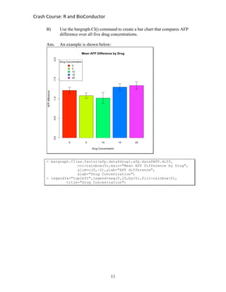
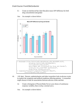
This document provides solutions to sample problems using various datasets. It demonstrates how to use R functions like bargraph.CI(), boxplot(), hist(), and table() to analyze and visualize data. For example, it shows how to create bar charts comparing mean BMI by gender and mean AFP difference by drug concentration using the bargraph.CI() function from the sciplot package. It also provides solutions for manipulating datasets, such as recoding a variable or sorting and subsetting data.


![[DSC Europe 25] Gordana Milutinovic Dumbelovic - From Insight to Oversight: A...](https://cdn.slidesharecdn.com/ss_thumbnails/t7dkjsfxqwwzceropjv4-gordana-milutinovicdumbelovic-from-insight-to-oversight-ai-driven-power-bi-moni-260119121559-9e0bf11b-thumbnail.jpg?width=640&height=640&fit=bounds)


![[DSC Europe 25] Tali Fulman - Guild Meetings, Then What? Building Data Commun...](https://cdn.slidesharecdn.com/ss_thumbnails/fgohhi33rwmhqdowdj5k-tali-fulman-guild-meetings-then-what-building-data-communities-that-actually-ch-260120105855-528492c3-thumbnail.jpg?width=640&height=640&fit=bounds)


