Download to read offline
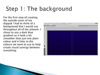
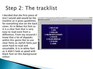
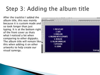
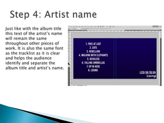
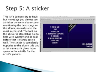
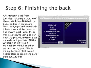
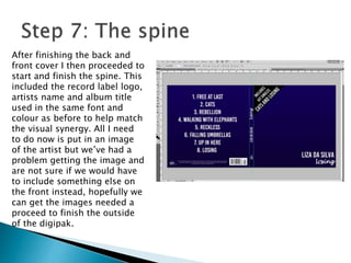

The document discusses the process of designing the cover of a digipak album. It describes selecting a dark blue gradient background and adding the tracklist in a clear font. It then details adding the album title and artist name in the same locations and font on all artwork pages to maintain visual cohesion. Additionally, it mentions including information like the record label and barcode on the back cover, and continuing the consistent design on the spine. The overall summary is that the document outlines the steps taken to create a coordinated design across the front, back and spine of a digipak album package.


