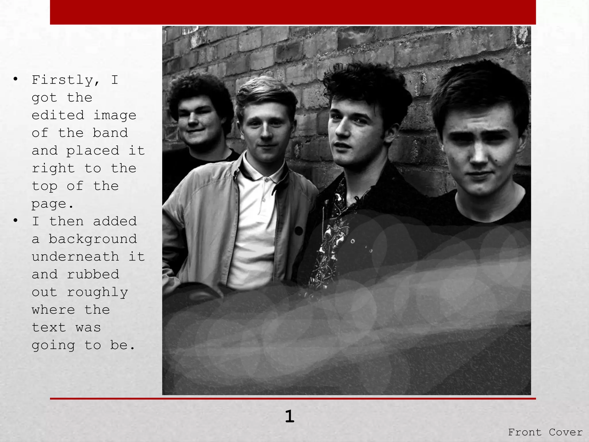
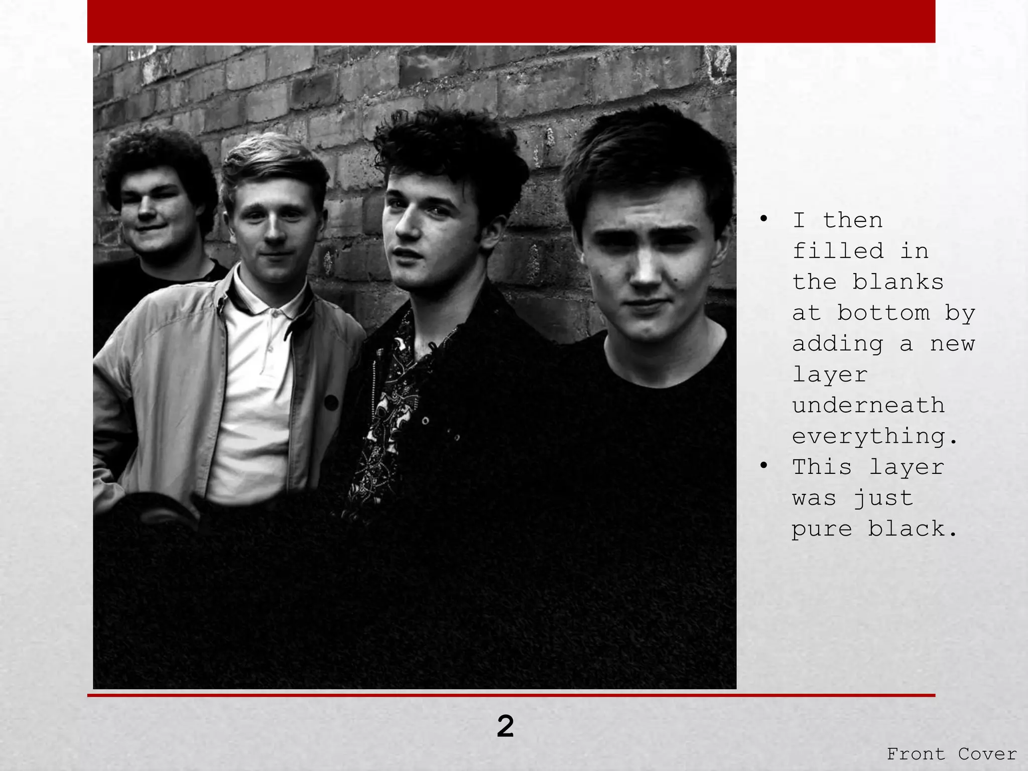
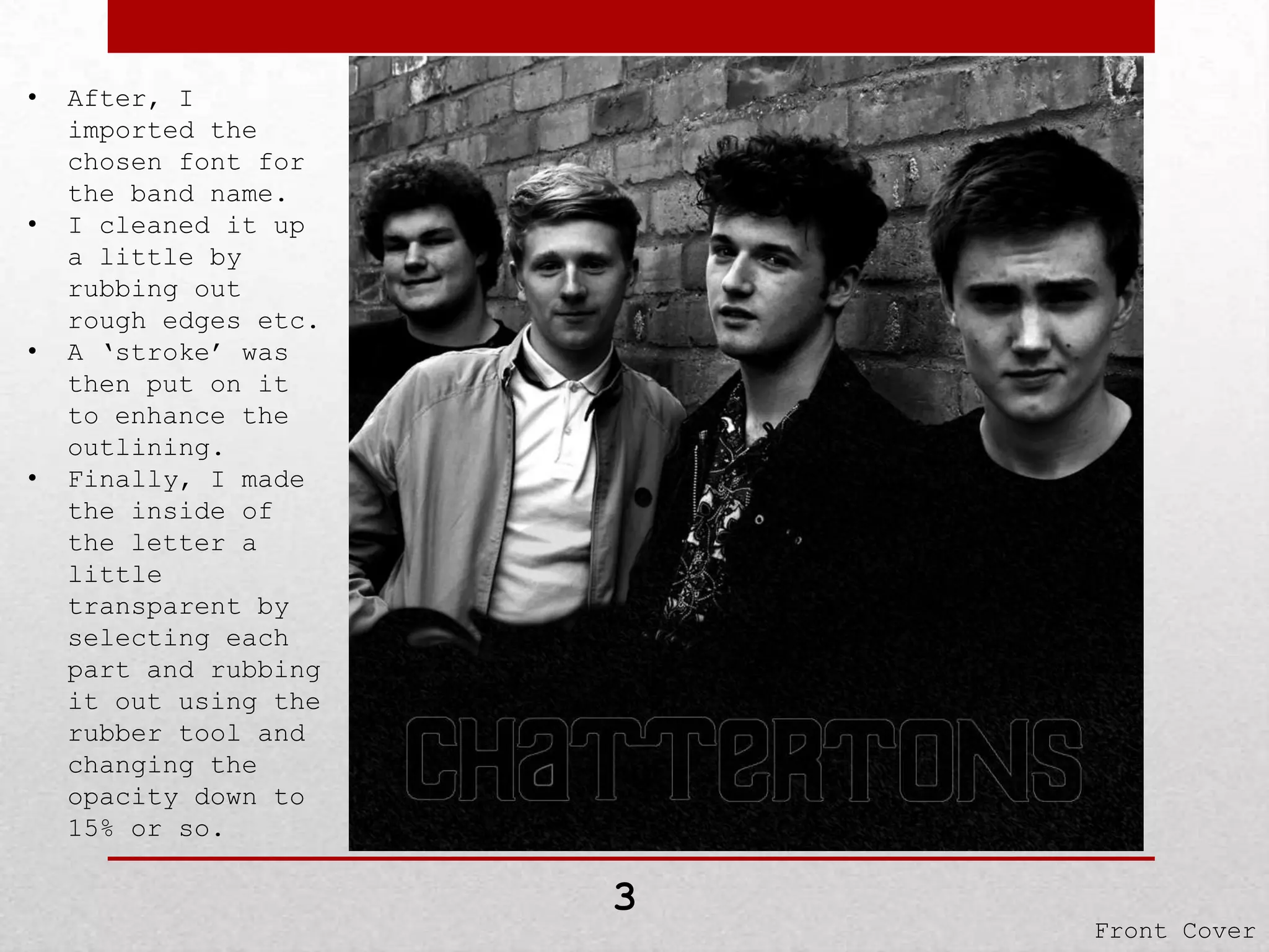
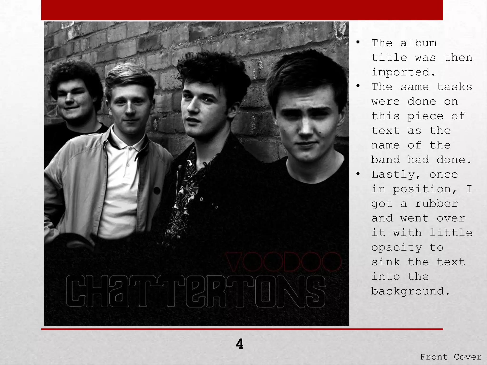
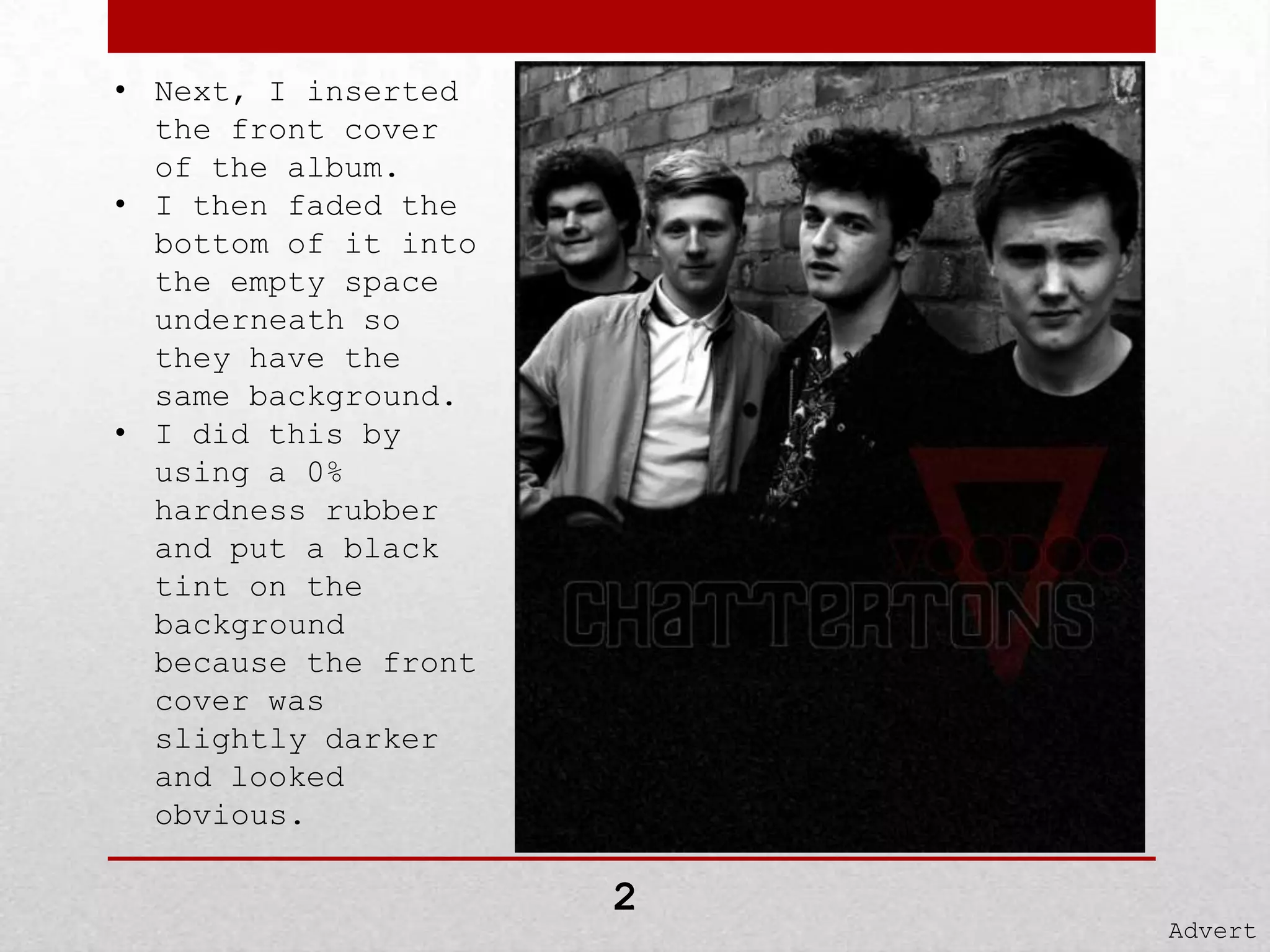
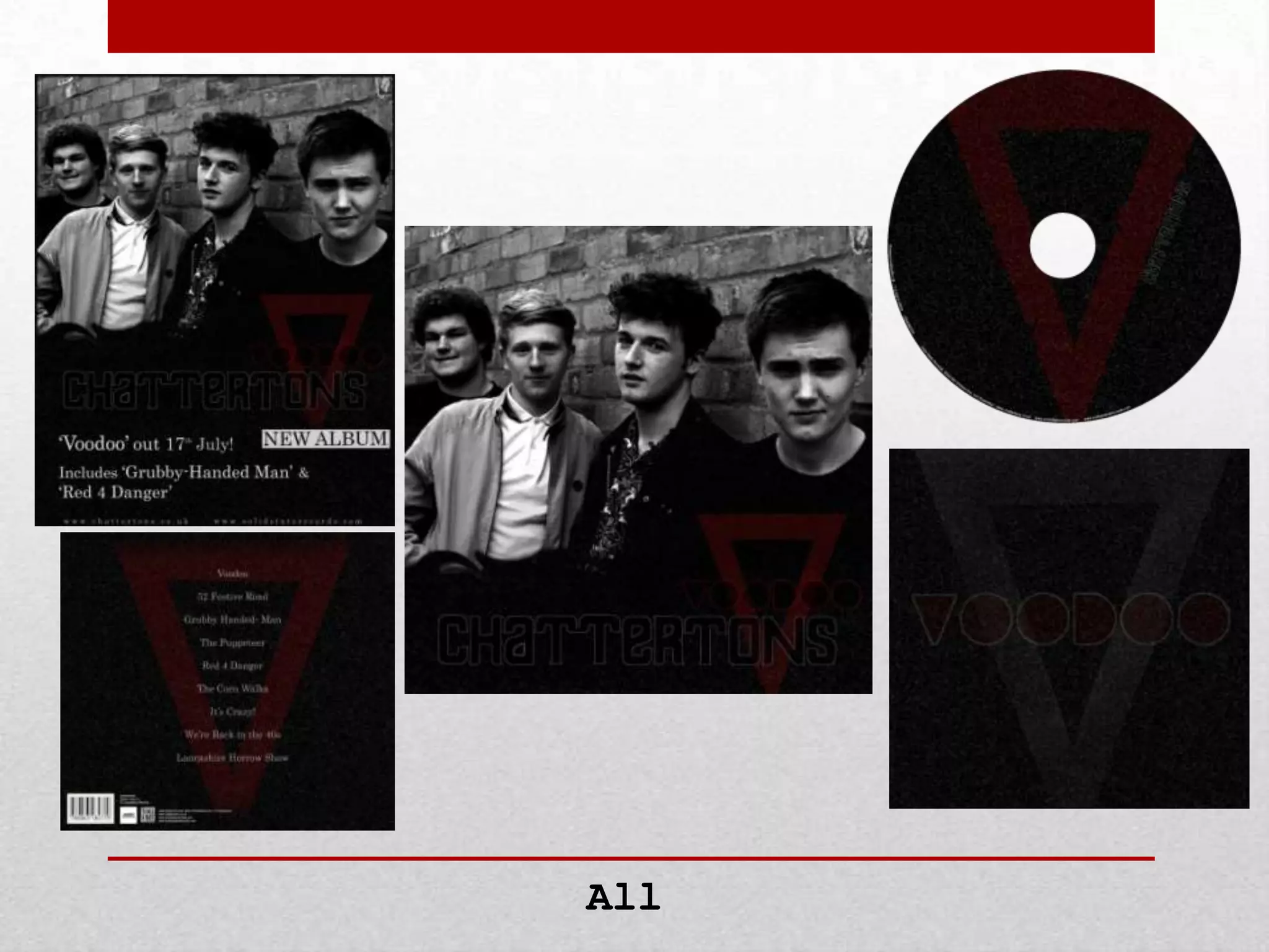
The Creation of my
Digipak
I will be explaining how I created
my front cover, back
cover, CD, Insert and Advert.
• Firstly, I
got the
edited image
of the band
and placed it
right to the
top of the
page.
• I then added
a background
underneath it
and rubbed
out roughly
where the
text was
going to be.

1

Front Cover
• I then
filled in
the blanks
at bottom by
adding a new
layer
underneath
everything.
• This layer
was just
pure black.

2

Front Cover
•

•

•

•

After, I
imported the
chosen font for
the band name.
I cleaned it up
a little by
rubbing out
rough edges etc.
A ‘stroke’ was
then put on it
to enhance the
outlining.
Finally, I made
the inside of
the letter a
little
transparent by
selecting each
part and rubbing
it out using the
rubber tool and
changing the
opacity down to
15% or so.

3

Front Cover
• The album
title was then
imported.
• The same tasks
were done on
this piece of
text as the
name of the
band had done.
• Lastly, once
in position, I
got a rubber
and went over
it with little
opacity to
sink the text
into the
background.

4

Front Cover
• The final
item to be
added was the
‘V’ that
stood for
‘Voodoo’.
• When cut
out, shaped
and coloured;
I went over
the image
with a rubber
(with a small
percentage of
opacity).

5

Front Cover
• The last thing
to do was to
merge all the
layers
together and
edit the
levels to make
the image as a
whole
brighter.
• I just boosted
the brighter
colours and
brought the
mids back.

Final

Front Cover
• The first task
for the back
cover was to
create a
backing.
• I dotted some
white bits in
a black
square, then
put many
effects on it
until it came
to this.

1

Back Cover
• I then got the
same
background, pu
t in front of
the other and
remove the
inside and
faded out the
sides.
• After, I
inserted the
‘V’ from the
front cover
and enlarged
to fit screen.

2

Back Cover
• The next task
to type in the
song titles.
• I used the
‘Century’
font.
• I aligned it
to the centre
then finally
put a low
percentage
opacity rubber
over the top
of it.

3

Back Cover
• The final task
was to add a
barcode, the
logos of the
record labels
and extra
information.

Final

Back Cover
• Firstly, I got
the same
background as
used in the
front and back
cover and
fitted it into
the screen. It
then got a CD
template and
reversed the
two (template
and
background).
• When
reversed, I
simply
highlighted
the edges and
cut them off.

1

CD
• Next, I
inserted the
same ‘V’ shape
used in the
front and back
cover and
slotted it over
the CD.
• I did the same
process of
reversing the
two items and
cutting of the
edges.
• Finally, I
liquefied the
‘V’ shape to
have cuts
inside of it
etc.

2

CD
• The band name
was then
imported.
• I grabbed it
from the front
cover as it
was the same.
• I positioned
it to run
along the side
of the ‘V’
shape.
• But because it
was a smaller
version, I had
to edit the
stroke outline
to make it
thinner.

3

CD
• Lastly, to
make it look
professional,
I included the
information
around the
side of the
CD.
• Each word was
typed up
individually
and warped to
the curve
perfectly
around the CD.

Final

CD
• I simply, to
start the
insert
off, got the
same
background
image as the
other parts of
my Digipak.

1

Insert
• I then
inserted the
‘V’ shape that
the other
parts of the
Digipak
included.
• I changed the
colour to grey
and re-rubbed
out with a low
percentage
opacity.
• I then turned
up the
percentage and
rubbed out so
parts of the
‘V’ ( e.g.
bottom corner)

2

Insert
• To finish, I
added the
album title
from the front
cover.
• I changed the
stroke outline
to grey and
gave the
insides a red
tint.
• Finally, I put
a low
percentage
opacity rubber
over the top
of it.

Final

Insert
• The first task
to create the
Advert for the
Digipak, I
needed a
background.
• I used the same
background as
used in all the
other aspects
of the Digipak.
• I extended it a
little because
the advert is a
little larger
than a
conventional
album.

1

Advert
• Next, I inserted
the front cover
of the album.
• I then faded the
bottom of it into
the empty space
underneath so
they have the
same background.
• I did this by
using a 0%
hardness rubber
and put a black
tint on the
background
because the front
cover was
slightly darker
and looked
obvious.

2

Advert
•
•

•

•

•

Final

To finish, I typed in
the essential text.
For the ‘New Album’ –
I created a white box
and typed of the top
of it.
For the rest of the
text, I enlarged the
key parts such as
‘Voodoo’ and the sons
names.
I then merged all the
text into one layer
and put a low
percentage opacity
rubber over the top.
I tried warping the
text and tilting
it, but it didn’t look
right and went for
dead straight.

Advert
All

The Creation of My Digipak

  • 1.
    The Creation ofmy Digipak I will be explaining how I created my front cover, back cover, CD, Insert and Advert.
  • 2.
    • Firstly, I gotthe edited image of the band and placed it right to the top of the page. • I then added a background underneath it and rubbed out roughly where the text was going to be. 1 Front Cover
  • 3.
    • I then filledin the blanks at bottom by adding a new layer underneath everything. • This layer was just pure black. 2 Front Cover
  • 4.
    • • • • After, I imported the chosenfont for the band name. I cleaned it up a little by rubbing out rough edges etc. A ‘stroke’ was then put on it to enhance the outlining. Finally, I made the inside of the letter a little transparent by selecting each part and rubbing it out using the rubber tool and changing the opacity down to 15% or so. 3 Front Cover
  • 5.
    • The album titlewas then imported. • The same tasks were done on this piece of text as the name of the band had done. • Lastly, once in position, I got a rubber and went over it with little opacity to sink the text into the background. 4 Front Cover
  • 6.
    • The final itemto be added was the ‘V’ that stood for ‘Voodoo’. • When cut out, shaped and coloured; I went over the image with a rubber (with a small percentage of opacity). 5 Front Cover
  • 7.
    • The lastthing to do was to merge all the layers together and edit the levels to make the image as a whole brighter. • I just boosted the brighter colours and brought the mids back. Final Front Cover
  • 8.
    • The firsttask for the back cover was to create a backing. • I dotted some white bits in a black square, then put many effects on it until it came to this. 1 Back Cover
  • 9.
    • I thengot the same background, pu t in front of the other and remove the inside and faded out the sides. • After, I inserted the ‘V’ from the front cover and enlarged to fit screen. 2 Back Cover
  • 10.
    • The nexttask to type in the song titles. • I used the ‘Century’ font. • I aligned it to the centre then finally put a low percentage opacity rubber over the top of it. 3 Back Cover
  • 11.
    • The finaltask was to add a barcode, the logos of the record labels and extra information. Final Back Cover
  • 12.
    • Firstly, Igot the same background as used in the front and back cover and fitted it into the screen. It then got a CD template and reversed the two (template and background). • When reversed, I simply highlighted the edges and cut them off. 1 CD
  • 13.
    • Next, I insertedthe same ‘V’ shape used in the front and back cover and slotted it over the CD. • I did the same process of reversing the two items and cutting of the edges. • Finally, I liquefied the ‘V’ shape to have cuts inside of it etc. 2 CD
  • 14.
    • The bandname was then imported. • I grabbed it from the front cover as it was the same. • I positioned it to run along the side of the ‘V’ shape. • But because it was a smaller version, I had to edit the stroke outline to make it thinner. 3 CD
  • 15.
    • Lastly, to makeit look professional, I included the information around the side of the CD. • Each word was typed up individually and warped to the curve perfectly around the CD. Final CD
  • 16.
    • I simply,to start the insert off, got the same background image as the other parts of my Digipak. 1 Insert
  • 17.
    • I then insertedthe ‘V’ shape that the other parts of the Digipak included. • I changed the colour to grey and re-rubbed out with a low percentage opacity. • I then turned up the percentage and rubbed out so parts of the ‘V’ ( e.g. bottom corner) 2 Insert
  • 18.
    • To finish,I added the album title from the front cover. • I changed the stroke outline to grey and gave the insides a red tint. • Finally, I put a low percentage opacity rubber over the top of it. Final Insert
  • 19.
    • The firsttask to create the Advert for the Digipak, I needed a background. • I used the same background as used in all the other aspects of the Digipak. • I extended it a little because the advert is a little larger than a conventional album. 1 Advert
  • 20.
    • Next, Iinserted the front cover of the album. • I then faded the bottom of it into the empty space underneath so they have the same background. • I did this by using a 0% hardness rubber and put a black tint on the background because the front cover was slightly darker and looked obvious. 2 Advert
  • 21.
    • • • • • Final To finish, Ityped in the essential text. For the ‘New Album’ – I created a white box and typed of the top of it. For the rest of the text, I enlarged the key parts such as ‘Voodoo’ and the sons names. I then merged all the text into one layer and put a low percentage opacity rubber over the top. I tried warping the text and tilting it, but it didn’t look right and went for dead straight. Advert
  • 22.