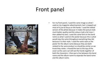
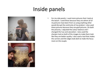
How I made my digipack
Front panel
• For my front panel, I used the same image as what I
used on my magazine advertisement, but I cropped out
most of it just to focus on the hands. I used the edited
version of the photo because it makes the picture look
much better quality and the colours look a lot nicer. I
then added my text. I used the same font on the band
name as what I used on the poster because this is what
would stay the same throughout everything they did
because it is their style. I used the same style as the
poster for the album name because they are both
related to the same product so should be similar so we
know they relate. I moved the text to the top of the
cover so the users can still see the hands together of
both the characters. I then put a line between the band
name and the album name to separate the band name
and the album name.
Back panel
• For my back panel, I used one of the other pictures that
I took when I was at the beach. I then edited the
picture by cropping it and then I changed the colour
and contrast settings to give it a dark vintage look. I
also used the sharpen tool to make it look a bit higher
quality. I then used the same text style and layout for
the band name and album name. I then placed my
tracks for the album underneath in 3 lines of three. I
originally tried doing it as a list of 7, but I thought this
left too much empty space and it didn’t look very good,
so I changed it to be like a paragraph. I used a font for
this that was downloaded from a website called
dafont.com and I used it because it looks really nice and
it is very similar to the other text but it is in-between
them both. I then added a barcode in to the bottom
corner because that is on all CD back covers because
they are often bought ins stores that use them. I also
added the record label logo because that is another
convention that is often on albums.
Inside panels
• For my side panels, I used more pictures that I took at
the beach. I used these because they are where all of
my pictures have been from so using anything other
would disrupt the continuity of my product. I also used
these pictures because they are goof pictures. On both
the pictures, I adjusted the colour balance and I
changed the hue and saturation. I also used the
sharpen tool on both of the images to make them look
like they are better quality. I also used a tool that makes
the corners and the edges look dark to make the focus
more on the couple.

How I made my digipack

  • 1.
    How I mademy digipack
  • 2.
    Front panel • Formy front panel, I used the same image as what I used on my magazine advertisement, but I cropped out most of it just to focus on the hands. I used the edited version of the photo because it makes the picture look much better quality and the colours look a lot nicer. I then added my text. I used the same font on the band name as what I used on the poster because this is what would stay the same throughout everything they did because it is their style. I used the same style as the poster for the album name because they are both related to the same product so should be similar so we know they relate. I moved the text to the top of the cover so the users can still see the hands together of both the characters. I then put a line between the band name and the album name to separate the band name and the album name.
  • 3.
    Back panel • Formy back panel, I used one of the other pictures that I took when I was at the beach. I then edited the picture by cropping it and then I changed the colour and contrast settings to give it a dark vintage look. I also used the sharpen tool to make it look a bit higher quality. I then used the same text style and layout for the band name and album name. I then placed my tracks for the album underneath in 3 lines of three. I originally tried doing it as a list of 7, but I thought this left too much empty space and it didn’t look very good, so I changed it to be like a paragraph. I used a font for this that was downloaded from a website called dafont.com and I used it because it looks really nice and it is very similar to the other text but it is in-between them both. I then added a barcode in to the bottom corner because that is on all CD back covers because they are often bought ins stores that use them. I also added the record label logo because that is another convention that is often on albums.
  • 4.
    Inside panels • Formy side panels, I used more pictures that I took at the beach. I used these because they are where all of my pictures have been from so using anything other would disrupt the continuity of my product. I also used these pictures because they are goof pictures. On both the pictures, I adjusted the colour balance and I changed the hue and saturation. I also used the sharpen tool on both of the images to make them look like they are better quality. I also used a tool that makes the corners and the edges look dark to make the focus more on the couple.