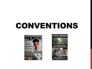
2. ANCILLARY PRODUCTS
MAGAZINE
The magazine uses a black and grey colour
scheme to connote a mysterious atmosphere
which is conventional of the Thriller film genre.
This is effective as it matches in with the colour
schemes of the characters clothing and does
not have too much color so that the font can
still be clearly seen.
Additionally, it is conventional to
use the font of the film on the front
cover of the magazine. This can be
seen in the Fatal Silence font on
the front page which matches that
in the film trailer. Therefore, directly
linking the two products.
The use of offers is conventional as it attract
the audiences attention.
Through using the barcode and the price listing
at the top it ensures that the magazine looks
professional and conventional.
The magazine uses the
conventional route of the eye
layout, this allows the audience to
quickly scan through the key details
of the page. The Thriller film reel at
the bottom can be part of the house
style of the magazine and can
alternate in line with the genre of
the magazine.
The mise-en-scene of the image is effective for
the magazine front cover. The blue clothing
matches in with the colour scheme and is
effective when edited to look darker to match
the background. Additionally, the prop of the
cross is effective as it represents religion which
is stereotypical seen as a sign of calmness.
This can lead the audience to see question
what will disturb this. Religious signs are also
conventional of the Thriller film genre as they
also represent community values.
A mid-shot image is conventional for the
magazine as it allows the audience to see the
main detail of the character.
The sans-serif font for the title of
the magazine is conventional as it
allows the audience to clearly
identify the magazine from a
distance allowing them to directly
associate it to the film genre format.
The conventional use of a single
statement image.
It is conventional for the background of the magazine to
not be within the location of the film trailer. In order to link
the two products, I used a creepy foggy background to
match the Thriller film genre and faded a tree image in the
background, so that it does not overshadow the image of
the person. However, it still links to the woodland location.
Bold typography in order for the text
to stand-out.
3. ANCILLARY PRODUCTS
POSTER
It is conventional to incorporate the use of captions in
the film poster which directly link to the film. This can
be seen in the phrase ‘In A Normal Wood, Normal
Things Should Happen’. This is written in a
typography that has a woodland effect and therefore
directly matches in with the location of the filming.
To match the magazine and the conventions of the
Thriller film genre I have used a dark colour scheme.
This is effective as it connotes a mysterious
atmosphere. This is a key theme within the Thriller
film genre as that are unaware of what is going to
happen next.
In order to match the conventional house-style of
poster layouts I have added the credits at the bottom
of the film in a narrow sans-serif font. This is smaller
that the main text so that it does not distract the
audience away from the main features of the poster.
Although, it does provide them with information such
as the actors and the production companies which I
appealed to in the Pitch for the Production planning.
The use of split poster is conventional for
the Thriller film genre. It also lets the
audience see the images of both the main
characters and the location which this film
is set within. This is effective with the text
breaking up the two images as it directly
connects the two images.
I edited all of the images which I used in
the poster in order for them to have a
darker and more mysterious appearance.
When editing these I ensured that the
image of the antagonist was darker than
the protagonist as this was conventional
of the genre as it shows the contrast
between the two character.
I think that the shh symbol is a key
effective point on the poster. It is
conventional to directly link the
image to the title and this can be
seen as the film is titled ‘Fatal
Silence’. In addition, in order for
the poster to directly link to the
film, I inserted a still of the image
that I took into the final cut of the
film trailer.
4. FILM TRAILER
The film trailer is effective as it
provides a snapshot of the film’s
narrative without revealing too
much of the plot. This is a
conventional point of the film
trailer form as it does not reveal
too much of the plot but provides
the audience with the key detail
of the plot, such as the
characters and the location. This
is done in order for the audience
to still have the want to go and
see the film which is being
advertised.
The mise-en-scene of the
film trailer is conventional
as the antagonist is dressed
in dark clothing, which
connotes a dark and
mysterious atmosphere.
This is contrasted with the
colours used in the scene
with the protagonist which
at the beginning depict a
bright and open
environment.
However, when confronted
by the antagonist the
lighting changes to low-key
throughout.
The scenes within the trailer are edited so that there is no
scene which is too long and takes up a large amount of
the trailer. This is conventional of film trailers as it only
aims to provide a snapshot of the action.
The trailer uses a
variety of camera
angles and shot types.
This is conventional of
film trailers as it gives
the audience a variety
of scenes and shots
from the film.
At the end f the trailer
I inserted a still of the
antagonist raising his
hand into the shh
symbol, this is
conventional as it links
the action directly to
the title of the film.
Additionally, it ensures
that the trailer and the
poster directly match
each other.
The use of the approval raring gives the trailer an profession look. Through following
this with the production company information ensure that this is a conventional
representation. It is also a conventional point to add the music over the New Line
Cinema Title as this joins the sections of the trailer together.
The music within the
trailer is conventional
of the Thriller film
genre as it creates a
mysterious
atmosphere which
capture the audiences
attention.
5. Convention
Effect
Typography
The typography ensures that the information which the three
sections of the productions are trying to provide the audience with.
When combined with the backgrounds and images these are clear
and easily capture the audiences attention. Additionally, the use of
the Wild Wood Font is effective as it directly links the production
work to the location which it was set within.
Image
The mid-shot used in the magazine allows the audience to identify
the key features of the main character such as the elements of the
mise-en-scene. The images used within the poster is also effective
as they link directly to the Title and Location of the Film.
Camera-Work
The film trailer uses a variety of shot types and camera-angles.
This mean that the audience have a variety of scene in which to
provide a snapshot of the action which will occur within the film
without revealing too much information. Additionally, through
varying the camera work it keeps the trailer interesting and keeps
the audience focused.
Sound
The sound used throughout the trailer is effective as it connotes
mystery and suspense. This keeps the audiences attention fixed
on the action of the film.
Editing
The use of editing ensure that there is continuity between the shot
without proving the audience with too greater amount of
information.
Lighting
The conventional use of low-key lighting creates a dark and
somber atmosphere when there is a confrontation between the
protagonist and antagonist
Mise-en-scene
The use of dark clothing matches in with the colour schemes of the
products and creates a mysterious atmosphere. Whereas, the
props of the newspaper and missing poster create suspense within
the trailer.
6. COMPARISON
Masthead
is placed
clearly at
the top
Offers to
attract the
audiences
attention
Stills from
other films
placed at the
bottom of the
magazines
front page.
These draw
in the
audiences
attention as
they can
relate to the
films that are
of a similar
genre to the
cover story.
Use of a misty
background in
order to
provide a
mysterious
appearance
Mid-shot of
the
protagonist
Clear
typography
Typography is the
same used in the
other elements of
the production
works
Use of the
route of
the eye
layout
Within the magazine layout the route of the eye style is used within both, this is designed in order to capture the audiences attention. In the I am
legend poster there is the use of a misty and foggy background in order to give the effect of a mysterious environment. This links the narrative of the
two Thriller films together as both are about not knowing what cold happen next to the characters involved in the plot. The typography in both of the
magazine are also both very clear as it allows the audience to easily identify the key elements of the film production.
7. Varied camera
work and poses
from the
characters
Contrast
between high
and low key
lighting
Characters are placed to
the side of the screen
rather than directly in the
middle
Split Images
- Contrasting
Mise-enscene
directly
linking to the
settings that
the
characters
are placed
within
Genre
related
typography
Production
Credits at the
bottom of the
screen
Bold
Typography
Edited
photos to add
to the effect
Medium close-up shots
so that the audience
can see the key details
of the characters.
The film poster both show key points of comparison specifically through the split screen layout. In the Atonement poster the
split is used to show the contrast between the man in a war environment and the women who is in a tranquil natural
landscape. This can be compared to the poster which I have created as there is a contrast between the calm woodland
environment and the image in which the antagonist takes over the majority of the space. Therefore, showing that the
normality of the environment has been disturbed.
Additionally, the credits at the bottom of the screen gives both of the posters a professional look and provides the audience
with key information about who is included in the production. The text between the images is written in a clear font and also
draws in the audiences attention.