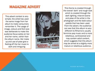
The magazine advert uses a simple dark image of the artist taking up most of the space to promote her album. Bold colors and lighting create a dark, rough theme suggesting a more rebellious album different than her usual pop music. Only the artist's name is in bold text while the album title is smaller to focus attention solely on her and make the album memorable.
2. This album front cover shows the
emotions of the artist and this We get a feeling of
makes the target audience aware relation with the artist
of the genre of the cd. This is a
close up shot of his face, he is as he looks directly into
looking directly at the audience the camera to take the
which is almost like he is forcing
the audience to buy the album shot for his album
cover.
In this CD cover they The title of the album
have added an effect and artist name is
of water, this implies simple and in the left
the mood he is feeling hand corner. This is
throughout his music, ideal because the water
his facial expression effect is kind of fussy
also enhances this and a loud title wouldn’t
idea. be as clear.
NICODA MITCHELL
3. The artist looks away whilst taking this
DOUBLE PAGE INSERT shot, we get the indication that he is in his
own world, the mini film strip at the
bottom of this inserts shows different
moods, this can also infer the continuous
moods through out his lyrics and music.
The colours used during the cd cover and
In the double pages double page spreads are all dark and
insert we get to see simple colours such as black, black
what the artist is trying normally connote sadness or unfairness
to sell us. He gives us this automatically comes to mind when
an idea of what his looking at the album covers this sets a
music videos will look frame of mind of what the songs will be
like. We get the like.
emotion of the artist
this sets our
expectations of the cd.
The body language of this shot is
not as bold as the other shots taken
for the album. We have text in the
left hand page this is custom in cd
album pages. It involves all the
producers and artists
NICODA MITCHELL
4. BACK COVER
This is the cd back cover. It It has the conventional
displays the link with the promotional methods, of
front cover with a continuous the artist and directors,
flow of the ‘water drops’. The producers, a bar code
logo of PPP signifies with the along with the price of the
title of the cd album Passion
CD. Lighting effect has
Pain Pleasure. We can
embed this into our own Cd
been used to make the
cover idea so that customers logo stand out. It gives an
are able to distinguish our idea of fire and rain mixed
Cd album from any others. together.
NICODA MITCHELL
5. This is a side view shot of the
artist Usher. The CD cover
reflects the artist (Usher) as the
photo of him portrays his
masculinity. He doesn’t look at
There has been added
the audience this gives a feeling effects of art, placed on
of seriousness. The title of the artist this flows into
Ushers album is not clear, but the background of the
by assuming the artist has done
this on purpose in a way it artists album.
makes the audience gain full
concentration and eagerness to
know what the album name is.
NICODA MITCHELL
6. BACK COVER Looking at both the front and cover it
shows a consistent look, colours are
similar along with the album art.
The background of the Cd cover
flows into the Cd back cover, this
shows the continuous house style
throughout the Cd packaging. The
song titles are clear in contrast
with the album title. A lot of
album back covers are like this,
with the song titles made bold but
plain. Along with the record name
and if added, any features made
on the track.
NICODA MITCHELL
7. A modest pose is used,
this connotes that his
This cd front cover is simple
music is humble, for
and clear he looks straight at
his target audience which example a rap artist
makes it seem as if he is would use a more
forcing the target audience ‘thuggish’ or ‘rowdy’
to buy his album, which pose where as this
allows us to feel his humble pose relates to
emotions, just by the the music he is selling.
interaction the artist is
His name and album
feeding. Steadiness of the
same colours are used from title is rich, and not too
the background of the artist fancy, a fancy loud title
to the title of the cd album would hinder the
right up until the back cover audience from seeing
the album name.
NICODA MITCHELL
8. BACK COVER
The image again is
Whereas the front modest but
cover font is simple instead he is
and clear, the back looking away from
cover, when the camera, his
declaring the track smart but casual
names is more dressing relates to
fussy and hard to the music he is
read. But the trying to sell and
placement of the correspondingly
track names are matches with the
clearly put. font used during
the course of the
album cover.
NICODA MITCHELL
9. They have made the album title the main
attraction on this advert and the artists name
‘Chris brown’ in a smaller font this is to promote it
and make the consumers focus on the album
cover rather than the artist.
This magazine advert is of Chris
brown selling his music album. The
album fortune was advertised in 2
ways through a commercial and a
advert. The dub stepped filled
commercial shows a little boy
running through an abandoned area
to release one of the cubes that
unlocks Chris Brown and his album.
The extraordinary album title
is shown nonstop through these
types of advertisement, this shows
that the main focus should be on the
album name
This music advert highly links to the
album, a consistent use of colour
and positioning
NICODA MITCHELL
10. With a logo present the audience
is able to identify who the artist is
instantly, with Jay-z being a well
known artist there is no need for
The subject is right in the him to be in the advert to
middle of the advert and take promote himself, which also
sup majority of the advert backs up the reason why his
space, this image contains name is not too bold
many different objects which
implies that the album is crazy
and full of different types of At the bottom of the advert we see
song types. The title of the the logo of the record label, this
song is plain and at the top of shows they are also advertising the
the magazine advert it also record label of Jay-z. This is
includes the album logo. definitely not a typical rap album
cover fonts vary based on the
importance of the information on
the advert
NICODA MITCHELL
11. This theme is created through
the overall ‘dark’ and rough look
which is created through the
This advert context is very dark lighting, mise-en-scene
simple, the artist has used and pose of the artist in the
the same image from her photograph and the bold colour
album to make consumers palette that has been used.
remember it. The usage of From the advert, the audience
image, colours and font size can see that this album is very
was deliberate to make the different to Rihanna’s usually
audience focus solely on her feminine pop music and is more
and her name, rather than rebellious, controversial and
the album name. Her make may contain adult content,
up and use of pose give a which suggests that this album
feeling off the her music is may be aimed at a slightly more
dark and intriguing mature or rebellious audience.
NICODA MITCHELL