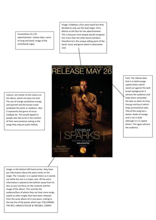
Image: Coldplays a four piece band but they
                                                            decided to only use the lead singer, Chris
                                                            Martin as the face for the advertisement.
             Conventions of a CD                            This is because most people would recognise
             advertisement: release date, name              him more than the other band members
             of song and band, image of the                 therefore he’s the unique selling point of the
             artist/band, logos.                            band, music and genre which is alternative
                                                            rock.


                                                                                                             Font: The release date
                                                                                                             font is in bold orange
                                                                                                             capital letters which
                                                                                                             stand out against the dark
                                                                                                             brown background. It
Colours: are similar to the colours on                                                                       attracts the audience and
the album, which are basic but dull.                                                                         helps them remember
The use of orange symbolises energy                                                                          the date so when its time,
and warmth and the brown could                                                                               they go and buy it which
symbolise the earth or outdoors. Also                                                                        helps promotional sales.
it represents the genre of music                                                                             Title of the song has a
Coldplay do. This would appeal to                                                                            darker shade of orange
people who like to be in the comfort                                                                         and is not in bold
of their own presence seeing as the                                                                          although it is in capital
songs they sing are quite mellow.                                                                            letters. This again attracts
                                                                                                             the audience.


Image: in the bottom left hand corner, they have
put information about the extra tracks on the
single. The ‘includes’ is in capital letters so it stands
out while the rest is in lower case. All the extra
information is placed at the bottom away from his
face so you can focus on the contents and the
image of the album. This reminds the
audience/fans of where they can hear more songs,
aswell as other singles that have been released
from the same album all in one place. Linking to
the top line of the poster which says ‘FOLLOWING
THE NO.1 SINGLES YELLOE & TROUBLE, COMES’
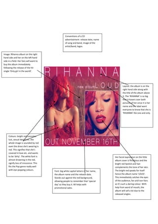
Conventions of a CD
                                                    advertisement: release date, name
                                                    of song and band, image of the
                                                    artist/band, logos.


Image: Rihanna album on the right
hand side and her on the left hand
side in a field. Her fans will want to
buy the album immediately
following the release of the hit
single ‘Only girl in the world’.


                                                                                                Layout: the album is on the
                                                                                                right hand side along with
                                                                                                the title of the album above
                                                                                                it. The ‘RIHANNA’ is so big
                                                                                                that it hovers over both
                                                                                                pictures of her since it is her
                                                                                                name and the label want
                                                                                                everyone to know that she is
                                                                                                ‘RIHANNA’ the one and only.


     Colours: bright red connotes
     lust, sexual desire etc. the
     whole image is sounded by red
     even the dress she’s wearing is
     red. This signifies that she’s
     covered in love etc. and wants
     to be ‘dirty’. The white font is                                                   Her facial expression on the little
     almost drowning in the red,                                                        album cover is flirtatious and the
     signify loss of innocence. This                                                    bright red lipstick and hair
     fits the Pop genre really well                                                     complements the tone of her skin.
     with eye-popping colours.                                                          The bright red speaks for itself
                                         Font: big white capital letters of her name,
                                         the album name and the release date.           hence the album name ‘LOUD’.
                                         Stands out against the red background,         This immediately catches the eyes
                                         allowing people to remember that ‘special      of the audience, fan and non-fans
                                         day’ so they buy it. All helps with            as it’s such a daring colour. With
                                         promotional sales.                             help from word of mouth, the
                                                                                        album will sell a lot due to the
                                                                                        released singles.

Digipak adverts

  • 1.
    Image: Coldplays afour piece band but they decided to only use the lead singer, Chris Martin as the face for the advertisement. Conventions of a CD This is because most people would recognise advertisement: release date, name him more than the other band members of song and band, image of the therefore he’s the unique selling point of the artist/band, logos. band, music and genre which is alternative rock. Font: The release date font is in bold orange capital letters which stand out against the dark brown background. It Colours: are similar to the colours on attracts the audience and the album, which are basic but dull. helps them remember The use of orange symbolises energy the date so when its time, and warmth and the brown could they go and buy it which symbolise the earth or outdoors. Also helps promotional sales. it represents the genre of music Title of the song has a Coldplay do. This would appeal to darker shade of orange people who like to be in the comfort and is not in bold of their own presence seeing as the although it is in capital songs they sing are quite mellow. letters. This again attracts the audience. Image: in the bottom left hand corner, they have put information about the extra tracks on the single. The ‘includes’ is in capital letters so it stands out while the rest is in lower case. All the extra information is placed at the bottom away from his face so you can focus on the contents and the image of the album. This reminds the audience/fans of where they can hear more songs, aswell as other singles that have been released from the same album all in one place. Linking to the top line of the poster which says ‘FOLLOWING THE NO.1 SINGLES YELLOE & TROUBLE, COMES’
  • 2.
    Conventions of aCD advertisement: release date, name of song and band, image of the artist/band, logos. Image: Rihanna album on the right hand side and her on the left hand side in a field. Her fans will want to buy the album immediately following the release of the hit single ‘Only girl in the world’. Layout: the album is on the right hand side along with the title of the album above it. The ‘RIHANNA’ is so big that it hovers over both pictures of her since it is her name and the label want everyone to know that she is ‘RIHANNA’ the one and only. Colours: bright red connotes lust, sexual desire etc. the whole image is sounded by red even the dress she’s wearing is red. This signifies that she’s covered in love etc. and wants to be ‘dirty’. The white font is Her facial expression on the little almost drowning in the red, album cover is flirtatious and the signify loss of innocence. This bright red lipstick and hair fits the Pop genre really well complements the tone of her skin. with eye-popping colours. The bright red speaks for itself Font: big white capital letters of her name, the album name and the release date. hence the album name ‘LOUD’. Stands out against the red background, This immediately catches the eyes allowing people to remember that ‘special of the audience, fan and non-fans day’ so they buy it. All helps with as it’s such a daring colour. With promotional sales. help from word of mouth, the album will sell a lot due to the released singles.