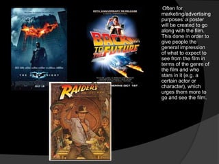
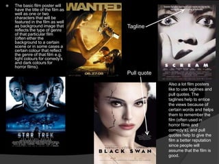
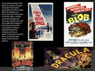
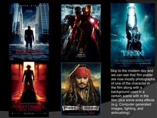
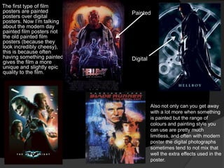
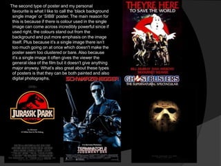
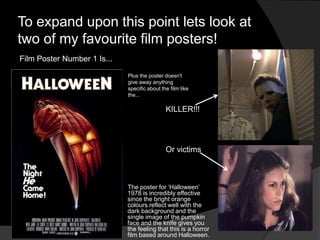
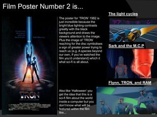
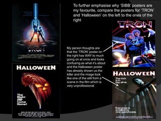
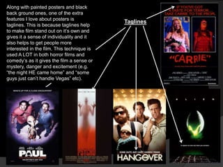
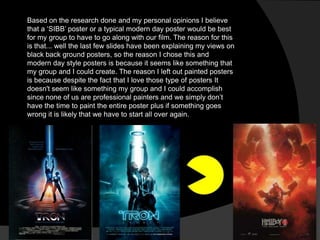
By Lewis Howard
Often for
marketing/advertising
purposes‟ a poster
will be created to go
along with the film.
This done in order to
give people the
general impression
of what to expect to
see from the film in
terms of the genre of
the film and who
stars in it (e.g. a
certain actor or
character), which
urges them more to
go and see the film.
   The basic film poster will
    have the title of the film as
    well as one or two
    characters that will be
    featured in the film as well
    as background image that        Tagline
    reflects the type of genre
    of that particular film
    (often ether the
    background to a certain
    scene or in some cases a
    certain colour that reflect
    the genre of that film e.g.
    light colours for comedy‟s
    and dark colours for
    horror films).
                                    Pull quote
                                                 Also a lot film posters
                                                 like to use taglines and
                                                 pull quotes. The
                                                 taglines help to entice
                                                 the views because of
                                                 certain words and helps
                                                 them to remember the
                                                 film (often used in
                                                 horror films and
                                                 comedy‟s), and pull
                                                 quotes help to give the
                                                 film a better reputation
                                                 since people will
                                                 assume that the film is
                                                 good.
When theatrical films first
became popular the type
of posters that would
accompany the film would
often be painted and
show the main characters
in the film with a simple
coloured background.
This was mainly to do with
the limited technology of
that time period since
computers as well as
digital/professional
cameras and so on
weren‟t around during that
time, so painting was
pretty much the only
options.
Skip to the modern day and
we can see that film poster
are now mostly photographs
of one of the character in
the film along with a
background used in a
certain scene with in the
film, plus some extra effects
(e.g. Computer generated
images, lighting, and
airbrushing)
   After looking at and analysing various
    film posters there are two specific type
    of posters and a certain feature of film
    posters that entices me the most to see
    the film since they look very strong and
    often make me incredibly interested in
    seeing the film.
The first type of film
posters are painted        Painted
posters over digital
posters. Now I‟m talking
about the modern day
painted film posters not
the old painted film
posters (because they
look incredibly cheesy),
this is because often
having something painted   Digital
gives the film a more
unique and slightly epic
quality to the film.


                                     Also not only can you get away
                                     with a lot more when something
                                     is painted but the range of
                                     colours and painting style you
                                     can use are pretty much
                                     limitless, and often with modern
                                     poster the digital photographs
                                     sometimes tend to not mix that
                                     well the extra effects used in the
                                     poster.
The second type of poster and my personal
 favourite is what I like to call the „black background
 single image‟ or „SIBB‟ poster. The main reason for
 this is because if there is colour used in the single
 image can come across incredibly powerful since if
 used right, the colours stand out from the
 background and put more emphasis on the image
 itself. Plus because it‟s a single image there isn‟t
 too much going on at once which doesn't make the
 poster seem too clustered or bare. Also because
 it‟s a single image it often gives the viewer the
 general idea of the film but it doesn't give anything
 major anyway. What‟s also great about these types
 of posters is that they can be both painted and also
 digital photographs.
To expand upon this point lets look at
two of my favourite film posters!
Film Poster Number 1 Is...

                             Plus the poster doesn't
                             give away anything
                             specific about the film like
                             the...

                                              KILLER!!!


                                              Or victims


                             The poster for „Halloween‟
                             1978 is incredibly effective
                             since the bright orange
                             colours reflect well with the
                             dark background and the
                             single image of the pumpkin
                             face and the knife gives you
                             the feeling that this is a horror
                             film based around Halloween.
Film Poster Number 2 is...
                                                      The light cycles
                  The poster for „TRON‟ 1982 is
                  just incredible because the
                  bright blue lighting contrasts
                  greatly with the black
                  background and draws the
                  viewers attention to the image.
                  Plus the image of „TRON‟
                  reaching for the disc symbolises
                  a sign of greater power trying to   Sark and the M.C.P
                  reach us (e.g. A species beyond
                  our own, if you‟ve watched the
                  film you‟d understand) which it
                  what sci-fi is all about.


                                                      Flynn, TRON, and RAM
                  Also like „Halloween‟ you
                  get the idea that this is a
                  sci-fi film about the world
                  inside a computer but you
                  don‟t know what will be
                  featured within the film
                  like...
To further emphasise why „SIBB‟ posters are
    my favourite, compare the posters for „TRON‟
    and „Halloween‟ on the left to the ones of the
    right


My person thoughts are
that the „TRON‟ poster on
the right has WAY to much
going on at once and looks
confusing as what it‟s about
and the Halloween poster
has already shown us the
killer and the image look
like one of the still from a
scene in the film which is
very unprofessional
Along with painted posters and black
back ground ones, one of the extra
features I love about posters is
                                            Taglines
taglines. This is because taglines help
to make film stand out on it‟s own and
gives it a sense of individuality and it
also helps to get people more
interested in the film. This technique is
used A LOT in both horror films and
comedy‟s as it gives the film a sense or
mystery, danger and excitement (e.g.
“the night HE came home” and “some
guys just can‟t handle Vegas” etc).
Based on the research done and my personal opinions I believe
that a „SIBB‟ poster or a typical modern day poster would be best
for my group to have to go along with our film. The reason for this
is that... well the last few slides have been explaining my views on
black back ground posters, so the reason I chose this and
modern day style posters is because it seems like something that
my group and I could create. The reason I left out painted posters
is because despite the fact that I love those type of posters It
doesn't seem like something my group and I could accomplish
since none of us are professional painters and we simply don‟t
have the time to paint the entire poster plus if something goes
wrong it is likely that we have to start all over again.
Thanks for watching 

Film poster study and analysis

  • 1.
  • 2.
    Often for marketing/advertising purposes‟ aposter will be created to go along with the film. This done in order to give people the general impression of what to expect to see from the film in terms of the genre of the film and who stars in it (e.g. a certain actor or character), which urges them more to go and see the film.
  • 3.
    The basic film poster will have the title of the film as well as one or two characters that will be featured in the film as well as background image that Tagline reflects the type of genre of that particular film (often ether the background to a certain scene or in some cases a certain colour that reflect the genre of that film e.g. light colours for comedy‟s and dark colours for horror films). Pull quote Also a lot film posters like to use taglines and pull quotes. The taglines help to entice the views because of certain words and helps them to remember the film (often used in horror films and comedy‟s), and pull quotes help to give the film a better reputation since people will assume that the film is good.
  • 4.
    When theatrical filmsfirst became popular the type of posters that would accompany the film would often be painted and show the main characters in the film with a simple coloured background. This was mainly to do with the limited technology of that time period since computers as well as digital/professional cameras and so on weren‟t around during that time, so painting was pretty much the only options.
  • 5.
    Skip to themodern day and we can see that film poster are now mostly photographs of one of the character in the film along with a background used in a certain scene with in the film, plus some extra effects (e.g. Computer generated images, lighting, and airbrushing)
  • 6.
    After looking at and analysing various film posters there are two specific type of posters and a certain feature of film posters that entices me the most to see the film since they look very strong and often make me incredibly interested in seeing the film.
  • 7.
    The first typeof film posters are painted Painted posters over digital posters. Now I‟m talking about the modern day painted film posters not the old painted film posters (because they look incredibly cheesy), this is because often having something painted Digital gives the film a more unique and slightly epic quality to the film. Also not only can you get away with a lot more when something is painted but the range of colours and painting style you can use are pretty much limitless, and often with modern poster the digital photographs sometimes tend to not mix that well the extra effects used in the poster.
  • 8.
    The second typeof poster and my personal favourite is what I like to call the „black background single image‟ or „SIBB‟ poster. The main reason for this is because if there is colour used in the single image can come across incredibly powerful since if used right, the colours stand out from the background and put more emphasis on the image itself. Plus because it‟s a single image there isn‟t too much going on at once which doesn't make the poster seem too clustered or bare. Also because it‟s a single image it often gives the viewer the general idea of the film but it doesn't give anything major anyway. What‟s also great about these types of posters is that they can be both painted and also digital photographs.
  • 9.
    To expand uponthis point lets look at two of my favourite film posters! Film Poster Number 1 Is... Plus the poster doesn't give away anything specific about the film like the... KILLER!!! Or victims The poster for „Halloween‟ 1978 is incredibly effective since the bright orange colours reflect well with the dark background and the single image of the pumpkin face and the knife gives you the feeling that this is a horror film based around Halloween.
  • 10.
    Film Poster Number2 is... The light cycles The poster for „TRON‟ 1982 is just incredible because the bright blue lighting contrasts greatly with the black background and draws the viewers attention to the image. Plus the image of „TRON‟ reaching for the disc symbolises a sign of greater power trying to Sark and the M.C.P reach us (e.g. A species beyond our own, if you‟ve watched the film you‟d understand) which it what sci-fi is all about. Flynn, TRON, and RAM Also like „Halloween‟ you get the idea that this is a sci-fi film about the world inside a computer but you don‟t know what will be featured within the film like...
  • 11.
    To further emphasisewhy „SIBB‟ posters are my favourite, compare the posters for „TRON‟ and „Halloween‟ on the left to the ones of the right My person thoughts are that the „TRON‟ poster on the right has WAY to much going on at once and looks confusing as what it‟s about and the Halloween poster has already shown us the killer and the image look like one of the still from a scene in the film which is very unprofessional
  • 12.
    Along with paintedposters and black back ground ones, one of the extra features I love about posters is Taglines taglines. This is because taglines help to make film stand out on it‟s own and gives it a sense of individuality and it also helps to get people more interested in the film. This technique is used A LOT in both horror films and comedy‟s as it gives the film a sense or mystery, danger and excitement (e.g. “the night HE came home” and “some guys just can‟t handle Vegas” etc).
  • 13.
    Based on theresearch done and my personal opinions I believe that a „SIBB‟ poster or a typical modern day poster would be best for my group to have to go along with our film. The reason for this is that... well the last few slides have been explaining my views on black back ground posters, so the reason I chose this and modern day style posters is because it seems like something that my group and I could create. The reason I left out painted posters is because despite the fact that I love those type of posters It doesn't seem like something my group and I could accomplish since none of us are professional painters and we simply don‟t have the time to paint the entire poster plus if something goes wrong it is likely that we have to start all over again.
  • 14.