
Recommended
More Related Content
What's hot
What's hot (19)
Similar to Rihanna's Loud Digpak
Similar to Rihanna's Loud Digpak (20)
Recently uploaded
Recently uploaded (20)
Rihanna's Loud Digpak
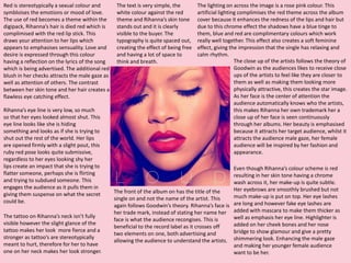
- 1. Red is stereotypically a sexual colour and symbloises the emotions or mood of love. The use of red becomes a theme within the digipack, Rihanna’s hair is died red which is complimised with the red lip stick. This draws your attention to her lips which appears to emphasises sensuality. Love and desire is expressed through this colour having a reflection on the lyrics of the song which is being advertised. The additional red blush in her checks attracts the male gaze as well as attention of others. The contrast between her skin tone and her hair creates a flawless eye catching effect. The close up of the artists follows the theory of Goodwin as the audiences likes to receive close ups of the artists to feel like they are closer to them as well as making them looking more physically attractive, this creates the star image. As her face is the center of attention the audience automatically knows who the artists, this makes Rihanna her own trademark her a close up of her face is seen continuously through her albums. Her beauty is emphasised because it attracts her target audience, whilst it attracts the audience male gaze, her female audience will be inspired by her fashion and appearance. The text is very simple, the white colour against the red theme and Rihanna’s skin tone stands out and it is clearly visible to the buyer. The typography is quite spaced out, creating the effect of being free and having a lot of space to think and breath. The lighting on across the image is a rose pink colour. This artificial lighting complimises the red theme across the album cover because it enhances the redness of the lips and hair but due to this chrome effect the shadows have a blue tinge to them, blue and red are complimentary colours which work really well together. This effect also creates a soft feminine effect, giving the impression that the single has relaxing and calm rhythm. The front of the album on has the title of the single on and not the name of the artist. This again follows Goodwin’s theory. Rihanna’s face is her trade mark, instead of stating her name her face is what the audience recongises. This is beneficial to the record label as it crosses off two elements on one, both advertising and allowing the audience to understand the artists. Rihanna’s eye line is very low, so much so that her eyes looked almost shut. This eye line looks like she is hiding something and looks as if she is trying to shut out the rest of the world. Her lips are opened firmly with a slight pout, this ruby red pose looks quite submissive, regardless to her eyes looking shy her lips create an impact that she is trying to flatter someone, perhaps she is flirting and trying to subdued someone. This engages the audience as it pulls them in giving them suspense on what the secret could be. Even though Rihanna’s colour scheme is red resulting in her skin tone having a chrome wash across it, her make-up is quite subtle. Her eyebrows are smoothly brushed but not much make-up is put on top. Her eye lashes are long and however fake eye lashes are added with mascara to make them thicker as well as emphasis her eye line. Highlighter is added on her cheek bones and her nose bridge to show glamour and give a pretty shimmering look. Enhancing the male gaze and making her younger female audience want to be her. The tattoo on Rihanna’s neck isn’t fully visible however the slight glance of the tattoo makes her look more fierce and a stronger as tattoo’s are stereotypically meant to hurt, therefore for her to have one on her neck makes her look stronger.
- 2. The colour scheme of red follows within the digipak. The CD is pink, despite this being a slightly lighter colour it still falls within the red colour family. The dark pinks and white allow the words and logos to stand out as well as blend in with the colour scheme. The typography is the same on the CD disc as well as the front cover. This is to keep the continuous theme throughout the digipak. The image on the disc is a rose. The rose could represent love and passion. Also roses are a symbolic present given to those who you love. With roses being pink in the image and not red will link with the theme without washing the whole product in red. The inside of the digipak is of Rihanna lying in a bed of roses therefore giving a linking element for the cd and images to match. On the rose image there are water droplets of several petals. The water droplets could represent tears of her as she has made a mistake, however because we are going with the theme that she has emotional shot him down then the water droplets could be his tears, as if he is crying over the rose he was going to give to her. The text on the repeats the title, however unlike the front cover the artists name Is added. You can’t see Rihanna’s face therefore to continuously advertise the artist and make sure her audience knows that the single is by her. On the CD there are 3 logo’s. This is to advertise the companies which have come together to help create this single. Here you have these logo’s again in a hot pink colour, regardless to the original colour of the logo. The 3 logos are Def Jam which is Rihanna’s record label; the disc company to represent and acknowledge the audience that it is a CD disc. To emphesis what these logo’s are below is the logo’s titles. Round the rim of the disc are titles of Rihanna’s other singles, such as Man down, California and Only Girl in the World, this to advertise to the audience other songs she has created as well as promote them. For example if they like this singe then they might look at other singles she has created, or if they have already heard of the other singles and liked them you might already know it is going to be something you’ll like to listen to.
- 3. The focus point of the centre of this digipak is image. Again the trade mark of Rihanna’s body features are using to fill the space. Despite not being able to see her full body completion she has her more sexualised objects on show which attracts the male gaze as well as making her look very beautiful. A mid- shot is used of Rihanna’s body to capture her face and her breast which are quite a strong image at this stage. As pointed out before the theme of red is used throughout, obviously her hair colour is red which is compromised with her red lipstick, which is also an re-enactment of the front cover. The red continues to symbolise love and affection. The inside cover also has connection to the image on the disk. As before mentioned the disk is an image of a rose, here you see Rihanna lying on a bed of roses. Roses are stereotypically symbolise love and usual mean a male giving them to a female. Here lying in a whole bed of them can create the message that she get roses all the time for either the same or a numerous amount of boys. This emphasise her easy use of her looks. In her hand she hold’s a punch of additional red roses. 12 roses are the cute gesture used across the world to represent love. As the audience you can only see 10 roses however where the image cuts off it could suggest that the other are on the cut off point of the page. This shows she is loved or she is giving the roses to the audience so could juxtapose the meaning and Rihanna could be showing her love to her audience and/or fans. The dress Rihanna is wearing is of a pale pink, the same pale pink as the CD itself. Due to the positioning of the CD the dress and CD have to be of similar colour to make the CD a little bit less obvious. The CD slot is on the dress therefore if the dress is the similar colour the CD would blend and not stand out to much. The dress has a natural flow to it, this juxtaposes the title of the single ‘loud’. ‘Loud’ is quite a harsh word quite is aggressive which is complete opposite to the dress, both colour and textures are subtle which creates different messages and meanings to the song which would lead to the audience listening to the lyrics more. Rihanna’s body figure is very sleek. The use of make-up (highlighter) helps increase the skinnies. The make-up is added to the jaw line and the title in her head helps emphases the sharpness of it, it’s also added to the collar bone to look skinnier. Also a slight highlight is added to the boob, the additional make-up draws attention to these key parts, allowing her target audience to want these body parts and attract the male girls. The idea of the ‘perfect’ body is massive, especially in todays society therefore, with Rihanna having this ‘perfect’ figure, it gives hope to her target audience. Rihanna’s pose I would say looks a little bit like ‘Sleeping Beauty’. This is a fairy tale story creating the idea that her song is of the fantasy idea of romance and has the fairy tale dream to it. The majority of songs especially in R’n’B have the common theme of love and sex, with the other hints from both the images and colour, a strong idea is made that this single is about love and sex.
- 4. The pink theme is used again within the back cover therefore as a whole the digipak has a pink theme. A long shot is used think this image, this means the whole digipak as a whole range of angles of the artist. Again the image is only of Rihanna emphasising that she is the trademark image for herself. Even though she is sat down a long angle is still applied as you can see her whole image. This gives the digipak length and depth. As so did the front cover in this image Rihanna has her head down, we never see a full image of her eyes therefore creating a mystery on why this is the case. The looking down shows the shyness and insecurity of the character within the single. Despite being confident and flattering in the middle picture she seems to be keeping a secret and keeping herself away from everyone. Maybe despite having all these admirers she still hasn’t found the right one which makes her upset. As this an item which is to be sold the barcode is on the bottom right. I know that the digipak needs to have a barcode however this looks really out of place and stands out to much. I suppose if you work at a checkout it’ll be easier to find and scan the barcode but it doesn’t fit in with the theme. Maybe the barcode could have been pink to fit in, however this could effect the scanning process. The writing on the back isn’t very bold, it looks as if it is in the same font as the title on the front. The context of the writing are a list of different artists she has worked with. After looking into research these artists are all under the same record label, concluding for this to be a advertisement campaign for the record label, suggesting if the audience liked Rihanna single then there’s a high chance that they’ll like the other artists as well. The writing of the artists are in pink to keep with the theme and like the CD is the main focus of righting therefore for it to be in colour makes it more interesting and stand out. Below the pink writing of the artists are the logos and in the small print the details of the record label used for Rihanna. This is important to advertise the record label because it creates a higher profile for the record label. The writing is in white because it’s not as obvious as the pink writing and blends slightly in with the background, I feel that the writing is slightly faded. This writing makes the back cover look busy and despite being a pink washed colour is has character. Round her neck is a ball pattern scarf/ necklace. This is a fashion accessory and could become a fashion icon for the target audience. The scarf is a weird design which you don’t see therefore making her style more retro and unique. Her netted dress again is unique and pretty, with the holes on the outfit it makes her look like she is showing a lot of flesh. Even though she is quite exposed her body language is very timid.