Question Two:

How effective is the combination of your main products and
                       ancillary texts?
Reflects how a product's name, is perceived by                   A successful brand has a consistent sense of ‘brand
                  the audience                                    identity’ throughout the media so it has the same
                                                                  reputation


        A USP. What makes your
        brand stand better than
        competition?
                                                                Creating a brand for your product enables it to stand from
                                                                competition


As a brand develops it’s own identity; so does brand loyalty.
This is when consumers choose to only purchase your product
based on the brand and how it is presented
                                                                           Not the same as a product.. the face and
                                                                           recognition of the product


                                        What is a brand?
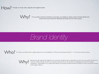
How?   Through our music video, digi-pak and magazine advert.


                    Why?                  For our artist to become noticed by consumers, we needed to create a sense of brand identity and
                                                        ensure that we promoted her effectively and break into the music industry


                                        Brand Identity

 Who?        To create a successful brand, a target audience has to be established. 15-20 year old caucasian females. C1 - E in the socio economic status.


                 Why?
                                        Because this age range are the highest music consumers, therefore have an abundance of music and music artists. This gives our
                                        artist the chance to break into the music industry. However, this can also be seen as challenging because of the existing
                                        competition. Nevertheless, if we create brand identity by providing consistent themes and ideas, our artist can become noticed
                                        by the target audience.
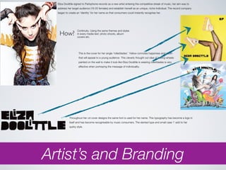
Eliza Doolittle signed to Parlophone records as a new artist entering the competitive streak of music, her aim was to
  address her target audience (16-25 females) and establish herself as an unique, niche individual. The record company
  began to create an ‘identity’ for her name so that consumers could instantly recognise her.


   How?
                   Continuity. Using the same themes and styles
                   in every media text: photo shoots, album
                   covers etc.


                    This is the cover for her single 'rollerblades'. Yellow connotes happiness and youth
                    that will appeal to a young audience This cleverly thought out idea of having wheels
                    painted on the wall to make it look like Eliza Doolittle is wearing rollerblades is very
                    effective when portraying the message of individuality.


            Throughout her cd cover designs the same font is used for her name. This typography has become a logo in
            itself and has become recognisable by music consumers. The slanted type and small case ‘i’ add to her
            quirky style.


Artist’s and Branding
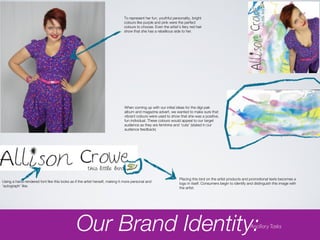
To represent her fun, youthful personality, bright
                                                                              colours like purple and pink were the perfect
                                                                              colours to choose. Even the artist’s fiery red hair
                                                                              show that she has a rebellious side to her.


                                                                              When coming up with our initial ideas for the digi-pak
                                                                              album and magazine advert, we wanted to make sure that
                                                                              vibrant colours were used to show that she was a positive,
                                                                              fun individual. These colours would appeal to our target
                                                                              audience as they are feminine and ‘cute’ (stated in our
                                                                              audience feedback)


                                                                                                                  Placing this bird on the artist products and promotional texts becomes a
Using a hand-rendered font like this looks as if the artist herself, making it more personal and                  logo in itself. Consumers begin to identify and distinguish this image with
‘autograph’ like.                                                                                                 the artist.


                                               Our Brand Identity:                                                                                             Ancillary Tasks
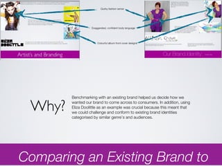
Quirky fashion sense


                  Exaggerated, confident body language


                      Colourful album front cover designs


        Benchmarking with an existing brand helped us decide how we

 Why?   wanted our brand to come across to consumers. In addition, using
        Eliza Doolittle as an example was crucial because this meant that
        we could challenge and conform to existing brand identities
        categorised by similar genre’s and audiences.


Comparing an Existing Brand to
We felt that when creating a brand image for our artist, continuity was
   important, so we used the same ideas and themes that would be
   associated with the artist. Hence, the mis en scene’ are the same in the
   music video, digi-pak album and magazine advert.


Media Language and Music
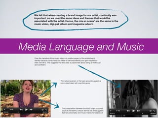
   Even the narrative of the music video is a positive aspect of the artists brand
   identity because consumers can relate to personal identity and gain insight into
   their own life’s. This suggests that this artist is passionate about being an individual
   and confident.


                                     The natural scenery in the back ground suggests a
                                     boho style linked with pop/folk genre


                                       The juxtaposition between the loud, bright coloured
                                       playsuit and earthy colours stands out and suggests
                                       that her personality and music makes her stand out
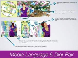
Cartoon effect suggests a naive, fun personality and
                                                                                                             style


                                                                                                          Merge between location shot in music video and
                                                                                                          splashed ink from front cover album. Suggest a
                                                                                                          creative side to the artist


                                                                                                        The titles of her songs are have a sweet, innocent life
                                                                                                        experience. Consumers can relate to her through these
                                                                                                        songs


             Body language such as looking down is really appealing to a target audience who are aware that
             promoters try to create brands that are ‘ too in your face’. This is more subtle and suggests being
             shy - ‘girl next door’.


  ‘This Little Bird’ lyrics placed on merged image of location shot and splashed ink.


Media Language & Digi-Pak
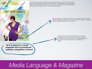
To promote an artist and maximise their chances of breaking into the music industry, we had to
                            produce a magazine advert that promoted her new album. Brand identity is a crucial point when
                            trying to catch the attention of consumers. Therefore, we have place her in the same clothing and
                            the same theme of splashed colours - similar to her digi-pak album.


                                                                            Using conventions of a magazine advert such as contacts like Twitter link with the
                                                                            uses and gratifications theory when consumers can key into surveillance : satisfying
                                                                            curiosity and general interest in the music industry


                                                                                       Therefore, using the same style as the album cover is easily
                                                                                       recognisable to consumers when flicking through a magazine.
                                                                                       immediately, the bright colours seen on the magazine advert can
                                                                                       later be noticed on the shelves when the digi-pak album is
                                                                                       released.


As it is placed in a music
magazine full of promotional
material, competition is fierce!


   Media Language & Magazine
?
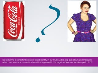
So by having a consistent sense of brand identity in our music video, digi-pak album and magazine
advert, we were able to create a brand that appealed to it’s target audience of females aged 15-20!

Question Two

  • 1.
    Question Two: How effectiveis the combination of your main products and ancillary texts?
  • 2.
    Reflects how aproduct's name, is perceived by A successful brand has a consistent sense of ‘brand the audience identity’ throughout the media so it has the same reputation A USP. What makes your brand stand better than competition? Creating a brand for your product enables it to stand from competition As a brand develops it’s own identity; so does brand loyalty. This is when consumers choose to only purchase your product based on the brand and how it is presented Not the same as a product.. the face and recognition of the product What is a brand?
  • 3.
    How? Through our music video, digi-pak and magazine advert. Why? For our artist to become noticed by consumers, we needed to create a sense of brand identity and ensure that we promoted her effectively and break into the music industry Brand Identity Who? To create a successful brand, a target audience has to be established. 15-20 year old caucasian females. C1 - E in the socio economic status. Why? Because this age range are the highest music consumers, therefore have an abundance of music and music artists. This gives our artist the chance to break into the music industry. However, this can also be seen as challenging because of the existing competition. Nevertheless, if we create brand identity by providing consistent themes and ideas, our artist can become noticed by the target audience.
  • 4.
    Eliza Doolittle signedto Parlophone records as a new artist entering the competitive streak of music, her aim was to address her target audience (16-25 females) and establish herself as an unique, niche individual. The record company began to create an ‘identity’ for her name so that consumers could instantly recognise her. How? Continuity. Using the same themes and styles in every media text: photo shoots, album covers etc. This is the cover for her single 'rollerblades'. Yellow connotes happiness and youth that will appeal to a young audience This cleverly thought out idea of having wheels painted on the wall to make it look like Eliza Doolittle is wearing rollerblades is very effective when portraying the message of individuality. Throughout her cd cover designs the same font is used for her name. This typography has become a logo in itself and has become recognisable by music consumers. The slanted type and small case ‘i’ add to her quirky style. Artist’s and Branding
  • 5.
    To represent herfun, youthful personality, bright colours like purple and pink were the perfect colours to choose. Even the artist’s fiery red hair show that she has a rebellious side to her. When coming up with our initial ideas for the digi-pak album and magazine advert, we wanted to make sure that vibrant colours were used to show that she was a positive, fun individual. These colours would appeal to our target audience as they are feminine and ‘cute’ (stated in our audience feedback) Placing this bird on the artist products and promotional texts becomes a Using a hand-rendered font like this looks as if the artist herself, making it more personal and logo in itself. Consumers begin to identify and distinguish this image with ‘autograph’ like. the artist. Our Brand Identity: Ancillary Tasks
  • 6.
    Quirky fashion sense Exaggerated, confident body language Colourful album front cover designs Benchmarking with an existing brand helped us decide how we Why? wanted our brand to come across to consumers. In addition, using Eliza Doolittle as an example was crucial because this meant that we could challenge and conform to existing brand identities categorised by similar genre’s and audiences. Comparing an Existing Brand to
  • 7.
    We felt thatwhen creating a brand image for our artist, continuity was important, so we used the same ideas and themes that would be associated with the artist. Hence, the mis en scene’ are the same in the music video, digi-pak album and magazine advert. Media Language and Music Even the narrative of the music video is a positive aspect of the artists brand identity because consumers can relate to personal identity and gain insight into their own life’s. This suggests that this artist is passionate about being an individual and confident. The natural scenery in the back ground suggests a boho style linked with pop/folk genre The juxtaposition between the loud, bright coloured playsuit and earthy colours stands out and suggests that her personality and music makes her stand out
  • 8.
    Cartoon effect suggestsa naive, fun personality and style Merge between location shot in music video and splashed ink from front cover album. Suggest a creative side to the artist The titles of her songs are have a sweet, innocent life experience. Consumers can relate to her through these songs Body language such as looking down is really appealing to a target audience who are aware that promoters try to create brands that are ‘ too in your face’. This is more subtle and suggests being shy - ‘girl next door’. ‘This Little Bird’ lyrics placed on merged image of location shot and splashed ink. Media Language & Digi-Pak
  • 9.
    To promote anartist and maximise their chances of breaking into the music industry, we had to produce a magazine advert that promoted her new album. Brand identity is a crucial point when trying to catch the attention of consumers. Therefore, we have place her in the same clothing and the same theme of splashed colours - similar to her digi-pak album. Using conventions of a magazine advert such as contacts like Twitter link with the uses and gratifications theory when consumers can key into surveillance : satisfying curiosity and general interest in the music industry Therefore, using the same style as the album cover is easily recognisable to consumers when flicking through a magazine. immediately, the bright colours seen on the magazine advert can later be noticed on the shelves when the digi-pak album is released. As it is placed in a music magazine full of promotional material, competition is fierce! Media Language & Magazine
  • 10.
    ? So by havinga consistent sense of brand identity in our music video, digi-pak album and magazine advert, we were able to create a brand that appealed to it’s target audience of females aged 15-20!

Editor's Notes