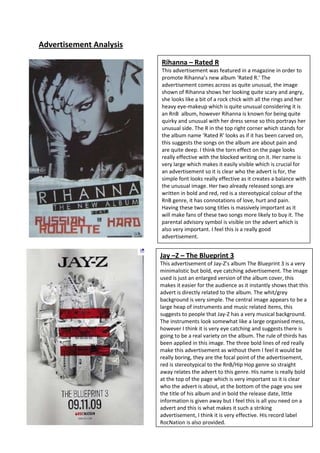
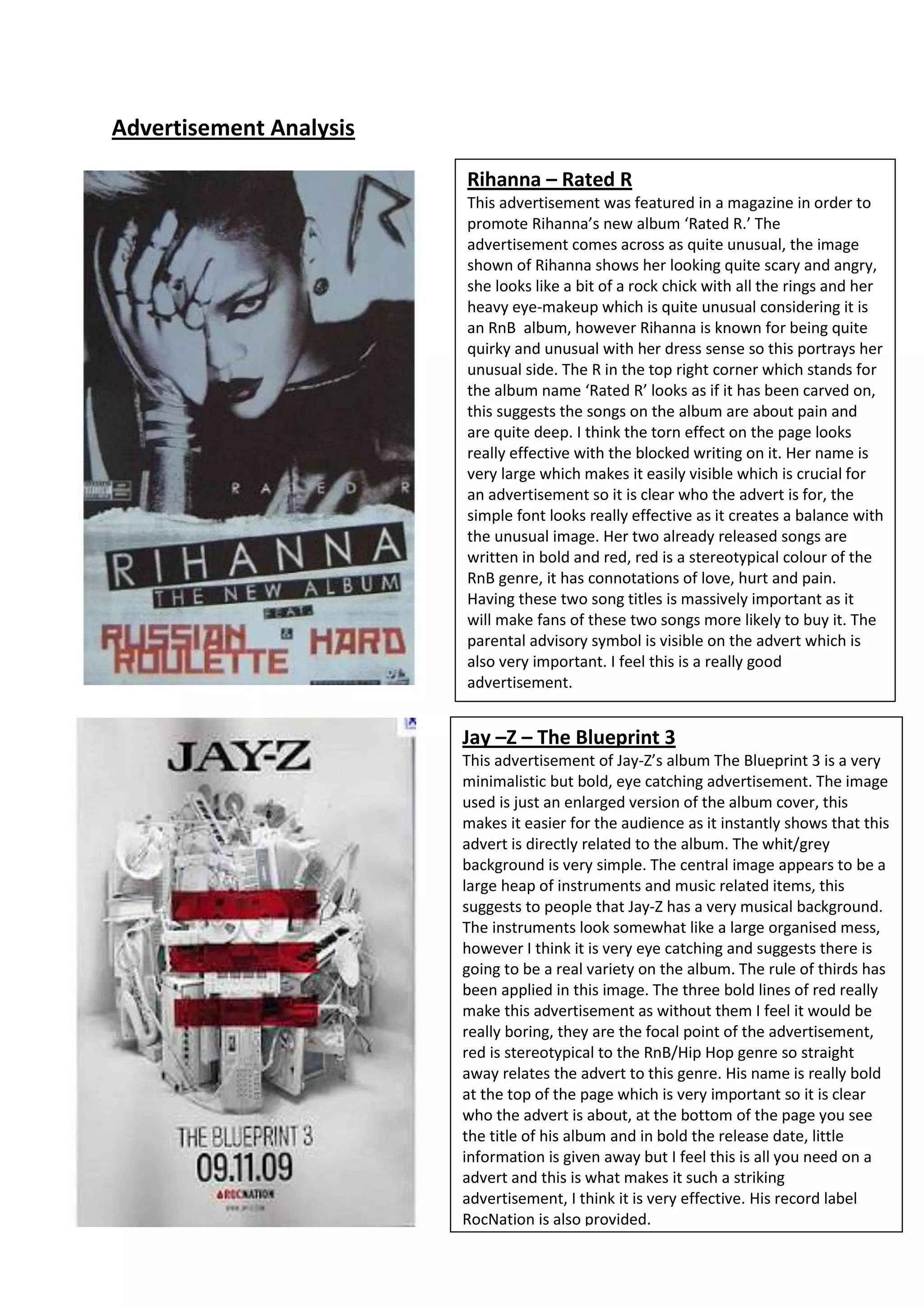
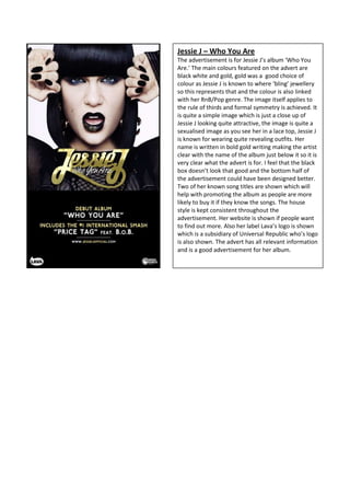
Advertisement Analysis

                         Rihanna – Rated R
                         This advertisement was featured in a magazine in order to
                         promote Rihanna’s new album ‘Rated R.’ The
                         advertisement comes across as quite unusual, the image
                         shown of Rihanna shows her looking quite scary and angry,
                         she looks like a bit of a rock chick with all the rings and her
                         heavy eye-makeup which is quite unusual considering it is
                         an RnB album, however Rihanna is known for being quite
                         quirky and unusual with her dress sense so this portrays her
                         unusual side. The R in the top right corner which stands for
                         the album name ‘Rated R’ looks as if it has been carved on,
                         this suggests the songs on the album are about pain and
                         are quite deep. I think the torn effect on the page looks
                         really effective with the blocked writing on it. Her name is
                         very large which makes it easily visible which is crucial for
                         an advertisement so it is clear who the advert is for, the
                         simple font looks really effective as it creates a balance with
                         the unusual image. Her two already released songs are
                         written in bold and red, red is a stereotypical colour of the
                         RnB genre, it has connotations of love, hurt and pain.
                         Having these two song titles is massively important as it
                         will make fans of these two songs more likely to buy it. The
                         parental advisory symbol is visible on the advert which is
                         also very important. I feel this is a really good
                         advertisement.


                         Jay –Z – The Blueprint 3
                         This advertisement of Jay-Z’s album The Blueprint 3 is a very
                         minimalistic but bold, eye catching advertisement. The image
                         used is just an enlarged version of the album cover, this
                         makes it easier for the audience as it instantly shows that this
                         advert is directly related to the album. The whit/grey
                         background is very simple. The central image appears to be a
                         large heap of instruments and music related items, this
                         suggests to people that Jay-Z has a very musical background.
                         The instruments look somewhat like a large organised mess,
                         however I think it is very eye catching and suggests there is
                         going to be a real variety on the album. The rule of thirds has
                         been applied in this image. The three bold lines of red really
                         make this advertisement as without them I feel it would be
                         really boring, they are the focal point of the advertisement,
                         red is stereotypical to the RnB/Hip Hop genre so straight
                         away relates the advert to this genre. His name is really bold
                         at the top of the page which is very important so it is clear
                         who the advert is about, at the bottom of the page you see
                         the title of his album and in bold the release date, little
                         information is given away but I feel this is all you need on a
                         advert and this is what makes it such a striking
                         advertisement, I think it is very effective. His record label
                         RocNation is also provided.
Jessie J – Who You Are
The advertisement is for Jessie J’s album ‘Who You
Are.’ The main colours featured on the advert are
black white and gold, gold was a good choice of
colour as Jessie J is known to where ‘bling’ jewellery
so this represents that and the colour is also linked
with her RnB/Pop genre. The image itself applies to
the rule of thirds and formal symmetry is achieved. It
is quite a simple image which is just a close up of
Jessie J looking quite attractive, the image is quite a
sexualised image as you see her in a lace top, Jessie J
is known for wearing quite revealing outfits. Her
name is written in bold gold writing making the artist
clear with the name of the album just below it so it is
very clear what the advert is for. I feel that the black
box doesn’t look that good and the bottom half of
the advertisement could have been designed better.
Two of her known song titles are shown which will
help with promoting the album as people are more
likely to buy it if they know the songs. The house
style is kept consistent throughout the
advertisement. Her website is shown if people want
to find out more. Also her label Lava’s logo is shown
which is a subsidiary of Universal Republic who’s logo
is also shown. The advert has all relevant information
and is a good advertisement for her album.

Advertisement analysis

  • 1.
    Advertisement Analysis Rihanna – Rated R This advertisement was featured in a magazine in order to promote Rihanna’s new album ‘Rated R.’ The advertisement comes across as quite unusual, the image shown of Rihanna shows her looking quite scary and angry, she looks like a bit of a rock chick with all the rings and her heavy eye-makeup which is quite unusual considering it is an RnB album, however Rihanna is known for being quite quirky and unusual with her dress sense so this portrays her unusual side. The R in the top right corner which stands for the album name ‘Rated R’ looks as if it has been carved on, this suggests the songs on the album are about pain and are quite deep. I think the torn effect on the page looks really effective with the blocked writing on it. Her name is very large which makes it easily visible which is crucial for an advertisement so it is clear who the advert is for, the simple font looks really effective as it creates a balance with the unusual image. Her two already released songs are written in bold and red, red is a stereotypical colour of the RnB genre, it has connotations of love, hurt and pain. Having these two song titles is massively important as it will make fans of these two songs more likely to buy it. The parental advisory symbol is visible on the advert which is also very important. I feel this is a really good advertisement. Jay –Z – The Blueprint 3 This advertisement of Jay-Z’s album The Blueprint 3 is a very minimalistic but bold, eye catching advertisement. The image used is just an enlarged version of the album cover, this makes it easier for the audience as it instantly shows that this advert is directly related to the album. The whit/grey background is very simple. The central image appears to be a large heap of instruments and music related items, this suggests to people that Jay-Z has a very musical background. The instruments look somewhat like a large organised mess, however I think it is very eye catching and suggests there is going to be a real variety on the album. The rule of thirds has been applied in this image. The three bold lines of red really make this advertisement as without them I feel it would be really boring, they are the focal point of the advertisement, red is stereotypical to the RnB/Hip Hop genre so straight away relates the advert to this genre. His name is really bold at the top of the page which is very important so it is clear who the advert is about, at the bottom of the page you see the title of his album and in bold the release date, little information is given away but I feel this is all you need on a advert and this is what makes it such a striking advertisement, I think it is very effective. His record label RocNation is also provided.
  • 2.
    Jessie J –Who You Are The advertisement is for Jessie J’s album ‘Who You Are.’ The main colours featured on the advert are black white and gold, gold was a good choice of colour as Jessie J is known to where ‘bling’ jewellery so this represents that and the colour is also linked with her RnB/Pop genre. The image itself applies to the rule of thirds and formal symmetry is achieved. It is quite a simple image which is just a close up of Jessie J looking quite attractive, the image is quite a sexualised image as you see her in a lace top, Jessie J is known for wearing quite revealing outfits. Her name is written in bold gold writing making the artist clear with the name of the album just below it so it is very clear what the advert is for. I feel that the black box doesn’t look that good and the bottom half of the advertisement could have been designed better. Two of her known song titles are shown which will help with promoting the album as people are more likely to buy it if they know the songs. The house style is kept consistent throughout the advertisement. Her website is shown if people want to find out more. Also her label Lava’s logo is shown which is a subsidiary of Universal Republic who’s logo is also shown. The advert has all relevant information and is a good advertisement for her album.