The document provides details about the design process for a Digi-Pak and auxiliary materials for a folk music album. Key points:
- The Digi-Pak design took inspiration from album covers by Mumford and Sons, Ryan Leslie, and Seth Lakeman in its use of the artist image and natural backgrounds.
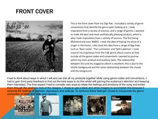
- Black and white imagery was used throughout to evoke the feelings of sadness, depression, and solitude represented in the song's lyrics.
- Feedback suggested making some inside panels less bland by incorporating lyrics.
- The magazine ad continued the black and white theme for consistency and used stereotypical folk conventions like fields.
- The ad and Digi-Pak were meant


![Comparing conventions [autosaved]](https://cdn.slidesharecdn.com/ss_thumbnails/comparingconventionsautosaved-160423210445-thumbnail.jpg?width=640&height=640&fit=bounds)


