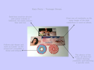
Album Design
Cohesive Style
From doing research on existing album front, back covers and the spine, I found that one of
the main fundamentals used is the idea of cohesion. Which is the impression that all products
come together to form a united whole creation allowing the audience to recognise pattern
and continuity throughout each creation. I believe it is important that on the album the front,
back covers and spine all follow a similar style and pattern in terms of colour scheme and
fonts. Here are some examples of existing album designs and how they use the idea of
cohesion.
Jay-Z and Linkin Park
Collision Course
Mumford and Sons
Sigh no more
Clear use of continuity as the
same image of the pink
candyfloss is used on album.
Follows the theme and
style of ‘Candy’ as the
actual CD’s resemble a
donut and lollipop.
Bold font used for all text
and colour scheme is
followed, two main colours
blue and red.
The photos of the
artist, all show her
naked showing
continuity and following
a specific style.
Katy Perry – Teenage Dream
Lana Del Rey – Born To Die
Established colour scheme
used, off-white and blue, also
with the red flowers used it
links to the front cover image
as she wears a red bra.
Same font followed
throughout, big
and bold.
On the spines the
same design is used
off the splatters,
which also follow the
colour scheme of the
red flowers and the
off-white
background
Conclusion
From what I have researched I have found that from the majority of
existing albums they use a cohesive style, I have concluded that
generally fonts and colour schemes are the main elements that are used
to keep the style constant, however images of the artist or band can be
different but commonly follow the same style such as there costumes
and location. When it comes to creating my own album I am going to
use a cohesive style so that overall it looks professional and, also it will
keep my album from looking fragmented and disorientated.

Album design

  • 1.
  • 2.
    From doing researchon existing album front, back covers and the spine, I found that one of the main fundamentals used is the idea of cohesion. Which is the impression that all products come together to form a united whole creation allowing the audience to recognise pattern and continuity throughout each creation. I believe it is important that on the album the front, back covers and spine all follow a similar style and pattern in terms of colour scheme and fonts. Here are some examples of existing album designs and how they use the idea of cohesion. Jay-Z and Linkin Park Collision Course Mumford and Sons Sigh no more
  • 3.
    Clear use ofcontinuity as the same image of the pink candyfloss is used on album. Follows the theme and style of ‘Candy’ as the actual CD’s resemble a donut and lollipop. Bold font used for all text and colour scheme is followed, two main colours blue and red. The photos of the artist, all show her naked showing continuity and following a specific style. Katy Perry – Teenage Dream
  • 4.
    Lana Del Rey– Born To Die Established colour scheme used, off-white and blue, also with the red flowers used it links to the front cover image as she wears a red bra. Same font followed throughout, big and bold. On the spines the same design is used off the splatters, which also follow the colour scheme of the red flowers and the off-white background
  • 5.
    Conclusion From what Ihave researched I have found that from the majority of existing albums they use a cohesive style, I have concluded that generally fonts and colour schemes are the main elements that are used to keep the style constant, however images of the artist or band can be different but commonly follow the same style such as there costumes and location. When it comes to creating my own album I am going to use a cohesive style so that overall it looks professional and, also it will keep my album from looking fragmented and disorientated.