Download to read offline
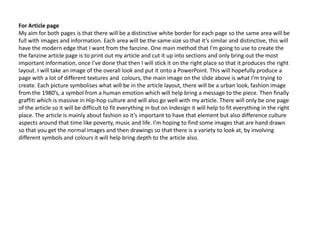
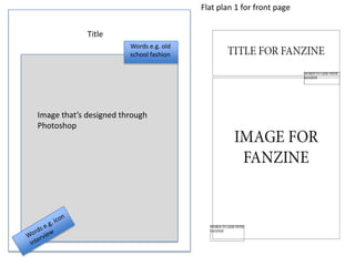
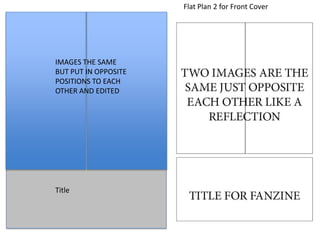
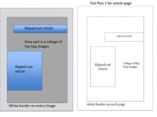
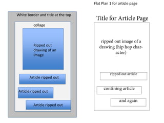
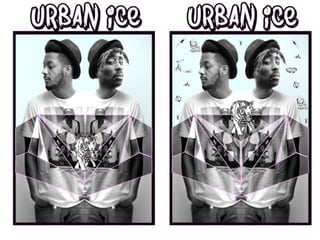
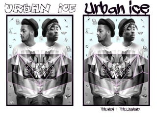
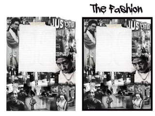
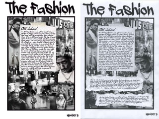

Hannah Sewell is researching and planning the design of a fanzine about hip hop music and fashion. She has created mood boards and flat plans to visualize the layout of the front cover and article pages. For the front cover, she wants to feature a black and white photo of a man with modern design elements incorporated through cropping and color. For the article pages, she plans to cut up her written piece and collage it with related images to fit within distinct borders on each page. Hannah has also explored different hip hop inspired fonts to use for the title and article text to achieve the style she wants for her fanzine.


