Photography Plan
Cover Photo
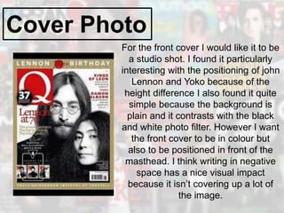
For the front cover I would like it to be
a studio shot. I found it particularly
interesting with the positioning of john
Lennon and Yoko because of the
height difference I also found it quite
simple because the background is
plain and it contrasts with the black
and white photo filter. However I want
the front cover to be in colour but
also to be positioned in front of the
masthead. I think writing in negative
space has a nice visual impact
because it isn’t covering up a lot of
the image.
Cover Photo
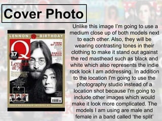
Unlike this image I’m going to use a
medium close up of both models next
to each other. Also, they will be
wearing contrasting tones in their
clothing to make it stand out against
the red masthead such as black and
white which also represents the indie
rock look I am addressing. In addition
to the location I'm going to use the
photography studio instead of a
location shot because I'm going to
include other images which would
make it look more complicated. The
models I am using are male and
female in a band called ‘the split’
Contents Page
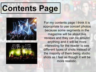
For my contents page I think it is
appropriate to use concert photos
because some segments in the
magazine will be about live
reviews and they can be around
anything and it will be more
interesting for the reader to see
different types of shots instead of
the majority of them being studio
shots as I feel as though it will be
more realistic.
Double Page Spread
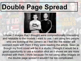
I chose 2 images that I thought were compositionally interesting
and relatable to the models I want to use. I am using two people
who are looking at the camera as I feel like the reader will
connect more with them if they were reading the article. Seen as
though my front cover will be in a studio I thought it would be a
good opportunity to use a location shot as it shows we are more
involved with them. I think because I'm not using other images on
the double page spread it wouldn’t be too complicated.
Double Page Spread
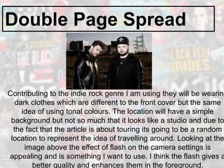
Contributing to the indie rock genre I am using they will be wearing
dark clothes which are different to the front cover but the same
idea of using tonal colours. The location will have a simple
background but not so much that it looks like a studio and due to
the fact that the article is about touring its going to be a random
location to represent the idea of travelling around. Looking at the
image above the effect of flash on the camera settings is
appealing and is something I want to use. I think the flash gives a
better quality and enhances them in the foreground.

Photography planning

  • 1.
  • 2.
    Cover Photo For thefront cover I would like it to be a studio shot. I found it particularly interesting with the positioning of john Lennon and Yoko because of the height difference I also found it quite simple because the background is plain and it contrasts with the black and white photo filter. However I want the front cover to be in colour but also to be positioned in front of the masthead. I think writing in negative space has a nice visual impact because it isn’t covering up a lot of the image.
  • 3.
    Cover Photo Unlike thisimage I’m going to use a medium close up of both models next to each other. Also, they will be wearing contrasting tones in their clothing to make it stand out against the red masthead such as black and white which also represents the indie rock look I am addressing. In addition to the location I'm going to use the photography studio instead of a location shot because I'm going to include other images which would make it look more complicated. The models I am using are male and female in a band called ‘the split’
  • 4.
    Contents Page For mycontents page I think it is appropriate to use concert photos because some segments in the magazine will be about live reviews and they can be around anything and it will be more interesting for the reader to see different types of shots instead of the majority of them being studio shots as I feel as though it will be more realistic.
  • 5.
    Double Page Spread Ichose 2 images that I thought were compositionally interesting and relatable to the models I want to use. I am using two people who are looking at the camera as I feel like the reader will connect more with them if they were reading the article. Seen as though my front cover will be in a studio I thought it would be a good opportunity to use a location shot as it shows we are more involved with them. I think because I'm not using other images on the double page spread it wouldn’t be too complicated.
  • 6.
    Double Page Spread Contributingto the indie rock genre I am using they will be wearing dark clothes which are different to the front cover but the same idea of using tonal colours. The location will have a simple background but not so much that it looks like a studio and due to the fact that the article is about touring its going to be a random location to represent the idea of travelling around. Looking at the image above the effect of flash on the camera settings is appealing and is something I want to use. I think the flash gives a better quality and enhances them in the foreground.