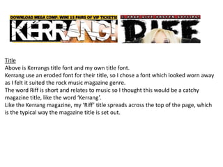
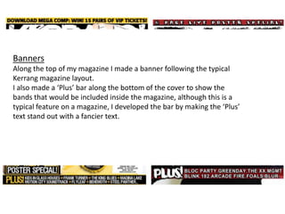
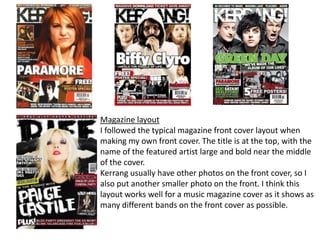
1. The document describes how a media product was designed to use and challenge conventions of real music magazines like Kerrang. Key elements that were modeled after Kerrang include the worn title font, banners along the top, and featuring multiple bands on the front cover. Some elements were developed further, like adding a "Plus" bar to highlight included bands.
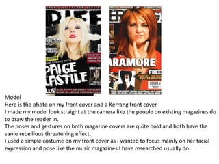
2. Photos on the cover were posed similarly to Kerrang with models looking directly at the camera to draw in readers. Layout conventions like the title at the top and large artist name in the middle were followed.
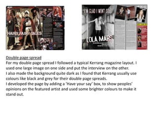
3. For inside pages, a typical Kerrang double page spread layout with a large image on one side and interview on the other was used. Dark