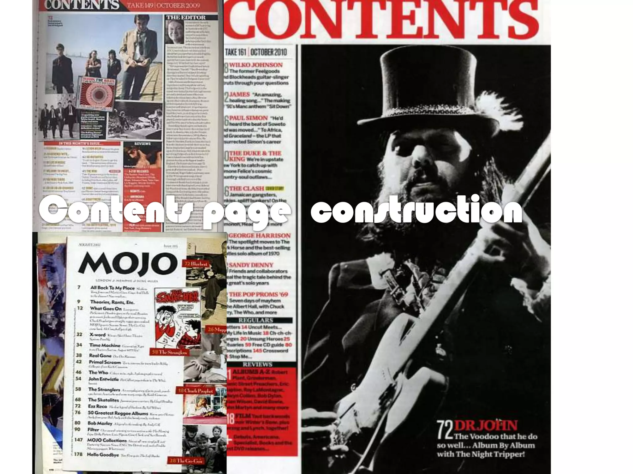
The document describes the design process for a contents page of a music magazine. The original design was bland, so the author chose to scatter images across the page in different areas rather than grouping them. A minimalist layout was selected to keep readers interested without revealing all the magazine offers. Images of local musicians were chosen to represent the music articles. Colors like red and blue were added to pull off a retro theme while keeping the images distinct on a plain white background.