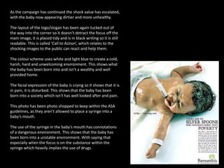
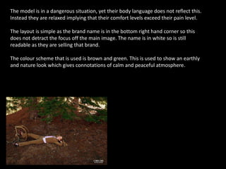
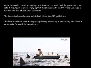
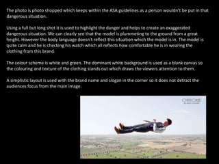
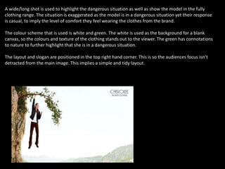
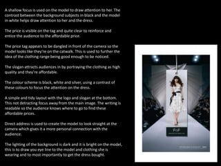
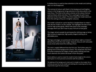
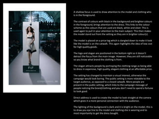
2. BARNARDO’S
Target Audience: Parents/Young Parents.
Representation: Uses shocking images to prompt donations which
prevents mistreatment.
Campaign Message: Not every child is born into privilege so
Banardo’s is trying to prevent that from happening.
3. The silver spoon represents wealth. The spoon is photo
shopped to keep with the ASA guidelines, as it would be
unsafe for the baby to hold a spoon and you can’t control a
baby the way you want to.
The slogan anchors the image- it portrays what the image is
showing to emphasise how important the campaign is.
The colour scheme uses gold and silver to create happy
emotions and a welcoming environment. Also the use of
fur shows wealth and they’re privileged.
The tag on the left hand gives connotations it was born into
a safe environment and is well looked after.
The baby is plump which signifies that it is a happy, healthy
and it is well looked after.
The writing on this image is positioned to the side out of
the way to make a tidy presentation, this means the image
is the main focus, but the writing is still readable as it isn’t
too small and it is in black.
4. In this photo there is a drastic change of imagery which adds to the shock value. In this
image the writing is tucked up in the corner, it is neat and tidy which doesn’t detract
from the image. With this the slogan has slightly changed to emphasise the change in
the imagery.
The colour scheme uses white and light blue to create a cold, hard, harsh and
unwelcoming environment. This shows that it isn’t born into a stable environment.
The baby has a bruise on its chest and a chemical bottle in
it’s mouth to signify that the baby is not well looked after in
a healthy and safe environment.
The photo is photo shopped to keep within the ASA
guidelines, as they can’t but a chemical bottle into a baby’s
mouth.
The facial expression on the babies face shows that it is in
pain which shows the baby in an unsafe environment and
that the baby has been born into pain.
The hospital tag links to being born in within an initial safe
environment but, that doesn’t mean the baby will be living
in a safe environment.
5. As the campaign grows larger the shock value becomes.
The babies facial expression looks like it is in pain and
disturbed which therefore shows that the baby has
been born into pain.
The colour scheme that is used is orange and white
which is similar to the first image, however the colours
are in a different context. Therefore the colour scheme
represents filth or dirt and an unhealthy environment,
that the baby has been born into.
The image of the cockroach furthers the impression that
the insert itself is known as being filthy and carrying
diseases. The cockroach is seen in the baby’s mouth,
which is viewed as a personal invasion.
The image has been photo shopped to keep within the
ASA guidelines, as they can’t but a cockroach into a
baby’s mouth.
The orange/greasy glow further emphasises that the
baby is in an unstable and unhealthy environment and
has been neglected. This shows that the baby needs
help.
The writing and logo is tucked out of the way it is laid
out in the corners so it doesn’t detract from the main
image, but is still readable.
6. As the campaign has continued the shock value has escalated,
with the baby now appearing dirtier and more unhealthy.
The layout of the logo/slogan has been again tucked out of
the way into the corner so it doesn’t detract the focus off the
main image, it is placed tidy and is in black writing so it is still
readable. This is called ‘Call to Action’, which relates to the
shocking images to the public can react and help them.
The colour scheme uses white and light blue to create a cold,
harsh, hard and unwelcoming environment. This shows what
the baby has been born into and isn’t a wealthy and well
provided home.
The facial expression of the baby is crying so it shows that it is
in pain, it is disturbed. This shows that the baby has been
born into a society which isn’t has well looked after and pain.
This photo has been photo shopped to keep within the ASA
guidelines, as they aren’t allowed to place a syringe into a
baby’s mouth.
The use of the syringe in the baby’s mouth has connotations
of a dangerous environment. This shows that the baby has
been born into a unstable environment. With saying that
especially when the focus is on the substance within the
syringe which heavily implies the use of drugs.
7. TESCO CHEROKEE
Target Audience: Middle aged Adults
Representation: Using models in terrifying situations, but their brand is
comfortable they don’t notice that is happening.
Campaign Message: No matter the situation you’re going to be comfortable
wearing the Tesco Cherokee brand.
8. The model is in a dangerous situation, yet their body language does not reflect this.
Instead they are relaxed implying that their comfort levels exceed their pain level.
The layout is simple as the brand name is in the bottom right hand corner so this
does not detract the focus off the main image. The name is in white so is still
readable as they are selling that brand.
The colour scheme that is used is brown and green. This is used to show an earthly
and nature look which gives connotations of calm and peaceful atmosphere.
9. Again the model is put into a dangerous situation, yet their body language does not
reflect this. Again they are implying that the clothes and brand they are wearing are
comfortable and exceed their pain level.
The image is photo shopped so it is kept within the ASA guidelines.
The layout is simple with the logo/slogan being tucked up in the corner, so it doesn’t
detract the focus off the main image.
10. The photo is photo shopped which keeps within the ASA guidelines as a person wouldn’t be put in that
dangerous situation.
Using a full but long shot it is used to highlight the danger and helps to create an exaggerated
dangerous situation. We can clearly see that the model is plummeting to the ground from a great
height. However the body language doesn’t reflect this situation which the model is in. The model is
quite calm and he is checking his watch which all reflects how comfortable he is in wearing the
clothing from this brand.
The colour scheme is white and green. The dominant white background is used as a blank canvas so
the colouring and texture of the clothing stands out which draws the viewers attention to them.
A simplistic layout is used with the brand name and slogan in the corner so it does not detract the
audiences focus from the main image.
11. A wide/long shot is used to highlight the dangerous situation as well as show the model in the fully
clothing range. The situation is exaggerated as the model is in a dangerous situation yet their response
is casual, to imply the level of comfort they feel wearing the clothes from the brand.
The colour scheme that is used is white and green. The white is used as the background for a blank
canvas, so the colours and texture of the clothing stands out to the viewer. The green has connotations
to nature to further highlight that she is in a dangerous situation.
The layout and slogan are positioned in the top right hand corner. This is so the audiences focus isn’t
detracted from the main image. This implies a simple and tidy layout.
12. TESCO F&F
Target Audience: Females aged 20-30 years old, working class.
Representation: Model/price on the catwalk to demonstrate high quality
clothing at affordable prices.
Campaign Message: You don’t have to pay a fortune to look good.
13. A shallow focus is used on the model to draw attention to her. The
contrast between the background subjects in black and the model
in white helps draw attention to her and the dress.
The price is visible on the tag and quite clear to reinforce and
entice the audience to the affordable price.
The price tag appears to be dangled in front of the camera so the
model looks like they’re on the catwalk. This is used to further the
idea of the clothing range being good enough to be noticed.
The slogan attracts audiences in by portraying the clothing as high
quality and they’re affordable.
The colour scheme is black, white and silver, using a contrast of
these colours to focus the attention on the dress.
A simple and tidy layout with the logo and slogan at the bottom.
This not detracting focus away from the main image. The writing is
readable so the audience knows where to go to find these
affordable prices.
Direct address is used to create the model to look straight at the
camera which gives it a more personal connection with the
audience.
The lighting of the background is dark and it is bright on the model,
this is to draw you eye line to the model and clothing she is
wearing and to most importantly to get the dress bought.
14. A shallow focus is used to draw attention to the model and clothing
who is in the foreground.
The contrast of colours with black in the background and brighter
colours in the foreground, brings attention to the dress which is the
main focus. This links to the colour scheme as the colours that are
used are black, white and silver. This is used again to pull in your
attention to the main subject. This then makes the model stand out
from the setting as they are in brighter colour(s).
The model is placed on a price tag that is dangled down to make it
look like the model is on the catwalk. This highlights the idea of low
cost for high quality goods. Which links back to the campaign
message where you don’t have to pay a fortune to look good.
The slogan attracts people by portraying the clothing range as being
able to dress in expensive, high quality, elegant clothing at an
affordable price.
The logo and slogan are positioned in the bottom right so it doesn’t
detract focus from the main image. However, they are still noticeable
so you know what brand the clothing is from.
The shot is angled different from the first one. The further away it is
getting more of the background in frame. This showcases the event
to further emphasise the slogan of high quality clothing and how
much attention the clothes will draw in from the public.
Direct address is used to create the model to look straight at the camera
which gives it a more personal connection with the audience.
The lighting of the background is dark and it is bright on the model, this is
to draw you eye line to the model and clothing she is wearing and to most
importantly to get the dress bought.
15. A shallow focus is used to draw attention to the model and clothing who
is in the foreground.
The contrast of colours with black in the background and brighter colours
in the foreground, brings attention to the dress. This links to the colour
scheme as the colours that are used are black, white and silver. This is
used again to pull in your attention to the main subject. This then makes
the model stand out from the setting as they are in brighter colour(s).
The model is placed on a price tag which is dangled down to make it look
like the model is on the catwalk. This again highlights the idea of low cost
for high quality goods.
The logo and slogan are positioned in the bottom right so it doesn’t
detract the focus from the main image. However, they are still noticeable
so you know what brand the clothing is from.
The slogan attracts people by portraying the clothing range as being able
to dress in expensive, high quality, elegant clothing at an affordable price.
The setting has changed to maintain a visual interest, otherwise the
campaign would look boring. The public setting is more relatable to the
target audience, as opposed to a closed catwalk. More people are
present in the public setting, which links to the campaign message of
people noticing the brand/clothing and you don’t need to spend a fortune
to look good.
Direct address is used to create the model to look straight at the camera
which gives it a more personal connection with the audience.
The lighting of the background is dark and it is bright on the model, this is
to draw you eye line to the model and clothing she is wearing and to
most importantly to get the dress bought.