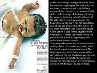
This document contains advertisements from various campaigns by Barnardo's and Tesco.
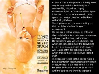
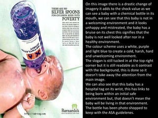
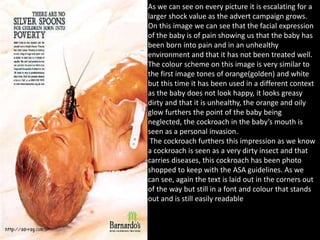
The Barnardo's campaigns use shocking imagery of neglected babies to promote donations to prevent child abuse. The images escalate in shock value to increase awareness.
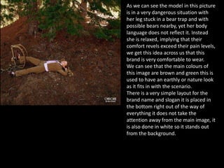
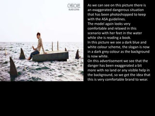
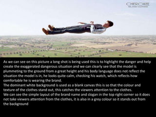
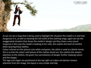
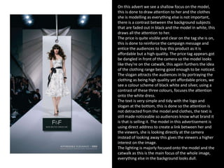
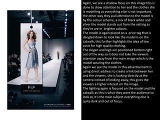
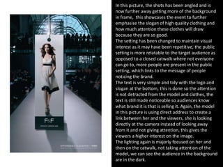
The Tesco Cherokee campaign features models in exaggerated dangerous situations who appear relaxed, implying the clothing's comfort. Tesco F&F features affordable yet high-quality clothing on models on "catwalks" to attract younger female audiences.