McFly – Motion In The Ocean
Advertisement
CONVENTIONS
• Artist name
• Album title
• Image of the artist
• Names of some of the songs
• Record label
• Websites
ANALYSIS
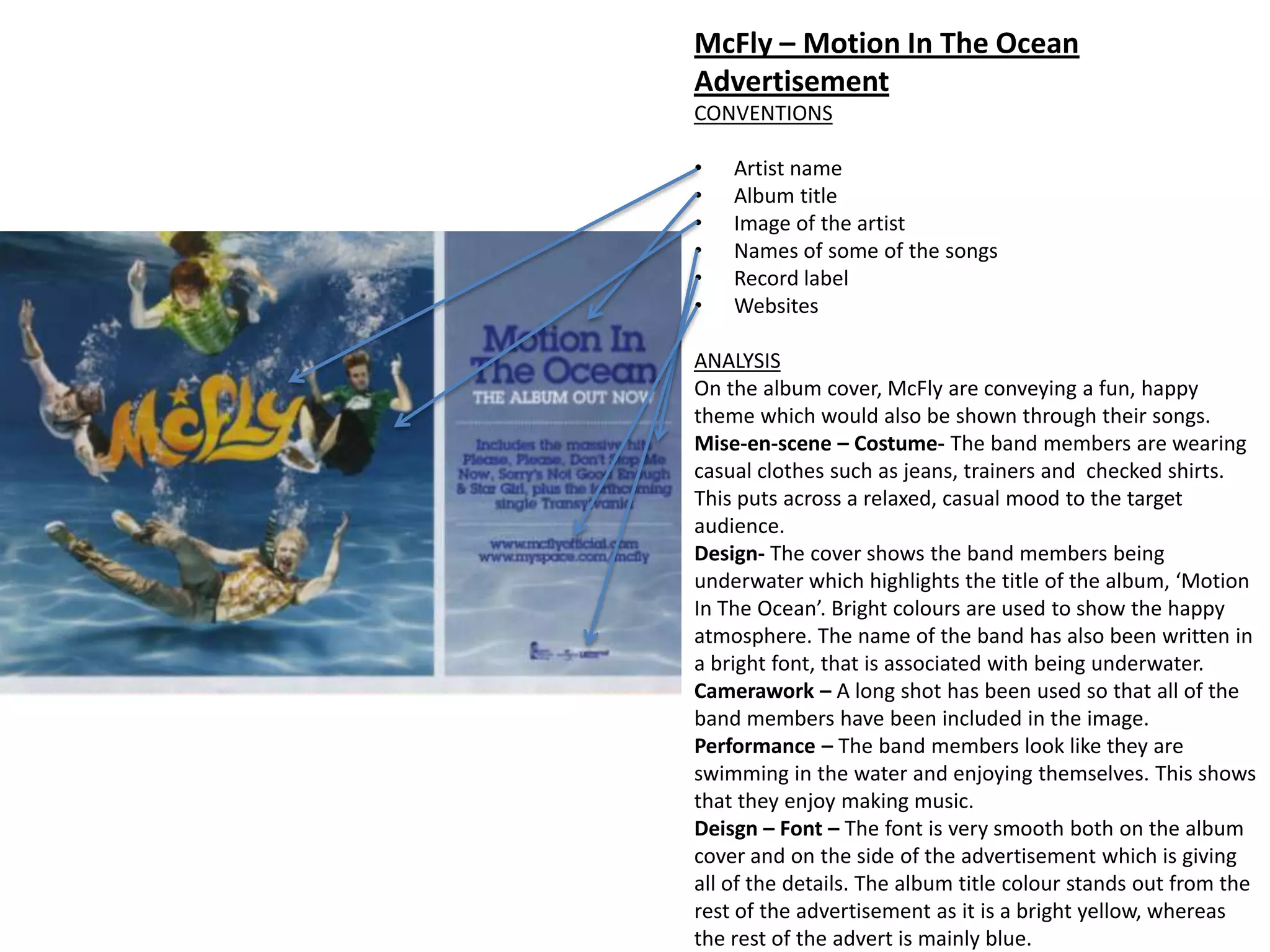
On the album cover, McFly are conveying a fun, happy
theme which would also be shown through their songs.
Mise-en-scene – Costume- The band members are wearing
casual clothes such as jeans, trainers and checked shirts.
This puts across a relaxed, casual mood to the target
audience.
Design- The cover shows the band members being
underwater which highlights the title of the album, ‘Motion
In The Ocean’. Bright colours are used to show the happy
atmosphere. The name of the band has also been written in
a bright font, that is associated with being underwater.
Camerawork – A long shot has been used so that all of the
band members have been included in the image.
Performance – The band members look like they are
swimming in the water and enjoying themselves. This shows
that they enjoy making music.
Deisgn – Font – The font is very smooth both on the album
cover and on the side of the advertisement which is giving
all of the details. The album title colour stands out from the
rest of the advertisement as it is a bright yellow, whereas
the rest of the advert is mainly blue.
Arctic Monkeys
CONVENTIONS:
• Name of the band
• Image associated with the band
• Record Label
• Websites
• Tour Dates
ANALYSIS:
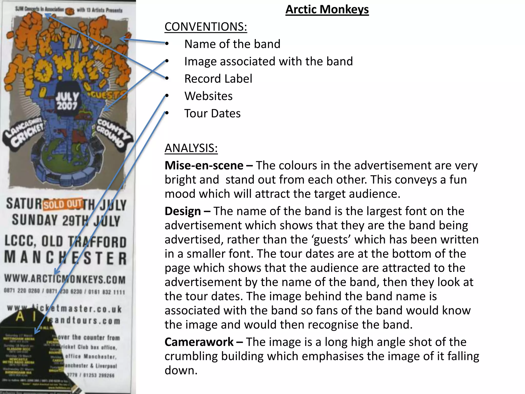
Mise-en-scene – The colours in the advertisement are very
bright and stand out from each other. This conveys a fun
mood which will attract the target audience.
Design – The name of the band is the largest font on the
advertisement which shows that they are the band being
advertised, rather than the ‘guests’ which has been written
in a smaller font. The tour dates are at the bottom of the
page which shows that the audience are attracted to the
advertisement by the name of the band, then they look at
the tour dates. The image behind the band name is
associated with the band so fans of the band would know
the image and would then recognise the band.
Camerawork – The image is a long high angle shot of the
crumbling building which emphasises the image of it falling
down.
The Motorettes – Kids In America
Advertisement
CONVENTIONS:
• Name of the artist
• Name of the album
• Associated image or logo
• Website
ANALYSIS:
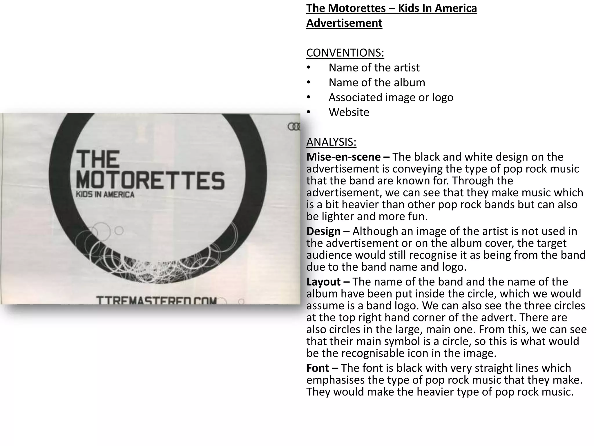
Mise-en-scene – The black and white design on the
advertisement is conveying the type of pop rock music
that the band are known for. Through the
advertisement, we can see that they make music which
is a bit heavier than other pop rock bands but can also
be lighter and more fun.
Design – Although an image of the artist is not used in
the advertisement or on the album cover, the target
audience would still recognise it as being from the band
due to the band name and logo.
Layout – The name of the band and the name of the
album have been put inside the circle, which we would
assume is a band logo. We can also see the three circles
at the top right hand corner of the advert. There are
also circles in the large, main one. From this, we can see
that their main symbol is a circle, so this is what would
be the recognisable icon in the image.
Font – The font is black with very straight lines which
emphasises the type of pop rock music that they make.
They would make the heavier type of pop rock music.

Advertisement analysis

  • 1.
    McFly – MotionIn The Ocean Advertisement CONVENTIONS • Artist name • Album title • Image of the artist • Names of some of the songs • Record label • Websites ANALYSIS On the album cover, McFly are conveying a fun, happy theme which would also be shown through their songs. Mise-en-scene – Costume- The band members are wearing casual clothes such as jeans, trainers and checked shirts. This puts across a relaxed, casual mood to the target audience. Design- The cover shows the band members being underwater which highlights the title of the album, ‘Motion In The Ocean’. Bright colours are used to show the happy atmosphere. The name of the band has also been written in a bright font, that is associated with being underwater. Camerawork – A long shot has been used so that all of the band members have been included in the image. Performance – The band members look like they are swimming in the water and enjoying themselves. This shows that they enjoy making music. Deisgn – Font – The font is very smooth both on the album cover and on the side of the advertisement which is giving all of the details. The album title colour stands out from the rest of the advertisement as it is a bright yellow, whereas the rest of the advert is mainly blue.
  • 2.
    Arctic Monkeys CONVENTIONS: • Nameof the band • Image associated with the band • Record Label • Websites • Tour Dates ANALYSIS: Mise-en-scene – The colours in the advertisement are very bright and stand out from each other. This conveys a fun mood which will attract the target audience. Design – The name of the band is the largest font on the advertisement which shows that they are the band being advertised, rather than the ‘guests’ which has been written in a smaller font. The tour dates are at the bottom of the page which shows that the audience are attracted to the advertisement by the name of the band, then they look at the tour dates. The image behind the band name is associated with the band so fans of the band would know the image and would then recognise the band. Camerawork – The image is a long high angle shot of the crumbling building which emphasises the image of it falling down.
  • 3.
    The Motorettes –Kids In America Advertisement CONVENTIONS: • Name of the artist • Name of the album • Associated image or logo • Website ANALYSIS: Mise-en-scene – The black and white design on the advertisement is conveying the type of pop rock music that the band are known for. Through the advertisement, we can see that they make music which is a bit heavier than other pop rock bands but can also be lighter and more fun. Design – Although an image of the artist is not used in the advertisement or on the album cover, the target audience would still recognise it as being from the band due to the band name and logo. Layout – The name of the band and the name of the album have been put inside the circle, which we would assume is a band logo. We can also see the three circles at the top right hand corner of the advert. There are also circles in the large, main one. From this, we can see that their main symbol is a circle, so this is what would be the recognisable icon in the image. Font – The font is black with very straight lines which emphasises the type of pop rock music that they make. They would make the heavier type of pop rock music.