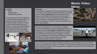
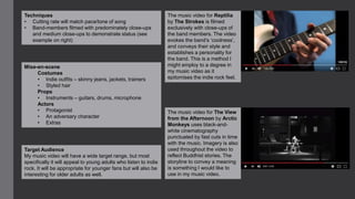
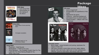
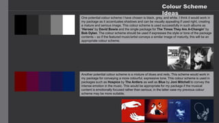
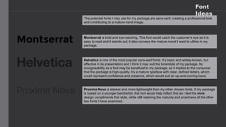
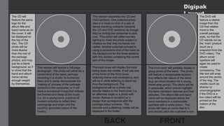
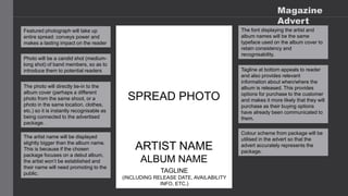
This is my analysis of album covers within my genre to gain knowledge of how to create my digipack and poster. I also looked into the synergy and how the album represented all aspects of an artist.
Fashionista Chic Couture Maze & Coloring Adventures is a coloring and activity book filled with many maze games and coloring activities designed to delight and engage young fashion enthusiasts. Each page offers a unique blend of fashion-themed mazes and stylish illustrations to color, inspiring creativity and problem-solving skills in children.
Explore the multifaceted world of Muntadher Saleh, an Iraqi polymath renowned for his expertise in visual art, writing, design, and pharmacy. This SlideShare delves into his innovative contributions across various disciplines, showcasing his unique ability to blend traditional themes with modern aesthetics. Learn about his impactful artworks, thought-provoking literary pieces, and his vision as a Neo-Pop artist dedicated to raising awareness about Iraq's cultural heritage. Discover why Muntadher Saleh is celebrated as "The Last Polymath" and how his multidisciplinary talents continue to inspire and influence.
Hadj Ounis's most notable work is his sculpture titled "Metamorphosis." This piece showcases Ounis's mastery of form and texture, as he seamlessly combines metal and wood to create a dynamic and visually striking composition. The juxtaposition of the two materials creates a sense of tension and harmony, inviting viewers to contemplate the relationship between nature and industry.
This tutorial offers a step-by-step guide on how to effectively use Pinterest. It covers the basics such as account creation and navigation, as well as advanced techniques including creating eye-catching pins and optimizing your profile. The tutorial also explores collaboration and networking on the platform. With visual illustrations and clear instructions, this tutorial will equip you with the skills to navigate Pinterest confidently and achieve your goals.
2. Music Video
Ideas
Location
• Studio
• Urban location
• Casual home location
The best choice for location depends
on the style of the song and band. For
example, a studio would convey a
professional style, whereas an urban
location would portray the band as
trendy or in touch with urban lifestyle. A
casual home setting would create a
band image of on-the-rise teenage
musicians at the start of their careers.
Concepts
One potential concept could be the band playing the song
in a location intercut with a separate narrative. An example
of this is Just by Radiohead, which features the band
playing in a flat while a narrative occurs on the street
below. The two narratives converge at the end when the
band look down on the street from the window; this
narrative merging is a device I could incorporate into my
music video plotline.
Another concept idea for a music video is a singular
narrative that reflects the song tone/meaning but does not
feature the band. The Suburbs by Arcade Fire features
child actors in the setting of the suburbs and a narrative
that reflects the song’s themes of nostalgia, coming-of-
age, and childhood. This method compliments and adds to
the effect of the featured song without just simply
recreating the lyrical content in video form.
I am certain that my music video will feature a storyline narrative (though I am unsure if there
will be a complementary narrative at this stage). The general framework for this storyline will be
that it follows a protagonist as they experience a change or development that will culminate at
the end of the song/video.
3. The music video for Reptilia
by The Strokes is filmed
exclusively with close-ups of
the band members. The video
evokes the band’s ‘coolness’,
and conveys their style and
establishes a personality for
the band. This is a method I
might employ to a degree in
my music video as it
epitomises the indie rock feel.
The music video for The View
from the Afternoon by Arctic
Monkeys uses black-and-
white cinematography
punctuated by fast cuts in time
with the music. Imagery is also
used throughout the video to
reflect Buddhist stories. The
storyline to convey a meaning
is something I would like to
use in my music video.
Techniques
• Cutting rate will match pace/tone of song
• Band-members filmed with predominately close-ups
and medium close-ups to demonstrate status (see
example on right)
Mise-en-scene
Costumes
• Indie outfits – skinny jeans, jackets, trainers
• Styled hair
Props
• Instruments – guitars, drums, microphone
Actors
• Protagonist
• An adversary character
• Extras
Target Audience
My music video will have a wide target range, but most
specifically it will appeal to young adults who listen to indie
rock. It will be appropriate for younger fans but will also be
interesting for older adults as well.
4. CD cover
• Iconic image/motif
• Encapsulates the style/theme of the
music
• Represents the genre
• Close-up – obscures background
and places focus on photo subject
• Casual location – reflects indie rock
casualness
Album ideas
• Debut album of new upcoming
band
• Hit singles compilation
• Reissued classic for 10th
anniversary release
DVD ideas
• Live concert film
• Documentary on
the making of
the album
Concept covers
• Band image – casual situation and posing, expresses the
values of indie rock
• Left cover conveys a more indie rock tone, better reflects
popular indie rock music; right cover is more subdued and
reflective, good for down-beat, slow-tempo indie rock
Song ideas
• Pavement – Gold Soundz
• Spiritualized – I Think I’m In Love
• Arctic Monkeys – You Probably Couldn’t See For The
Lights But You Were Staring Straight At You
• British indie music
Package
Ideas
5. Colour Scheme
Ideas
One potential colour scheme I have chosen is black, grey, and white. I think it would work in
my package as it accentuates shadows and can be visually appealing if used right, creating
a mature and serious image. This colour scheme is used successfully in such albums as
‘Heroes’ by David Bowie and the single package for The Times They Are A-Changin’ by
Bob Dylan. The colour scheme should be used if expresses the style or tone of the package
contents – so if the featured music/artist conveys a similar image of maturity, this will be an
appropriate colour scheme.
Another potential colour scheme is a mixture of blues and reds. This scheme would work in
my package for conveying a more colourful, expressive tone. This colour scheme is used in
packages such as Hospice by The Antlers as well as Blue by Joni Mitchell to convey the
intense emotion in the music. This would be appropriate for my package if the musical
content is emotionally focused rather than serious; in the latter case my previous colour
scheme may be more suitable.
6. Font
Ideas
The potential fonts I may use for my package are sans-serif, creating a professional look
and contributing to a mature band image.
Montserrat is bold and eye-catching. This font would catch the customer’s eye as it is
easy to read and it stands out; it also conveys the mature mood I want to utilise in my
package.
Helvetica is one of the most popular sans-serif fonts. It’s basic and widely-known, but
effective in its presentation and I think it may suit the tone/style of my package. Its
recognisability as a font may be beneficial to my package, as it implies to the consumer
that the package is high-quality. It’s a mature typeface with clear, defined letters, which
could represent confidence and presence, which would suit an up-and-coming band.
Proxima Nova is sleeker and more lightweight than my other chosen fonts. If my package
is based on a younger band/artist, this font would help reflect this as I feel the sleek
design compliments that style, while still retaining the maturity and smartness of the other
two fonts I have examined.
7. Digipak
Layout
The back cover will display the track
listing down the middle. It will use one
of the fonts on the front cover,
retaining theme and consistency, and
will be in white lettering to stand out
from the background. The
background will be a photo that
directly relates to the front cover (i.e.
an alternate angle or a photo with
similar themes or location) or a
design that corresponds with the
package colour scheme. The
barcode and publishing credits will be
displayed in the footer.
The front cover will possibly display a
group photo of the band. The photo
will feature a recognisable location
that reflects the nature of the band
(e.g. an urban location for a young,
street-wise group). The photo will be
in greyscale, which should highlight
the band members’ stances and their
attitudes. The album title and band
name will be displayed above the
band members in a memorable
typeface with a white colour. The
photo will have an iconic feel to it,
and should catch the customer’s eye.
This section separates the CD and
DVD sections. One potential photo
idea is a head-on shot of a pair of
hands reaching outwards (towards
the CD and DVD sections) as though
they’re inviting the consumer to pick
one. This photo will utilise low-key
lighting to mask the photo subject in
shadow so that only his hands are
visible. Another potential concept is
using a panorama shot of the band as
the background for the three sections
with this section containing the centre
part of the image.
This section will feature a full-page
photograph. The photo will either be a
candid shot of the band, perhaps
recording in a studio, to humanize
them and to partly demonstrate the
‘making of’ process of the package
contents to the consumer, or it will
have a conceptual image that reflects
the themes and ideas of the music
(i.e. for a young band, a picture of
modern suburbia to reflect their
upbringings and origin and the
youthful, grounded nature of the
music).
The CD will
feature the same
logo for the
album title and
band name as on
the cover. It will
be displayed on
the top of the
disc. The CD
photo will be
more illusive
than the rest of
the package
photos, and may
just be a blank
background, as if
to show that the
band and album
name carries
enough weight
by themselves.
The DVD will
feature a clearer
image than the
CD that relates
more to the
overall package
style, so that the
CD stands out as
the ‘main’ product
(such as a
snapshot from the
DVD video). The
album cover
typeface will
again be used to
create
consistency. The
title text will wrap
around the centre
of the ring. The
credits (such as
director or
cinematographer
if the DVD is a
live video) will be
printed on the
bottom of the
disc.
8. Magazine
Advert
Featured photograph will take up
entire spread: conveys power and
makes a lasting impact on the reader
SPREAD PHOTO
Photo will be a candid shot (medium-
long shot) of band members, so as to
introduce them to potential readers
The photo will directly tie-in to the
album cover (perhaps a different
photo from the same shoot, or a
photo in the same location, clothes,
etc.) so it is instantly recognisable as
being connected to the advertised
package.
ARTIST NAME
ALBUM NAME
TAGLINE
(INCLUDING RELEASE DATE, AVAILABILITY
INFO, ETC.)
The artist name will be displayed
slightly bigger than the album name.
This is because if the chosen
package focuses on a debut album,
the artist won’t be established and
their name will need promoting to the
public.
The font displaying the artist and
album names will be the same
typeface used on the album cover to
retain consistency and
recognisability.
Tagline at bottom appeals to reader
and also provides relevant
information about when/where the
album is released. This provides
options for purchase to the customer
and makes it more likely that they will
purchase as their buying options
have already been communicated to
them.
Colour scheme from package will be
utilised in the advert so that the
advert accurately represents the
package.