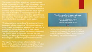
Magazine Advert 
Analysis 
THE HORRORS - SKYING
I’ve decided to analyse a print based advert 
of Skying, an album by The Horrors which 
was released in July 2011. This advert comes 
from the back cover of the February 2012 
edition of Uncut. I think it’s significant that the 
album is still being advertised seven months 
after its initial release, especially in a 
magazine that is aimed for adults. This would 
suggest that the album had such a good 
reception that the media think it deserves 
more exposure. This does fit in with how Still 
Life, the first single from this album, had far 
more mainstream radio airplay than any of 
their previous releases, including reaching 
the Radio 1 A list.
The Horrors are a British band that could best 
be described as an indie rock and partly 
psychedelic band. From this image, you would 
probably assume The Horrors were exactly 
that as the colours and effects that are used in 
the image relate to those genres. The image, 
which is their album cover, has quite a 
psychedelic aesthetic with the way the colours 
are blending together, almost distorting the 
original image which seems to be that of 
clouds and a sea. However, the colours while 
still bold are quite faded from how vivid the 
colours of an actual psychedelic album cover 
would be, giving it a calm vibe linking it to the 
indie scene. Neil Krug, the designer, will have 
taken this into account and made it so that 
their neo-psychedelic sound that explodes into 
this album is shown through the art.
The majority of the advert displays the album cover for 
Skying which completely advertises it and would make it 
easier for the audience to recognise it when it would be 
advertised in the media. This particular advert doesn’t 
feature the actual band visually which could be a link to 
how this is the first album released by The Horrors which 
doesn’t have people on the cover. It’s quite basic, but 
also serves a purpose as it is there to advertise this 
particular record. The focus on the album as the product 
rather than the band as the product makes it so that 
people would look more into the particular album rather 
than the band in general. 
The band name is displayed at the top of the image 
(which is the album art for Skying) but it isn’t actually on 
the proper album art. It’s shown here to tell the audience 
that The Horrors are the album artist 
advert album art 
Strange House Primary Colours
The bottom third of the page shows quotes from well 
known magazines including Q. This holds weight behind 
it because they are well-respected magazines in the 
media industry. This means that it will mean more to an 
audience if popular magazines rate this album highly. It 
also hints that readers of these magazines will be 
interested in this music due to the other types of music 
they advertise. Promoting it ‘album of the month’ makes 
it seem better than expected by some readers. 
“The Horrors have come of age” is an important quote 
because it tells the reader that this record is almost a 
breakthrough and says that people should give them a 
change with this particular album. It does have a 
different sound to the previous two albums released by 
The Horrors which is significant because you can 
actually see it through the change in album art and how 
their image as a band changed between the albums. 
The logo for XL Recordings is featured at the very 
bottom which could show people who are fans of other 
bands on that label they should listen to The Horrors. 
Furthermore, the colour all of this writing is 
presented on is exactly the same to the back 
cover of the physical Skying album, meaning 
it’s following the same conventions.

Magazine advert analysis

  • 1.
    Magazine Advert Analysis THE HORRORS - SKYING
  • 2.
    I’ve decided toanalyse a print based advert of Skying, an album by The Horrors which was released in July 2011. This advert comes from the back cover of the February 2012 edition of Uncut. I think it’s significant that the album is still being advertised seven months after its initial release, especially in a magazine that is aimed for adults. This would suggest that the album had such a good reception that the media think it deserves more exposure. This does fit in with how Still Life, the first single from this album, had far more mainstream radio airplay than any of their previous releases, including reaching the Radio 1 A list.
  • 3.
    The Horrors area British band that could best be described as an indie rock and partly psychedelic band. From this image, you would probably assume The Horrors were exactly that as the colours and effects that are used in the image relate to those genres. The image, which is their album cover, has quite a psychedelic aesthetic with the way the colours are blending together, almost distorting the original image which seems to be that of clouds and a sea. However, the colours while still bold are quite faded from how vivid the colours of an actual psychedelic album cover would be, giving it a calm vibe linking it to the indie scene. Neil Krug, the designer, will have taken this into account and made it so that their neo-psychedelic sound that explodes into this album is shown through the art.
  • 4.
    The majority ofthe advert displays the album cover for Skying which completely advertises it and would make it easier for the audience to recognise it when it would be advertised in the media. This particular advert doesn’t feature the actual band visually which could be a link to how this is the first album released by The Horrors which doesn’t have people on the cover. It’s quite basic, but also serves a purpose as it is there to advertise this particular record. The focus on the album as the product rather than the band as the product makes it so that people would look more into the particular album rather than the band in general. The band name is displayed at the top of the image (which is the album art for Skying) but it isn’t actually on the proper album art. It’s shown here to tell the audience that The Horrors are the album artist advert album art Strange House Primary Colours
  • 5.
    The bottom thirdof the page shows quotes from well known magazines including Q. This holds weight behind it because they are well-respected magazines in the media industry. This means that it will mean more to an audience if popular magazines rate this album highly. It also hints that readers of these magazines will be interested in this music due to the other types of music they advertise. Promoting it ‘album of the month’ makes it seem better than expected by some readers. “The Horrors have come of age” is an important quote because it tells the reader that this record is almost a breakthrough and says that people should give them a change with this particular album. It does have a different sound to the previous two albums released by The Horrors which is significant because you can actually see it through the change in album art and how their image as a band changed between the albums. The logo for XL Recordings is featured at the very bottom which could show people who are fans of other bands on that label they should listen to The Horrors. Furthermore, the colour all of this writing is presented on is exactly the same to the back cover of the physical Skying album, meaning it’s following the same conventions.