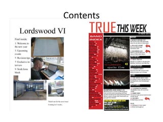
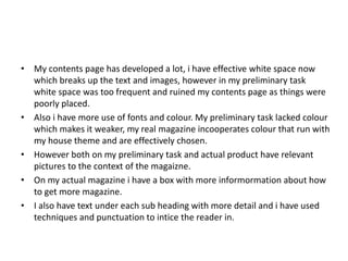
The document compares the author's preliminary magazine project with their actual completed magazine product. For the front cover, the preliminary version had a poorly placed title and lower image quality, while the actual cover used proper conventions like a bold title behind the model. The contents page of the preliminary project had too much white space, while the completed version experimented more with fonts, color, and layout. Overall, the real magazine showed improved use of design elements and techniques to engage readers.