Preliminary task – Evaluation 2
• By vincent Bullock
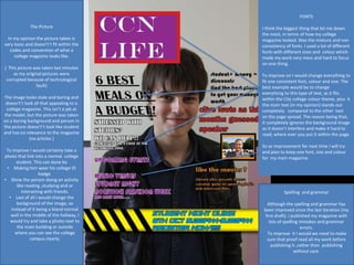
FONTS
I think the biggest thing that let me down
the most, in terms of how my college
magazine looked. Was the mixture and non
consistency of fonts. I used a lot of different
fonts with different sizes and colour which
made my work very mess and hard to focus
on one thing.
To improve on I would change everything to
fit one consistent font, colour and size. The
best example would be to change
everything to this type of text, as it fits
within the City college colour theme, plus it
the main text (in my opinion) stands out
completely compared to the other text
on the page spread. The reason being that,
it completely ignores the background image
as it doesn’t interfere and make it hard to
read; where ever you put it within the page.
So as improvement for next time I will try
and plan to keep one font, size and colour
for my main magazine.
The Picture
In my opinion the picture taken is
very basic and doesn't’t fit within the
codes and convention of what a
college magazine looks like.
( This picture was taken last minutes
as my original pictures were
corrupted because of technological
fault)
The image looks stale and boring and
doesn't’t look all that appealing to a
college magazine. This isn’t a jab at
the model, but the picture was taken
on a boring background and person in
the picture doesn't’t look like student
and has no relevance to the magazine
(no articles )
To improve I would certainly take a
photo that link into a normal college
student. This can done by
• Making him wear his college ID
badge.
• Show the person doing an activity
like reading ,studying and or
interacting with friends.
• Last of all I would change the
background of the image, so
instead of it being a bland normal
wall in the middle of the hallway, I
would try and take a photo next to
the main building or outside
where you can see the college
campus clearly.
Spelling and grammar
Although the spelling and grammar has
been improved since the last iteration (my
first draft). I published my magazine with
lots of spelling mistakes and grammar
errors.
To improve it I would we need to make
sure that proof read all my work before
publishing it ,rather than publishing
without care.
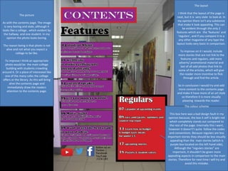
The picture
As with the contents page. The image
is very boring and stale, although it
looks like a college , which evident by
the hallway and one student. In my
opinion the photo looks boring.
The reason being is that photo is not
alive and not what you expect a
college to be like.
To improve I think an appropriate
photo would be the main college
building with students crowding
around it. Or a place of interested like
one of the many cafes the college
offers or the library. As this will bring
alive the contents page and
immediately draw the readers
attention to the contents page.
The layout
I think that the layout of the page is
neat, but it is very stale to look at. In
my opinion there isn’t any substance
that make it look appealing. This can
be evident through the only 2
features which are the ‘features’ and
‘regulars’, and if you compare it to a
any other magazine of any type the
layout looks very basic in comparison.
To improve on it I would, include
more stories that are not link to the
features and regulars, add more
adverts/ promotional material and
last of all add photos that link to
some of the articles, which will give
the reader more incentive to flick
through and find the article.
So in conclusion I would try and add
more content to the contents page
and make it have more of an art style
so therefore it is more visually
pleasing towards the reader.
The colour scheme
This box here was a bad design fault in my
opinion because, the box it self is bright red
which completely stands out compared to
the rest of the page. Internally this I want,
however it doesn't’t quite follow the codes
and conventions. Because regulars are less
important stories they should be less visually
appealing than the main stories (which is
purple box located on the left hand side),
Although the “regulars stories” are
important, it shouldn't be given more
appealing aspects in comparison to the main
stories. Therefore for next time I will try and
avoid this mistake.

Evaluation task 2

  • 1.
    Preliminary task –Evaluation 2 • By vincent Bullock
  • 2.
    FONTS I think thebiggest thing that let me down the most, in terms of how my college magazine looked. Was the mixture and non consistency of fonts. I used a lot of different fonts with different sizes and colour which made my work very mess and hard to focus on one thing. To improve on I would change everything to fit one consistent font, colour and size. The best example would be to change everything to this type of text, as it fits within the City college colour theme, plus it the main text (in my opinion) stands out completely compared to the other text on the page spread. The reason being that, it completely ignores the background image as it doesn’t interfere and make it hard to read; where ever you put it within the page. So as improvement for next time I will try and plan to keep one font, size and colour for my main magazine. The Picture In my opinion the picture taken is very basic and doesn't’t fit within the codes and convention of what a college magazine looks like. ( This picture was taken last minutes as my original pictures were corrupted because of technological fault) The image looks stale and boring and doesn't’t look all that appealing to a college magazine. This isn’t a jab at the model, but the picture was taken on a boring background and person in the picture doesn't’t look like student and has no relevance to the magazine (no articles ) To improve I would certainly take a photo that link into a normal college student. This can done by • Making him wear his college ID badge. • Show the person doing an activity like reading ,studying and or interacting with friends. • Last of all I would change the background of the image, so instead of it being a bland normal wall in the middle of the hallway, I would try and take a photo next to the main building or outside where you can see the college campus clearly. Spelling and grammar Although the spelling and grammar has been improved since the last iteration (my first draft). I published my magazine with lots of spelling mistakes and grammar errors. To improve it I would we need to make sure that proof read all my work before publishing it ,rather than publishing without care.
  • 3.
    The picture As withthe contents page. The image is very boring and stale, although it looks like a college , which evident by the hallway and one student. In my opinion the photo looks boring. The reason being is that photo is not alive and not what you expect a college to be like. To improve I think an appropriate photo would be the main college building with students crowding around it. Or a place of interested like one of the many cafes the college offers or the library. As this will bring alive the contents page and immediately draw the readers attention to the contents page. The layout I think that the layout of the page is neat, but it is very stale to look at. In my opinion there isn’t any substance that make it look appealing. This can be evident through the only 2 features which are the ‘features’ and ‘regulars’, and if you compare it to a any other magazine of any type the layout looks very basic in comparison. To improve on it I would, include more stories that are not link to the features and regulars, add more adverts/ promotional material and last of all add photos that link to some of the articles, which will give the reader more incentive to flick through and find the article. So in conclusion I would try and add more content to the contents page and make it have more of an art style so therefore it is more visually pleasing towards the reader. The colour scheme This box here was a bad design fault in my opinion because, the box it self is bright red which completely stands out compared to the rest of the page. Internally this I want, however it doesn't’t quite follow the codes and conventions. Because regulars are less important stories they should be less visually appealing than the main stories (which is purple box located on the left hand side), Although the “regulars stories” are important, it shouldn't be given more appealing aspects in comparison to the main stories. Therefore for next time I will try and avoid this mistake.