SlideShare a Scribd company logo
Evaluation
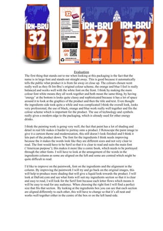
The first thing that stands out to me when looking at this packaging is the fact that the
name is in large font and stands out straight away. This is good because it automatically
tells the public what product it is from far away or close up. The colours chosen went
really well as they fit Irn-Bru’s original colour scheme, the orange and blue I feel is really
balanced and works well with the white font on the front. I think by making the main
colour font white means they all work together and both mean the same thing, by having
‘energy’ at the bottom is looks quite classy and sophisticated because it has a lot of space
around it to look at the graphics of the product and then the title and text. Even thought
the ingredients side took quite a while and was complicated I think the overall look, looks
very professional, the use of black, orange and blue work really well together and fits the
colour scheme which is important for the product. The use of technology and symbols
really gives a modern edge to the packaging, which is already used for other energy
drinks.
I think the painting work is going very well, the fact that paint has a lot of shading and
detail in real life makes it harder to portray onto a product. I Rotoscope the paint image to
give it a cartoon theme and modernisation, this still doesn’t look finished and I think it
lets part of the product down. The font for the ingredients I think needs improving
because the it makes the words look like they are different sizes and not very clear to
read. The font would have to be Serif so that it is clear to read and suits the main font
(‘American purpose’); this makes it more like a comic book, which needs to be portrayed
through the other fonts. I will have to look at the arrangement of the words in the
ingredients column as some are aligned on the left and some are centred which might be
quite difficult to read.
I’d like to improve on the paintwork, font on the ingredients and the alignment in the
column. By improving the paintwork I will try and go back on the original images, this
will help to produce more shading that will give a liquid look towards the product. I will
look at DaFont.com and see what fonts will suit my ingredients section so that it is clear
and easy to read, I will look for the Serif font because each letter flows which means it
will be easy to read for any audience. When choosing the right font I will find a perfect
size that fits that section. By looking at the ingredients box you can see that each section
are aligned differently to each other, this will have to change so that it’s all neat and
works well together either in the centre of the box or on the left hand side.

More Related Content

What's hot

Print screen of progress contents page
Print screen of progress contents pagePrint screen of progress contents page
Print screen of progress contents page
caitlin959767
 
Vocal success magazine
Vocal success magazineVocal success magazine
Vocal success magazine
callumharrison
 
How did i find my mast head
How did i find my mast headHow did i find my mast head
How did i find my mast head
TracieClaire
 
Screenshot of progress-Double Page Spread
Screenshot of progress-Double Page SpreadScreenshot of progress-Double Page Spread
Screenshot of progress-Double Page Spread
Callum_Greenslade
 
Step by step print screens of my front cover pp
Step by step print screens of my front cover ppStep by step print screens of my front cover pp
Step by step print screens of my front cover pp
asmediaf12
 
Contents Page Versions
Contents Page VersionsContents Page Versions
Contents Page Versions
paigeh1995
 
Double Page Evaluation
Double Page EvaluationDouble Page Evaluation
Double Page Evaluation
callumharrison
 
My front cover
My front coverMy front cover
My front cover
ahiya777
 
TASK 10 STYLE SHEET
TASK 10 STYLE SHEETTASK 10 STYLE SHEET
TASK 10 STYLE SHEET
Anya Clayton
 

What's hot (20)

Print screen of progress contents page
Print screen of progress contents pagePrint screen of progress contents page
Print screen of progress contents page
 
Vocal success magazine
Vocal success magazineVocal success magazine
Vocal success magazine
 
How did i find my mast head
How did i find my mast headHow did i find my mast head
How did i find my mast head
 
Screenshot of progress-Double Page Spread
Screenshot of progress-Double Page SpreadScreenshot of progress-Double Page Spread
Screenshot of progress-Double Page Spread
 
New conetnts page presentation
New conetnts page presentationNew conetnts page presentation
New conetnts page presentation
 
Text analysis for Cd cover and advert
Text analysis for Cd cover and advertText analysis for Cd cover and advert
Text analysis for Cd cover and advert
 
Contents Page Analysis
Contents Page AnalysisContents Page Analysis
Contents Page Analysis
 
5. pre production (1)
5. pre production (1)5. pre production (1)
5. pre production (1)
 
Step by step print screens of my front cover pp
Step by step print screens of my front cover ppStep by step print screens of my front cover pp
Step by step print screens of my front cover pp
 
Contents Page Versions
Contents Page VersionsContents Page Versions
Contents Page Versions
 
Double Page Evaluation
Double Page EvaluationDouble Page Evaluation
Double Page Evaluation
 
My front cover
My front coverMy front cover
My front cover
 
Kentucky Kernel Rebranding
Kentucky Kernel RebrandingKentucky Kernel Rebranding
Kentucky Kernel Rebranding
 
Production Log
Production Log Production Log
Production Log
 
Production Log
Production Log Production Log
Production Log
 
Production Log
Production LogProduction Log
Production Log
 
TASK 10 STYLE SHEET
TASK 10 STYLE SHEETTASK 10 STYLE SHEET
TASK 10 STYLE SHEET
 
Skills development for blog
Skills development for blogSkills development for blog
Skills development for blog
 
7. evaluation (js)
7. evaluation (js)7. evaluation (js)
7. evaluation (js)
 
Print screens of contents
Print screens of contentsPrint screens of contents
Print screens of contents
 

Viewers also liked

Evaluation theme packaging
Evaluation  theme packagingEvaluation  theme packaging
Evaluation theme packaging
Turner2c
 
Tetra pak casestudy
Tetra pak casestudyTetra pak casestudy
Tetra pak casestudy
Duy Nguyen
 

Viewers also liked (9)

In what ways do consumer stray away from deliberative, rational decision making
In what ways do consumer stray away from deliberative, rational decision makingIn what ways do consumer stray away from deliberative, rational decision making
In what ways do consumer stray away from deliberative, rational decision making
 
Evaluation theme packaging
Evaluation  theme packagingEvaluation  theme packaging
Evaluation theme packaging
 
How do consumers make purchasing decision
How do consumers make purchasing decisionHow do consumers make purchasing decision
How do consumers make purchasing decision
 
Packaging Evaluation
Packaging EvaluationPackaging Evaluation
Packaging Evaluation
 
Thinking outside the box in packaging
Thinking outside the box in packagingThinking outside the box in packaging
Thinking outside the box in packaging
 
Tetra pak casestudy
Tetra pak casestudyTetra pak casestudy
Tetra pak casestudy
 
Three Star Product Experiences
Three Star Product ExperiencesThree Star Product Experiences
Three Star Product Experiences
 
The Build Trap
The Build TrapThe Build Trap
The Build Trap
 
You Are Not As Rational As You Think
You Are Not As Rational As You ThinkYou Are Not As Rational As You Think
You Are Not As Rational As You Think
 

Similar to Evaluation for Packaging (20)

Mini Evaluations
Mini EvaluationsMini Evaluations
Mini Evaluations
 
Can and Magazine evaluations
Can and Magazine evaluationsCan and Magazine evaluations
Can and Magazine evaluations
 
Mini Evaluations
Mini EvaluationsMini Evaluations
Mini Evaluations
 
Final evaluation
Final evaluationFinal evaluation
Final evaluation
 
Factual writing analysing
Factual writing analysingFactual writing analysing
Factual writing analysing
 
Pre production FMP
Pre production FMPPre production FMP
Pre production FMP
 
Pre production fmp
Pre production fmpPre production fmp
Pre production fmp
 
Pre Production FMP
Pre Production FMPPre Production FMP
Pre Production FMP
 
Fmp Research
Fmp Research Fmp Research
Fmp Research
 
Fmp research
Fmp researchFmp research
Fmp research
 
Can development
Can developmentCan development
Can development
 
Factual writing analysing
Factual writing analysingFactual writing analysing
Factual writing analysing
 
Desig pro forma 2
Desig pro forma 2Desig pro forma 2
Desig pro forma 2
 
Desig pro forma 2
Desig pro forma 2Desig pro forma 2
Desig pro forma 2
 
Design Pro Forma (with improvements)
Design Pro Forma (with improvements)Design Pro Forma (with improvements)
Design Pro Forma (with improvements)
 
Design for Advertising pro forma
Design for Advertising pro formaDesign for Advertising pro forma
Design for Advertising pro forma
 
Tests
TestsTests
Tests
 
Task 6
Task 6Task 6
Task 6
 
6. production reflection
6. production reflection6. production reflection
6. production reflection
 
Production reflection
Production reflectionProduction reflection
Production reflection
 

More from Hannah Sewell

Research broadsheet newspaper
Research broadsheet newspaperResearch broadsheet newspaper
Research broadsheet newspaper
Hannah Sewell
 
Research in factual products
Research in factual productsResearch in factual products
Research in factual products
Hannah Sewell
 
Research in factual products
Research in factual productsResearch in factual products
Research in factual products
Hannah Sewell
 
Research in factual products
Research in factual productsResearch in factual products
Research in factual products
Hannah Sewell
 
Planning experiement
Planning experiementPlanning experiement
Planning experiement
Hannah Sewell
 
On going evaluations
On going evaluationsOn going evaluations
On going evaluations
Hannah Sewell
 
Harris Shutter Practicing Pictures
Harris Shutter Practicing PicturesHarris Shutter Practicing Pictures
Harris Shutter Practicing Pictures
Hannah Sewell
 
Practicing pictures2
Practicing pictures2Practicing pictures2
Practicing pictures2
Hannah Sewell
 
Practicing the main idea technique
Practicing the main idea techniquePracticing the main idea technique
Practicing the main idea technique
Hannah Sewell
 

More from Hannah Sewell (20)

Peer feedback(1) 3
Peer feedback(1) 3Peer feedback(1) 3
Peer feedback(1) 3
 
Evaluation
EvaluationEvaluation
Evaluation
 
Presentation1
Presentation1Presentation1
Presentation1
 
Tabloid research
Tabloid researchTabloid research
Tabloid research
 
Research broadsheet newspaper
Research broadsheet newspaperResearch broadsheet newspaper
Research broadsheet newspaper
 
Tasks 3 to 6
Tasks 3 to 6Tasks 3 to 6
Tasks 3 to 6
 
Tasks 3 to 6
Tasks 3 to 6Tasks 3 to 6
Tasks 3 to 6
 
Research in factual products
Research in factual productsResearch in factual products
Research in factual products
 
Research in factual products
Research in factual productsResearch in factual products
Research in factual products
 
Research in factual products
Research in factual productsResearch in factual products
Research in factual products
 
Planning experiement
Planning experiementPlanning experiement
Planning experiement
 
On going evaluations
On going evaluationsOn going evaluations
On going evaluations
 
Second practice raw
Second practice rawSecond practice raw
Second practice raw
 
First raw pictures
First raw picturesFirst raw pictures
First raw pictures
 
Harris Shutter Practicing Pictures
Harris Shutter Practicing PicturesHarris Shutter Practicing Pictures
Harris Shutter Practicing Pictures
 
Practicing pictures2
Practicing pictures2Practicing pictures2
Practicing pictures2
 
Case studies art
Case studies art Case studies art
Case studies art
 
Practicing pictures
Practicing picturesPracticing pictures
Practicing pictures
 
Practicing pictures
Practicing picturesPracticing pictures
Practicing pictures
 
Practicing the main idea technique
Practicing the main idea techniquePracticing the main idea technique
Practicing the main idea technique
 

Evaluation for Packaging

  • 1. Evaluation The first thing that stands out to me when looking at this packaging is the fact that the name is in large font and stands out straight away. This is good because it automatically tells the public what product it is from far away or close up. The colours chosen went really well as they fit Irn-Bru’s original colour scheme, the orange and blue I feel is really balanced and works well with the white font on the front. I think by making the main colour font white means they all work together and both mean the same thing, by having ‘energy’ at the bottom is looks quite classy and sophisticated because it has a lot of space around it to look at the graphics of the product and then the title and text. Even thought the ingredients side took quite a while and was complicated I think the overall look, looks very professional, the use of black, orange and blue work really well together and fits the colour scheme which is important for the product. The use of technology and symbols really gives a modern edge to the packaging, which is already used for other energy drinks. I think the painting work is going very well, the fact that paint has a lot of shading and detail in real life makes it harder to portray onto a product. I Rotoscope the paint image to give it a cartoon theme and modernisation, this still doesn’t look finished and I think it lets part of the product down. The font for the ingredients I think needs improving because the it makes the words look like they are different sizes and not very clear to read. The font would have to be Serif so that it is clear to read and suits the main font (‘American purpose’); this makes it more like a comic book, which needs to be portrayed through the other fonts. I will have to look at the arrangement of the words in the ingredients column as some are aligned on the left and some are centred which might be quite difficult to read. I’d like to improve on the paintwork, font on the ingredients and the alignment in the column. By improving the paintwork I will try and go back on the original images, this will help to produce more shading that will give a liquid look towards the product. I will look at DaFont.com and see what fonts will suit my ingredients section so that it is clear and easy to read, I will look for the Serif font because each letter flows which means it will be easy to read for any audience. When choosing the right font I will find a perfect size that fits that section. By looking at the ingredients box you can see that each section are aligned differently to each other, this will have to change so that it’s all neat and works well together either in the centre of the box or on the left hand side.