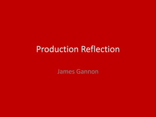
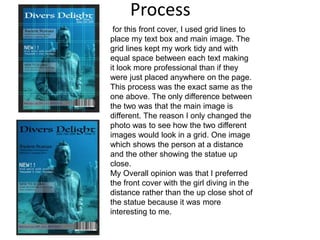
Production Reflection
James Gannon
Process
For this Front-cover idea I opened up an
Adobe InDesign page where I could get a
6 by 6 grid to copy over to Photoshop. I
then got my A4 photograph and put my
accomplice slightly to the right instead of
in the middle so she fit in a grid. After this
I made up a title that I could use for a
magazine. After I had my title, I played
around with the hue and saturation of the
picture to make the image slightly darker
round the edges and overall more
realistic. I think that this type of layout
looks quite nice compared to the ones
seen below. It was easy to make, and also
easy to read and rather eye catching
because the page is not full of writing or
pictures.
Process
for this front cover, I used grid lines to
place my text box and main image. The
grid lines kept my work tidy and with
equal space between each text making
it look more professional than if they
were just placed anywhere on the page.
This process was the exact same as the
one above. The only difference between
the two was that the main image is
different. The reason I only changed the
photo was to see how the two different
images would look in a grid. One image
which shows the person at a distance
and the other showing the statue up
close.
My Overall opinion was that I preferred
the front cover with the girl diving in the
distance rather than the up close shot of
the statue because it was more
interesting to me.
Process
Process
Process
Process
Process
Process
Process
Process
Process
Process
Process
Process
Process
Process
Process
Process
Process
Process
Process
Process
Process

6. production reflection

  • 1.
  • 2.
    Process For this Front-coveridea I opened up an Adobe InDesign page where I could get a 6 by 6 grid to copy over to Photoshop. I then got my A4 photograph and put my accomplice slightly to the right instead of in the middle so she fit in a grid. After this I made up a title that I could use for a magazine. After I had my title, I played around with the hue and saturation of the picture to make the image slightly darker round the edges and overall more realistic. I think that this type of layout looks quite nice compared to the ones seen below. It was easy to make, and also easy to read and rather eye catching because the page is not full of writing or pictures.
  • 3.
    Process for this frontcover, I used grid lines to place my text box and main image. The grid lines kept my work tidy and with equal space between each text making it look more professional than if they were just placed anywhere on the page. This process was the exact same as the one above. The only difference between the two was that the main image is different. The reason I only changed the photo was to see how the two different images would look in a grid. One image which shows the person at a distance and the other showing the statue up close. My Overall opinion was that I preferred the front cover with the girl diving in the distance rather than the up close shot of the statue because it was more interesting to me.
  • 4.
  • 5.
  • 6.
  • 7.
  • 8.
  • 9.
  • 10.
  • 11.
  • 12.
  • 13.
  • 14.
  • 15.
  • 16.
  • 17.
  • 18.
  • 19.
  • 20.
  • 21.
  • 22.
  • 23.
  • 24.

Editor's Notes

  • #3 Discuss the tools and processes used in your production. Log your thoughts and feelings about your work.
  • #4 Discuss the tools and processes used in your production. Log your thoughts and feelings about your work.
  • #5 Discuss the tools and processes used in your production. Log your thoughts and feelings about your work.
  • #6 Discuss the tools and processes used in your production. Log your thoughts and feelings about your work.
  • #7 Discuss the tools and processes used in your production. Log your thoughts and feelings about your work.
  • #8 Discuss the tools and processes used in your production. Log your thoughts and feelings about your work.
  • #9 Discuss the tools and processes used in your production. Log your thoughts and feelings about your work.
  • #10 Discuss the tools and processes used in your production. Log your thoughts and feelings about your work.
  • #11 Discuss the tools and processes used in your production. Log your thoughts and feelings about your work.
  • #12 Discuss the tools and processes used in your production. Log your thoughts and feelings about your work.
  • #13 Discuss the tools and processes used in your production. Log your thoughts and feelings about your work.
  • #14 Discuss the tools and processes used in your production. Log your thoughts and feelings about your work.
  • #15 Discuss the tools and processes used in your production. Log your thoughts and feelings about your work.
  • #16 Discuss the tools and processes used in your production. Log your thoughts and feelings about your work.
  • #17 Discuss the tools and processes used in your production. Log your thoughts and feelings about your work.
  • #18 Discuss the tools and processes used in your production. Log your thoughts and feelings about your work.
  • #19 Discuss the tools and processes used in your production. Log your thoughts and feelings about your work.
  • #20 Discuss the tools and processes used in your production. Log your thoughts and feelings about your work.
  • #21 Discuss the tools and processes used in your production. Log your thoughts and feelings about your work.
  • #22 Discuss the tools and processes used in your production. Log your thoughts and feelings about your work.
  • #23 Discuss the tools and processes used in your production. Log your thoughts and feelings about your work.
  • #24 Discuss the tools and processes used in your production. Log your thoughts and feelings about your work.
  • #25 Discuss the tools and processes used in your production. Log your thoughts and feelings about your work.