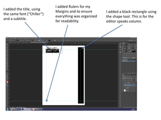
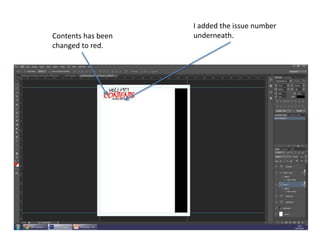
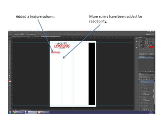
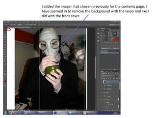
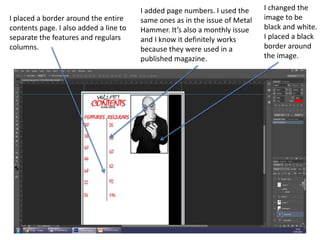
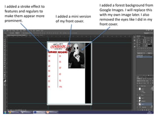
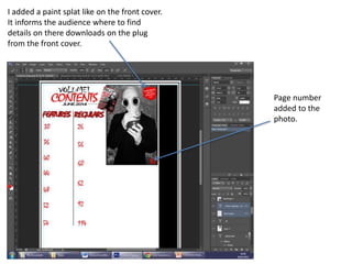
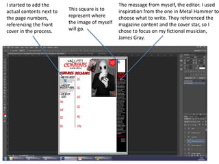
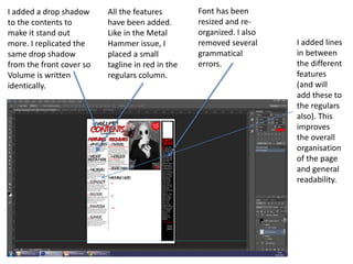
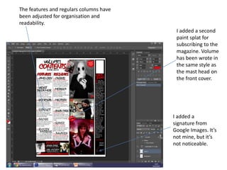
The document summarizes the steps taken to design a magazine contents page in Adobe Photoshop. Key points include:
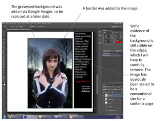
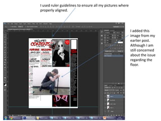
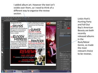
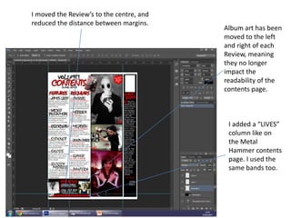
- Adding section titles, page numbers, and formatting elements like rulers and borders for organization.
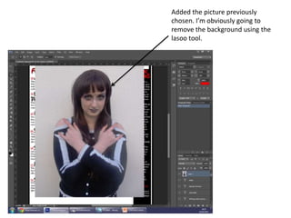
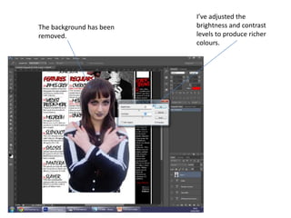
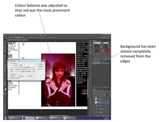
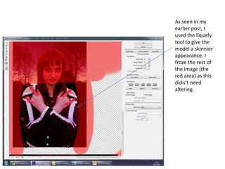
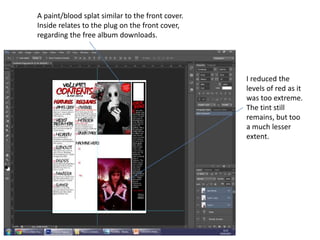
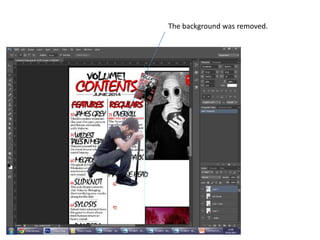
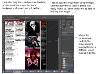
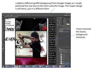
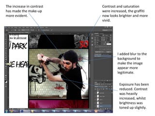
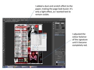
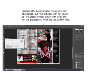
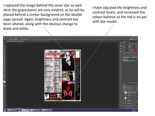
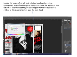
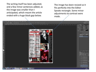
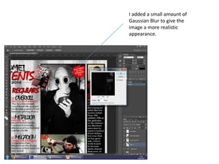
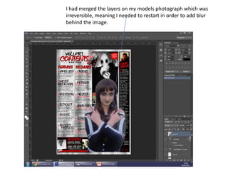
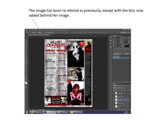
- Inserting images and adjusting settings like brightness, contrast and effects to refine the visual design.
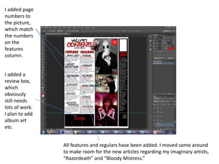
- Populating the sections with fictional article and review details while referencing real magazines for inspiration.
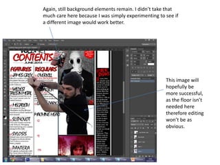
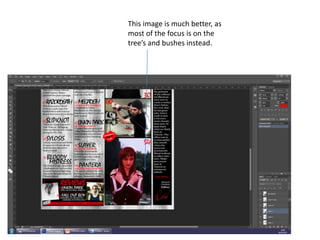
- Iteratively improving elements through testing alternative images and layout adjustments.