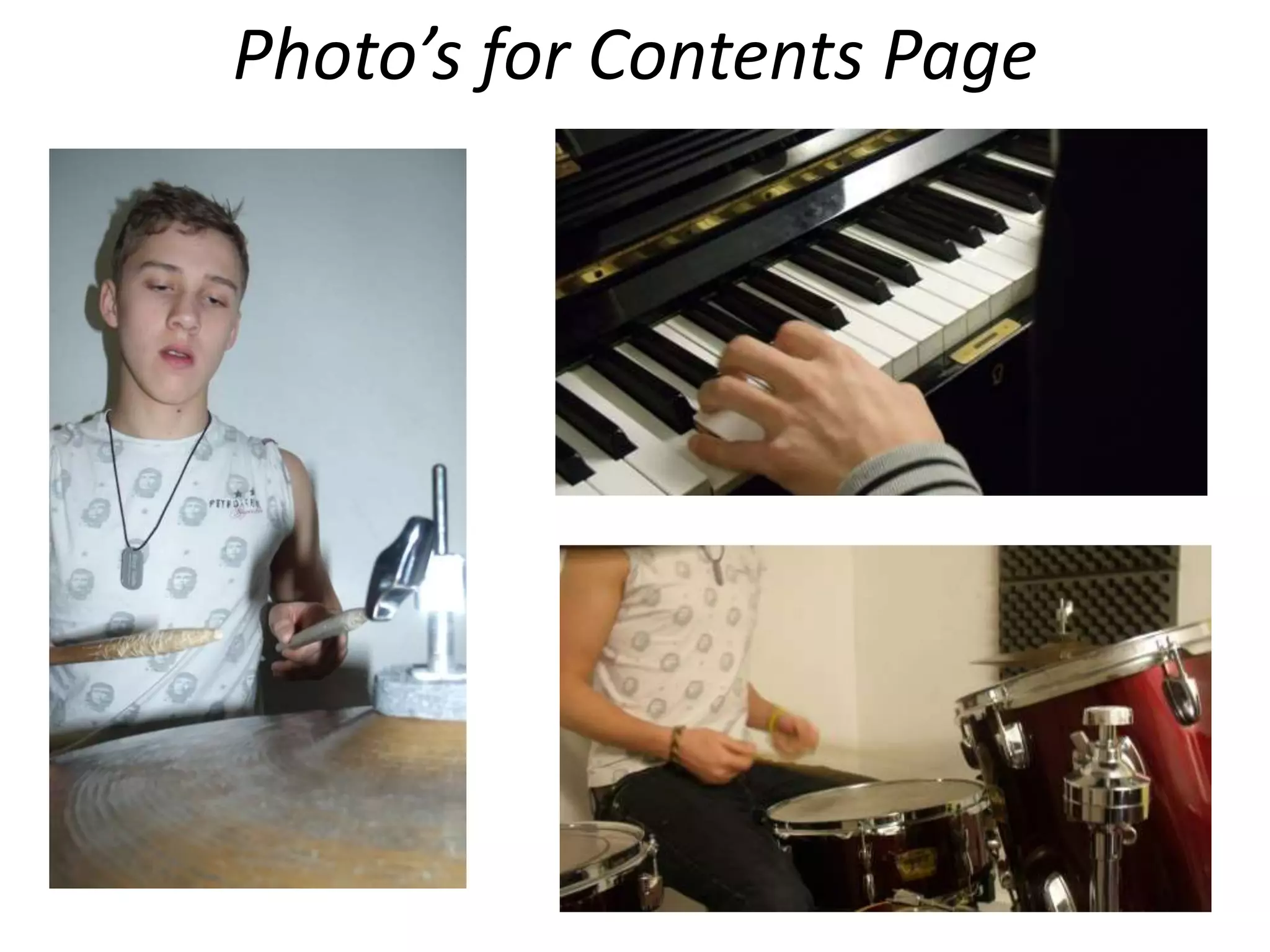
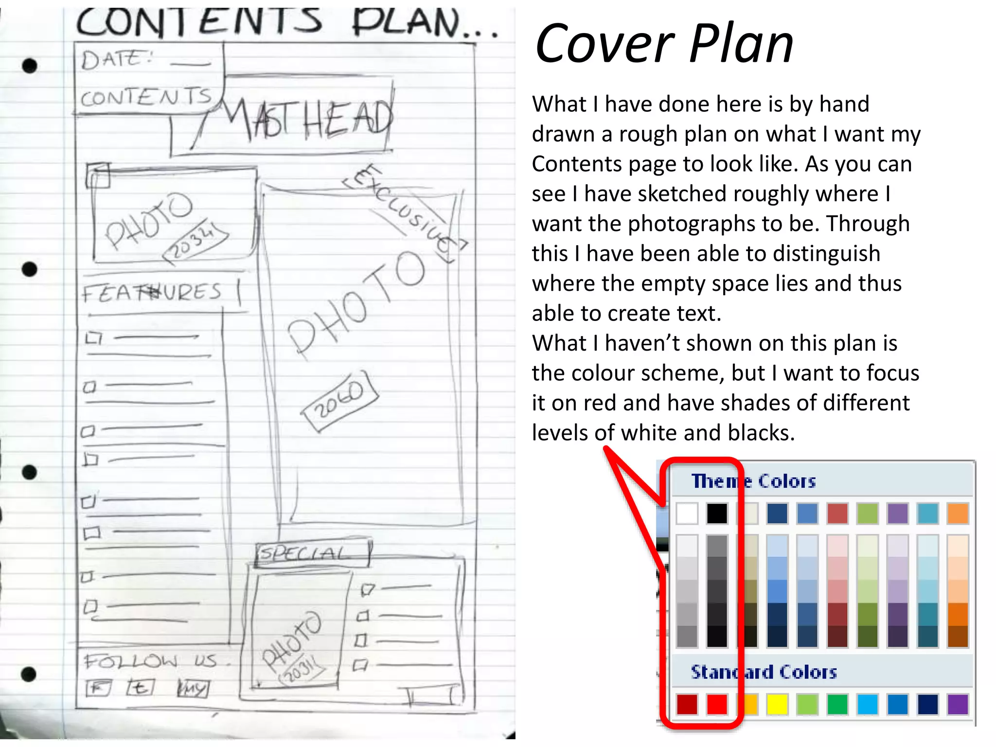
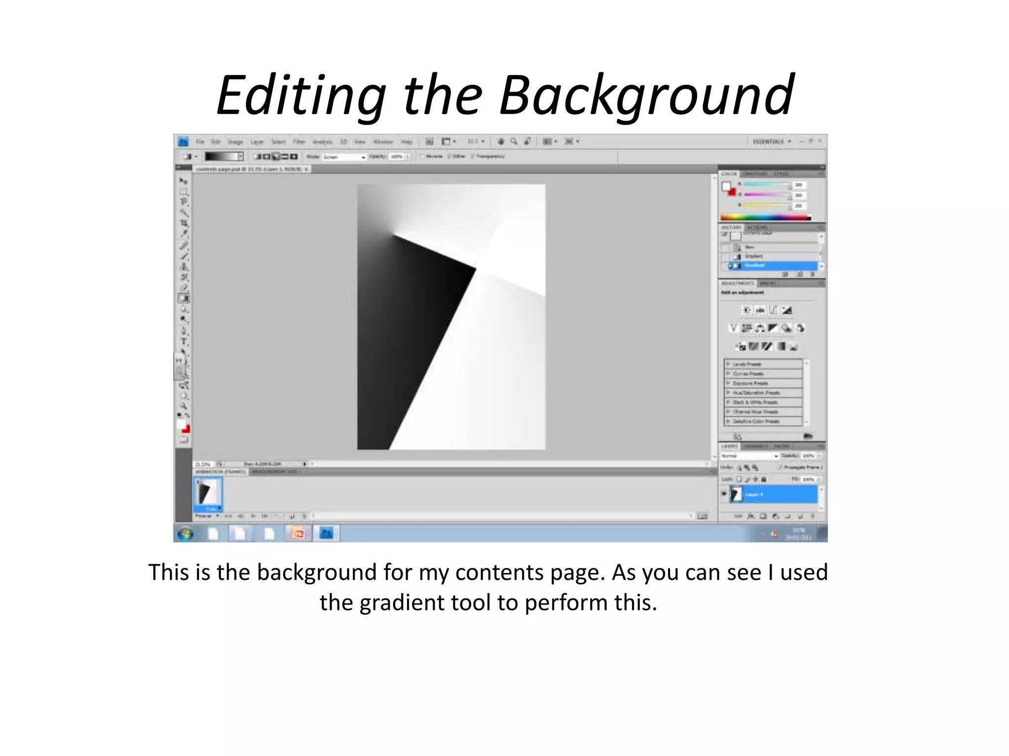
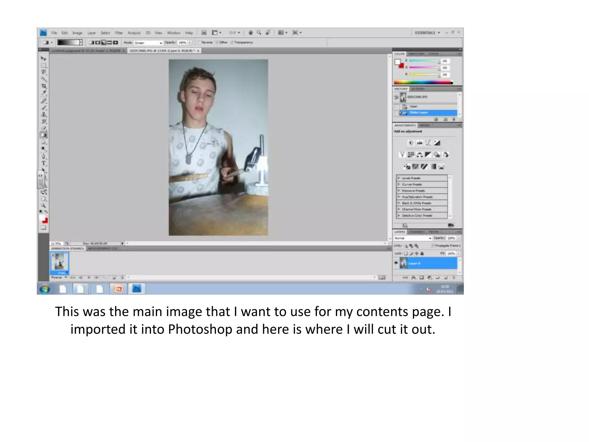
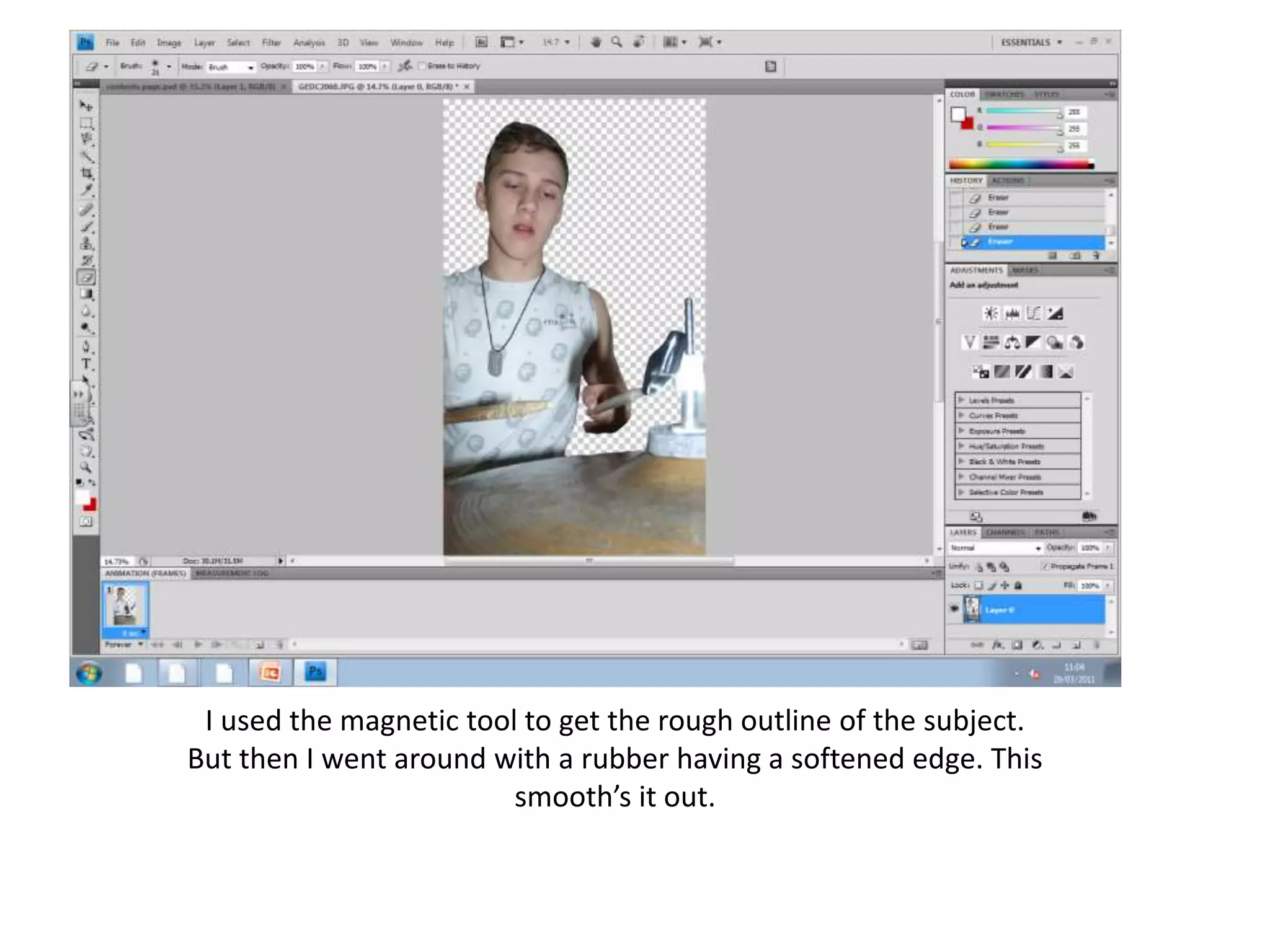
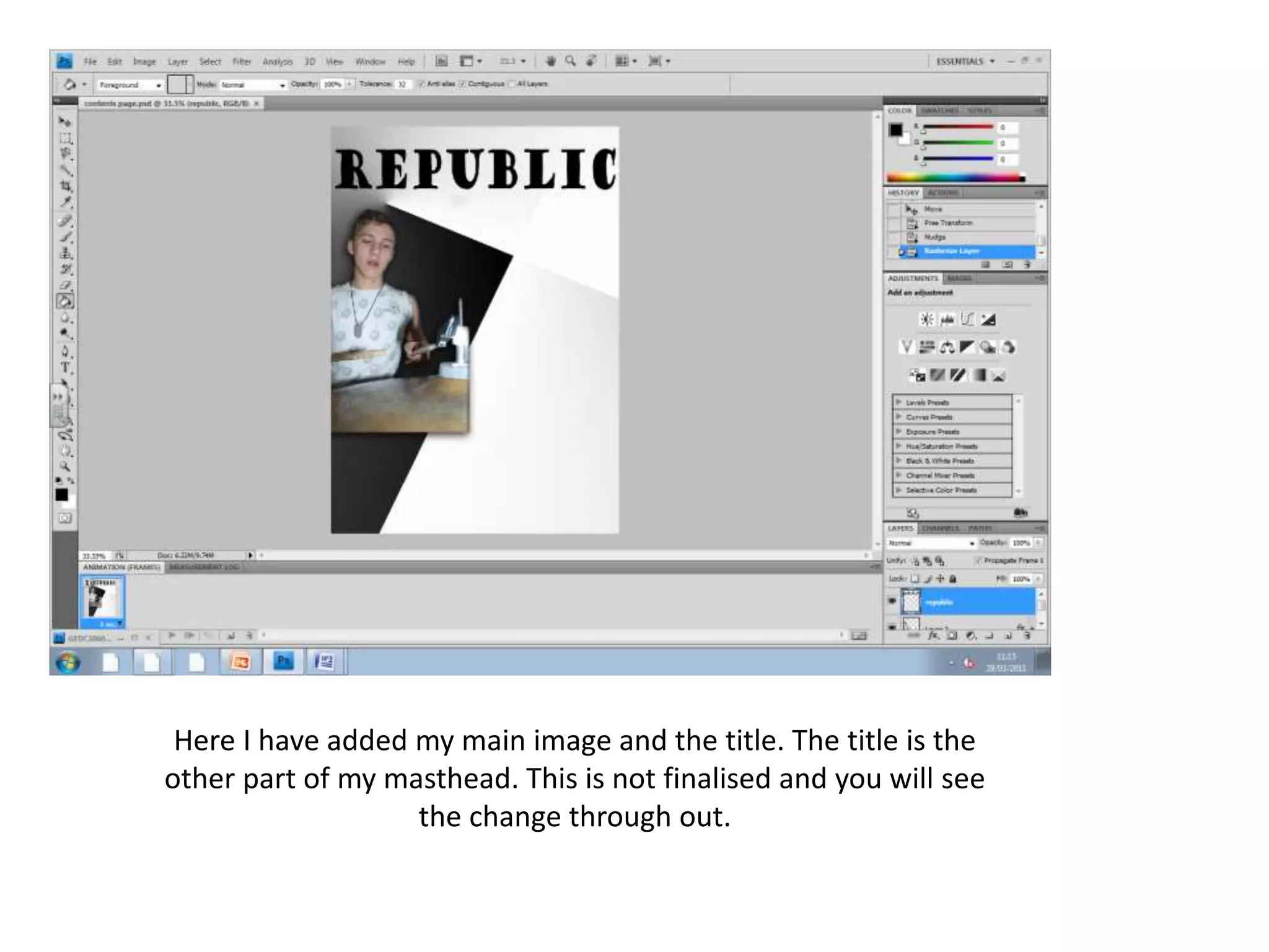
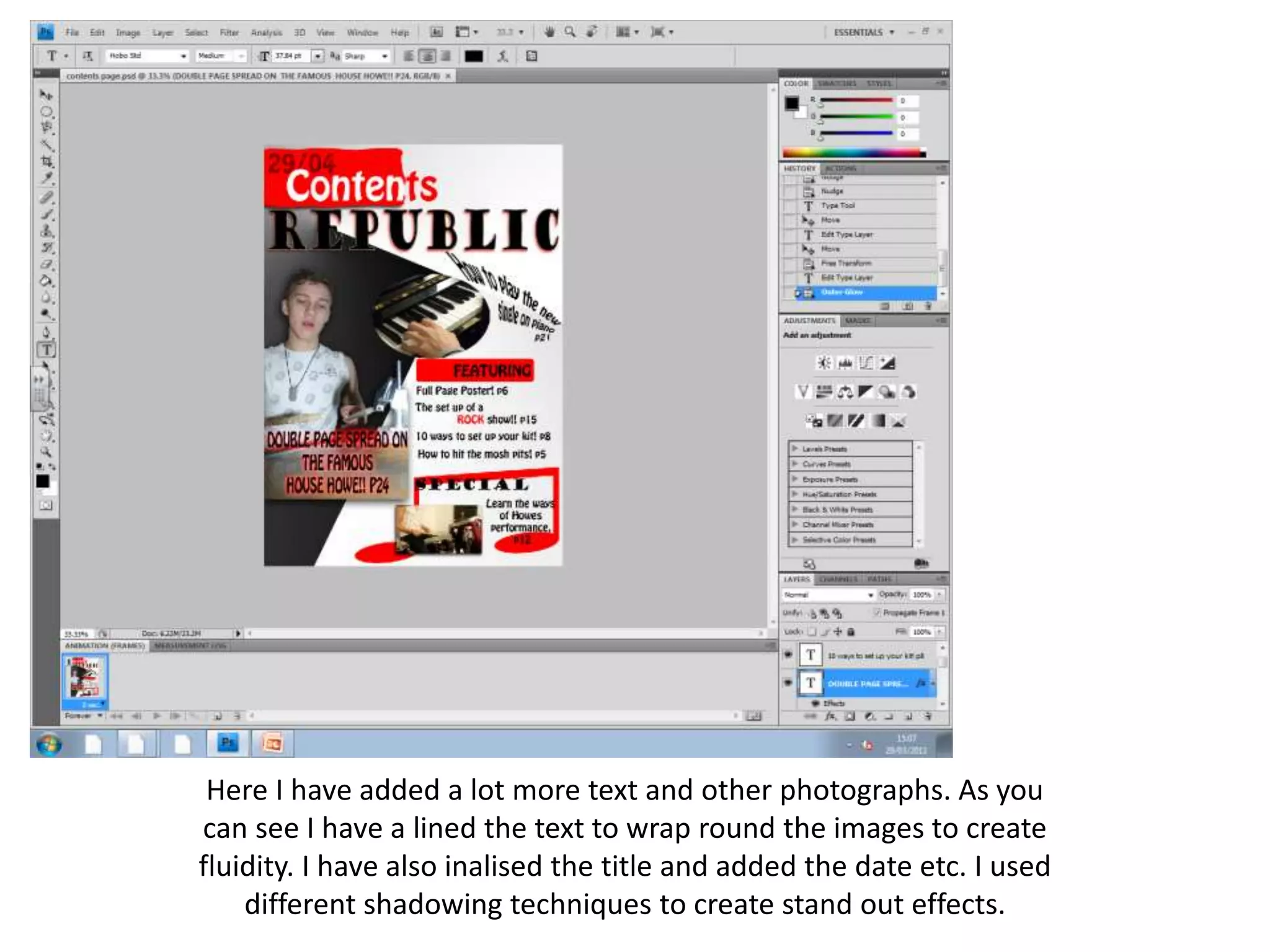
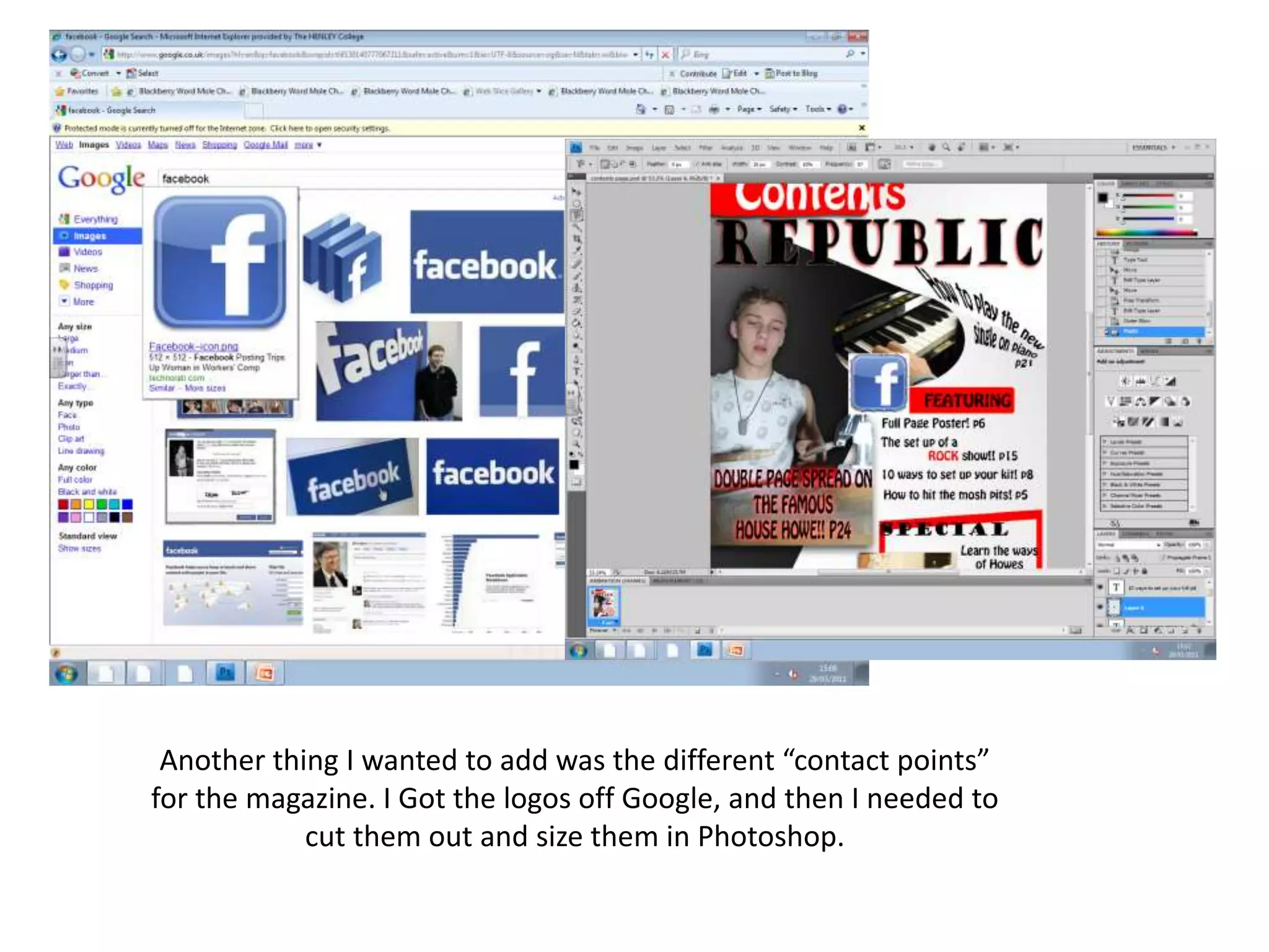
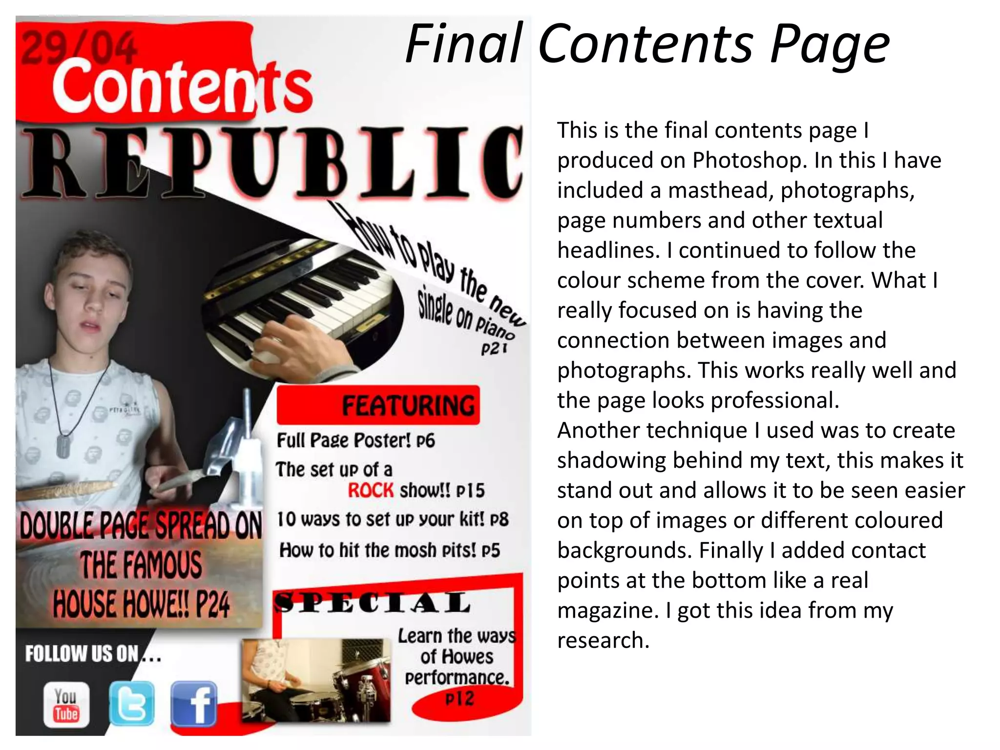
Media AS
M a k i n g o f t h e C o n t e n t s Pa g e
Photo’s for Contents Page
What I have done here is by hand
drawn a rough plan on what I want my
Contents page to look like. As you can
see I have sketched roughly where I
want the photographs to be. Through
this I have been able to distinguish
where the empty space lies and thus
able to create text.
What I haven’t shown on this plan is
the colour scheme, but I want to focus
it on red and have shades of different
levels of white and blacks.
Cover Plan
Editing the Background
This is the background for my contents page. As you can see I used
the gradient tool to perform this.
This was the main image that I want to use for my contents page. I
imported it into Photoshop and here is where I will cut it out.
I used the magnetic tool to get the rough outline of the subject.
But then I went around with a rubber having a softened edge. This
smooth’s it out.
Here I have added my main image and the title. The title is the
other part of my masthead. This is not finalised and you will see
the change through out.
Here I have added a lot more text and other photographs. As you
can see I have a lined the text to wrap round the images to create
fluidity. I have also inalised the title and added the date etc. I used
different shadowing techniques to create stand out effects.
Another thing I wanted to add was the different “contact points”
for the magazine. I Got the logos off Google, and then I needed to
cut them out and size them in Photoshop.
Final Contents Page
This is the final contents page I
produced on Photoshop. In this I have
included a masthead, photographs,
page numbers and other textual
headlines. I continued to follow the
colour scheme from the cover. What I
really focused on is having the
connection between images and
photographs. This works really well and
the page looks professional.
Another technique I used was to create
shadowing behind my text, this makes it
stand out and allows it to be seen easier
on top of images or different coloured
backgrounds. Finally I added contact
points at the bottom like a real
magazine. I got this idea from my
research.
Evaluation
By having a pre made plan for what my contents page was going to look
like, really helped me because I had an idea that I was able to follow. Having said
that a few things changed from the plan with the final, such as the positioning of the
photographs.
My colour scheme went well and I was pleased with the stylish look. I
made sure all the text was easy to read and went well with the background colours. I
also changed certain lettering to suite such as the word “Content” at the top. I
personally feel this gives a really good effect and I learnt this from my preliminary
task.
I also added the “follow us on…” at the bottom, a lot of modern magazines
do this now and I thought it would be a good Idea to put this at the bottom with
icons of Face book, Twitter and YouTube. These are the three most popular sites for
viral advertising and blogs etc.
I think this contents page looks the part and has all the features of a
professional magazine contents page should. I think it goes well with the cover, it
keeps to the colour scheme, has the same model in the images, same writing.

Making of the contents page

  • 1.
    Media AS M ak i n g o f t h e C o n t e n t s Pa g e
  • 2.
  • 3.
    What I havedone here is by hand drawn a rough plan on what I want my Contents page to look like. As you can see I have sketched roughly where I want the photographs to be. Through this I have been able to distinguish where the empty space lies and thus able to create text. What I haven’t shown on this plan is the colour scheme, but I want to focus it on red and have shades of different levels of white and blacks. Cover Plan
  • 4.
    Editing the Background Thisis the background for my contents page. As you can see I used the gradient tool to perform this.
  • 5.
    This was themain image that I want to use for my contents page. I imported it into Photoshop and here is where I will cut it out.
  • 6.
    I used themagnetic tool to get the rough outline of the subject. But then I went around with a rubber having a softened edge. This smooth’s it out.
  • 7.
    Here I haveadded my main image and the title. The title is the other part of my masthead. This is not finalised and you will see the change through out.
  • 8.
    Here I haveadded a lot more text and other photographs. As you can see I have a lined the text to wrap round the images to create fluidity. I have also inalised the title and added the date etc. I used different shadowing techniques to create stand out effects.
  • 9.
    Another thing Iwanted to add was the different “contact points” for the magazine. I Got the logos off Google, and then I needed to cut them out and size them in Photoshop.
  • 10.
    Final Contents Page Thisis the final contents page I produced on Photoshop. In this I have included a masthead, photographs, page numbers and other textual headlines. I continued to follow the colour scheme from the cover. What I really focused on is having the connection between images and photographs. This works really well and the page looks professional. Another technique I used was to create shadowing behind my text, this makes it stand out and allows it to be seen easier on top of images or different coloured backgrounds. Finally I added contact points at the bottom like a real magazine. I got this idea from my research.
  • 11.
    Evaluation By having apre made plan for what my contents page was going to look like, really helped me because I had an idea that I was able to follow. Having said that a few things changed from the plan with the final, such as the positioning of the photographs. My colour scheme went well and I was pleased with the stylish look. I made sure all the text was easy to read and went well with the background colours. I also changed certain lettering to suite such as the word “Content” at the top. I personally feel this gives a really good effect and I learnt this from my preliminary task. I also added the “follow us on…” at the bottom, a lot of modern magazines do this now and I thought it would be a good Idea to put this at the bottom with icons of Face book, Twitter and YouTube. These are the three most popular sites for viral advertising and blogs etc. I think this contents page looks the part and has all the features of a professional magazine contents page should. I think it goes well with the cover, it keeps to the colour scheme, has the same model in the images, same writing.