Downloaded 312 times


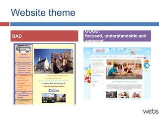

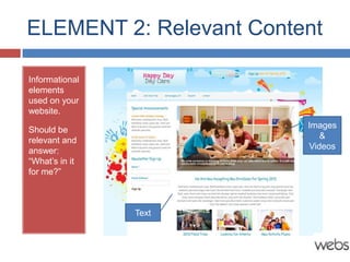

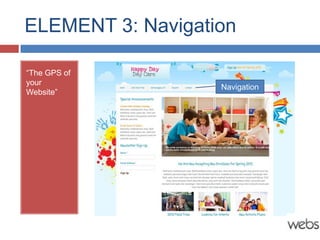


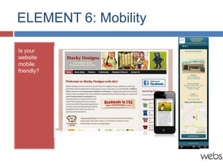


The document outlines six key elements that contribute to a good website, including good visual design, relevant content, effective navigation, clear calls to action, credibility, and mobile friendliness. It also provides tips to enhance each element, such as ensuring compelling visual themes and keeping navigation simple. Additionally, it emphasizes avoiding common mistakes like stale content and poor design.


![Getting Started with Apache Spark: Big Data Made Simple [Free Meetup]](https://cdn.slidesharecdn.com/ss_thumbnails/apachesparkgettingstarted-260203175547-8361bcc3-thumbnail.jpg?width=640&height=640&fit=bounds)
