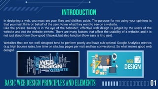
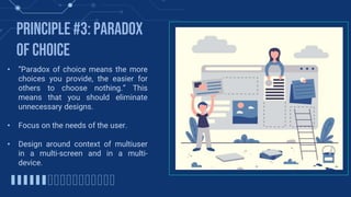
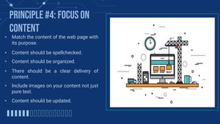
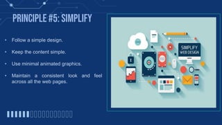
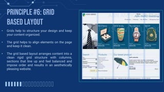
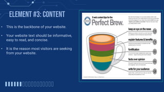
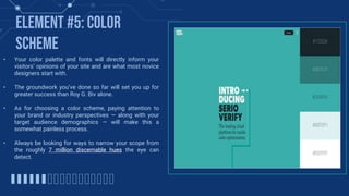
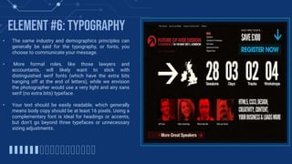
2. Introduction
In designing a web, you must set your likes and dislikes aside. The purpose for not using your opinions is
that you must think on behalf of the user. Know what they want to see on a website.
Like the phrase âbeauty is in the eye of the beholderâ, effective web design is judged by the users of the
website and not the website owners. There are many factors that affect the usability of a website, and it is
not just about form (how good it looks), but also function (how easy is it to use).
Websites that are not well designed tend to perform poorly and have sub-optimal Google Analytics metrics
(e.g. high bounce rates, low time on site, low pages per visit and low conversions). So what makes good web
design?
3. BASIC WEB DESIGN principles
Web design principles are general rules for the design of
web-based media that include basic guidelines for the design of layouts
and interaction design. Design principles are derived from fields as
varied as Human-computer interaction, usability and user experience
design, Graphic design and Typography, Color theory, and Design
processes and models. They can stand alone as general rules or be the
basis for the development of design methodologies.
An effective website design should fulfill its intended
function by conveying its particular message whilst simultaneously
engaging the visitor. Several factors such as consistency, colors,
typography, imagery, simplicity and functionality all contribute to good
website design.
When designing a website there are many key factors that
will contribute to how it is perceived. A well designed website can help
build trust and guide visitors to take action. Creating a great user
experience involves making sure your website design is optimized for
usability (form and aesthetics) and how it easy is it to use (functionality).
4. Principle #1: Visual
Language⢠Use a consistent template on each page with a uniform
color scheme.
⢠Use contrasting color between text and background in
the place you want attention.
⢠Avoid large and small font sizes and many typefaces.
⢠Use common font style to similar items across the web
pages.
⢠Make important links or menus more prominent in
terms of color.
⢠Use pictures that are high quality.
⢠Use the rule of thirds for images. (The image is divided
into three regions both horizontally and vertically.
5. Principle #2: Balance
⢠There should be a balance distribution of
heavy and light elements on the page.
⢠Proper alignment of text and images in a web
page helps maintain consistency in design.
⢠Important information is placed near the top.
⢠The size of a button should be proportional to
its expected frequency of use.
⢠Group similar things together in terms of
shape, color or shading.
⢠Create a pattern which will make your page
easier to use, remember and understand.
6. Principle #3: Paradox
of Choice
⢠âParadox of choice means the more
choices you provide, the easier for
others to choose nothing.â This
means that you should eliminate
unnecessary designs.
⢠Focus on the needs of the user.
⢠Design around context of multiuser
in a multi-screen and in a multi-
device.
7. Principle #4: Focus on
Content
⢠Match the content of the web page with
its purpose.
⢠Content should be spellchecked.
⢠Content should be organized.
⢠There should be a clear delivery of
content.
⢠Include images on your content not just
pure text.
⢠Content should be updated.
8. Principle #5: Simplify
⢠Follow a simple design.
⢠Keep the content simple.
⢠Use minimal animated graphics.
⢠Maintain a consistent look and feel
across all the web pages.
9. ⢠Grids help to structure your design and keep
your content organized.
⢠The grid helps to align elements on the page
and keep it clean.
⢠The grid based layout arranges content into a
clean rigid grid structure with columns,
sections that line up and feel balanced and
impose order and results in an aesthetically
pleasing website.
Principle #6: grid
based layout
10. Principle #7: load time
⢠Waiting for a website to load will lose visitors.
⢠Nearly half of web visitors expect a site to load
in 2 seconds or less and they will potentially
leave a site that isnât loaded within 3 seconds.
⢠Tips to make page load times more effective
include optimizing image sizes (size and scale),
combining code into a central CSS or JavaScript
file (this reduces HTTP requests) and minify
HTML, CSS, JavaScript (compressed to speed
up their load time)
11. BASIC WEB DESIGN ELEMENTS
Web design is the process of
creating websites. It encompasses
several different aspects, Including
webpage layout, content production, and
graphic design. The layout and
appearance of the elements within
a webpage are typically defined using
CSS, or cascading style sheets.
12. ELEMENT #1: NAVIGATION
⢠The website design should be easy to
navigate
⢠The viewer should always know exactly
where they are on the website and have
easy access to where they would like to
be.
⢠Menu items should easily accessible
from any page.
13. ELEMENT #2: VISUAL
DESIGN
⢠Scrolling text, animation, and ďŹash intros
should be used sparingly in your web
design and only to emphasize a point for
maximum effect.
⢠Let them know that your is trustworthy
and professional.
⢠Your website has about 1/10th of a
second to impress your visitor.
14. ELEMENT #3: CONTENT
⢠This is the backbone of your website.
⢠Your website text should be informative,
easy to read, and concise.
⢠It is the reason most visitors are seeking
from your website.
15. ELEMENT #4: WEB
FRIENDLY
⢠No matter how informative, beautiful, and easy
to use your website design is, it's useless
unless it's web-friendly.
⢠It is important that your web designers know
the keys to making your website work on all the
major browsers, and that they utilize meta tags,
alt tags, are fully versed in SEO (Search Engine
Optimization).
⢠Many factors effect your search engine
placement and visual appearance of your site,
so make sure your web designers know their
stuff.
16. ELEMENT #5: color
scheme
⢠Your color palette and fonts will directly inform your
visitorsâ opinions of your site and are what most novice
designers start with.
⢠The groundwork youâve done so far will set you up for
greater success than Roy G. Biv alone.
⢠As for choosing a color scheme, paying attention to
your brand or industry perspectives â along with your
target audience demographics â will make this a
somewhat painless process.
⢠Always be looking for ways to narrow your scope from
the roughly 7 million discernable hues the eye can
detect.
17. ELEMENT #6: typography
⢠The same industry and demographics principles can
generally be said for the typography, or fonts, you
choose to communicate your message.
⢠More formal roles, like those lawyers and
accountants, will likely want to stick with
distinguished serif fonts (which have the extra bits
hanging off at the end of letters), while we envision
the photographer would use a very light and airy sans
serif (no extra bits) typeface.
⢠Your text should be easily readable, which generally
means body copy should be at least 16 pixels. Using a
complementary font is ideal for headings or accents,
but donât go beyond three typefaces or unnecessary
sizing adjustments.
18. ELEMENT #7: turnaround
time
⢠The number one complaint of website design
customers is the time it takes to get the site
up and running.
⢠Unfortunately, a ďŹrm that takes unusually
long to complete your website is par for the
course.
⢠The longer it takes to complete the website,
the more business - and value - you lose.
⢠If you want a great website with a very quick
turnaround, its going to cost you significantly
more than if you want a great website and are
willing to wait for it.
20. OUR TEAM
Christine Angeline B. Belmonte
Leader
Alodia Ysabel S. Briones
Member
Nyckah Janne C. Graneta
Member
Harry Josh B. Mejia
Member
Erom L. Ramos
Member
Christian Joseph P. CariĂąo
Member
Marck P. Yranon
ICT Teacher